

Brand St. - Wynn Las Vegas
Frame/Glass Decor Redesign - study
I was given these as a rough file, based off of a design/theme my manager at Brand St. did for the Wynn casino in Vegas. Some kind of interior redesign of a few rooms/suites and these were supposed to go along with that theme.
Frame/Glass Decor Redesign - study
I was given these as a rough file, based off of a design/theme my manager at Brand St. did for the Wynn casino in Vegas. Some kind of interior redesign of a few rooms/suites and these were supposed to go along with that theme.
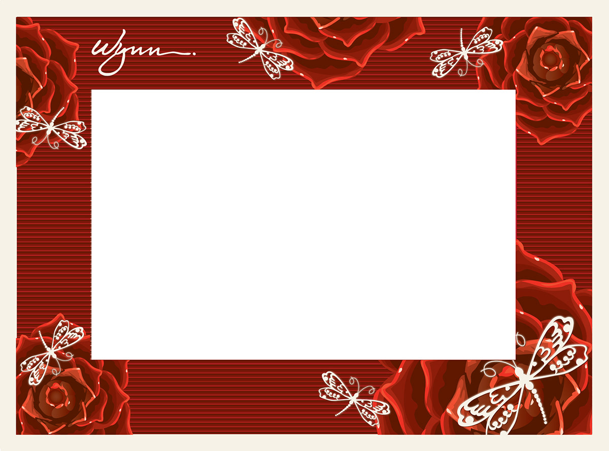
Picture frame with the dragonfly/rose theme. Had to edit and resize the dragonflies so they mostly fit within the lines of the frame. Roses were resized as well. Haphazardly arranged for the most part, but tried to tie them together between the with varying space.

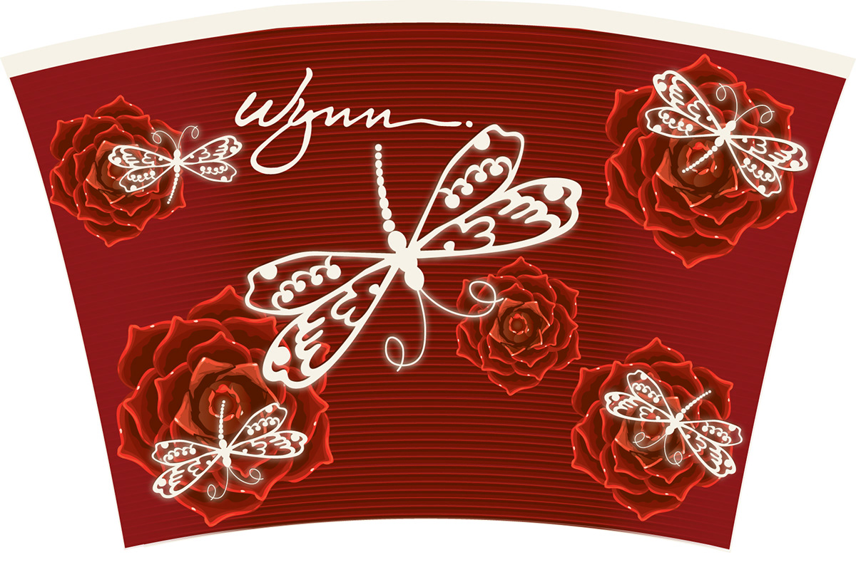
Design to be wrapped around a mug. Similar work as with the frame, built from a rough start and go to this with some simple resizing and organizing. Opacity mas used to make the red bleed more transparent toward the center to show the line/texture.
More or less the same as the mug, this was designed to wrap around a shot glass.
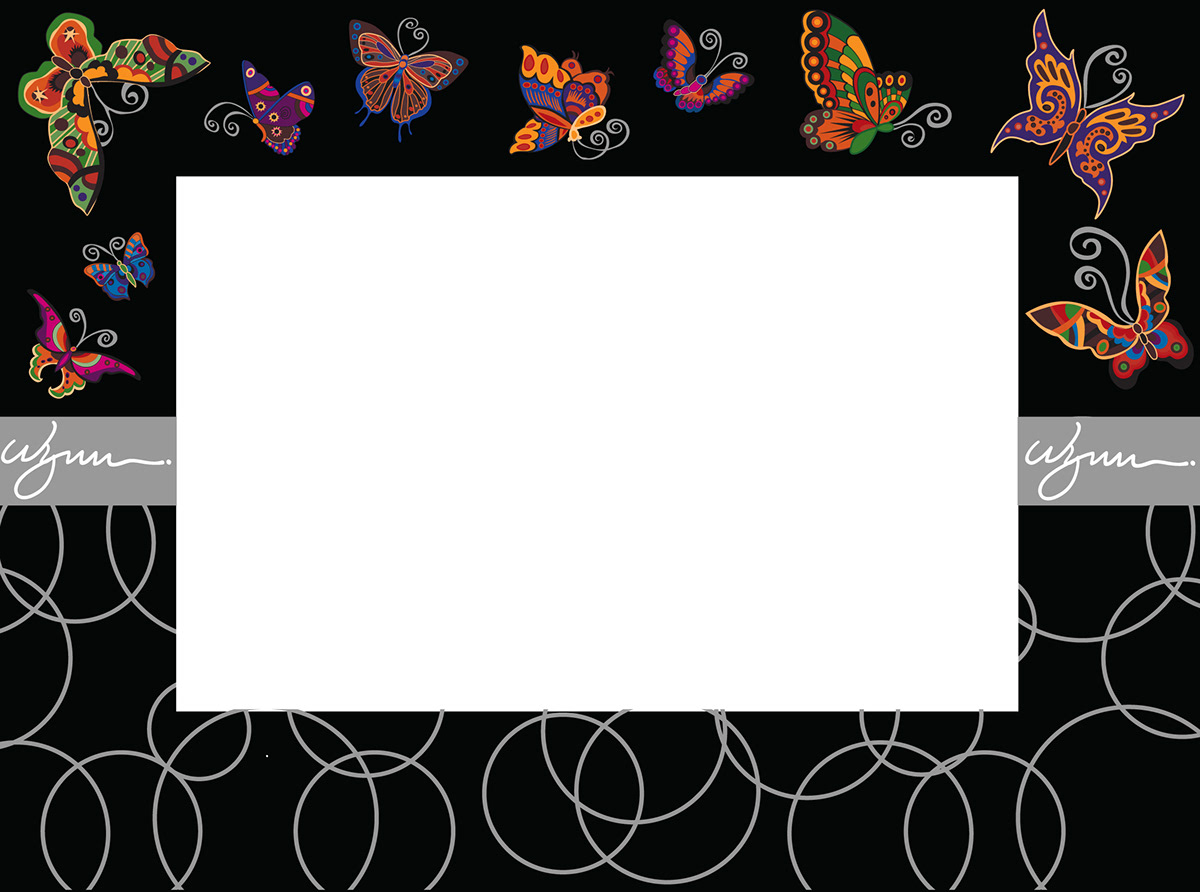
Again no shots of the original rough pieces (nor is this the final) but it was originally shades of red, with a thin tan line in the middle. And circles of the same size interconnected evenly. I don't think the butterflies were even included when i first got it. Got a copy of the butterfly files, had to edit some colors and resize them, also redo some of the antennae. The Wynn logo was resized/edited and changed to white for transparency/printing purposes (was going to be etched..) as well as the middle grey bar being resized. The circles also were resized (overlapping a little bit in this rough one) and arranged so they were varying sizes, but still connected sporadically.

Again, a mug wrap. Butterflies edited, and now that I think about it, they didn't want any of the two same butterflies on any of these. Had to create a line to curve the Wynn logo over the middle repeatedly. Circles were resized like the frame, but the client wanted to keep them inside the borders so they wouldn't need to worry about lining them up when the wrap was on. This one still looks a little disorganized prior to the final.

Shot glass, same work as the mug, a little different look.

Tried out a black/white test after just for fun. I liked it; the client didn't because obviously the monochrome/black and white theme wasn't part of their redesign. I kind of like it though!


