COSMO
⟶ Role: Refresh of the brand / Art direction / Animation 2D / Graphic Design / UI & UX Design
CLIENT:
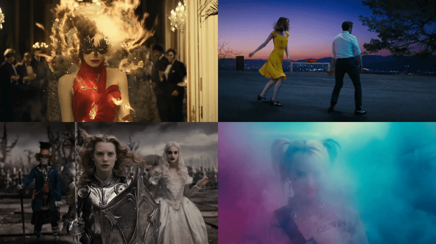
COSMO wants to be the reference channel and space for women in which they can be inspired, entertained and be disconnected from reality.
OBJECTIVE:
The job was to refresh the brand with a smart system that could package different types of content where communication is effective and appealing.
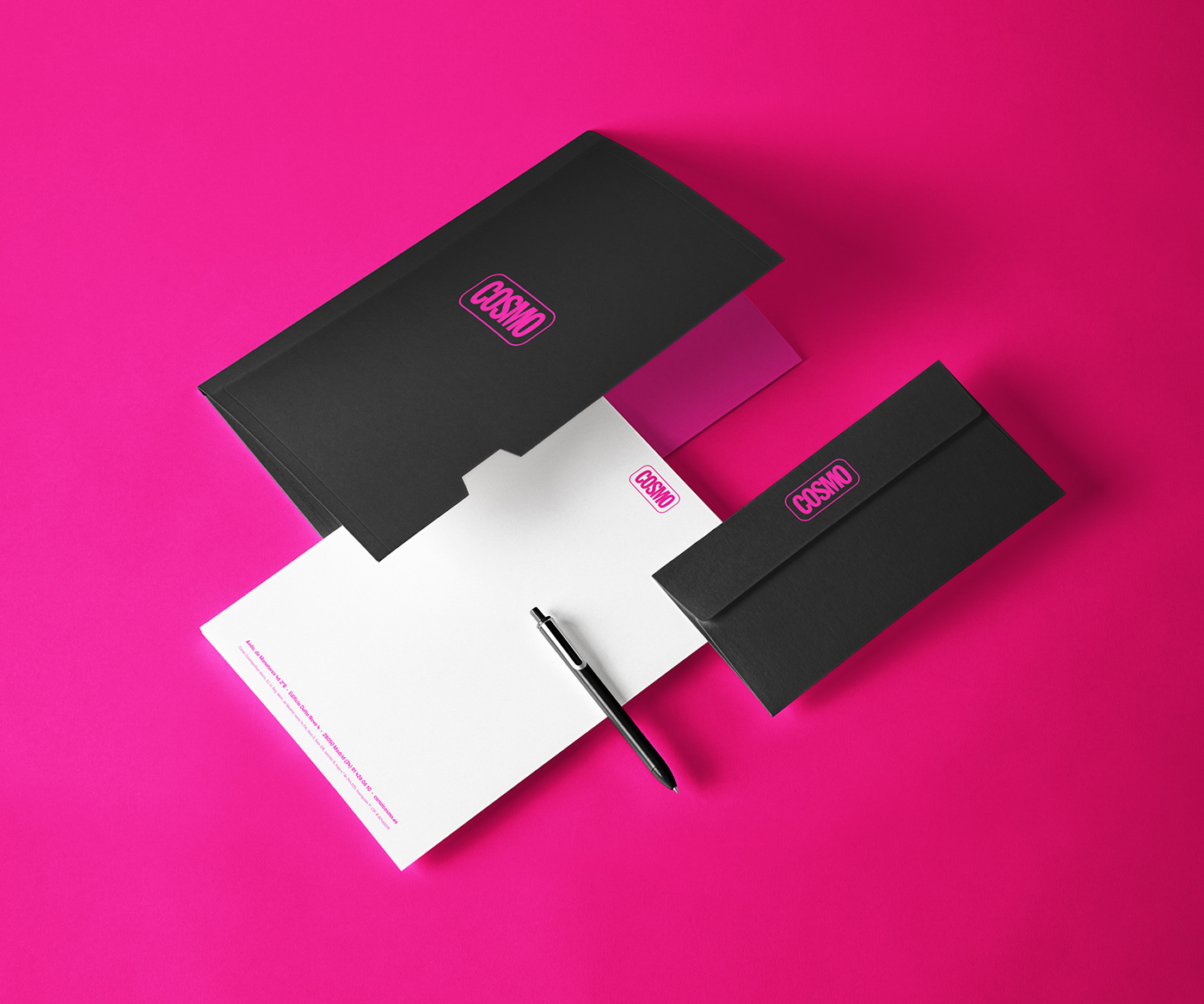
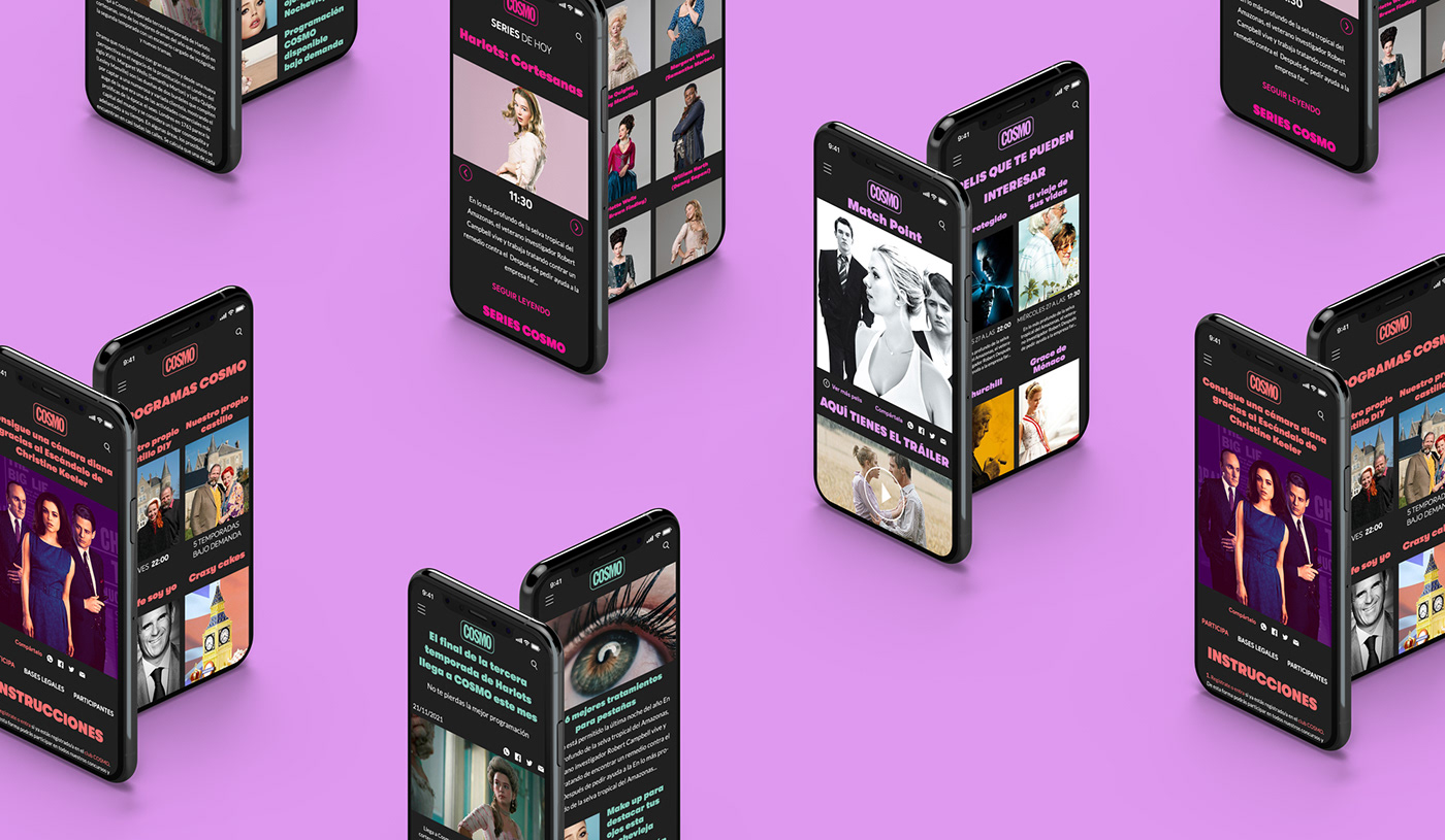
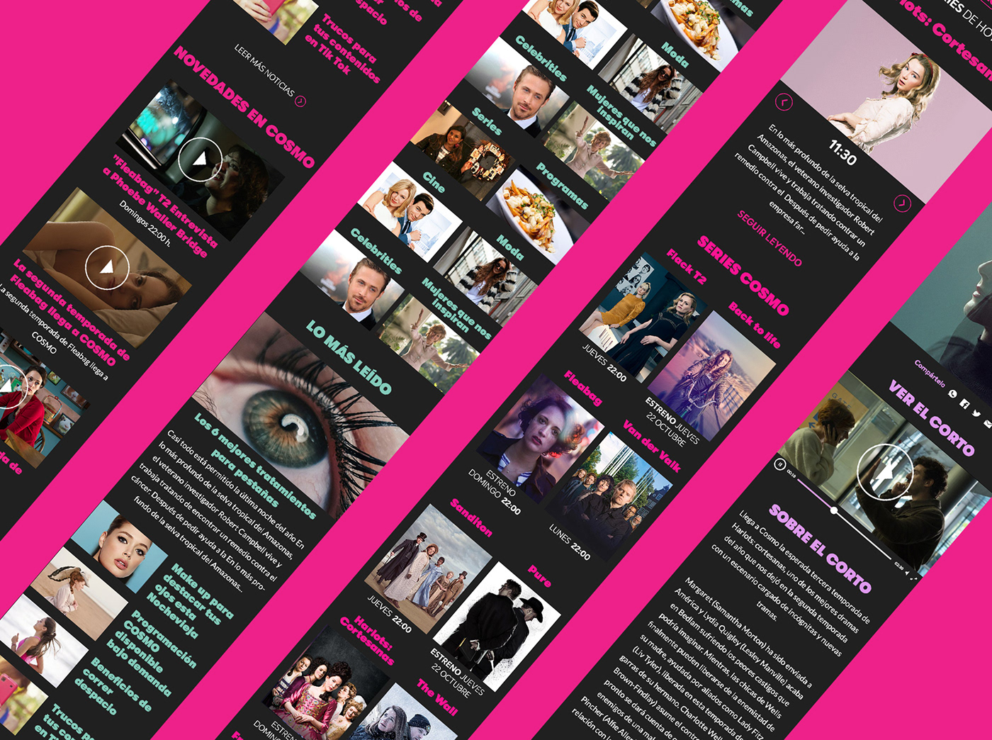
COSMO needed a total broadcast design, the restyling of their logo, a new website, a new stationary and office decoration, a complete graphic package for their assets and a brand book.
SOLUTION:
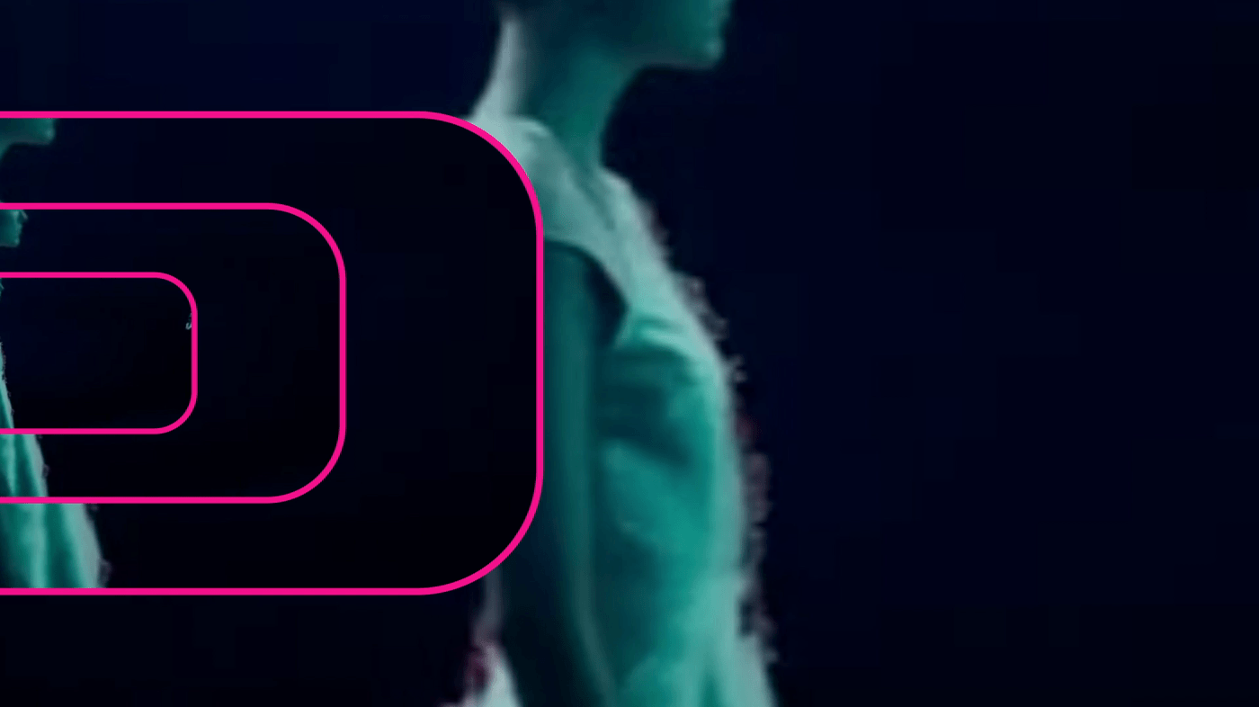
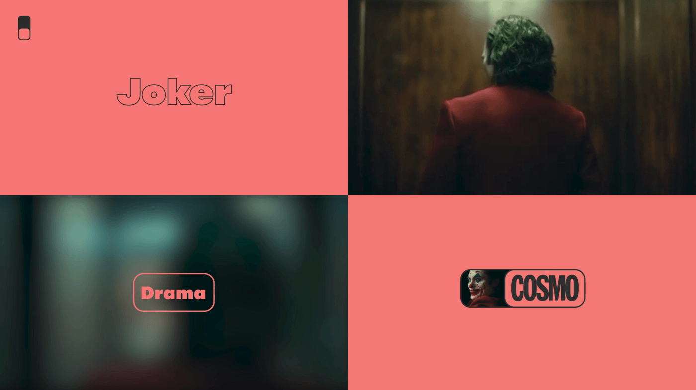
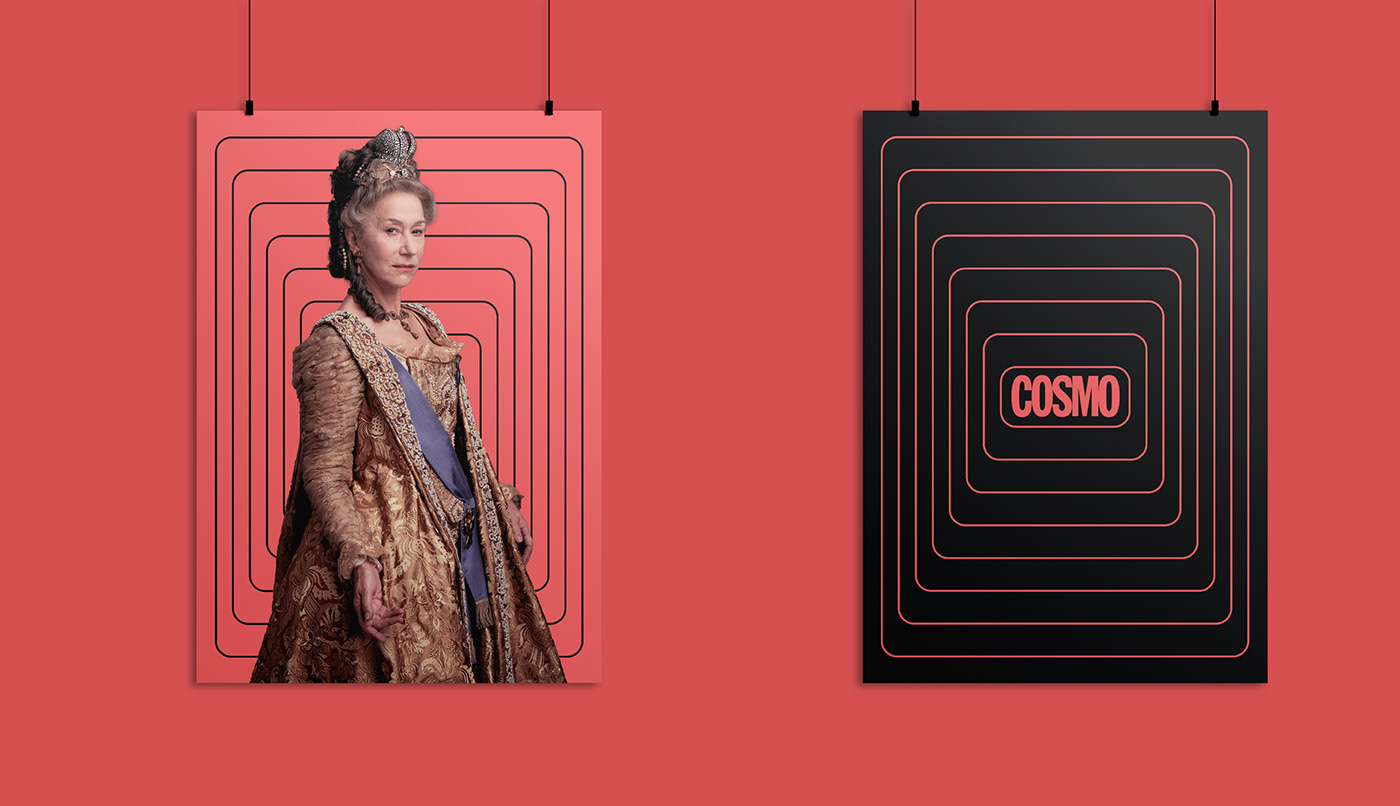
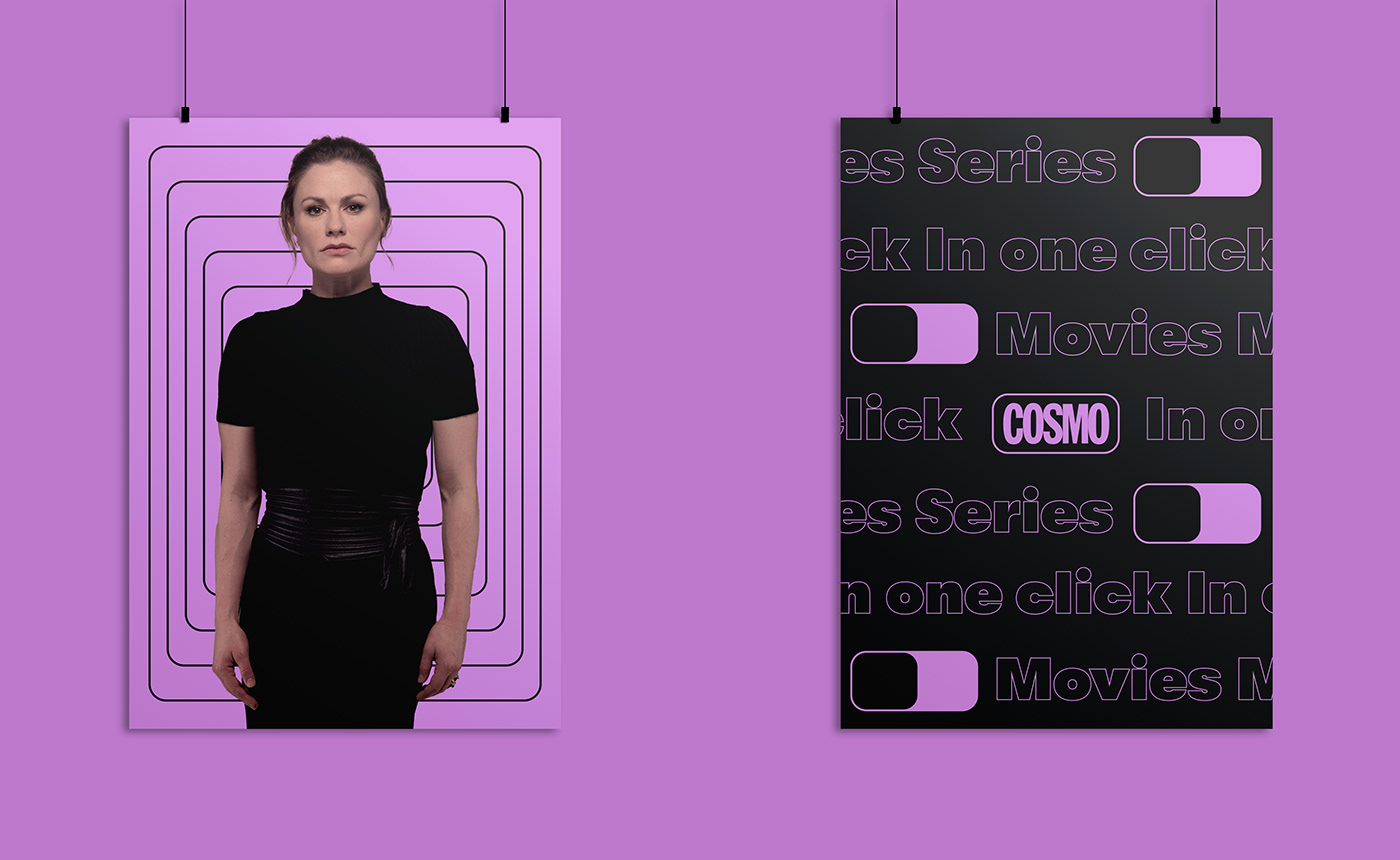
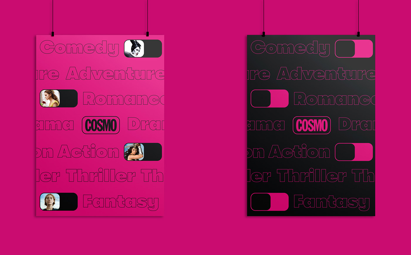
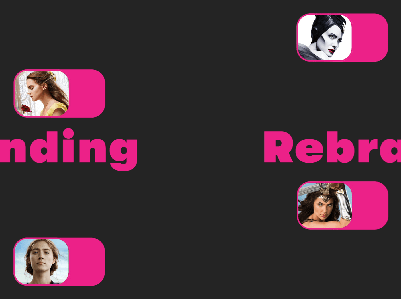
I made an intervention in the logo to give it a regular shape so we can play with a switch effect. The claim we chose was "COSMO: Everything in one click". The "logo button" acts like a switch generating effects when it changes the position. Also we play with the outline in the graphics animation to achieve an hypnotic effect. Now you are entering in trance mode where you are watching COSMO.
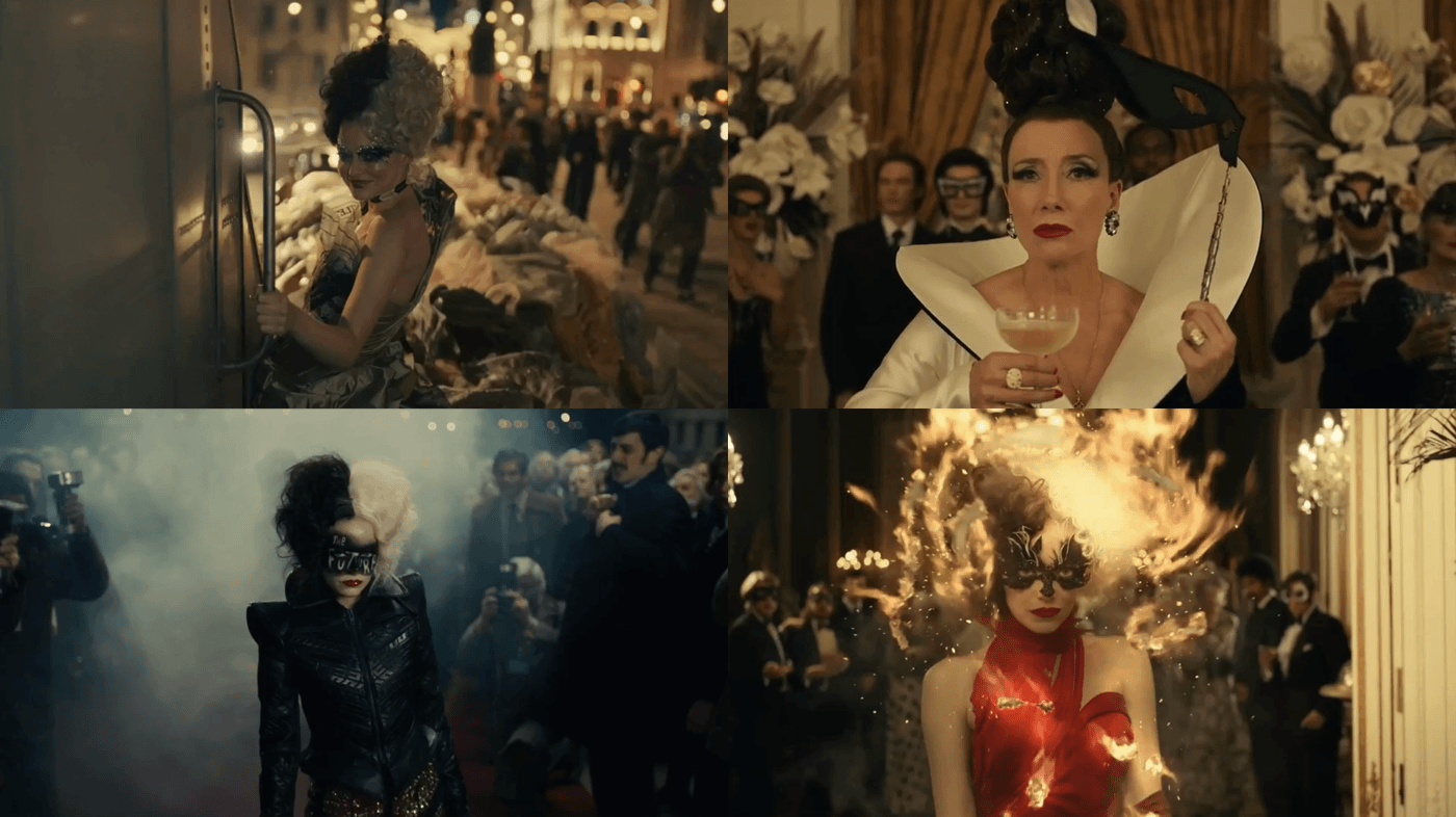
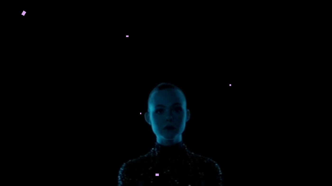
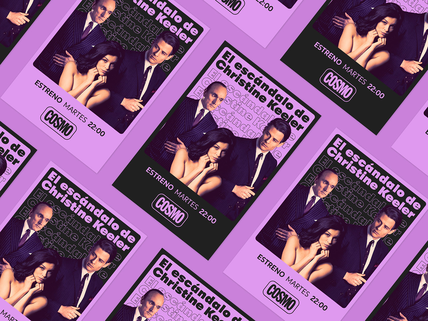
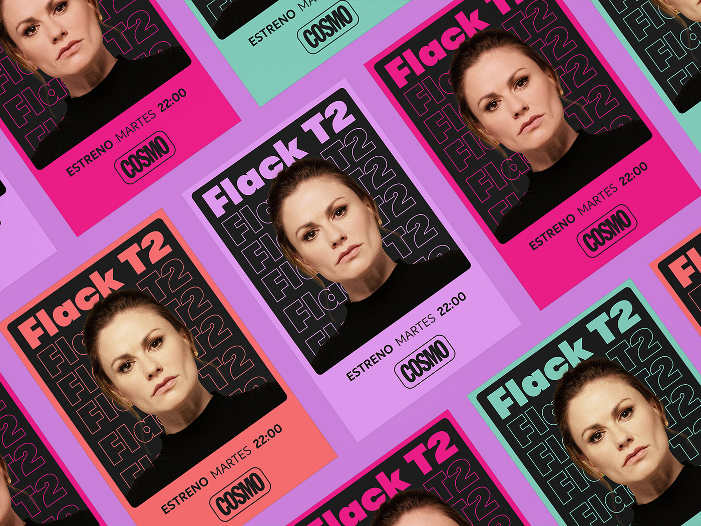
The original palette of the brand was very simple, they only played with pink, black and white. We needed to extend the color palette to make the brand more fresh and to help to separate the moods of the different contents. For ON-air media we made 9 color combos, and for OFF-air assets we reduce the palette to 4 main colors that are also into the 9 color combos. The result was a playful and attractive color palette.
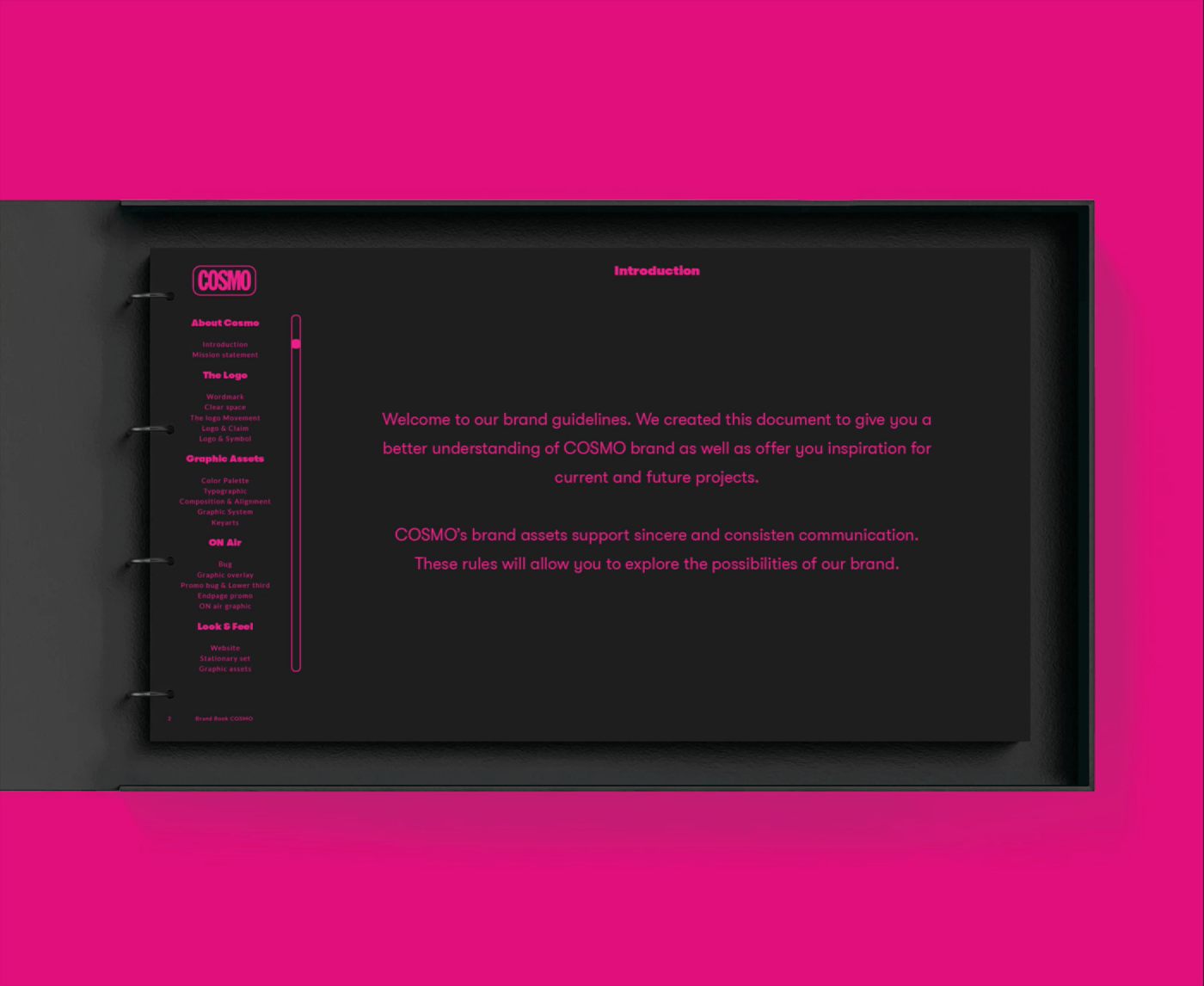
I made the brand guidelines with rules that will allow exploring the possibilities of the brand. These rules are backed by honest and consistent communication. The brand book will provide a better understanding of the COSMO brand and offer inspiration for current and future projects.