PT-BR
Luiza Aguiar é uma profissional que trabalha com psicoterapia online individual para adultos e a inserção de venezuelanos indígenas na cidade de Belo Horizonte. Posteriormente ela pretende oferecer palestras, treinamentos, consultoria para instituições públicas e privadas sobre migração, suas potencialidades e desafios a nível de indivíduo e grupo.
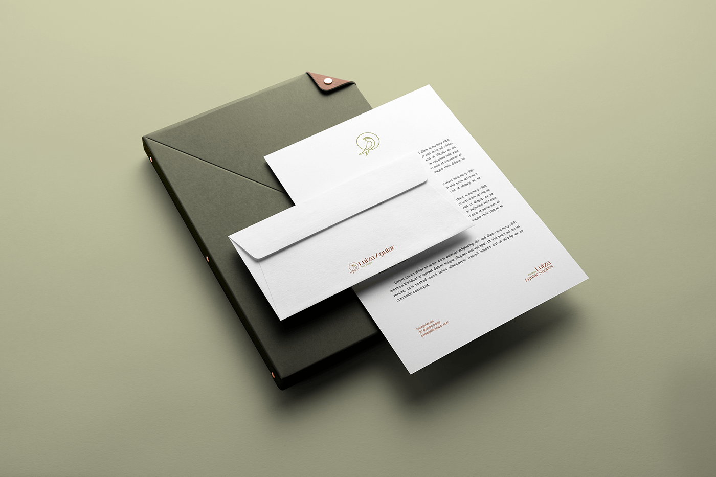
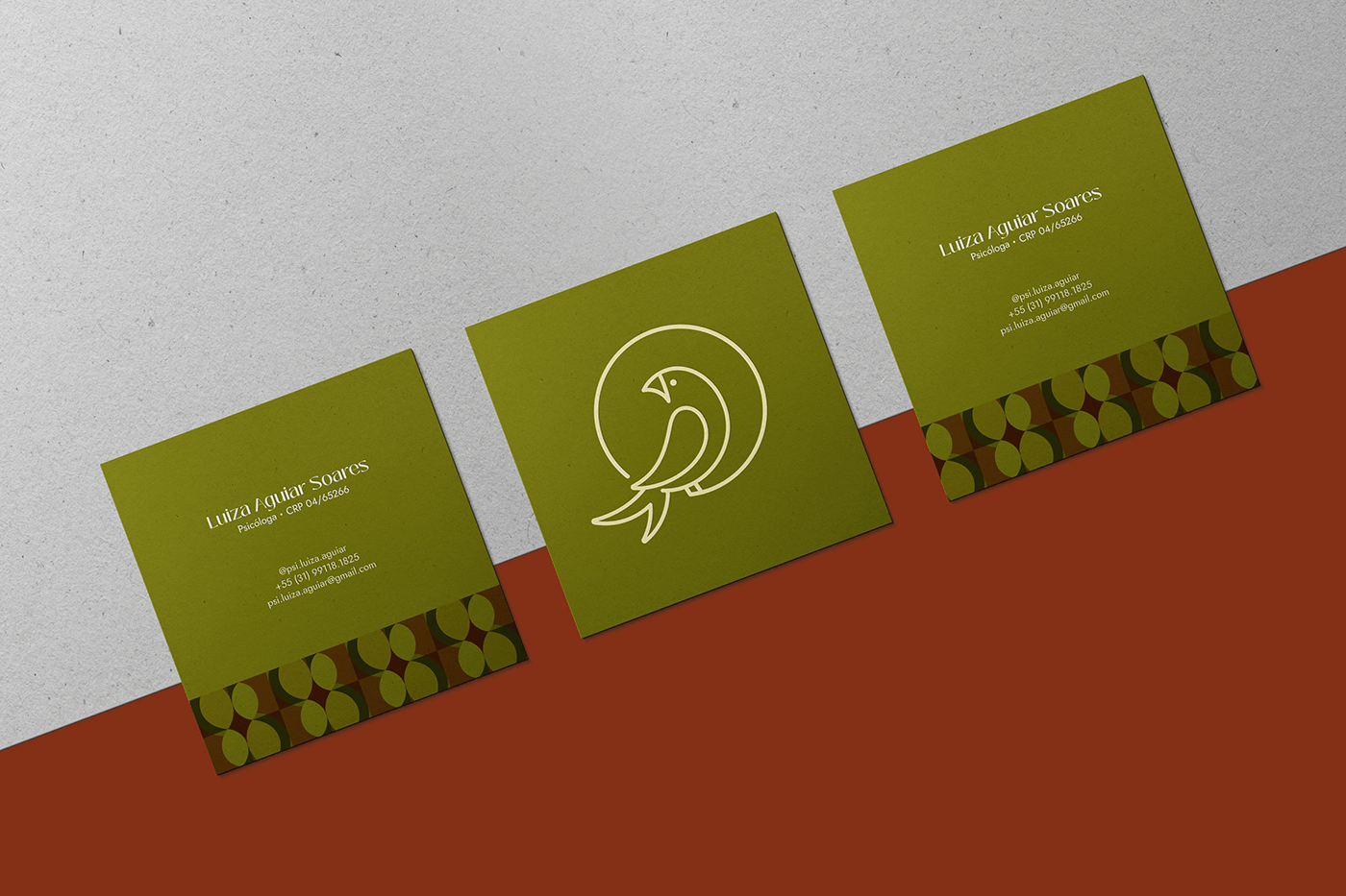
Luiza tinha em mente a flor de lótus para o símbolo, mas após realizar pesquisas encontrei um pássaro que tem relação direta com o público-alvo, os migrantes. Essas pessoas são determinadas em seu plano de conquistar melhor qualidade de vida, sejam elas materiais ou imateriais, apresentando também ansiedade por conta da distâncias dos famíliares e amigos, pela incerteza e falta de apoio. A psicóloga pretende então acolhê-las e direcioná-las para o conforto mental e físico, amenizando as dores e as dificuldades ocasionadas pela migração.
A andorinha-do-ártico voa em média 90 mil quilômetros numa viagem de ida e volta — a mais longa migração feita por um animal. O caminho que elas percorrem pelo oceano Atlântico forma um “S”, já que elas usam as correntes de ar para poupar energia. Podemos assim fazer um paralelo com o trabalho da Luiza, onde ela atua tornando a transição e a vida dos migrantes mais fácil e menos dolorosa.
A andorinha-do-ártico voa em média 90 mil quilômetros numa viagem de ida e volta — a mais longa migração feita por um animal. O caminho que elas percorrem pelo oceano Atlântico forma um “S”, já que elas usam as correntes de ar para poupar energia. Podemos assim fazer um paralelo com o trabalho da Luiza, onde ela atua tornando a transição e a vida dos migrantes mais fácil e menos dolorosa.
EN
Luiza Aguiar is a professional who works with online individual psychotherapy for adults and the integration of indigenous Venezuelans in the city of Belo Horizonte. Later on, she intends to offer lectures, training, and consultancy for public and private institutions on migration, its potentials, and challenges at the individual and group levels.
Luiza had in mind the lotus flower for the symbol, but after conducting research, she found a bird that has a direct relationship with the target audience, the migrants. These people are determined in their plan to achieve a better quality of life, whether material or immaterial, also presenting anxiety due to the distance from their family and friends, uncertainty, and lack of support. The psychologist intends to welcome and guide them towards mental and physical comfort, alleviating the pains and difficulties caused by migration.
The Arctic Tern flies an average of 90,000 kilometers in a round-trip journey - the longest migration made by an animal. The path they take across the Atlantic Ocean forms an "S" since they use air currents to save energy. We can thus draw a parallel with Luiza's work, where she acts to make the transition and life of migrants easier and less painful.


PT-BR
A tipografia escolhida é a Black Mango. Possui uma família simples e moderna que consiste em 9 pesos e tem dezenas de alternativas para combinar. É versátil, sendo melhor para branding, projetos de webdesign e logotipos, pois possui formato variável bem como suporte multilíngue, números e símbolos de moeda.
Essa type foi escolhida porque expressa a delicadeza e elegância da marca de forma sutil, além de ser de fácil leitura mesmo em tamanhos reduzidos.
EN
The typography chosen is Black Mango. It is a modern simple family consists of 9 weights and has dozens of alternates to combine with. This versatile family is best for branding, web design projects, logos and much more. comes with variable format as well as multilingual support, numbers, and currency symbols.
It was chosen because expresses the delicate and elegance of the brand in a subtle way, in addition to being easy to read even in reduced sizes.


PT-BR
Para esse projeto foi utilizado a cor amarela, que é alegre e revigorante e a cor do sol, sendo assim também a cor da iluminação. O amarelo irradia, ri e é a principal cor da disposição amistosa. Junto com o tom alaranjado/terroso + o tom avermelhado, se tornam o tríplice acorde típico do prazer e de tudo que o cerca: alegria de viver, atividade, energia e animação clamorosa.
O verde é uma cor tranquilizadora, refrescante e humana. Na simbologia cromática fica entre o vermelho e o azul, o que faz com que ele atue de um jeito que acalma e transmite segurança, sendo envolvente e tonificante. Apresenta também uma passividade saudável, repleta de satisfação.
Tons de marrom trazem sensação de aconchego e segurança. Junto com o amarelo, ele se torna especialmente agradável.
EN
For this project, the color yellow was used, which is cheerful and invigorating, and the color of the sun, therefore also the color of illumination. Yellow radiates, laughs, and is the primary color of a friendly disposition. Together with the earthy/orange tone and the reddish tone, they become the typical triple chord of pleasure and everything around it: the joy of living, activity, energy, and clamorous animation.
Green is a calming, refreshing, and human color. In chromatic symbolism, it is between red and blue, which makes it act in a way that calms and conveys security, being engaging and invigorating. It also presents healthy passivity, full of satisfaction.
Shades of brown bring a feeling of coziness and security. Together with yellow, it becomes especially pleasant.