This set of 9 icons will most likely grow in the future as there are so many processes, tools and practices in the field of User Experience that can be represented. For now, I hope you enjoy the original set and the thought process that went into each individual icon as well as the set as a whole.
These icons can be downloaded for free (link at bottom) and can be used for whatever you want. I hope you enjoy them and are willing to show your appreciation through clicking the "Appreciate This" button and/or leaving sincere, constructive feedback in the comments section.

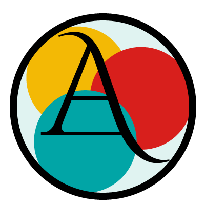
Visual Design
"Visual design focuses on the aesthetics of a site and its related materials by strategically implementing images, colors, fonts, and other elements. A successful visual design does not take away from the content on the page or function. Instead, it enhances it by engaging users and helping to build trust and interest in the brand." - usability.gov
Colors, typography, spacial relation of objects, these are the things that immediately come to mind when I think of Visual Design. I wanted to show this in the icon while maintaining the goal of simplicity in the designs. This was the first icon in the series I created and decided that three circles representing the objects made the most sense both logically and aesthetically. They represent "the object", whatever that may be, such as an image, a slideshow, a div or a section. Within the space given they must coincide with each other, complement each other while maintaining their own importance and, on some level, interact with each other. While all this is happening, content remains king which is why I placed the letter A on top and made it the focus of the icon. It is slightly stylized as it must match the feel and personality of the design as a whole, but makes it clear that it is type.
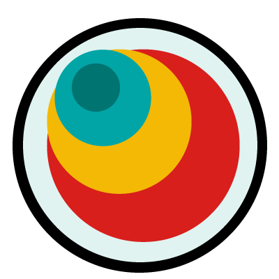
Information Architecture & Design
Information architecture (IA) focuses on organizing, structuring, and labeling content in an effective and sustainable way. The goal is to help users find information and complete tasks. To do this, you need to understand how the pieces fit together to create the larger picture, how items relate to each other within the system. - usability.gov
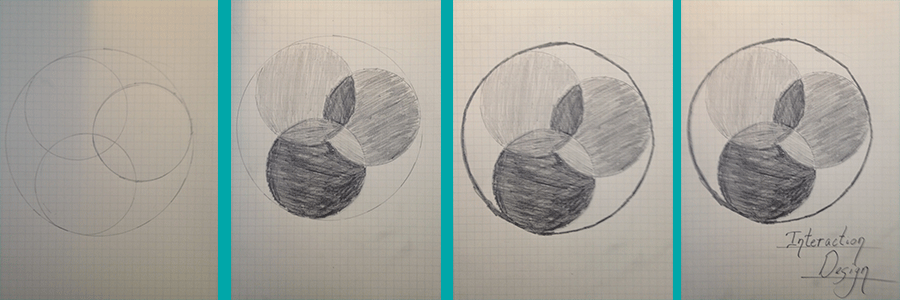
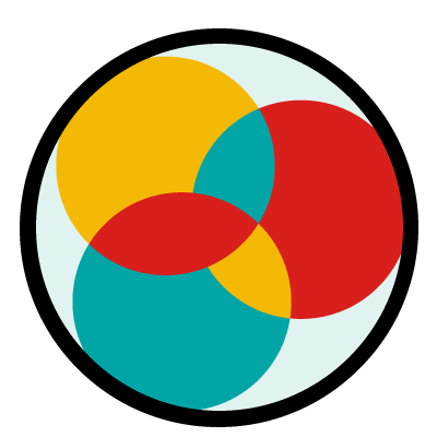
Interaction Design
"Interaction design focuses on creating engaging interfaces with well thought out behaviors. Understanding how users and technology communicate with each other is fundamental to this field. With this understanding, you can anticipate how someone might interact with the system, fix problems early, as well as invent new ways of doing things." - usability.gov
Keeping with my "objects" to be symbolic representation of the elements I chose to recreate the same layout as in the Visual Design icon, but demonstrate the interaction of the objects through by swapping the colors of the objects at the sections where they overlap.
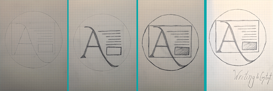
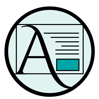
UX Writing & Content
"Writing for users is a deeply intuitive and technical trade. As with web design, digital writing needs to resolve the user’s existing knowledge and instincts with an interactive product." - uxmag
Being an English and Communications major and being certified in Strategic Copywriting, this icon is the most meaningful to me and I wanted it to reflect several things I find important when writing for the web. The giant A repeats what I am conveying in the Visual Design icon which is Content is King. I also wanted to keep this icon extremely simple showing that it is always quality not quanity of the words. They must be chosen carefully because they are a conversation with your reader. I attempt to demonstrate this by creating a few lines to repesent text. Lastly, I wanted to show that context does indeed have a relationship with content, so I added a small square object in with the text.

User Research
"User research focuses on understanding user behaviors, needs, and motivations through observation techniques, task analysis, and other feedback methodologies. Mike Kuniaysky further notes that it is 'the process of understanding the impact of design on an audience.'” - usability.gov
Using my circles, I create three users for this icon that are similar, shown through being same shape. I wanted to show they are different as well, so I changed the color combination for each. Using the same colors and shapes demonstrations their relation to each other, but being different color combinations gives each user an element of individuality.

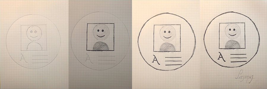
Personas
"The purpose of personas is to create reliable and realistic representations of your key audience segments for reference. These representations should be based on qualitative and some quantitative user research and web analytics. Remember, your personas are only as good as the research behind them." - usability.gov
There are clearly many user research tools I can create icons for and mostly like will as additions to this collection. I chose Personas for this original set because I love their purpose. I believe that it is a step towards falling in love with your user and seeing them as more then a "user" but as a friend or family member. For this reason, I purposely included the smily face. I believe it's a symbol of happiness and therefor makes people happy when they see one. At the bottom to finish off the persona card I added lines and a letter as a description of this particular user.


Wireframe
"A wireframe is a two-dimensional illustration of a page’s interface that specifically focuses on space allocation and prioritization of content, functionalities available, and intended behaviors. For these reasons, wireframes typically do not include any styling, color, or graphics. Wireframes also help establish relationships between a website’s various templates." - usability.gov
"A wireframe is a two-dimensional illustration of a page’s interface that specifically focuses on space allocation and prioritization of content, functionalities available, and intended behaviors. For these reasons, wireframes typically do not include any styling, color, or graphics. Wireframes also help establish relationships between a website’s various templates." - usability.gov
Prototype
"A prototype is a draft version of a product that allows you to explore your ideas and show the intention behind a feature or the overall design concept to users before investing time and money into development. A prototype can be anything from paper drawings (low-fidelity) to something that allows click-through of a few pieces of content to a fully functioning site (high-fidelity)." - usability.gov
When I first started designing this icon on paper, it's intention was to be a Wireframing icon. I also went through a lot of versions of this icon on paper. I kept wanting to naturally start wireframing a site complete with navigation, a hero unit, etc.. This icon was a lesson in itself about simplicity. When I starting designing it in Illustrator, I also originally kept it greyscale. After reflection, I decided to add the colors and upgrade it to Prototype. Besides the obvious reason that I wanted the icons to look alike, I wanted the icon to be further along in the process as I have already included Personas and User Research. Again, I can create so many icons, and perhaps will, but I wanted to stick to certain ones. I was happy with Prototype.

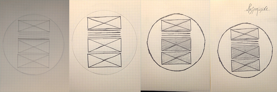
Responsive
"Attempting to create and maintain multiple versions of your site to accommodate each device can be time consuming, resource intensive, and unsustainable as a long-term solution. So how do you give people a comparable user experience regardless of the device they use to access your site? The solution lies in responsive design." - usability.gov
This icon is actually an extension of the Prototype icon. It just seems natural to create it as the Prototype did not seemed finished without showing a responsive version of it.
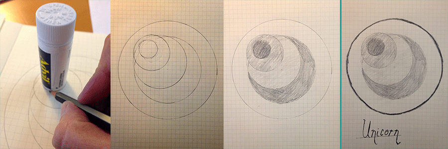
Unicorn
"Mythical user experience designer with an advanced and adaptive skill range. Outstanding skills in graphic design, rapid prototyping, front end development, user testing, technical specifications, marketing and branding. It does not have an opinion, it has a process, and will harmonise with any environment." - uxunicorn.com
This is almost where my series fell apart. I wanted to include the Unicorn icon, but keeping the simplicity of the designs without designing something that looked like a coneless soft serve ice cream or like I dehorned a My Pretty Pony Unicorn proved to be quite the challenge. One that needed my trusty little container of Advil. Just when it seemed the Unicorn icon was going to live up to its mythical name and while I was still holding my Advil, the idea came to me - a fourth, smaller circle to create the impression of a horn. Funny, where inspiration comes from.


