


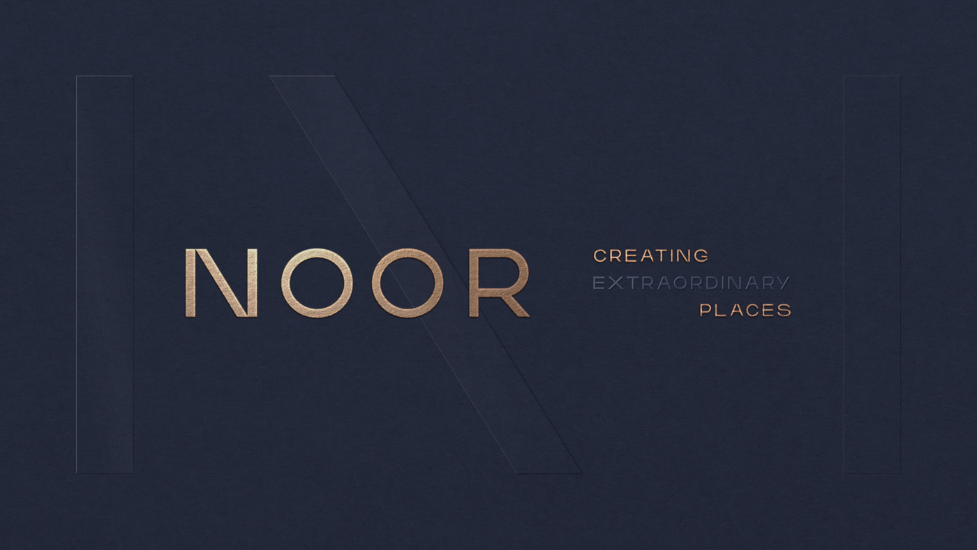


NOOR it’s a company specialized in the renovation of apartments, office and commercial spaces for the most demanding clients.
We developed the visual identity in order to reflect all the refinement that the brand represents and elevate the savior-faire of the NOOR team in creating an excellent service with craftsmanship.
From the naming process we defined the letter "N" as the main graphic element for the brand identity. Because the company was founded by three persons with different backgrounds, that complement each other, the took the N apart. This way, the "N" complements the lettering and the brand icon, referring not only to the brand name and it's founders, but also to the elements present in architecture, engineering and interior design.
The colors choice, teal, beige and gold, as well as the fine finishes complement the values that NOOR wishes to convey in it’s visual communication to its clients in its sector. Subtlety, refinement and elegancy in all its fronts.


