Background
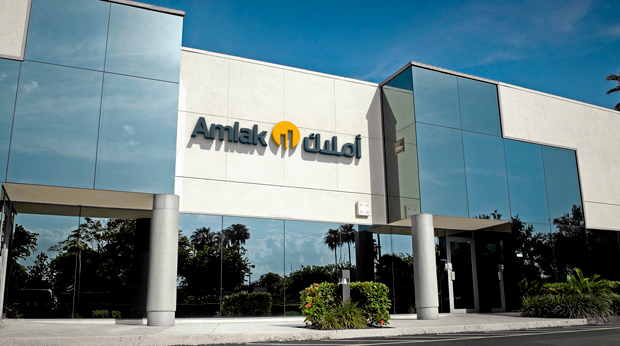
Amlak (meaning 'towers') is the new name for the rebranded Social Insurance Organisation Property Management Company. (SIOPMC). The spun out public company required a bold and dynamic new brand to separate itself from the other organisational entities which previously formed the Social Insurance Organisation. Unisono was charged with creation of a brand strategy which will enable them to compete in a highly competitive sector as a new private company.
Design solution
Our solution to their brand design to create a bold, striking new identity which reinforces the notion that the buildings are a product of their context - the people and the environments they need to succeed. Amlak looks at the requirements of the tennent to choose the best means by which to develop the property. The form reflects that it is a product of the things which it serves - the towers are formed out of the things surrounding it.
The strong colouration hints at their brand's reach beyond real estate consultation and property management to actual construction; the stack capitals helps to reinforce this notion. The slogan 'Building Performance' helps to underscore that Amlak's work is about making buildings perform optimally for the tennant as well as for the shareholders in the firm.
_______
Credits
Client - Amlak
Sector - Real Estate and Construction
Design Agency - Unisono
Strategist - Amy Morgan
Creative Director- Liam Farrell
Designer - Liam Farrell
Sector - Real Estate and Construction
Design Agency - Unisono
Strategist - Amy Morgan
Creative Director- Liam Farrell
Designer - Liam Farrell
3D artist - Jose Aubele, Aleksi Segodin
Year - 2013
Year - 2013

Design exploration. Icon studies, font selection studies, type studies, layout studies, additional visual device design and application studies.


Study in visual harmonics


Colour versioning


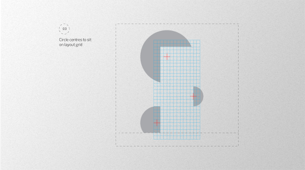
Additional visual device proportioning. Golden mean used to proportion tower and roundel devices.


Visual device combines with visuall verticals in typography to form towers

Combinations are endless, helping to reinforce dynamic nature of brand through negative space in layout across all media

Performance is a key brand notion which is at play everything time the brand communicates.

Monolingual logo and slogal lock up

Prelo, a dynamic and modern font with loads of delicious weights to play with.

Brand book and stationery shows system in play


Brand bag, who can live without one?

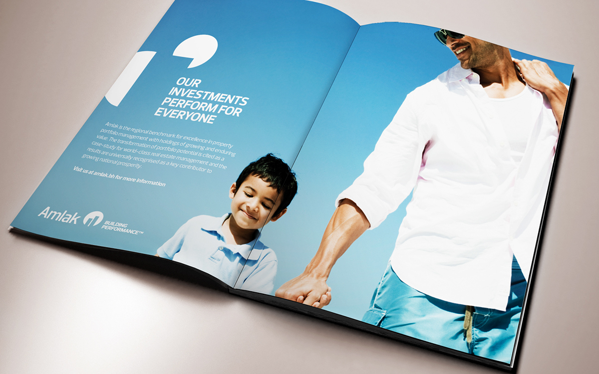

We opted for a more pragmatic approach to typography in posters and print advertising.


