

D i t o I t a l i a n o Y o s h k a r - O l a
area: 175,7 m²
Year: 2022
Team: STUDIO SOO, SHUSHANA KHACHATRIAN, KATIE KUTUZOVA, YASMIN Lavritskaya, KETEVANA Abdallakh
Year: 2022
Team: STUDIO SOO, SHUSHANA KHACHATRIAN, KATIE KUTUZOVA, YASMIN Lavritskaya, KETEVANA Abdallakh
photo: KATIE KUTUZOVA
MANUFACTURERS:
MOSAICS: KIRILL ROMANOV

" Dito — a joy you could share without any words"
CONCEPT


material board, mood board and interior concept collage
Dito Italiano draws inspiration from traditional Italian Trattorias but gives it a fresh new look. With bright pastels, it comes out in the natural materials that are used throughout this modern space.
The charms of the past are reflected on the column and floor tiles creating a beautiful nuance with the furniture. Interior design concept adds interest with a carefully considered mix of materials and visual elements to create a contemporary space to visit.


3d visualizations
With visualizations we tried to transfer the ambiance of a warm summer day, vibrant multi-coloured ripples, waves of water and local market atmosphere. We were eager to submit all these essential elements to Dito and did our best to share a family mood, where the guests can come for a leisurely Sunday lunch with their loved ones or keenly enjoy Italian espresso at the bar with friends.
IN PROGRESS


photos by Marina Plukhina


mosaics drafts by Kirill Romanov and Marina Plukhina
STUDIO SHOO’s mosaic sketches were thoughtfully designed for Dito Italiano, whereas acclaimed mosaicist Kirill Romanov has perfectly carried out with exquisite craftsmanship. The monumental artist specialises in technique of Roman mosaic.


floor mosaic in progress
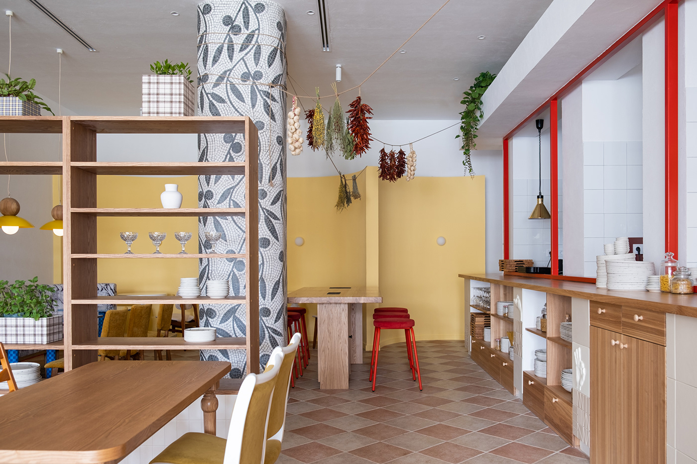
Mosaic decorated columns and “doormat” welcome guests at the entrance to set the Italian mood. The image of the dog refers to Classical Roman mosaics.


photos by Marina Plukhina
NOW
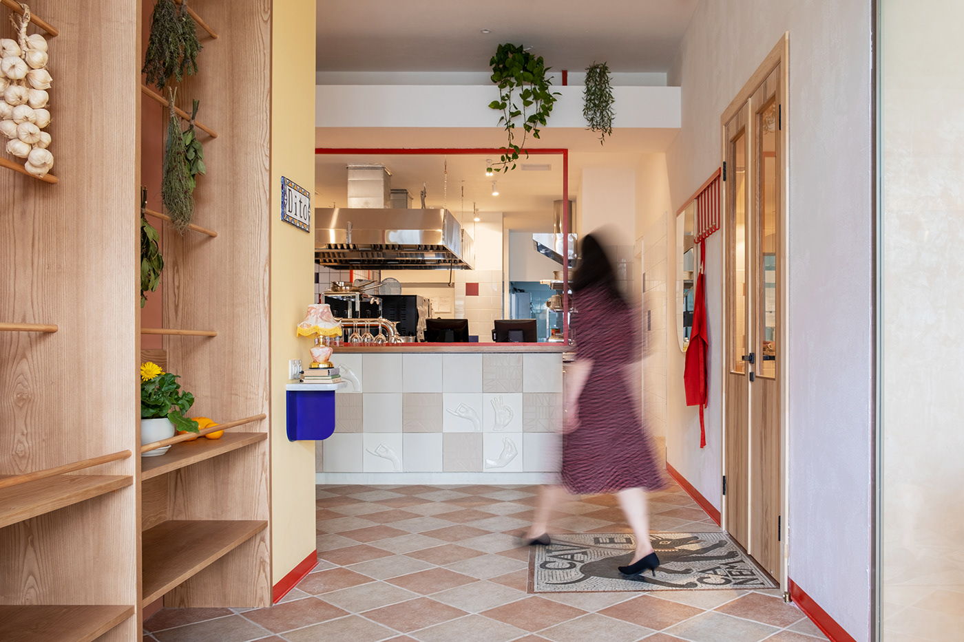
At the entrance, guests instantly notice yellow walls, a tile street sign, red elements of an open kitchen, blue colour that can be discovered in bricks and decorative features.


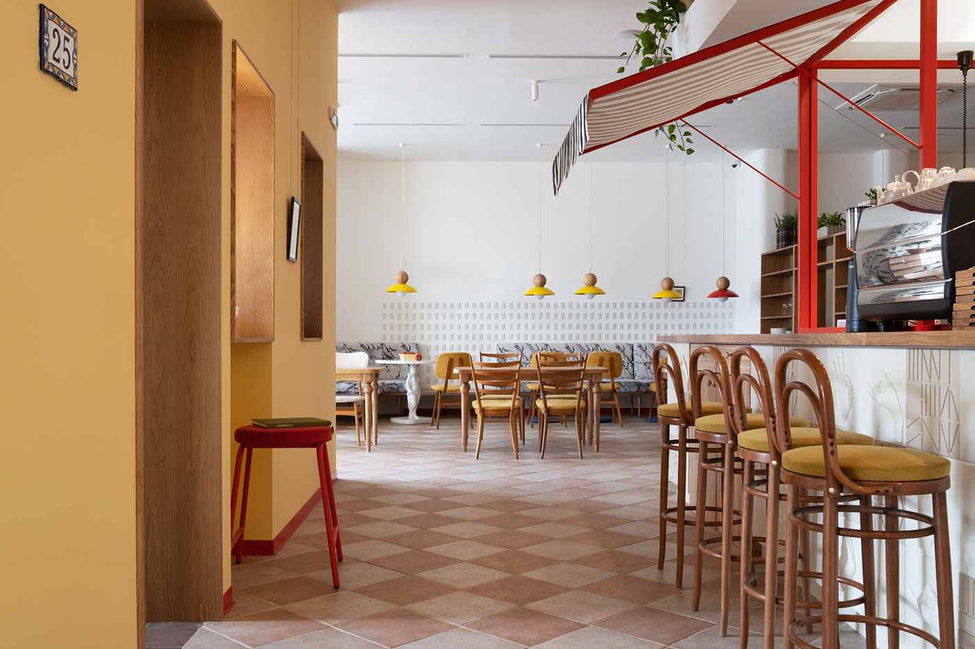
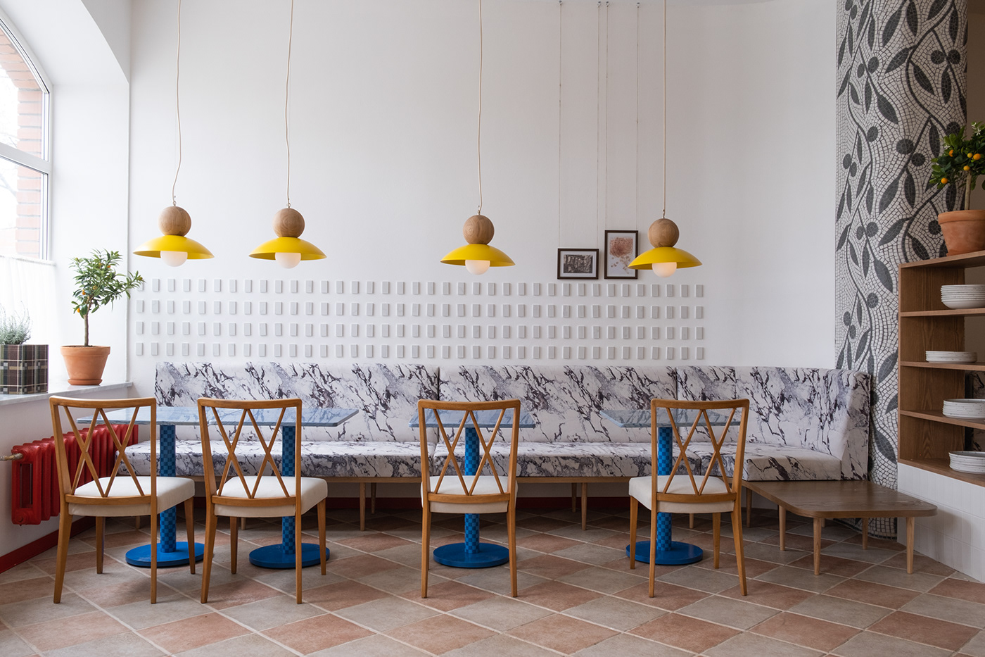
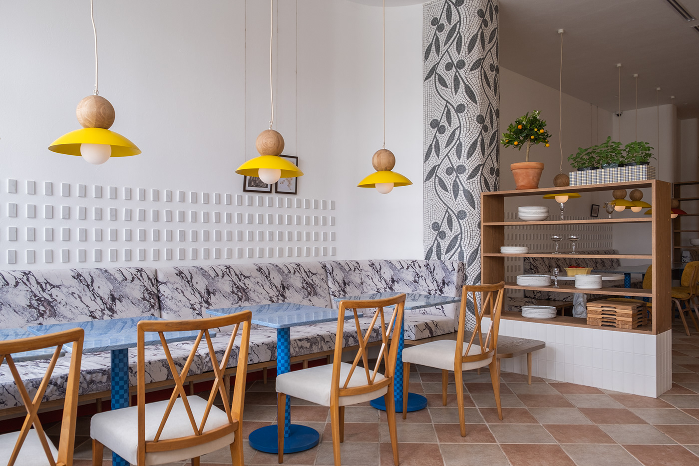
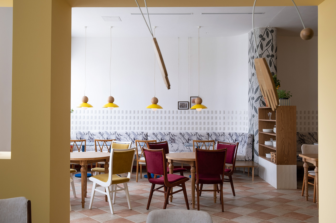
Decorative features, solid oak and blue marble tables, vintage chairs, hand-crafted mosaic work, sofa’s marble printed upholstery and light wood with yellow speckles - all those details serve to enhance an overall look of the space.


Dito has a special charm that draws in guests. References to traditional Italian gestures and emotions can be instantly found throughout the whole interior area. The team’s meticulous attention was passionately devoted to walls and kitchen bar decorations by designing bas-relief ornaments which were brought to life by a local artist.
All trattoria tables are carefully made of dissimilar materials: blue marble was used for the main room, the lounge goes with malachite coloured glass, and the rest are solid oak. The idea was to create an atmosphere that will encourage customers to spread the good word and return with family and friends.


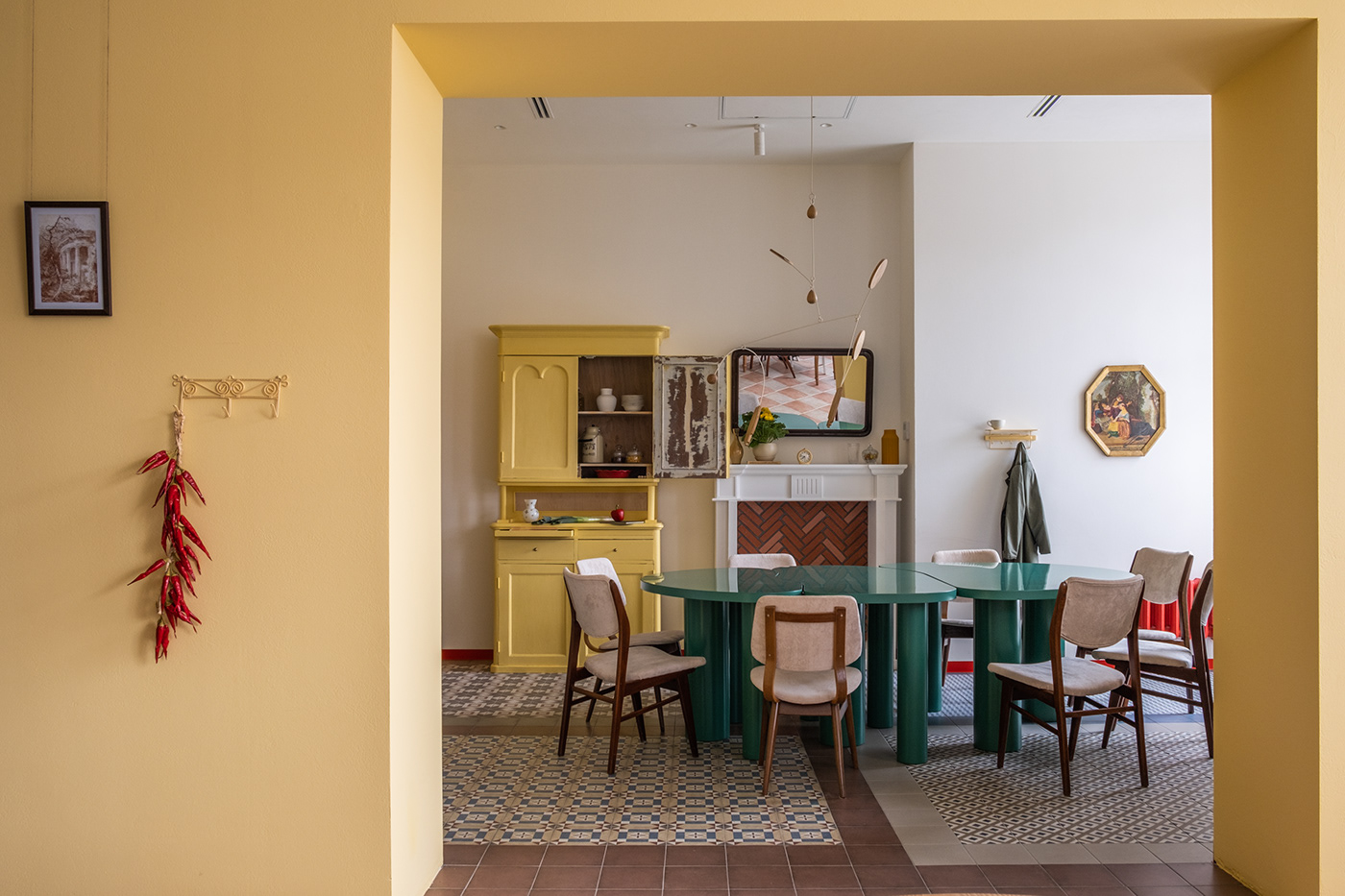
A petit room that creates a sense of hidden place was designed specifically for family or friends’ gatherings. There are multi-functional table, vintage chairs, a decorative fireplace, a painting from a local flea market, vintage shelf and kinetic custom sculpture with handmade wooden and metallic pieces.


A bright yellow vintage shelf accurately represents a key element in the project.
Carefully restored and repainted — it now playfully goes with the space, and it is music to the guests’ ears.
The floor has four unique types of patterned tiles.


Dito Italiano has a quiet, home-style appeal suitably reflected in its logo. The restaurant opted for a minimalistic approach in its design to match this ambiance. The logo is placed in a square with red as the background colour. This is common in Italian restaurant logos as red is known to boost appetite aside from it projecting positive and energetic vibes.


