La Chipotlera, a love story
Starting a social revolution from a project with a unique character.
La Chipotlera was born in 2011 and after 10 years with a still limited reach in the market, it was time to give a blow to the table and place the brand at the height of its incredible product and project. When the client approached us and told us about this project, it was love at first sight. We got down to work to help and accompany them in this challenging rebranding project.
This blow to the table had to start, inevitably, with a strategic shift. They were clear: they wanted to revolutionise the world of spicy food, democratise it, break with all stereotypes and bring it closer to people in a different way, not only through the flavour but also through its ritual and what spicy food brings to the table. That’s where the concept ‘The trigger of a revolution’ and the idea of our beloved ‘Guerrilla del picante’ was born.


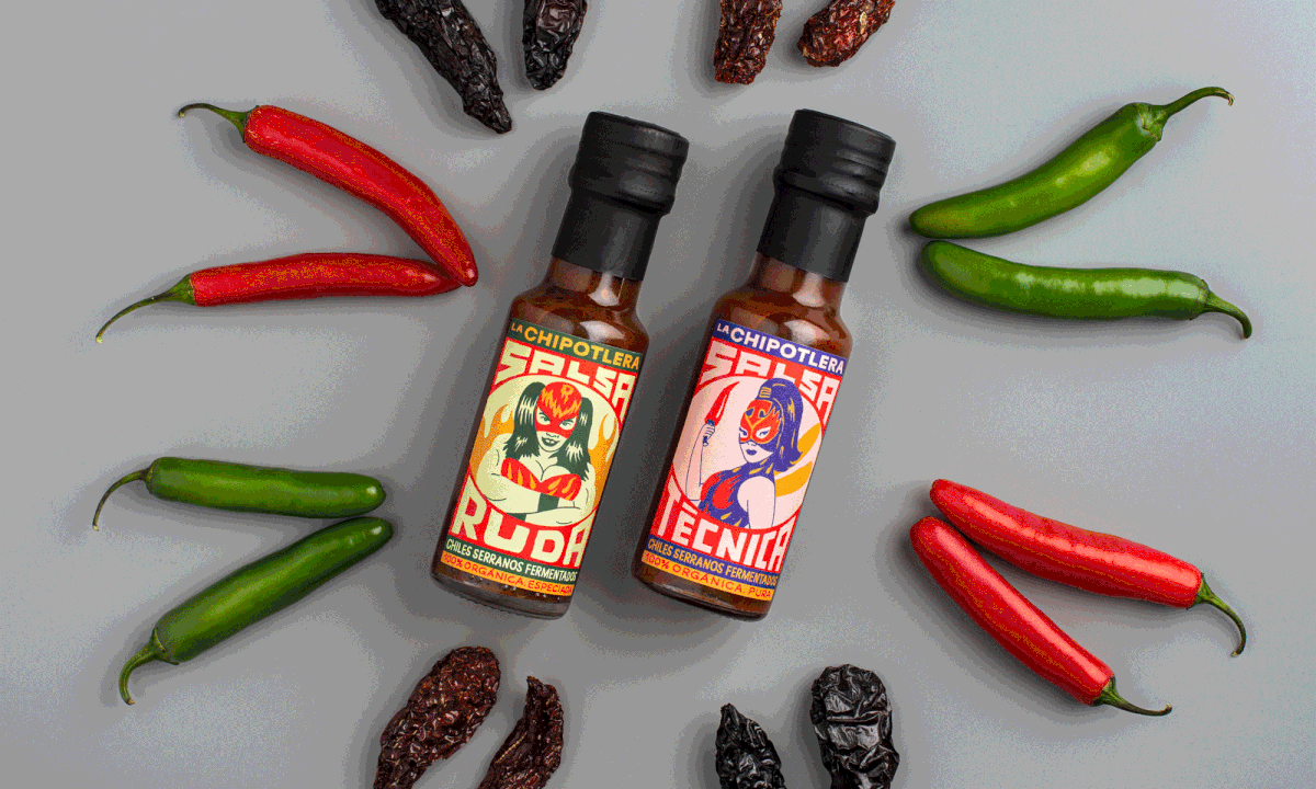
The creative process to bring this project to life was bold and exhaustive. We devised the characters, their names, their appearance and personality, as well as a first-person story for each of them that would convey their value and organoleptic qualities.
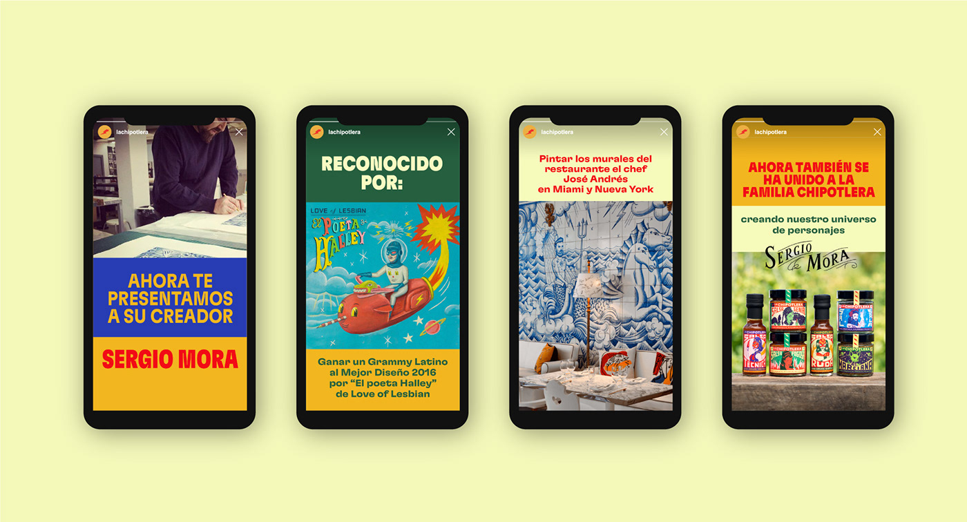
One of the most important decisions we had to make was the search and selection of the artist who would bring these characters to life. Our challenge was to retain the underground essence of the brand, while bringing it to the present day through a fresh, fun and rogue universe. No one better than Sergio Mora, who also fell in love with the project, to help us with this challenge.
Together with him, we finished creating our unique illustrative universe of characters.

Sergio Mora is a renowned artist who has designed the cover for Love of Lesbian’s album ‘El poeta Halley’ (for which he won a Grammy). He has also illustrated one of the latest covers of Forbes magazine, collaborated with bands such as Fangoria and Kiko Veneno and even designed the murals for Chef José Andrés’ restaurants in Miami and New York.
This is how our guerrilla of flavour was born.


On the other hand, in order to materialise this idea of revolution and guerrilla warfare, we created a brand manifesto. Through a rogue, haughty and radical tone, this manifesto showed that in revolutions, half-measures are superfluous. Both the tone and the brand messages created for the different items and designs project this idea of joint struggle and a bit of a war cry.


But the brand doesn’t only live by illustrations and tone. That’s why we created a clearly revolutionary visual system: a boxy look and feel that provides structure and strength, but with the flexibility that revolutions need. With a multicoloured logo that acts as a flag and a rich palette that symbolises the idea of an open revolution, giving the brand a radical colour-against-colour approach. Finally, a singular typography, sharp and confident like the brand, designed to ‘shout’, to speak loud and clear.


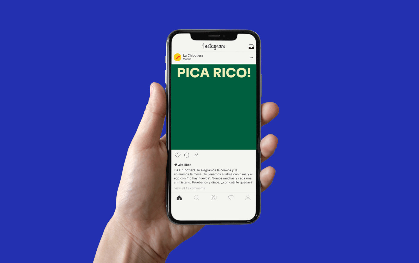
In addition, we helped La Chipotlera to coherently take this brand universe to all touch points through a social media strategy that not only aimed to reposition the brand, but also to help amplify its reach and boost sales in this new phase.
The result is a renewed and brave brand, with a look&feel full of personality and colour, as well as a powerful narrative that manages to transfer the good humour and the positive revolution that is generated around the hot pepper to each product. A brand with principles, where ‘organic’ is a way of life and that combines the soul of haute cuisine with an open and approachable attitude towards everyone.