A study of the International Typographic Style (Swiss Style)
We were tasked with deisgning digital layouts, which incorporated the Internation Typographic Style.
We were to use 'Brighton Museums Review 2013' as our inspiration.
One is to be a design based around image and one is to be a text-based design.
Both of my designes are based on the Brighton Museum 'Subversive Design' exhibition.
My first brochure is my text based layout. In the Swiss Style I wanted to keep the image as monochromatic as possible. I loved the design of the roll out chair, and decided to use this as the cover photo. All the text is in a sans-serif font, and continues the Swiss Design with all 'ragged right', typing.


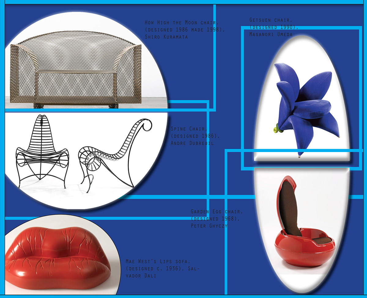
My second design is my image based layout. I wanted to use perpendicular lines and boxes to create a sense of grids within the brochure. After using black and white in the first brochure I wanted to use some colour in my second image. The cover has no image but the title is hidden behind these perpendicular lines to create a sense of subversiveness.