KOOZMETIK
Fine Natural Cosmetics
Believing that true beauty is in simplicity, a fine natural skincare brand Koozmetik is known for its picky selection of ingredients, an essential product range, and minimalism in design.
Preparing to expand on EU markets, the brand needed a redesign that would strengthen its premium and sophisticated qualities, while achieving perceptual continuity with its previous design, and unisex look and feel. At the same time we had to consolidate the entire visual system to ensure strong consistency across the range.
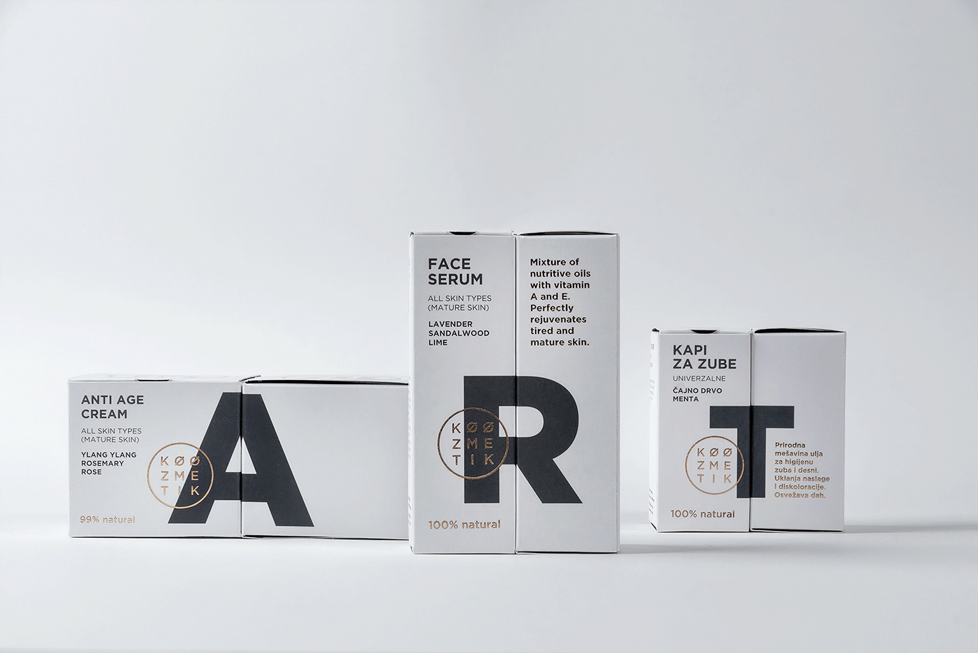
The first step in our approach was to redefine the portfolio architecture as the baseline for a seamless customer experience and navigation through product lines and categories when shopping online and offline.
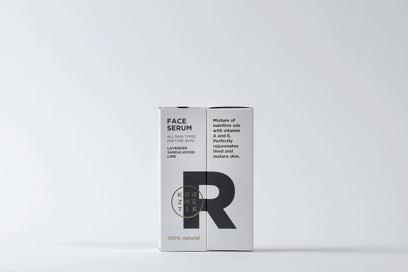
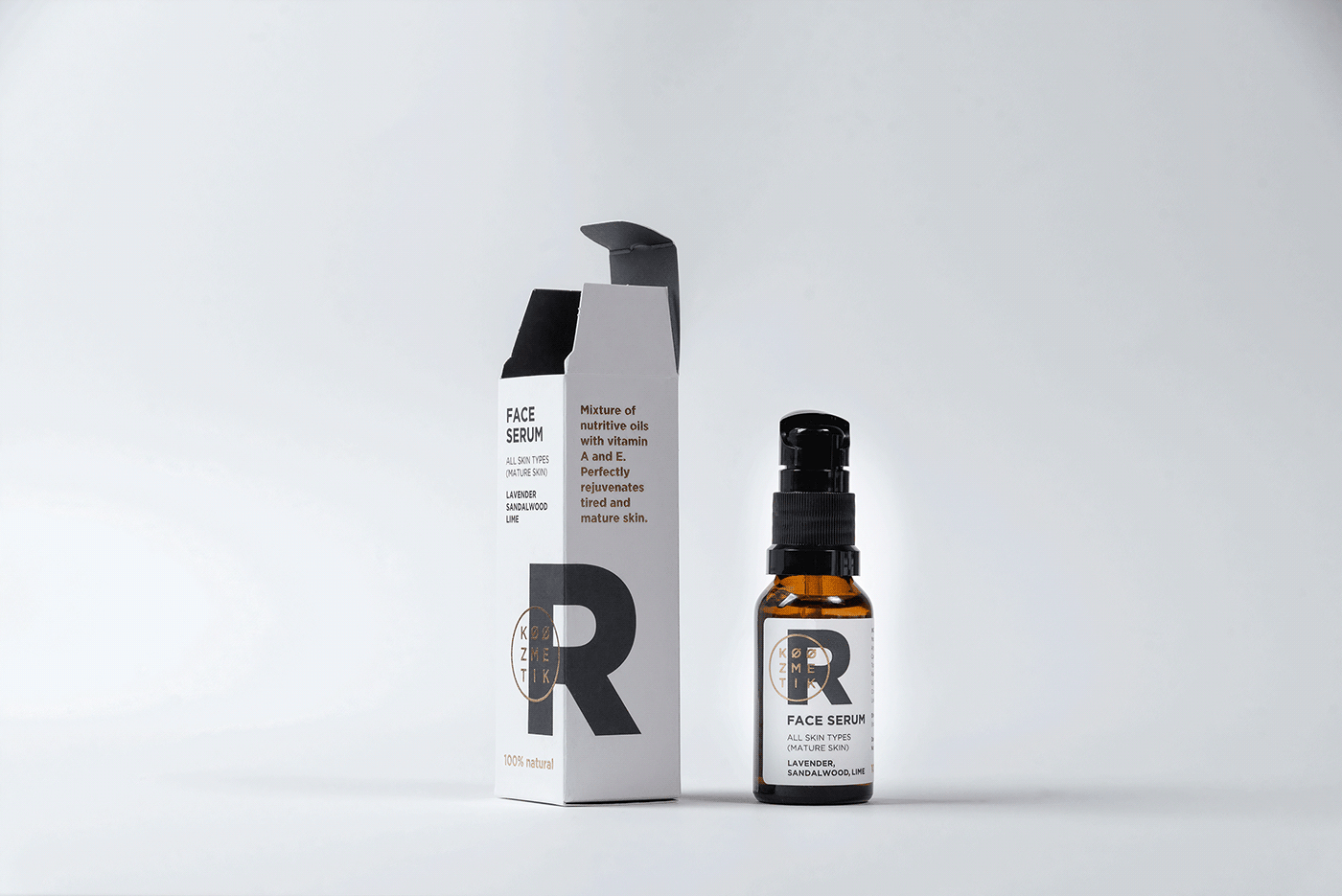
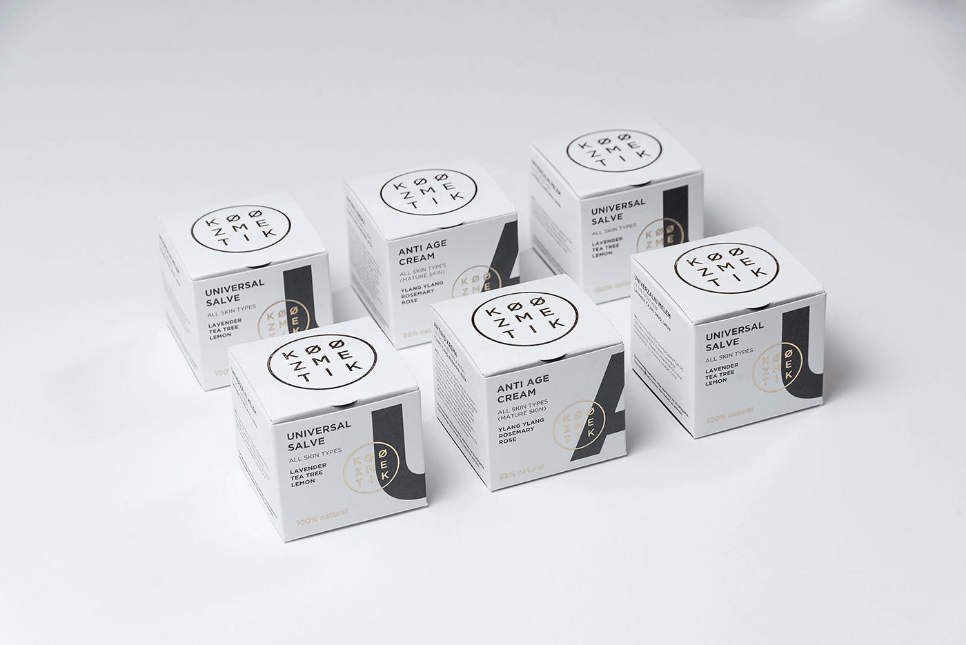
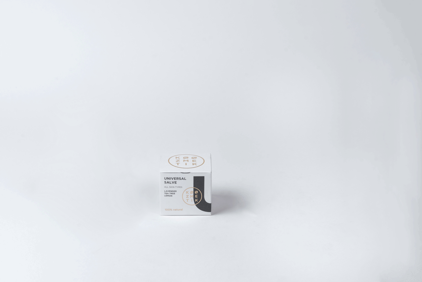
Next, since each of the key product and brand information was positioned on a separate side of a package – making the product placements on shelves and purchase experience rather complex, it was necessary to redefine the informational architecture on the packaging itself.
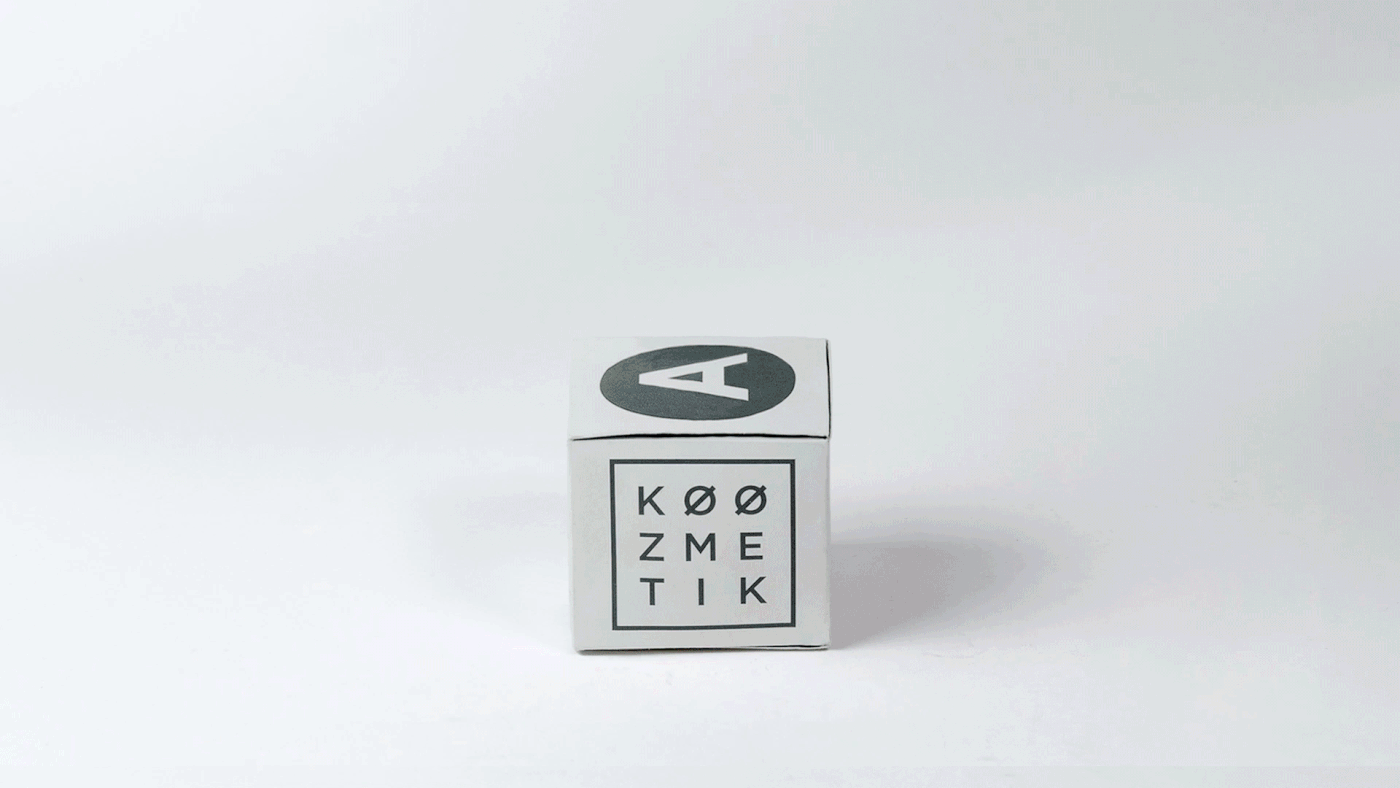
Finally, this strategic and creative analysis led us to design concept carefully devised and crafted around the letter element, previously used as an associative product descriptor. Albeit a bit subdued, it appeared as a quite interesting and original detail on the packaging, so we decided to give it a more prominent place and role. Enlarging it to become a striking and recognisable brand device, we achieved the new Koozmetik’s branding feels fresh and artistic, just like the products it represents.