


Finmate IT tax platform
Brand Naming / Brand Identity / Creative Strategy
Brand Slogan / Brand Tagline / Applications
FINMATE is an IT tax management platform that helps to improve the efficiency of life beyond the limits of the existing industry by applying innovative technology to the existing tax industry that relied on human resources. By quickly and conveniently checking the sales and purchase status of a store in real time, it saves time and increases its value.
Leading the growth trend of the current platform industry, FINMATE confidently suggests a rapidly changing, expanding and efficient life. In addition to accounting and taxation, FINMATE provides a total platform that aims to improve life efficiency by expanding to areas necessary for our lives, such as labor, finance, medicine, and education. As an IT technology platform with future-oriented values that grows endlessly into a wider business area, it is an essential platform that cares for the entire life, bringing new values to our lives.


Objective
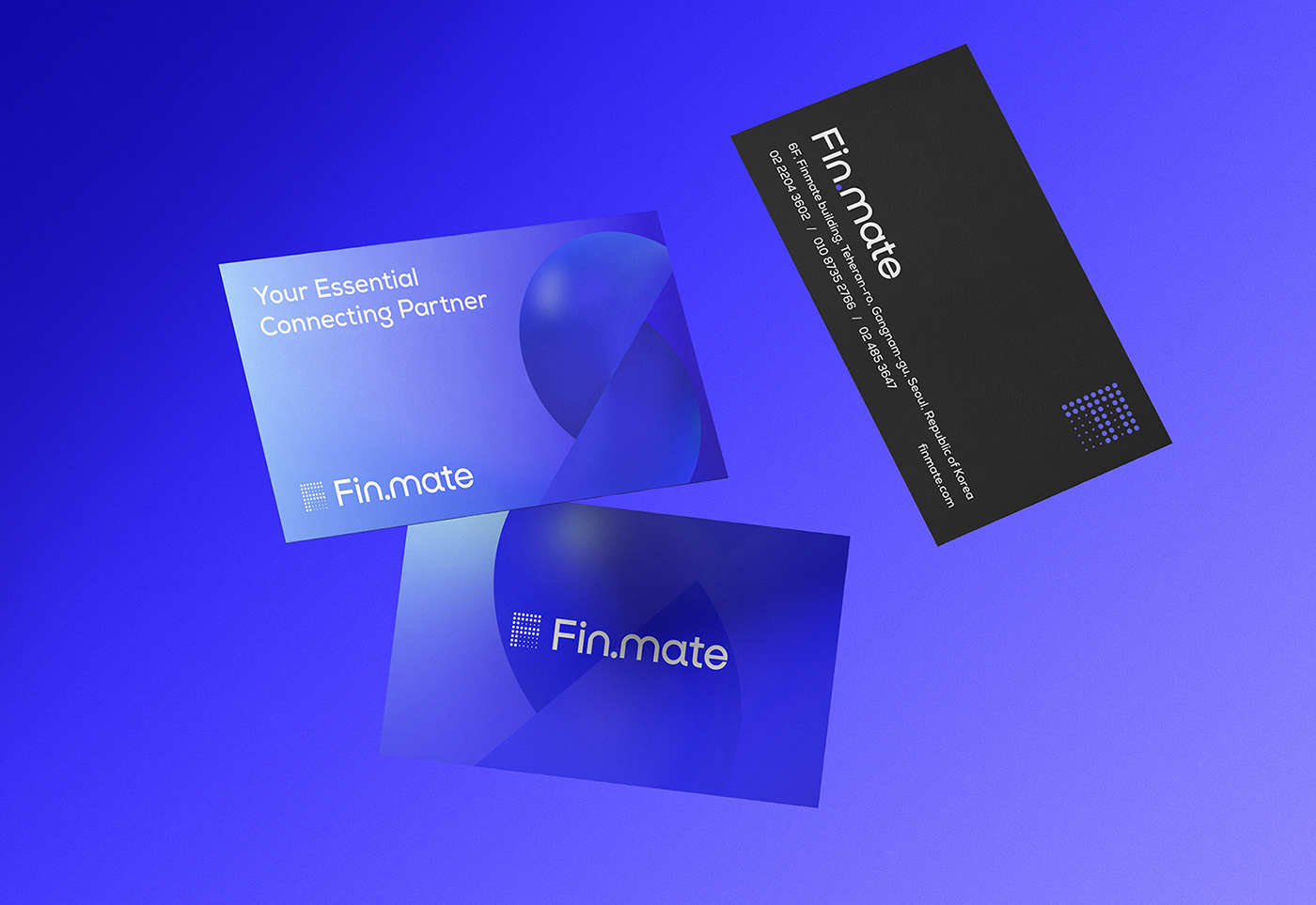
As an IT platform brand, the brand core value of FINMATE, a helper that helps customers live a convenient life, is expressed with the brand slogan “Your Essential connecting Partner”. FINMATE connects the tax industry and business, the present and the future, and humans and technology, and connects our lives as a partner that coexists for each other and enhances the efficiency of life.
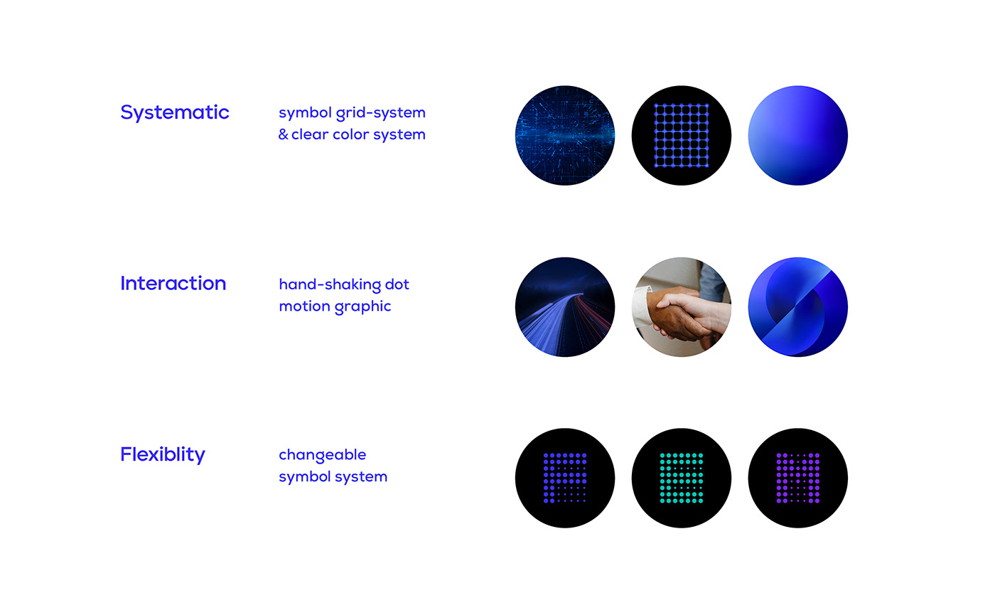
FINMATE’s brand philosophy that helps limitless growth beyond accounting services is defined by three CORE VALUEs: [Systemetic, Interaction, Flexibility].
This contains the brand message of FINMATE, which provides systematic and intuitive tax accounting services, coexists with consumers, and expands flexibly into various fields.


Solution
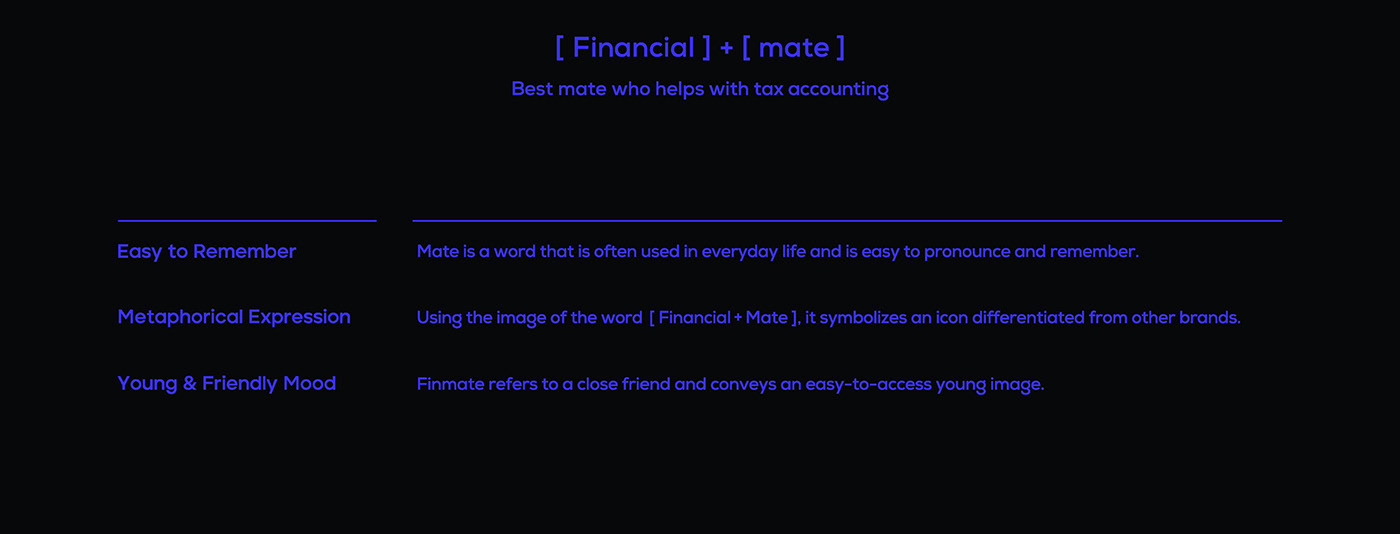
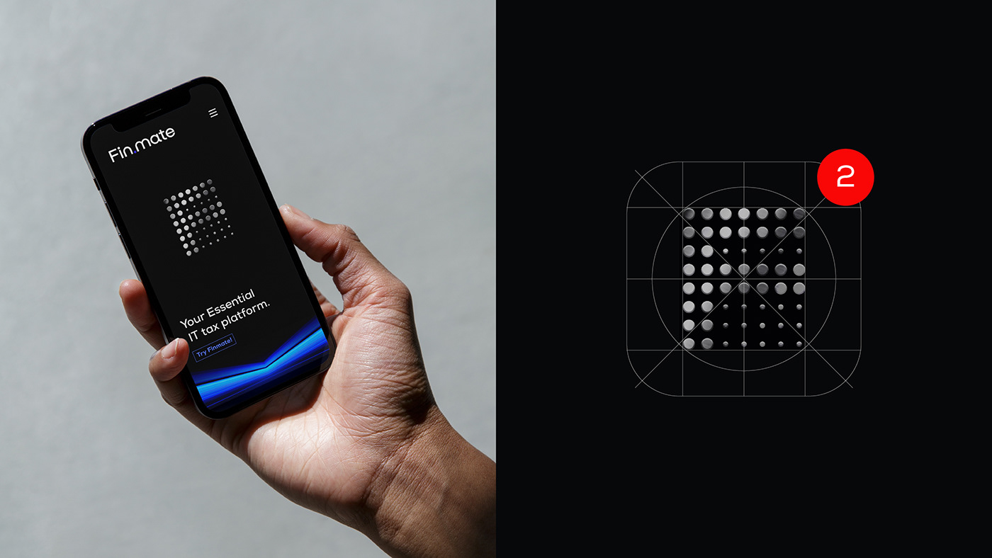
FINMATE’s brand core value is expressed as a symbol that expresses the initial F in an iconic way. The F symbol was built based on the grid dot system that visualized the systematic establishment of the system. It goes beyond a simple IT accounting management program to express a brand philosophy focused on making life more efficient. In addition, through the flexible system that can change all spellings, we can visualize FINMATE that endlessly develop into a wider business area, covering the overall necessary for life. The wordmark uses the connecting dot that connects FIN and MATE to interact and contains the message of FINMATE coexisting and coexisting for each other. Connecting dots are extended to motion graphics and established as a hand-shaking dot graphic motif.
The main color of the brand is neon blue, which gives a sense of momentum and future-oriented image, and white and black are used together to build a bright and professional brand image with high visibility. FINMATE’s brand symbol, word mark, slogan and graphic motif are uniformly used in various applications to increase the brand value of FINMATE, and to build a visual communication system of flexible symbols and color systems for expandability and applicability to various areas.


Finmate IT tax platform
Brand Naming / Brand Identity / Creative Strategy
Brand Slogan / Brand Tagline / Applications
Project Brand Design : YNL Design Team
YNL Design
Art Direction & Design : Liz Yoona Lee
Brand Design : SoHee Kim


