PROJECT DESCRIPTION
Hoiio's website had already went through two redesigns previously. Once when the company pivoted, and once more when we decided to use and host our website on weebly (see the project here). My aim this time around with the redesign is mainly to make the website responsive, to cater for visitors on mobile devices, along with a minor visual facelift.
PROBLEM
Prior to this latest redesign, Hoiio's website was designed for desktop users. Users on mobile devices will get redirected to a dedicated mobile site, depending on the mobile OS they use. (iPhone users will go to iphone.hoiio.com, and Android users will go to android.hoiio.com).
The problem with the mobile sites is that the content is very limited and seldomly updated. Since the mobile site is effectively a separate site, making sure that it also has the same content would mean twice the work for the content editors. While there is a link that will take users back to the desktop site, the viewing experience is less than optimal on phones and tablets since users would have to frequently zoom and pan to be able to read the content.
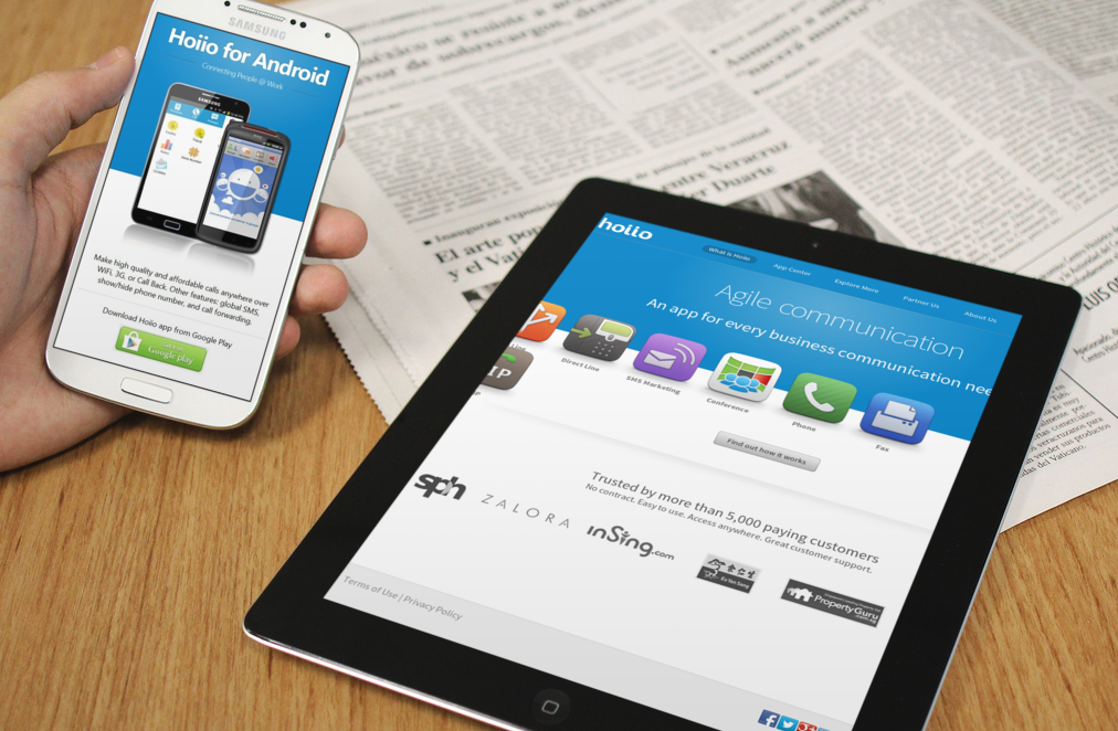
(Left) Mobile site for Android. (Right) Sub-optimal browsing on tablet.
There is another (minor) problem, which has to do with how the page title is designed. The page title - the text in the blue section at the top - is actually an image. This means that every time a new page is created, or the page title and/or subtitle is modified, the content editor who made the changes will have to ask and wait for the design team to create the new title image. Thus, there's a potential bottleneck, as content editors would be dependent on the design team's workload.
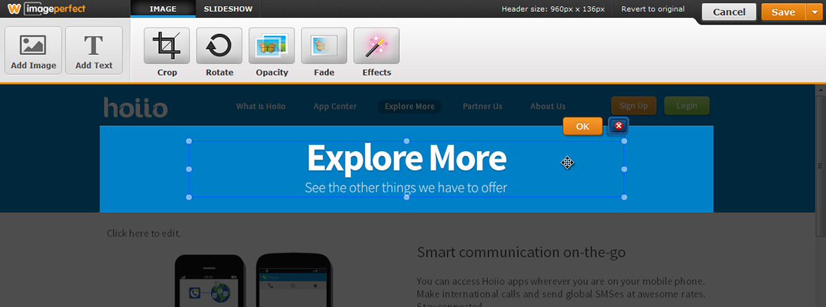
The page title 'Explore More' is actually an image.
CONSTRAINTS & PROJECT GOALS
Using weebly has been great for content editors (copywriter, marketing and sales team) since they can easily create a page and add text and/or images, without needing to know how to code. On the other hand, the inability to add classes or IDs to elements added onto the page using weebly editor means that the web developer and designer have lesser fine-grain control over how the page should behave and look. However, so far the benefits have outweighed the drawback, and so the website will still use weebly.
After considering the problems and the constraints, the solution would be to create a responsive web template that meets the following goals:
- Template must be usable in weebly
- Serve the same content regardless of device, but re-layout the content to match the device's screen
- To not use image & improve workflow for content editor with regards to page titles
DESIGINING THE SOLUTION
For the responsive theme I created four templates for different page type: landing page, default content page, content page without navigation bar (standalone page), and app center page.
LANDING PAGE
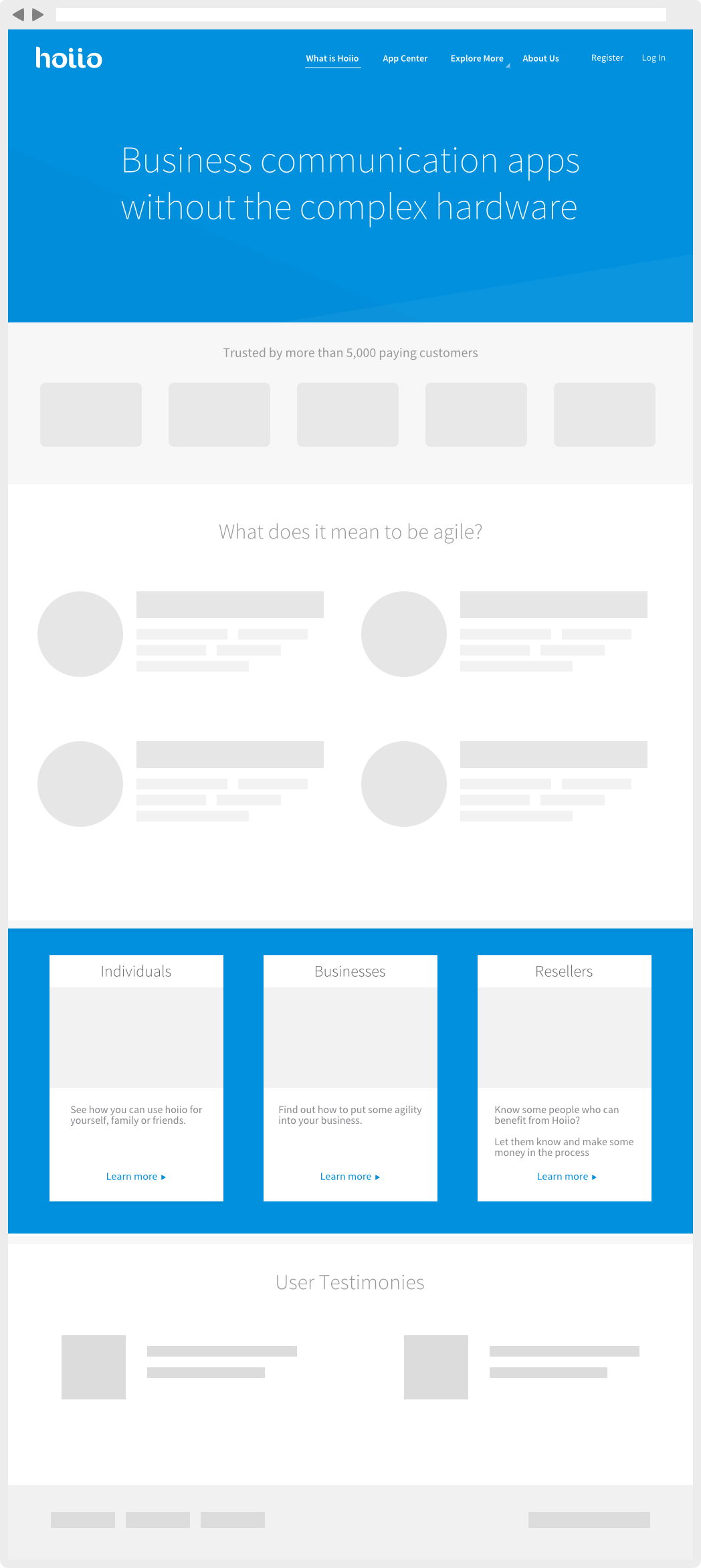
Landing page - mockup
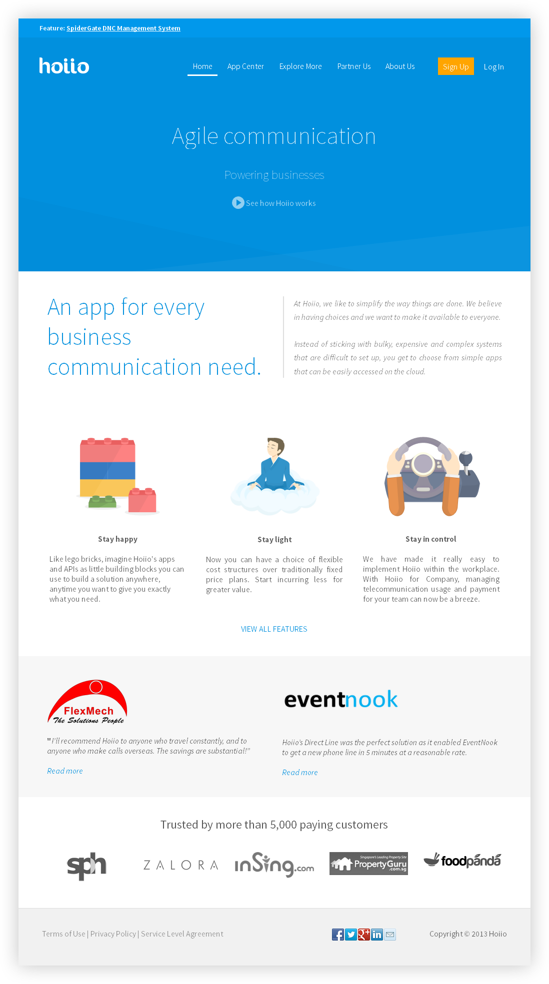
Landing page - live site

Landing page - mobile
CONTENT PAGE

Explore more - Desktop view
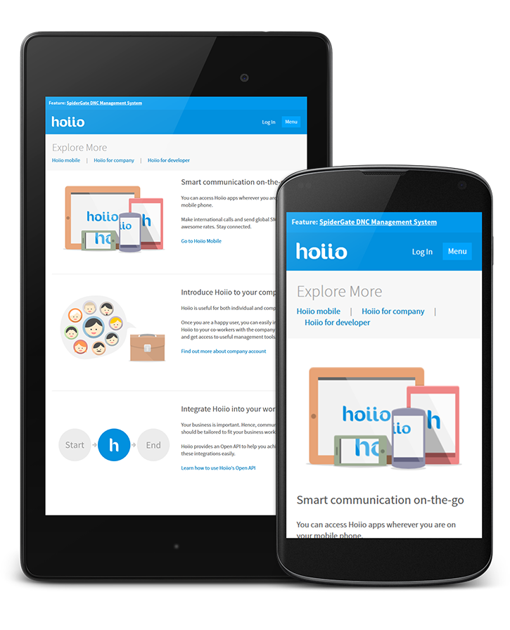
Explore more - tablets and phone view

Content page without navigation (normally used for forms) - Desktop/iPad Landscape view
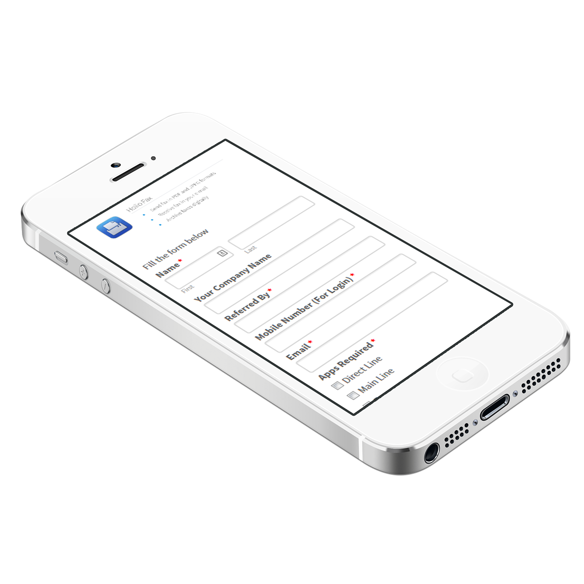
The same page as above - mobile view.
Forms expand to full width when viewed on mobile devices
APP CENTER
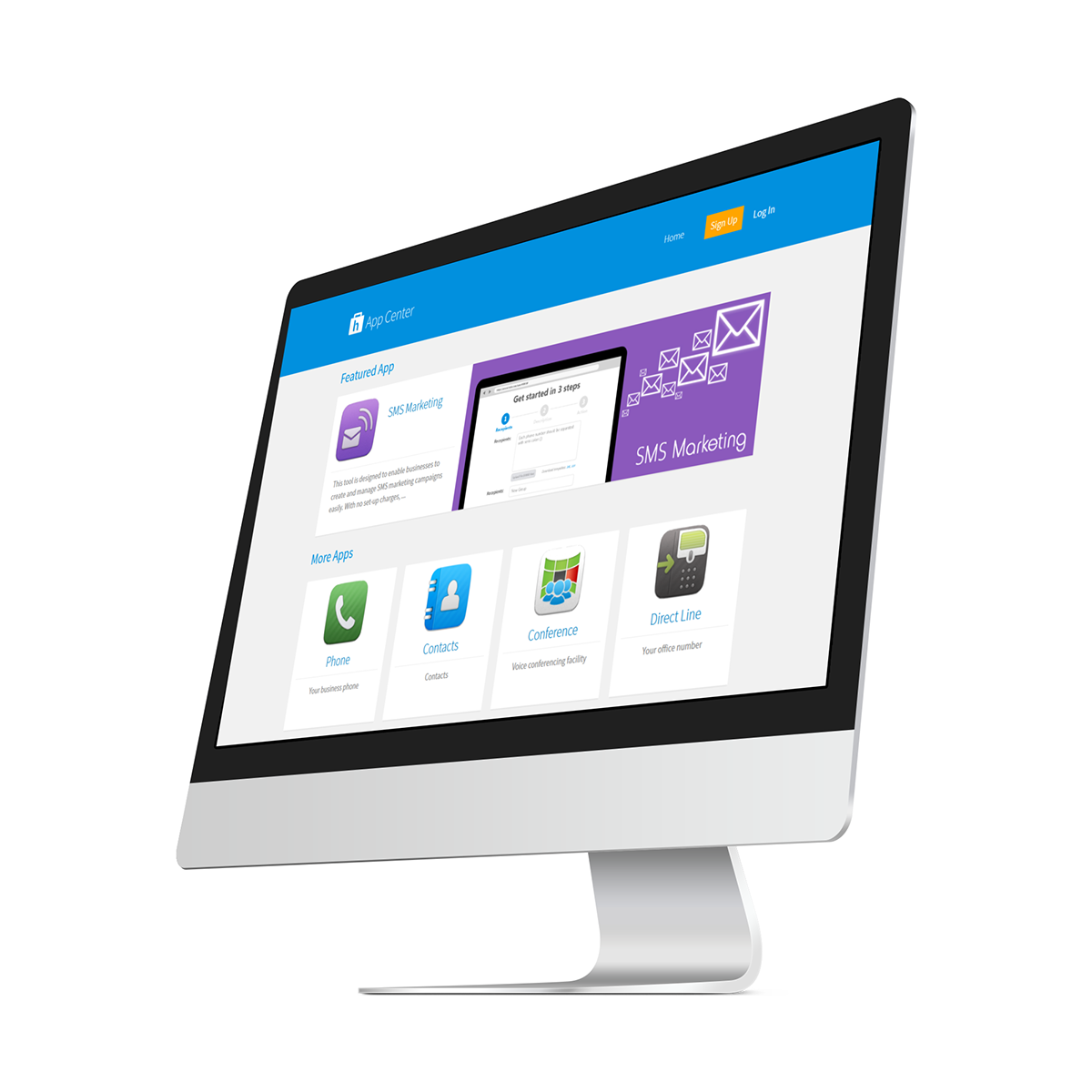

App Center Overview - Desktop view

App details page - Desktop view
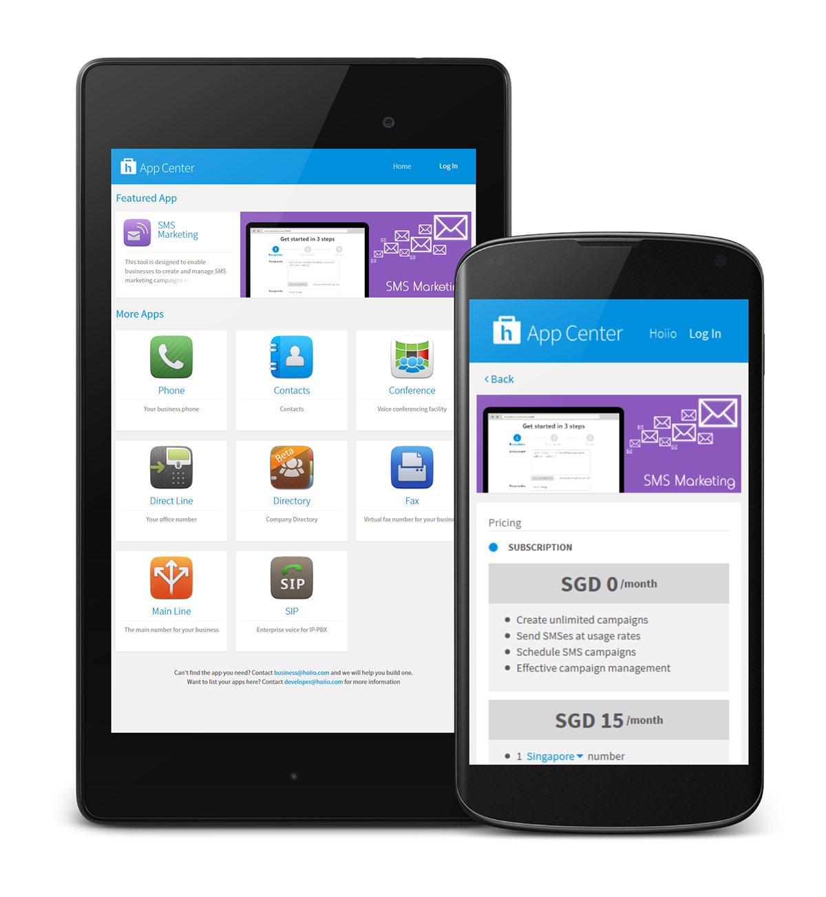
App center overview & app detail page - mobile view
ADDING PAGE TITLE

Page title can be easily created using weebly's text element

Text element dropped into the page title section is styled to always have the same font size and color, ensuring consistency
NAVIGATION ON MOBILE DEVICE

Click 'Menu' button to display mobile navigation menu

Mobile menu expanded, showing sub-menu
CREDITS
Responsive weebly theme - designed & developed by myself
Hoiio App Center - designed by myself, developed by Max Tan
Illustrations - myself & Dikae Uy
Content (body copy) - Denise Tham, Zul, Samip Shah & Masaru Imanaka
Thanks for scrolling all the way down :D

