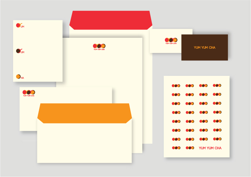
This branding exercise was one of the options provided for a restaurant that will offer converyor belt dim sums. The idea behind its construction was to combine the logo and symbol (circular shape) to make a single unit. The circles represent plates and the type represents loops of a conveyor belt.