


_
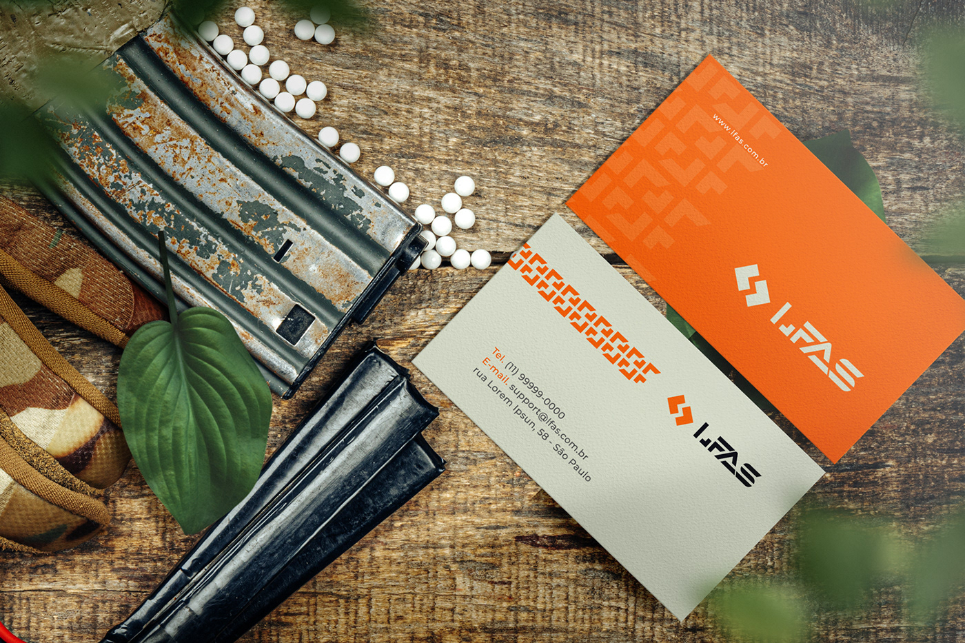
O que é LFAS?A LFAS é uma loja online e física de airsoft, camping e tiro esportivo. A empresa comercializa armas de pressão, armas de airsoft, carregadores, roupas e acessórios em geral.
_
Onde estava o problema?A empresa estava com dificuldades de se comunicar com o seu publico, para isso criamos uma estratégia para a marca adotar daqui pra frente, definimos seu publico alvo, criamos uma persona e criamos uma identidade visual conceituada com a mensagem que empresa deseja transmitir para o publico que consome seu produtos.
_
O ProjetoO projeto foi basicamente a elaboração de um logotipo e uma identidade visual completa para a marca. Desde o primeiro minuto este projeto foi desafiador, pois se tratava de um tipo de publico bem especifico. Eu deveria tomar todos os cuidados necessários para que pudesse transmitir uma mensagem clara e objetiva, para que as pessoas não tivessem nenhum tipo de confusão com a mensagem da identidade.
[EN]
What is LFAs?
LFAS is an online and physical store for airsoft, camping and shooting. The company sells airsoft guns, airsoft guns, magazines, clothing and accessories in general.
Where was the problem?
The company is having difficulties communicating with its audience, for that we created a strategy for the brand to adopt from now on, we defined its target audience, created a persona and created a conceptualized visual identity with the company's message and with the public that consume your products.
The project
The project was basically elaboration of a logo and a complete visual identity for the brand. From the first minute of this project it was challenging, because it is a very specific type of audience. I should take all the necessary care so that I could convey a clear and objective message, so that people wouldn't have any kind of confusion with the message of the identity.


_
Conceito
O conceito aplicado nesse projeto foi com uma pesquisa semântica bem especifica. Utilizamos o airsoft como base de pesquisa, já que é o foco da empresa.
Estudamos a história, a chegada no Brasil e os que nossos vizinhos mundo
afora estão fazendo no esporte.
Entendemos que honra e união é um elo que traduz o espirito do esporte
então partimos desses atributos. Além disso, queríamos uma marca
agressiva, mas que ao mesmo tempo fosse moderna e dinâmica.
É um esporte de movimento, de ação e as cores vão nos ajudar muito na aplicação da identidade. O tiro esportivo e o camping também estão presentes.
[EN]
Concept
The concept applied in this project was a very specific semantic research. We used airsoft as a research base, as it is the focus of the company.We studied the history, the arrival in Brazil and the ones that our neighbors in the worldout are doing in the sport.We understand that honor and union is a link that translates the spirit of the sportso we start from these attributes. In addition, we wanted a brandaggressive, but at the same time modern and dynamic. It is asport of movement, action and colors will help us a lot in applying the identity. Sport shooting and camping are also present.


_
O símbolo
O símbolo segue o conceito base de União. Queríamos incluir o elementos do airsoft e
do camping de uma forma abstrata. Seguimos o conceito do Closed Quarter, que é um dos terrenos mais procurado no airsfot, então criamos os corredores entre as 2 formas, que usamos também para simbolizar as trilhas do camping.
Na vertical ele tem a forma de uma montanha e como dito antes a trilha do
camping ao meio. As setas direcionais < > são usadas de forma bem comum no mundo militar, seja para compor mapas táticos, condecorações, medalhas, insígnias e em códigos escritos.
Além disso ele esta presenta na forma do “L” (éle) do logotipo.
_
O logotipo
O logotipo tem uma tipografia totalmente personalizada. Criamos linhas consistentes, com cortes agressivos em diagonais e com traços negativos em algumas letras. O porque disse é que queríamos um logotipo que fosse moderno, forte e que seu uso sem o símbolo não o deixasse menos atraente visualmente. Decidimos deixá-la parecida com a anterior para manter o apelo da marca, apenas dando a ela personalidade, modernidade e agressividade.
[EN]
The symbol
The symbol follows the basic concept of Union. We wanted to include the airsoft elements and
of the camping in an abstract way. We followed the concept of the Closed Quarter, which is one of the most sought after terrains in airsfot, so we created the corridors between the 2 shapes, which we also use to symbolize the camping trails.
Vertically, it has the shape of a mountain and, as mentioned before, the trail of the
camping in the middle. The directional arrows < > are used quite commonly in the military world, whether to compose tactical maps, decorations, medals, insignia and in written codes.
In addition, it is present in the shape of the “L” (he) of the logo.
The logo
The logo has a fully customized typography. We created consistent lines, with aggressive diagonal cuts and negative strokes in some letters. The reason I said it is that we wanted a logo that was modern, strong and that its use without the symbol doesn't make it less visually appealing. We decided to make it similar to the previous one to maintain the brand's appeal, just giving it personality, modernity and aggressiveness.


Thanks for watching!


