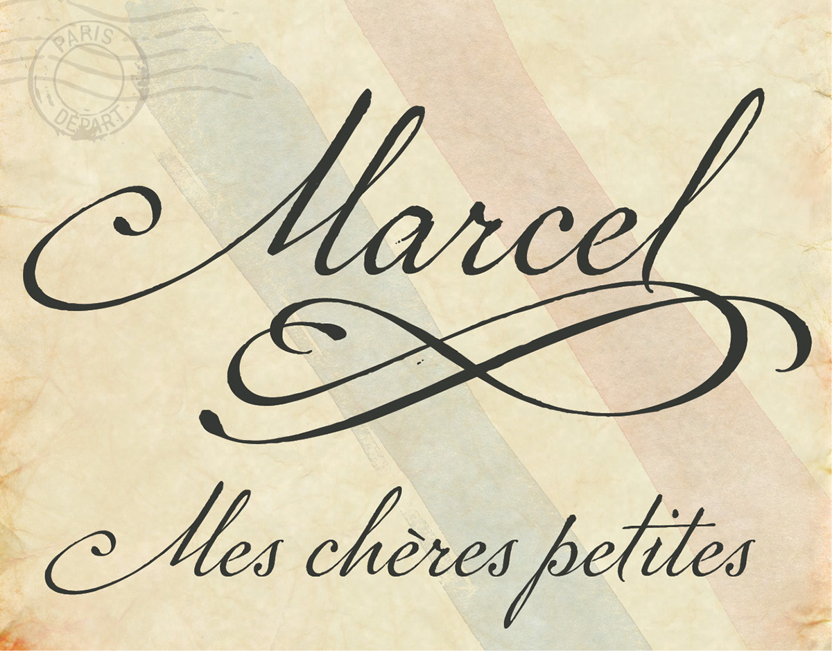
P22 Marcel Script Pro font
“I have an affection for script lettering,” graphic designer Carolyn Porter admits. Over the years, she has collected assignments from turn-of-the-century penmanship classes, 19th-century letters, journals and cards, and even an 18th-century marriage contract. The commonality? “They all have beautiful handwriting.”
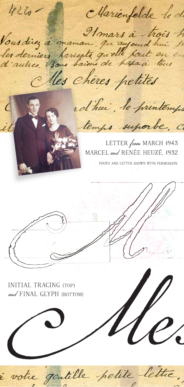
Years ago, five handwritten WWII-era letters that Carolyn found in an antique shop in Stillwater, Minnesota, captured her attention in a way no other letters had. “As I stood in the store, I knew I was going to use the letters as the basis for a font,” she said. The letters had been written in French, so Carolyn wasn’t able to read them. But, that wasn’t a problem. “I was drawn to the handwriting and the shapes of individual characters,” she explained. “And even without being able to read them, it was clear that these letters were special.”
Carolyn had taken Letterform classes as part of her college graphic design program requirement. That’s where she first learned about the history of typography, and about the shape, style, balance and proportion of letters. But, it wasn’t until years later that she decided to design a font.
She didn’t know how else to begin, so she scanned the five letters, then meticulously traced her favorite characters. “In hindsight, it was probably the single-most inefficient way to begin,” she admits with a laugh.
Carolyn has a thriving freelance design business; she provides design and communication services to clients in the medical, financial, environmental and business-service industries. She worked on the font evenings and weekends, as time allowed. “Sometimes months would go by and I couldn’t carve out time to work on it.” But, the font was always in the background, waiting to be completed. She eventually took a class on FontLab software, which is what she used to transform the traced letters into a fully functional, modern font.
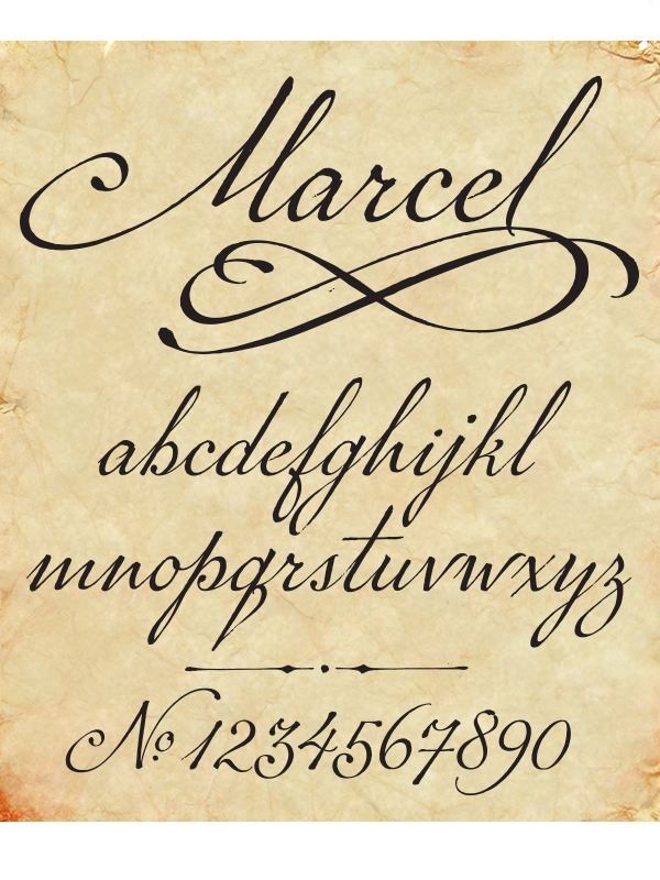
Over the following years, she continued to develop, refine and revise the font, which she ultimately named “Marcel.” She added alternate characters, swashes, ornaments, inkspots, and custom ligatures. The result is a highly readable running script that captures the detail of ink-on-paper writing. The font also retains many of the characteristics she loved so much about the original handwriting, such as the swash “M” and a high lead-in vertical stroke on the letter “p.” The Pro version of the font has more than 1300 individual characters and OpenType stylistic sets so the user can select preferences such as European or American-style numerals. It is compatible with all Western European languages.
In addition to the script font, Carolyn designed a complementary all-cap titling font. The titling font incorporates characteristics of the script font.
One day in mid-2011, Carolyn wondered who had written the letters and what the letters actually said. She had the five letters translated and was shocked to learn they had been written while the author, a Frenchman named Marcel Heuzé, was a conscripted worker in Berlin. The letters, stained and scarred with censor marks, include rare first-person testimony of survival inside a labor camp. One of the letters, written to his wife and three young daughters back home in rural France, began, “Now I can give you details about my life as a prisoner.” He described the clothes he had been given to wear, how hungry he was, a schedule of his daily work life, and how he and his fellow prisoners sought shelter while the factory was bombed.
All of Marcel’s letters contain extraordinary expressions of love for his wife and family. In one letter, he wrote passages directly to each of his young daughters. And in another letter he inquired how his wife was getting by before adding, “kiss my little rascals for me.” Marcel ended his letters with passages such as: “And for you, my beloved one, I always save my most tender kisses,” or “Your guy who hopes to hold you in his arms soon.”
Carolyn began to wonder how these letters wound up in an antique store halfway around the world, and more importantly, whether Marcel returned home to the family he missed so desperately and loved so deeply. Carolyn embarked on what would turn out to be a year-long search to learn Marcel’s fate. The outcome of her search is almost too incredible to believe and resulted in, among other things, a trip to Paris with an extraordinary meeting at the base of the Eiffel Tower.

A book is in development which will tell the story of the design of this font, and Carolyn’s remarkable and exhaustive search to learn the fate of Marcel Heuzé. The book is being published with the approval of the Heuzé family. In fact, they have granted Carolyn the exclusive right to share Marcel’s story and the contents of his extraordinary letters.
Additional info on Marcel featired on The Daily Heller

