


Waning sunbeams are fading outside the window. The weather is glacial. Earth, cars and trees are covered with pure and fleecy snow. However it is warm and comfortable in the room. A cup of freshly brewed tea is now slowly getting cold. It’s standing next to a small saucer with raspberry confiture.
Varvarka – is a brand for homemade confiture. It is cooked according to one of the company’s founders’ grandma’s recipes. The company is named in her honour. For producing Varvarka we use only all natural berries from local farmers.
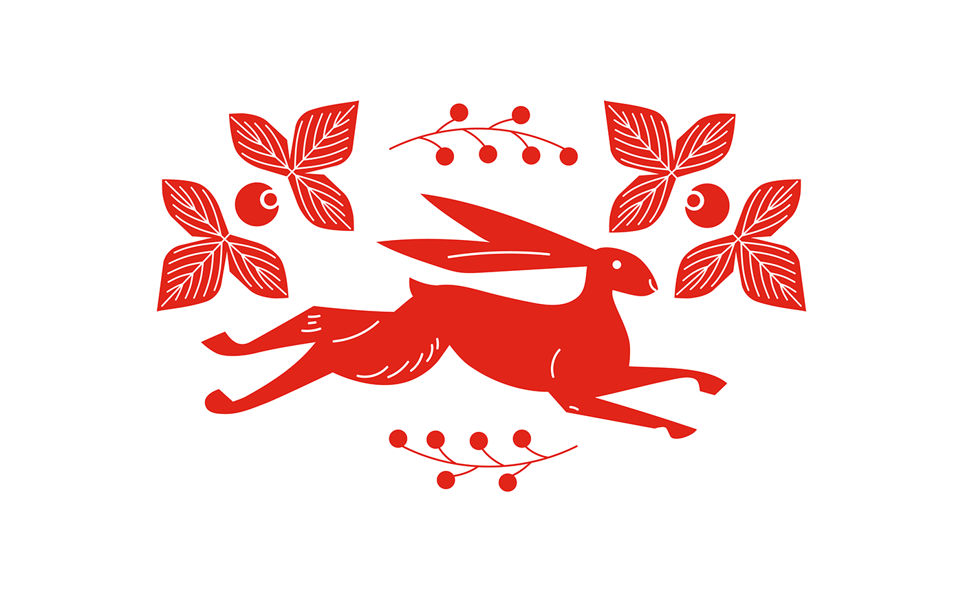
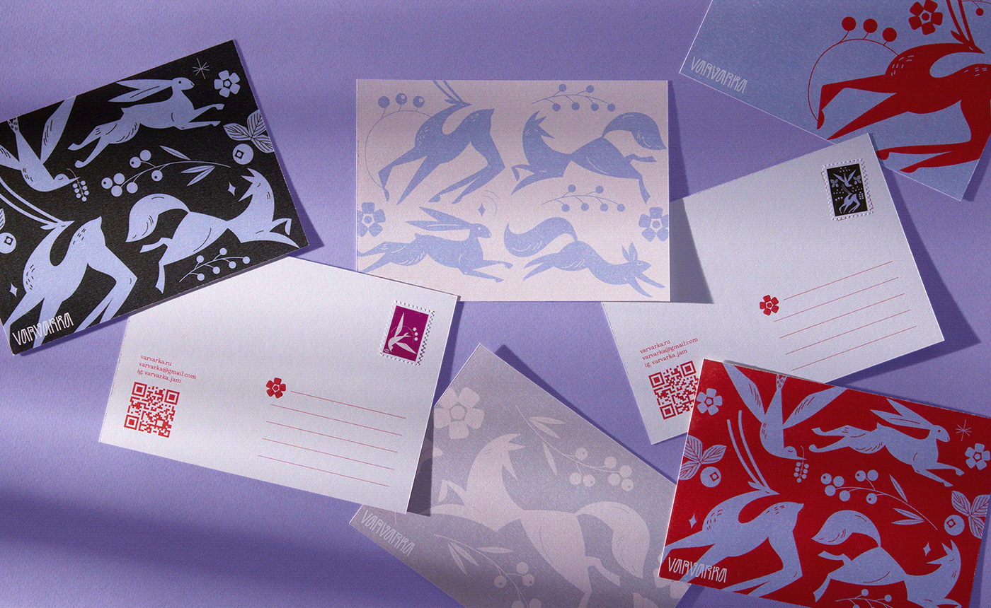
Unique style highlights authenticity and localness of the brand. Designers were drawing inspiration from books of old Russian folk tales and their popular characters. In such a way the brand’s mascots were created: the Fox, the Hare and the Deer. Varvarka’s logo is the nowadays version of Old Cyrillic letters. Sombre pastel colors represent the feeling of winter while the rich-red one fits into the product’s category and refers to Russian traditions. Combining the antique and grotesque styles is another way of books layout.
Specific thing about Varvarka is that we deliver via postal services. That is why we designed unique boxes and branded postage stamps. These niceties give a sense of a postage being delivered straight out of fairy tales.
Varvarka – is not just about sweetness, it’s about concentrated happiness, strained and made with berries. Here’s a hint for you: 2 spoons of Varvarka in your tea on a daily basis and your life will be brighter!


Credits:
Art Director — Olga Kutovaya
Brand Identity — Ksenya Shatko
Brand Identity — Ksenya Shatko
Logo — Anastasia Kuprina
Illustration — Ksenya Shatko
Photo — Pavel Paramonov
Photo — Pavel Paramonov
Copywriting — Mitya Kutepov


