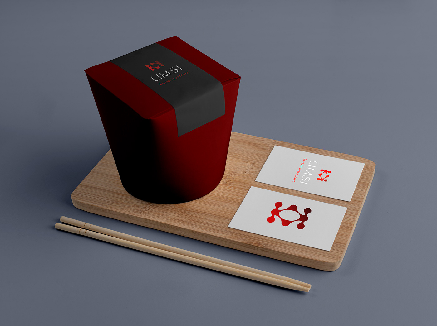
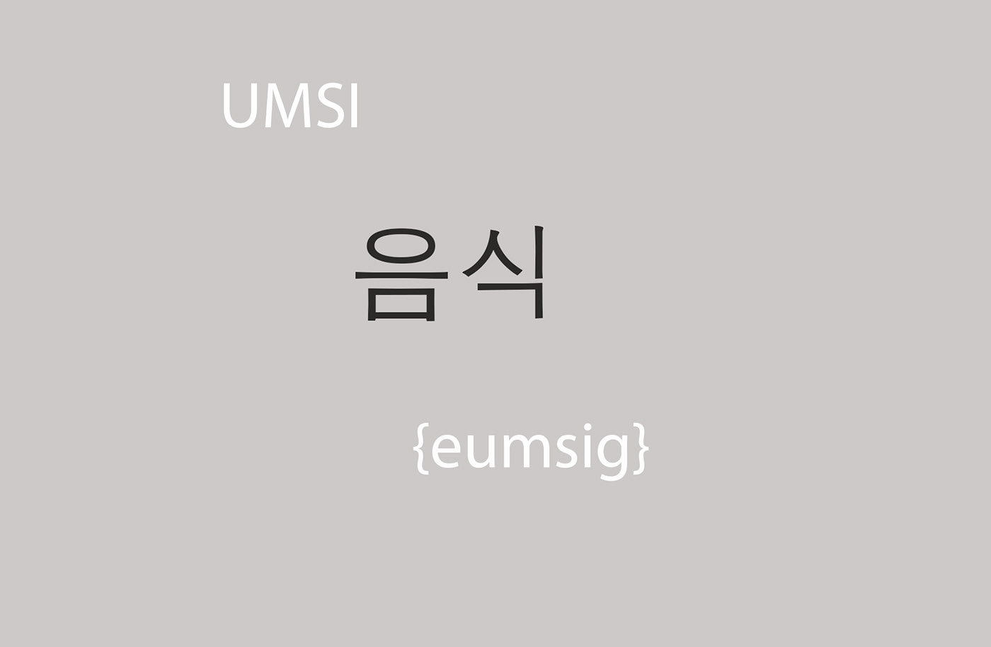
Ресторан корейской кухни UMSI ( кор. eumsig, в переводе "еда").
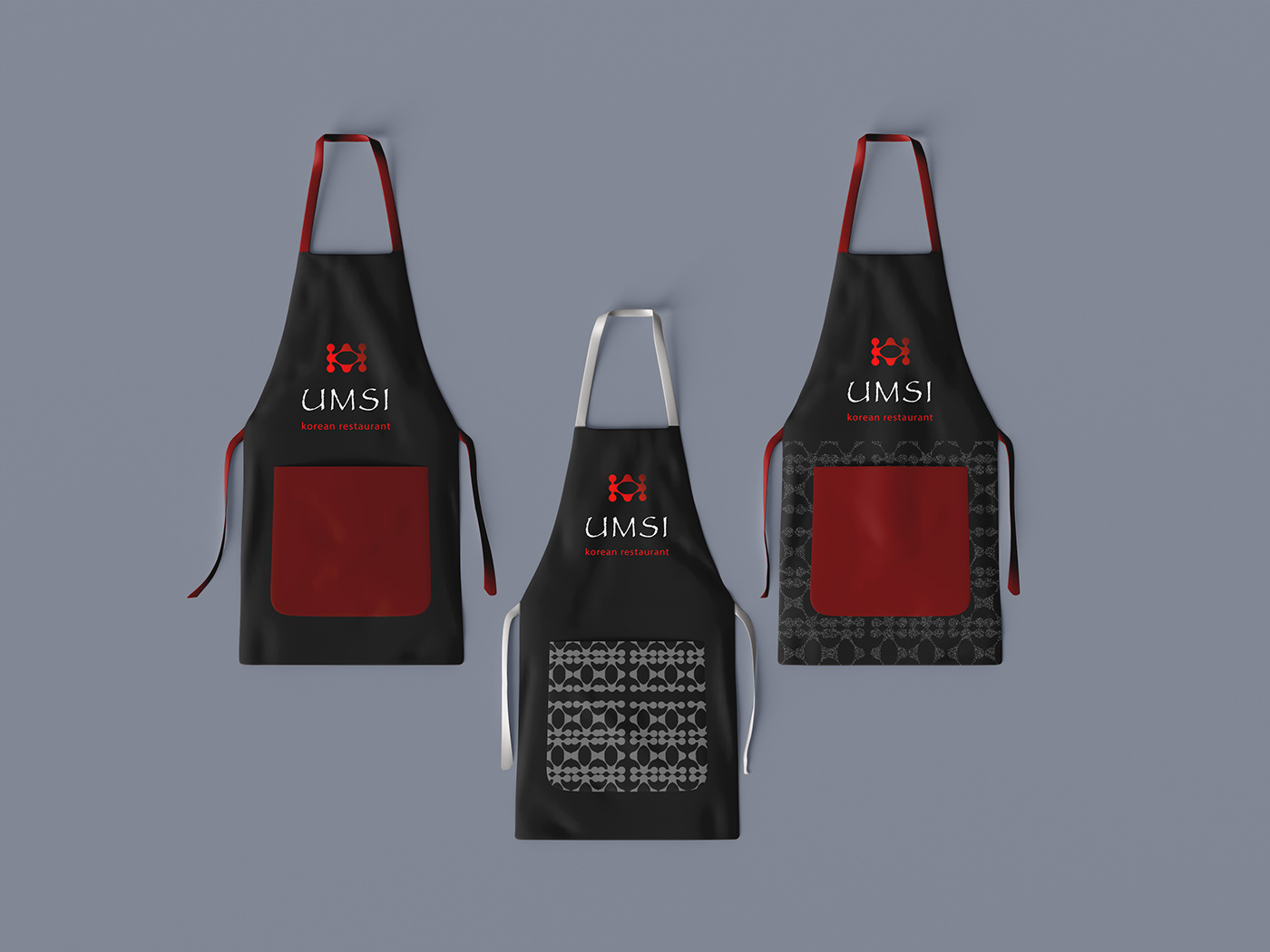
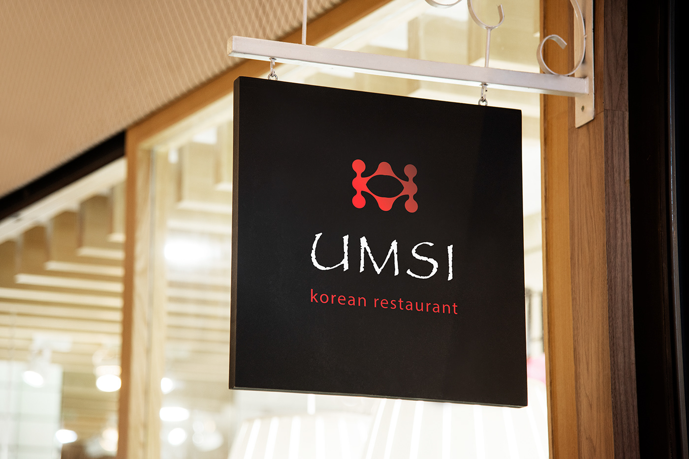
Логотип разработан с помощью метабола и определенного скрипта, позволяющего соединять метаболы диагональной линией. В данном логотипе-символе читается кухня. Цвет градиента, переходящий от бордового к огненно-красному, напоминает об огне, на котором готовится самая вкусная пища и остроте, которую так ценят корейцы. Здесь можно увидеть будто два повара в национальном головном уборе повернуты друг к другу сковородками.
В ресторане можно пообедать или поужинать, а также заказать доставку домой или в офис.
Korean cuisine restaurant UMSI (cor. eumsig, translated as "food").
The logo was designed using a metaball and a specific script that allows you to connect the metaballs with a diagonal line. In this logo-symbol, the kitchen is read, the color of the gradient turning from burgundy to fiery red reminds of the fire, on which the most delicious food is prepared and the spiciness that the Koreans appreciate so much. Here you can see as if two cooks in a national headdress are facing each other with frying pans.
In the restaurant you can have lunch or dinner, as well as order delivery to your home or office.
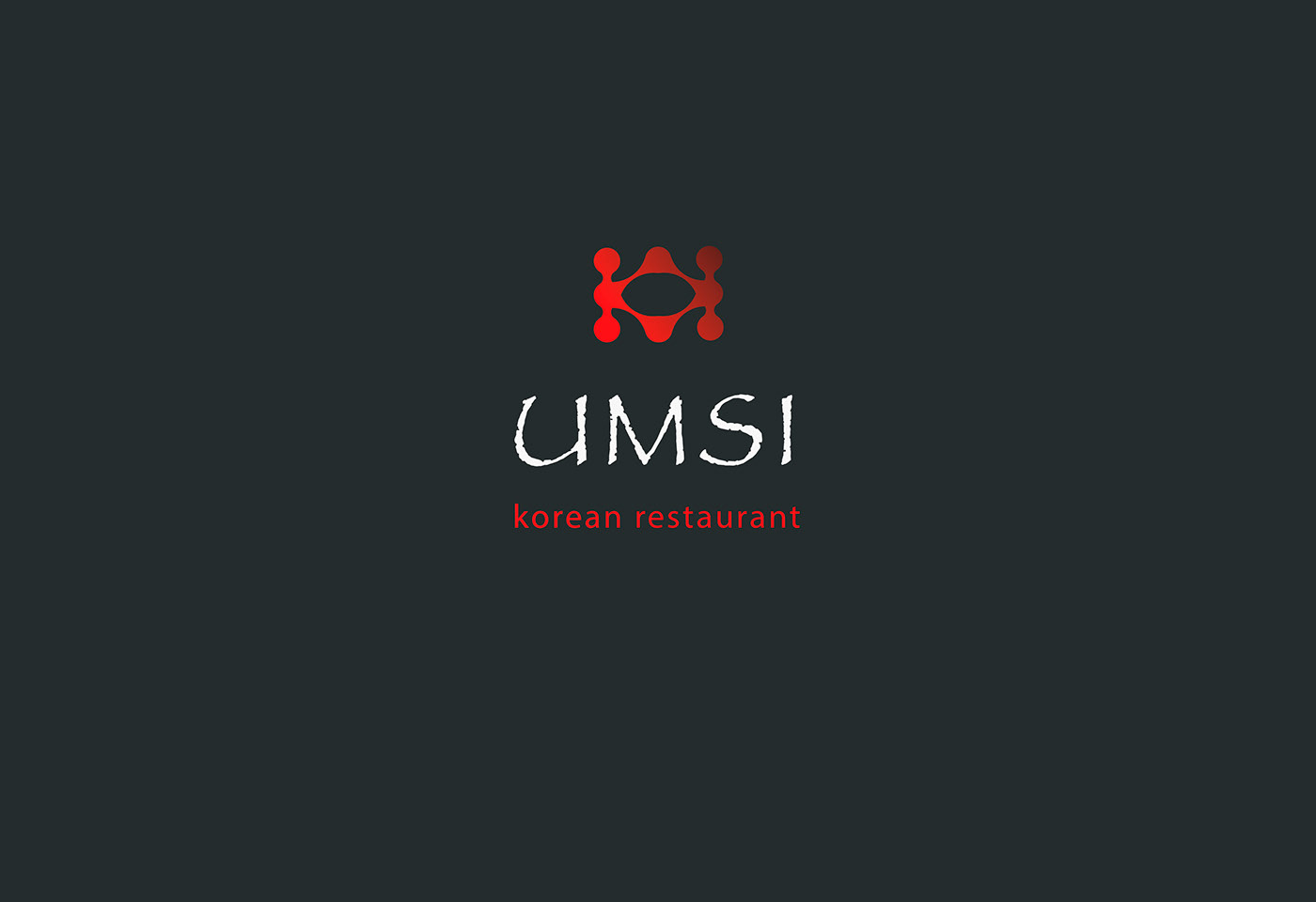
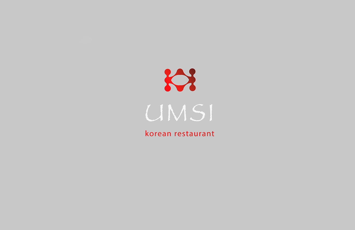
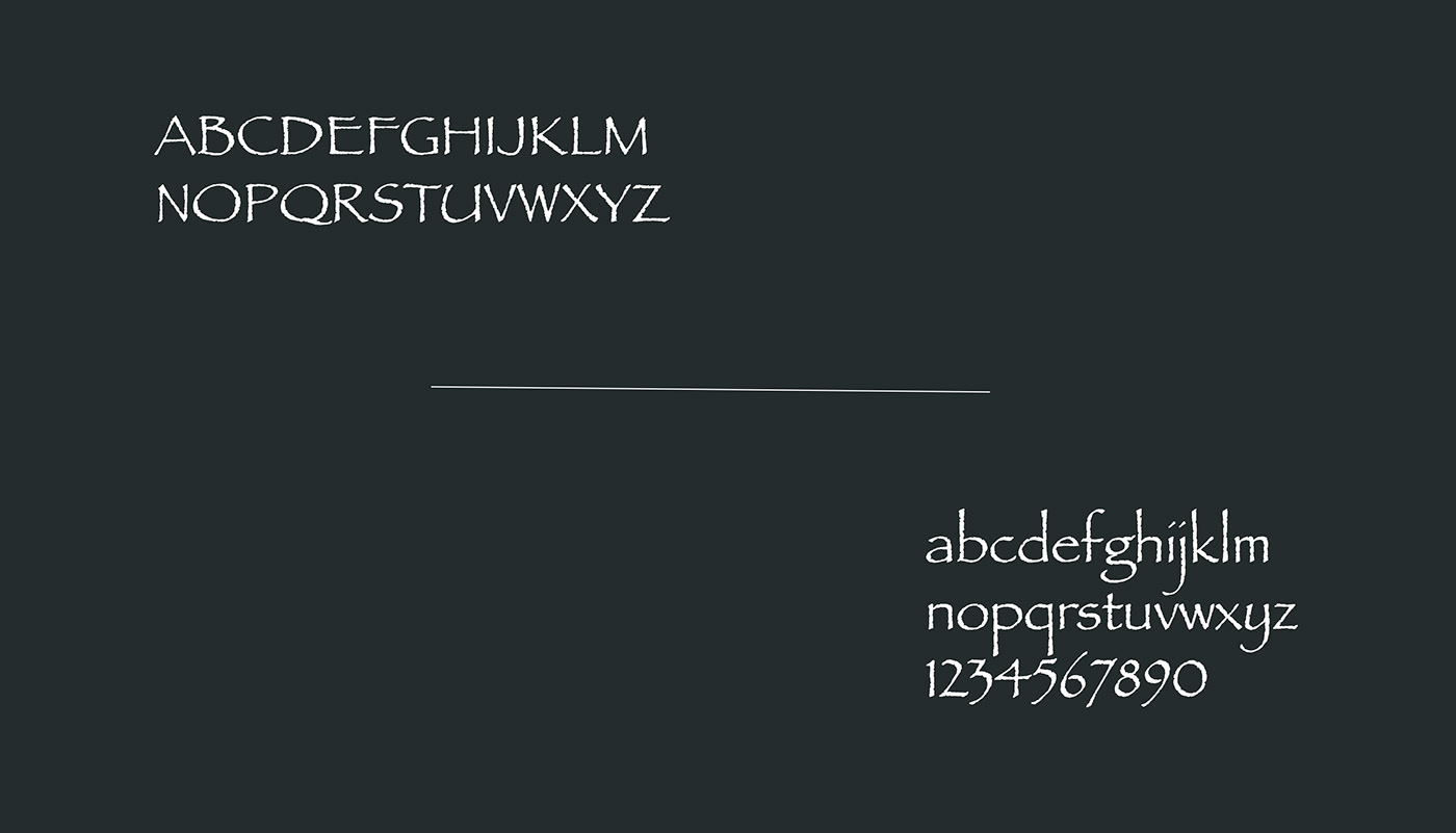
Для названия был выбран шрифт Papirus Regular, который подчеркивает традиции и самобытность корейской кухни.
For the name, the Papirus Regular font was chosen, which emphasizes the traditions and originality of Korean cuisine.
Спасибо за просмотр!
Thanks for watching, like and comments! ヅ
I'm open to cooperation:
anastazeos@gmail.com