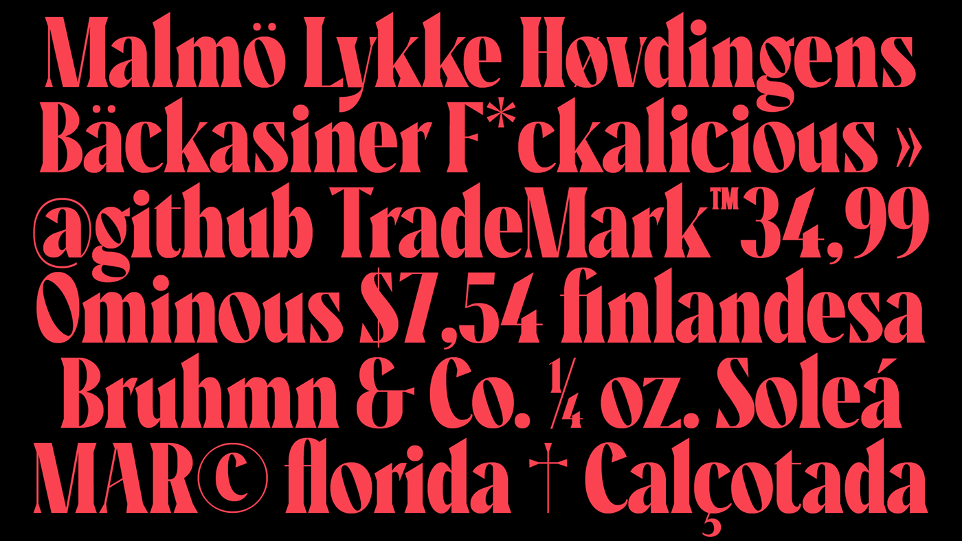
After drawing Recia Display, I wanted to explore the process of building a serif typeface. Here, there wasn’t specific inspiration. I simply decided to take advantage of the same proportions that Recia Display has, but play with a higher stem contrast (mainly with uppercases), rough serifs, and specific angles without losing the form’s density. I think this font would be suitable for packaging and short headlines (In fact, sometimes the shapes of this font remind me of old printed newspapers headlines). I have drawn this font just for fun while I learn the process. If you wanna try it for free you can download it h̶e̶r̶e̶.


(*A few weeks after I posted this work, I realized that the word “Recia” was used by a talented designer, Carlos del Toro, to name an elegant font he designed some years ago. It is available in Fontshare, a free fonts service launched by the Indian Type Foundry.)
Credits.
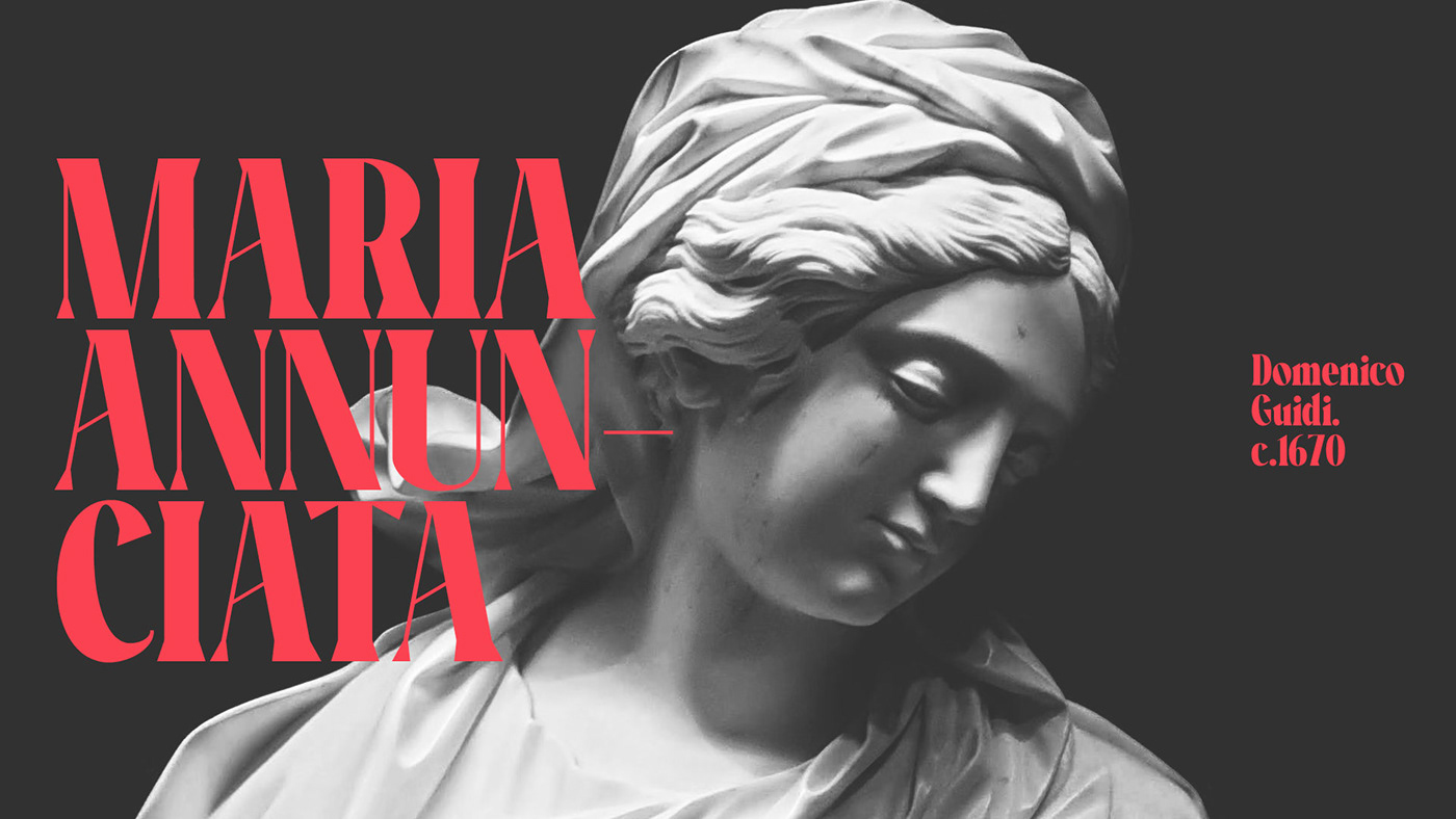
For visual concepts I've used a photograph of Domenico Guidi's Maria Annunciata by Michele Caliani @Unsplash and the portrait of Guiliano de Medicis by Sandro Botticelli (Accademia Carrara, Bergamo)
For visual concepts I've used a photograph of Domenico Guidi's Maria Annunciata by Michele Caliani @Unsplash and the portrait of Guiliano de Medicis by Sandro Botticelli (Accademia Carrara, Bergamo)
DOWNLOAD RECIA SERIF DISPLAY h̶e̶r̶e̶

