


Roná Comunicação
[EN] Roná is a communication agency that helps those who are recently in the digital world to communicate with their audience. The brand has a very outgoing and welcoming footprint, making the experience of its customers unique and assertive.
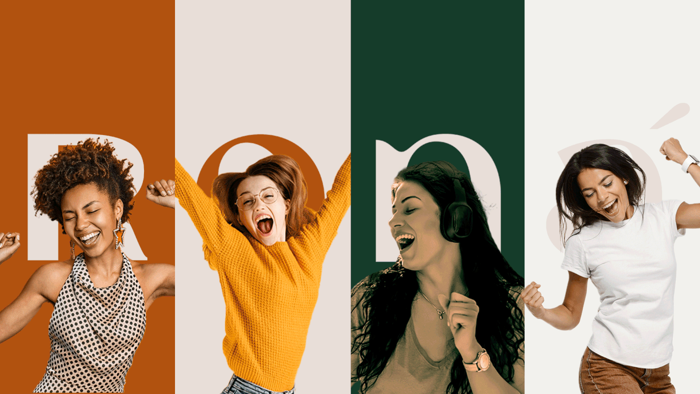
The challenge of the project was to create a visual identity that could transmit a strong, cheerful, creative and welcoming brand in all its points of contact.
[PT-BR] A Roná é uma agência de comunicação que auxilia empresas que recém estão entrando no mundo digital a se comunicarem com seu público. A marca tem uma pegada bem extrovertida e acolhedora, fazendo com que a experiência dos seus clientes possa ser única, de um jeito leve e assertivo.
O desafio do projeto era criar uma identidade visual que conseguisse transmitir em todos os seus pontos de contato uma marca forte, alegre, criativa e acolhedora.
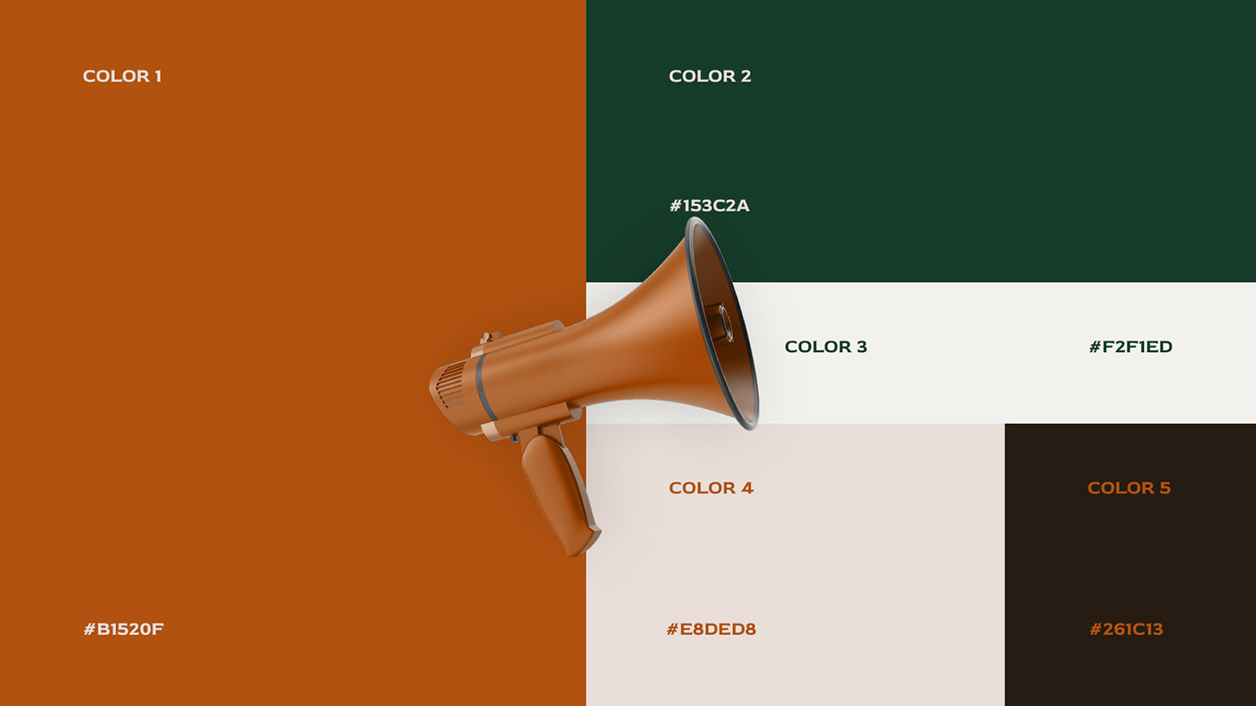
Cliente: Roná | Projeto de Identidade Visual | 2022 | Design & Direção: Ritter Design

[PT-BR] O nome da marca era muito importante para a fundadora, portanto o logotipo foi pensado em destacar o nome Roná em toda a comunicação.
Para representar uma marca de um jeito único e extrovertido, não houve nenhum tipo de composição gráfica baseada em guias, a ideia era justamente sem algo fora das regra.
Para representar uma marca de um jeito único e extrovertido, não houve nenhum tipo de composição gráfica baseada em guias, a ideia era justamente sem algo fora das regra.
A tipografia do logotipo possuitraços mais orgânicos e elegantes, trazendo características essenciais para representar a personalidade da marca.
-
[EN] The brand name was very important to the founder, so the logo was designed to highlight the Roná name in all communication.
To represent a brand in a unique and extroverted way, there was no type of graphic composition based on guides, the idea was precisely without anything out of the ordinary.
The logo typography has more organic and elegant features, bringing essential characteristics to represent the brand personality.


O vento | The Wind
[EN] The brand's support elements were inspired by the different movements of the wind. The wind is a symbol of freedom and lightness, which faithfully translates Roná's personality. It's calm, cool, cozy and takes us in many directions. Roná proposes to take its clients to their goals in a light and fun way.
[PT-BR] Os elementos de apoio da marca foram inspirados nos diversos movimentos do vento. O vento é um símbolo de liberdade e leveza, o que traduz fielmente a personalidade da Roná. É calmo, fresco, aconcheganhe e que nos leva há muitas direções. A Roná se propõe a levar seus clientes aos seus objetivos de um jeito leve e divertido.


Design & Strategy/Design & estratégia:
Mateus Ritter
Mateus Ritter
Deliverables/Serviços:
Visual Identity/Identidade Visual
Visual Identity/Identidade Visual
Contact/contato:
Hire us/contrate: contato@ritterdesign.com.br
Visit/Visite: www.ritterdesign.com.br
Instagram: @ritterdesign_
Visit/Visite: www.ritterdesign.com.br
Instagram: @ritterdesign_


