The new Cornell University Program Board website, at http://orgsync.rso.cornell.edu/org/cupb/
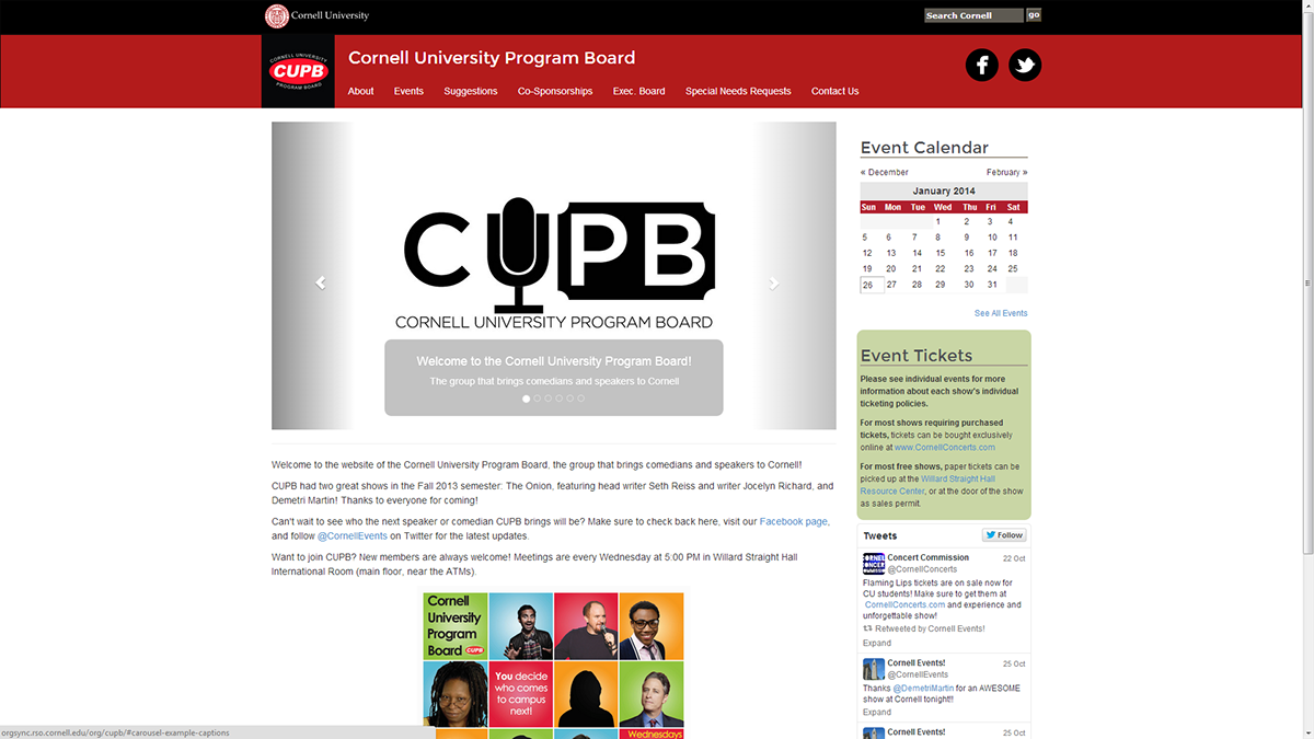
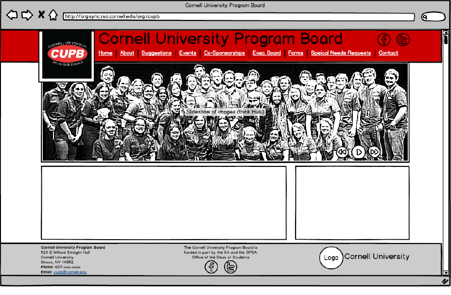
Working within template websites can often feel challenging, though I think it can also be an opportunity to try to be creative. My task was to redesign the website for the Cornell University Program Board (http://orgsync.rso.cornell.edu/org/cupb/), on the new OrgSync platform for Cornell student organizations. The platform allows modification of HTML and CSS elements (though not PHP or database functions). Both individual pages and a template can be customized to various extents. Rather than using PHP or databases for content, content can be manually entered into pages, or be added via a CMS and embedded into pages via pre-built modules and some custom markup language. All sites are provided with an initial template, as seen below:
Pre-loaded template for Cornell OrgSync Sites
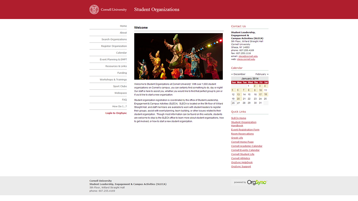
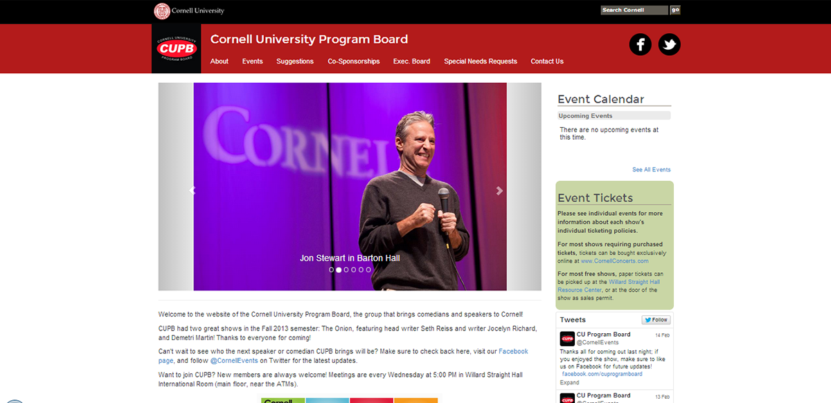
The original CUPB OrgSync site, using the pre-loaded template
I wanted to try to push the boundaries a bit of a rather run-of-the-mill template that didn't seem to inspire too much creativity. I also wanted to see how well the platform would be able to support a mobile site, and decided to go with a responsive design. I figured that I would probably end up using Bootstrap for its ease of implmenting responsive design and I like its built-in classes and libraries. The first thing I did was do some initial sketching on paper, and then created a wireframe in Balsamiq.
The general layout was inspired partly by the layout of Facebook Pages - I wanted to have a image of the CUPB logo in a proportion similar to the Facebook Page icons, and have a moving cover photo, similar in size to Facebook, but closer in functionality to Hulu's front page. This would be accompanied by a horizontal menu that would collapse in the responsive layout. There would also be social media links at the top of each page, and the standard footer information.
Home page of the new website
Some changes were made between my sketches and the eventual implementation, both due to constraints on the platform, and my desire to follow the Cornell Branding Guide as much as possible. A "Cornell University" bar with a Cornell Search box was added to the top of every page. The slideshow on the homepage also does not take up the entire width but rather just the width of the main column - I wanted to have a right column on every page (except the homepage), so it is included in the template design. However, every page must include the template, including the home page, I settled for a slideshow that's 2/3 wide on the page.
The right column of every page includes an event listing of upcominf events (which is a module updated through the OrgSync CMS), a panel with information about event tickets, and an embeded Twitter feed. The default Twitter feed fits better in the responsive-width column than the default Facebook feed, althought in the future it may be possible to take advantage of both services' APIs to create a feed integrating both social media feeds.
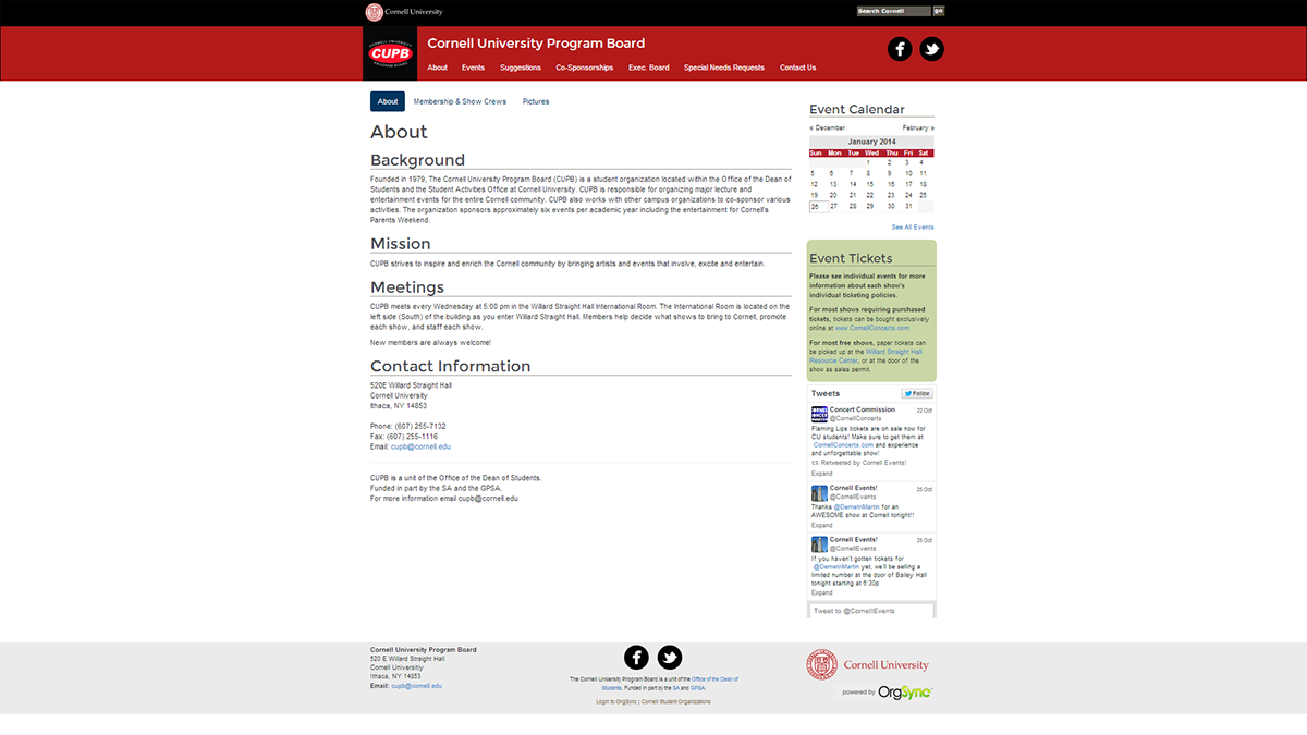
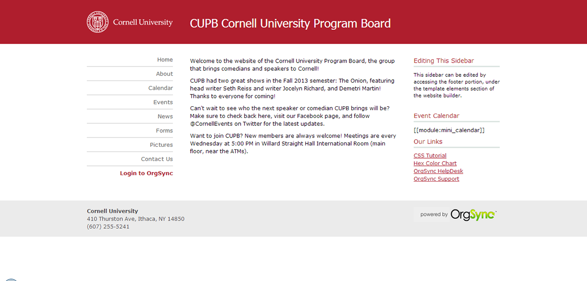
Sample of a page on the website, with right column and footer
Most of the major sections on the website (accessed by the main navigation bar) are their own pages, but a couple of sections of subpages. In those cases, like the one above, a secondary menu bar is placed below the main navigation, and the current page is highlighted. While ideally they would have been included as dropdowns in the main menu, problems occured trying to implement this, particularly on the mobile version, due to what I believe are javascript and CSS conflcits between Bootstrap and the default Org Sync files that both must be included. The sections are mostly carried over from our old website (via Internet Archive), though the information architecture has been modified to better suit the organization's needs.
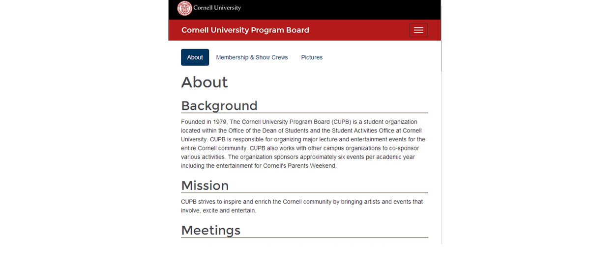
Screenshot of the mobile version of the site
Thanks to Bootstrap, the site collapses into mobile view quite easily. The right column stacks underneath the main content on the left, and the 3 sections of the footer stack as well. The CUPB icon and social media icons in the navigation bar go away, as does the Cornell University search box, and the navigation menu collapses (accessed by the box with horizontal lines).
I'm happy with how the website turned out, and am glad to see that being constrained to a template-based website on someone else's platform doesn't mean that you can't make a nice website!