


SHAPED OVER TIME
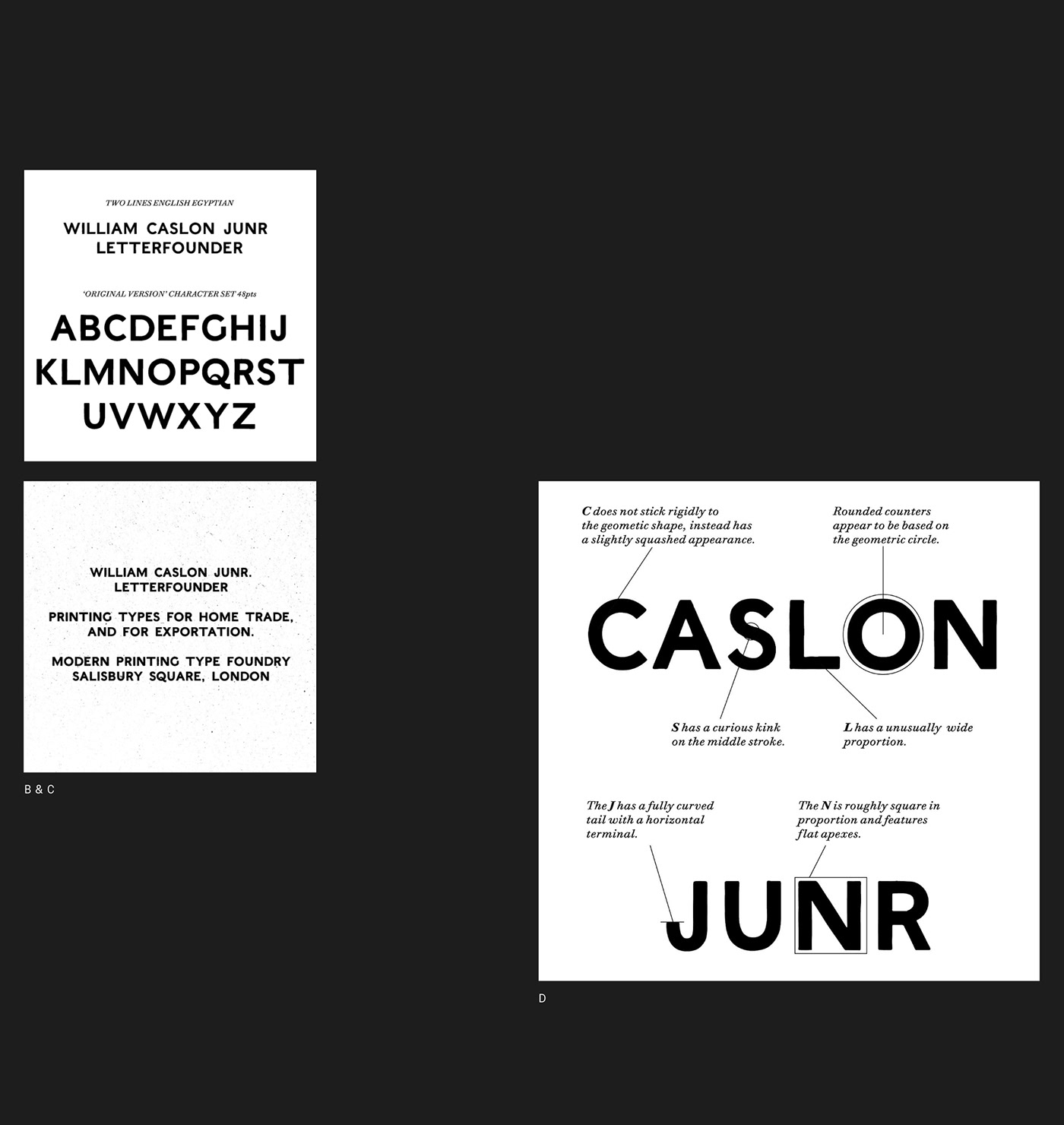
Rework carries the accumulated influence of multiple eras and processes. From the stately, square proportions of ancient monumental Greco-Roman inscription, to its 19th century revivals, as commercial architectural lettering, or as William Caslon IV’s Two Lines English Egyptian, the very first printed sans.
While the influence of copperplate engraved type and its later phototypeset counterparts (such as Gary Sackers’ eponymous Gothic) is evident Rework’s uppercase, the lowercase draws from the idiosyncratic character of Stephenson Blake’s 19th century Grotesques.

PART MAN, PART MACHINE
Rework’s personality is defined by its contrasting industrial and humanistic qualities. The processes that shaped its ancestors – stone carving, metal type, copperplate engraving, phototypesetting – each leave their mark, giving Rework a decidedly pre-digital feel and a sense of robust physicality.
Rework’s more overtly mechanical traits – its perpendicular terminals, and the slightly squared ovals of its rounded characters – are tempered by the humanistic proportions of its uppercase, and moments of irregularity and unexpected contrast in the lowercase letterforms.
It’s this combination of qualities that lends Rework the feel of a thing shaped over time; revised, rebuilt, and reconditioned. Like a perpetual work-in-progress for a world that’s always changing.


© 2022 Sociotype. All Rights Reserved.


