

CJCO X Kokoro Brand Identity | Campaign | Web Design
From the Japanese word connecting ‘mind, body and spirit’, Kokoro is a not-for-profit working in radical collaboration with a global network of allies, partners and funders to drive real action in the mental health field.
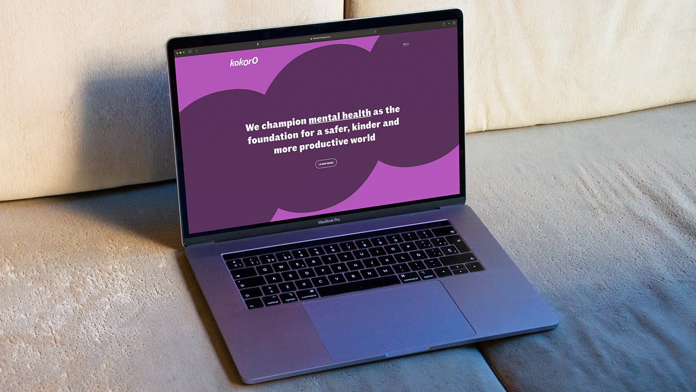
Founded by Natasha Müller, Kokoro has set out to champion mental health for a safer, kinder and more productive world. An ambitious feat for an organisation led by mightily ambitious change makers Jules Chappell, CEO and Gaia Brignone, Head of Community and Communication.
With such a powerful purpose established, Kokoro needed a kick-ass brand identity to boot.

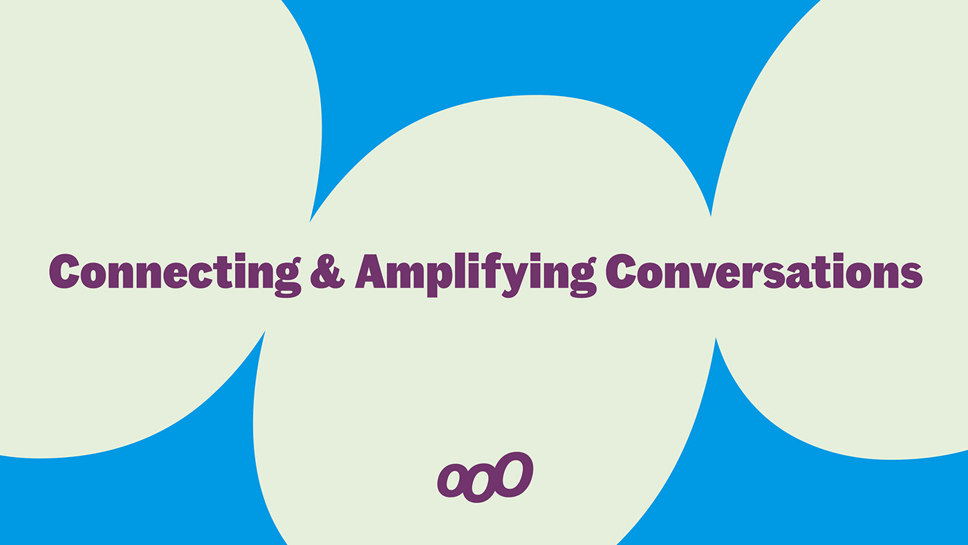
Inspired by the impact and action of manga comic books, the new identity boasts a masthead-like logotype, impactful typography and a visual language built around the idea of connecting and amplifying conversations. The speech bubble form is expressed across the identity in both static and animated formats, most notably in the logotype and short form brand icon — the purest distillation of the core idea.
It’s vital for Kokoro to promote positivity as an antidote to negativity in the world, therefore a graphic illustration style has been developed to encourage the discussion of tough subjects without the harsh or overwhelming impact that photography often has. This is a brand identity and communication toolkit to promote positivity, to encourage action and drive engagement.