


Tamworth Country Music Festival - Re-Branding
Academic Work 2021
Tamworth Country Music Festival was looking into potentially re-branding their event. The rebrand had to be comprehensive and radically different while reflecting the vibe and atmosphere.
A survey completed by Pegg & Patterson in 2008 studied the visitors motivations and experiences. From the usable 1320 surveys the majority of those surveyed were female (59%) who were between the ages 45 – 64 (60%). From the questions about reasons for attending 52% attended for their love of country music and almost 20% each motivated by friends and family and the fact that they have always wanted to come.
The Tamworth Country Music Festival is a week long festival held in the self-made ‘Country Music Capital’ of Australia. Don’t let this small town fool you, this is the largest country music festival in the southern hemisphere. On a global scale TCMF is the second biggest country festival following behind Nashville, Tennessee.
The Current Logo
The festival was an integral part of the radio channel 2TM’s strategic plan to create the Tamworth Country Music Festival to highlight and lead up to the climax of the festival; the Country Music Awards. Over the years various events have been included throughout the festival week such as the Bluegrass Championships,
Hands of Fame, The Rodeo just to name a few. ("Origins of the Tamworth Country Music Festival", 2020)
Over the 10 days the festival sees 700 performers, almost 3000 events with over 300,000 festival goers. ("Home - TCMF", 2020) With an estimated population of 62.000 people for this one week every year the population is more than tripled. With the tourism industry worth over $110 million yearly. (“Tamworth Population 2020 | Population Australia", 2020)
While the festival targets country music fans and families it’s interesting to see the breakdown of festival goers. A survey completed in 2008 over five days of the festival set out to and who was attending and why; as they studied Visitors Motivations and experiences. From the usable 1320 surveys the majority of those surveyed were female (59%) who were between the ages 45 - 64 (60%).From the questions about reasons for attending 52% attended for there love of country music and almost 20% each motivated by friends and family and the fact that they have always wanted to come. (Pegg & Patterson, 2010)
Reasoning
The new rebranding for the Tamworth Country Music Festival will bring the branding into line with the opinions on the event, iconic.While the event puts Tamworth on the map, the new rebranding will support the iconic festival, doing it justice.
Firstly looking at the font, Calvous provides personality to the branding while also letting the viewer know what the ‘Tamworth Country Music Festival’ is without going past the first line. Heirachy and importance is also given back to Tamworth. Long and gone is the guitar and stripes, making way for the new guitar pick symbol. The reason why this design was chosen was because of how the pick resembles the very well known icon of a location on Google Maps. This is where the rebranding starts to tell you to be there, because you know you want to be.
Inside the pick features a side of the guitar shape created into a mountain, where for many it may no longer resemble a guitar. The main symbol includes two people enjoying a festival together, one on the others shoulders waving their akubras.
As stated earlier the colour palette will remain with the Yellow and Red. The Yellow was added into a gradient to give it that afternoon golden sun resemblance. Because of the contrasting colours and inverting helps to produce
this strong, eye-catching piece and really adds and makes the symbol.

Proposed App Icon
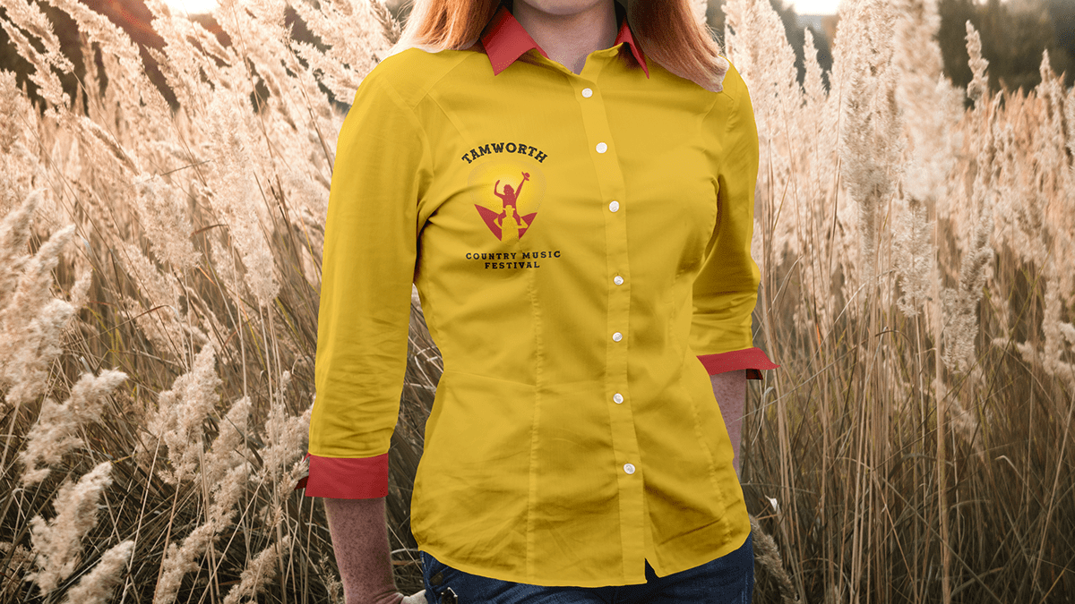
Proposed Promotional Clothing


