In the heart of historic canal belt of Amsterdam, master florist Alexander founded AP Bloem to create floral masterpieces, inspired by the lush still life of the Dutch Golden Age. Design & Practice created a brand identity that strikes a balance between luxury and abundance on the one hand and artisanal modesty on the other, reflecting the informal take on luxury typical for Amsterdam.


The shop is located in the Kerkstraat, situated between 2 major canals and minutes away from the the Rijksmuseum - which vast collection of floral and still life paintings are an endless source of inspiration to the team of AP Bloem.


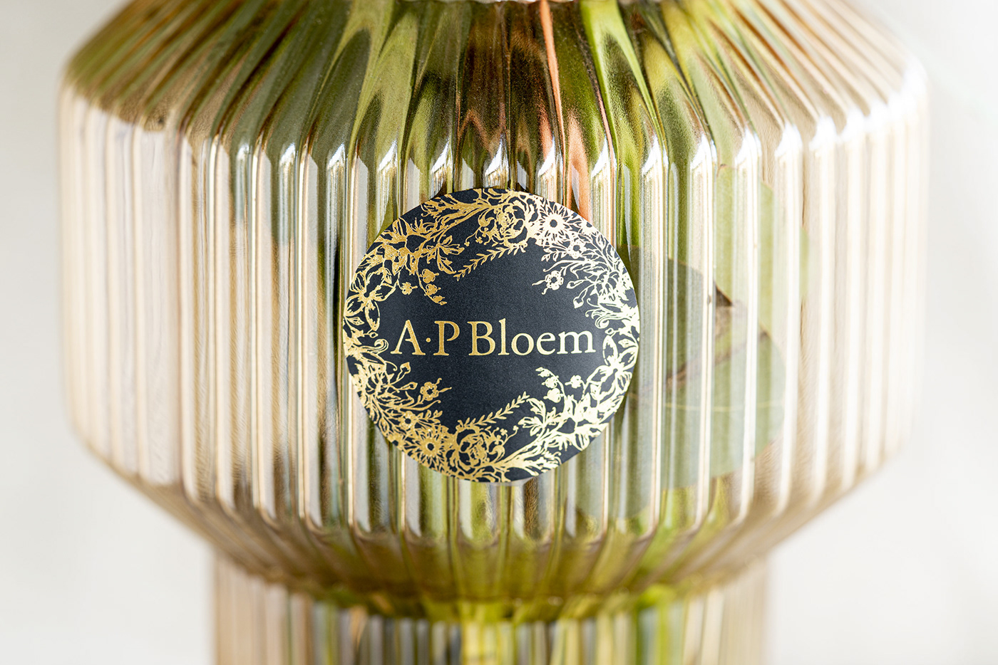
Along with the filled logo, which allows for more versatility, we also created their heritage logo, the A.P Bloem type surrounded by an ornate etched floral composition, to be used when size and context allow. The logo was hand-drawn to strike a fine balance between the opulent heritage of Amsterdam's Golden Age and the rustic and effortless floral compositions of the florist.


We developed a collection of printed collateral using both heritage printing techniques - the cards are printed on recycled board using the old letterpress technique - as well as the highest quality natural cotton printed ribbons, sourced from a high-end fashion supplier in Paris. The logo was meticulously drawn by hand to reflect the crafted quality of each bouquet, and animated to symbolise growth.