


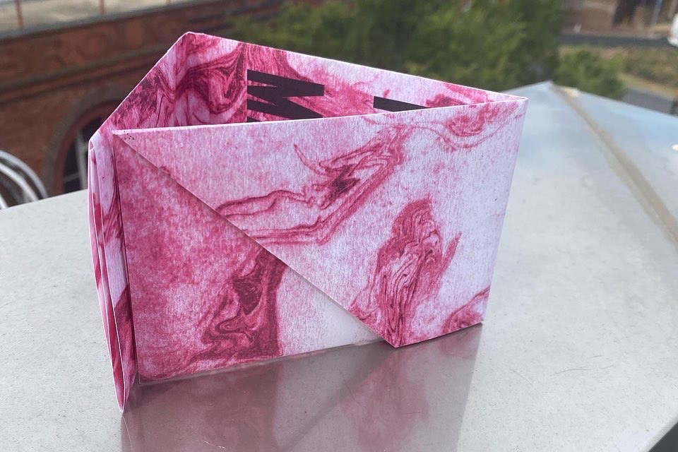
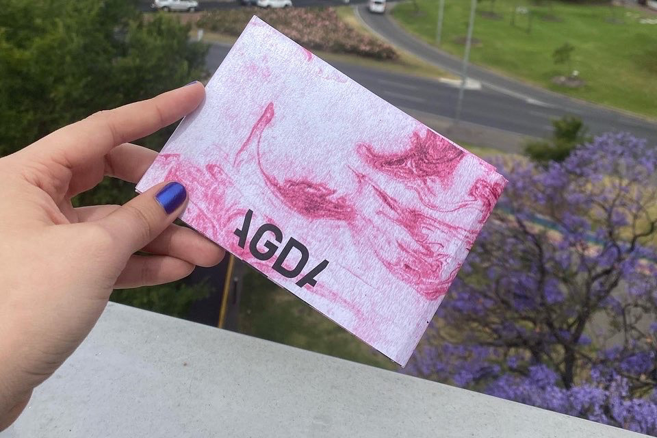
The brief was to design a double-sided A3 poster that provides relevant information for graphic designers about the industry. It had to be foldable into a smaller size and it had to include a large quote on one side with the AGDA logo and the information on the other side.
After reading the brief I decided I wanted to take a different approach format the examples I had seen, I wanted my poster to highlight the typography whilst keeping it quite simplistic. I wanted to create a pattern or a print that had an organic feel and create a strong contrast against the type. After conducting some research into different techniques I landed on Suminagashi, which translates to floating ink.
Suminagashi originated in Tokyo, it is the process of marbling plain pap with water and ink to transform it into something vibrant and colourful.
The process involved placing small drops of ink into water and creating a marbling effect that then can be transferred into paper. I was very drawn to this technique because I knew I would make unique patterns that would make the type stand out and I could play with colours and learn something new.
After acquiring the right materials I started learning how to properly use this technique and I started creating unique fluid-like prints until I was happy with the amount of detail I created. I knew I wanted the pattern to have some colour but I thought it would be best to do that on the computer since I had limited materials.
After reaching the desired pattern I thought would work best with the typography I transferred them into the computer and started playing around with colours. I choose a bright Fluro pink because the contrast it created with the dark parts of the pattern was quite striking and eye-catching.
When choosing the right typeface I knew it had to be bold, clean, and sans serif. I experimented with a few alternatives but my final decision met the requirements I had in mind.
The final design is very unique because it is a mix of organic and fluid-like graphics against the straight bold typography it balances out and it makes the composition very appealing.


