

Knoun is a verbal design studio. They specialise in brand verbal identity, brand personality and language, naming, copywriting and more. Offering a premium tailored service,
Knoun distinguish themselves by committing to every project on a truly personal level.
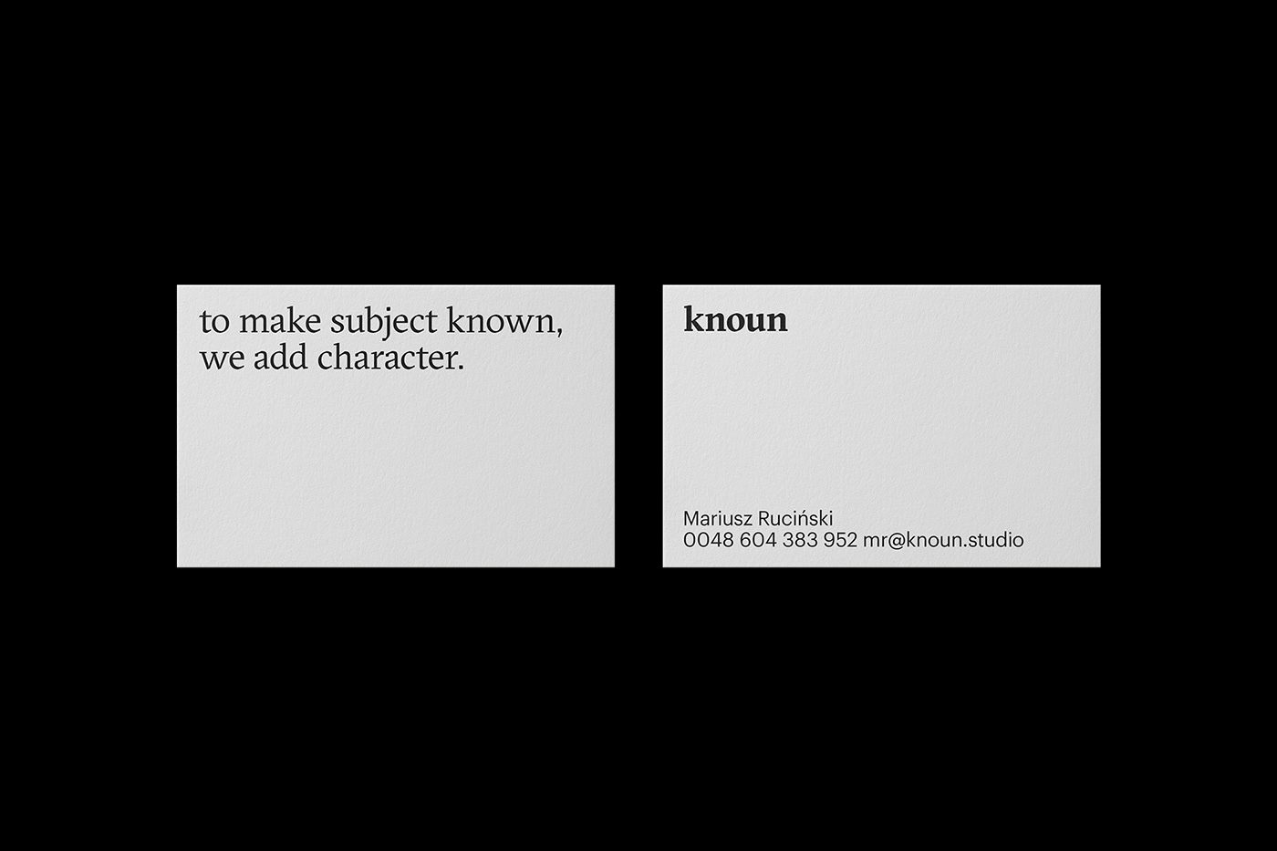
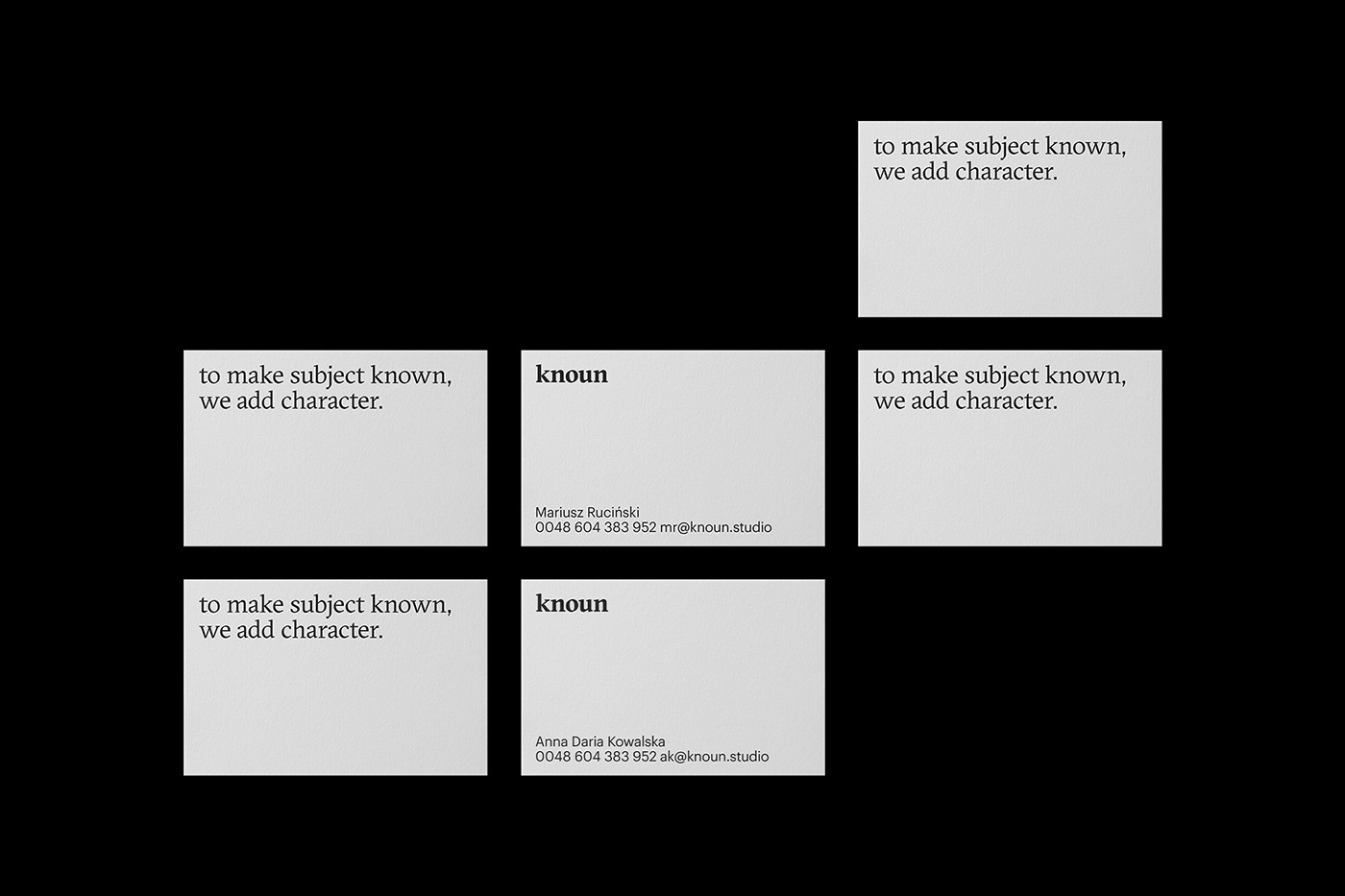
The studio’s own verbal identity was designed to be both subtle and sophisticated.
The studio’s own verbal identity was designed to be both subtle and sophisticated.
The word “Knoun” is a neologism, deliberately open to different interpretations and pronunciations, yet consistent with the greater brand identity.
The claim “To make subject known, we add character” gently plays with rules of
English grammar, rewarding the inquisitive with elegant ambiguities.
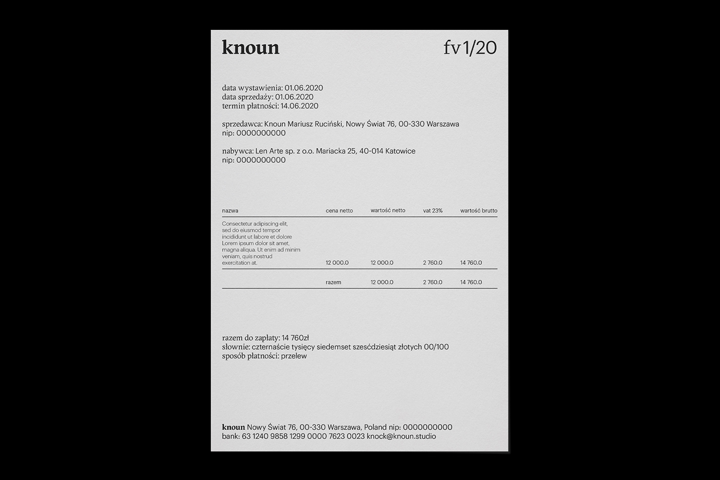
The main typeface, GT Sectra, was first designed for a German newspaper and later used by numerous periodicals all over the world. It is graceful, sophisticated, and accessible. The secondary typeface, Graphic, is both aesthetically complementary and readable.
The main typeface, GT Sectra, was first designed for a German newspaper and later used by numerous periodicals all over the world. It is graceful, sophisticated, and accessible. The secondary typeface, Graphic, is both aesthetically complementary and readable.
The overall visual design – by channelling a style that is effortlessly minimalist – invites the viewer into the very essence of the brand – words.


Client: knoun
Year: 2020
Fonts in use: GT Sectra + Graphik
Fonts in use: GT Sectra + Graphik
Communication Design: Mariusz Ruciński
Art Director & Graphic Designer
Thank you


