
A NEW BRAND
We modified the main typography adapting it to the arches that are constantly found in the architecture of El Poble. In this way, we have managed to capture the essence of the place with a minimalist and typographic logo.


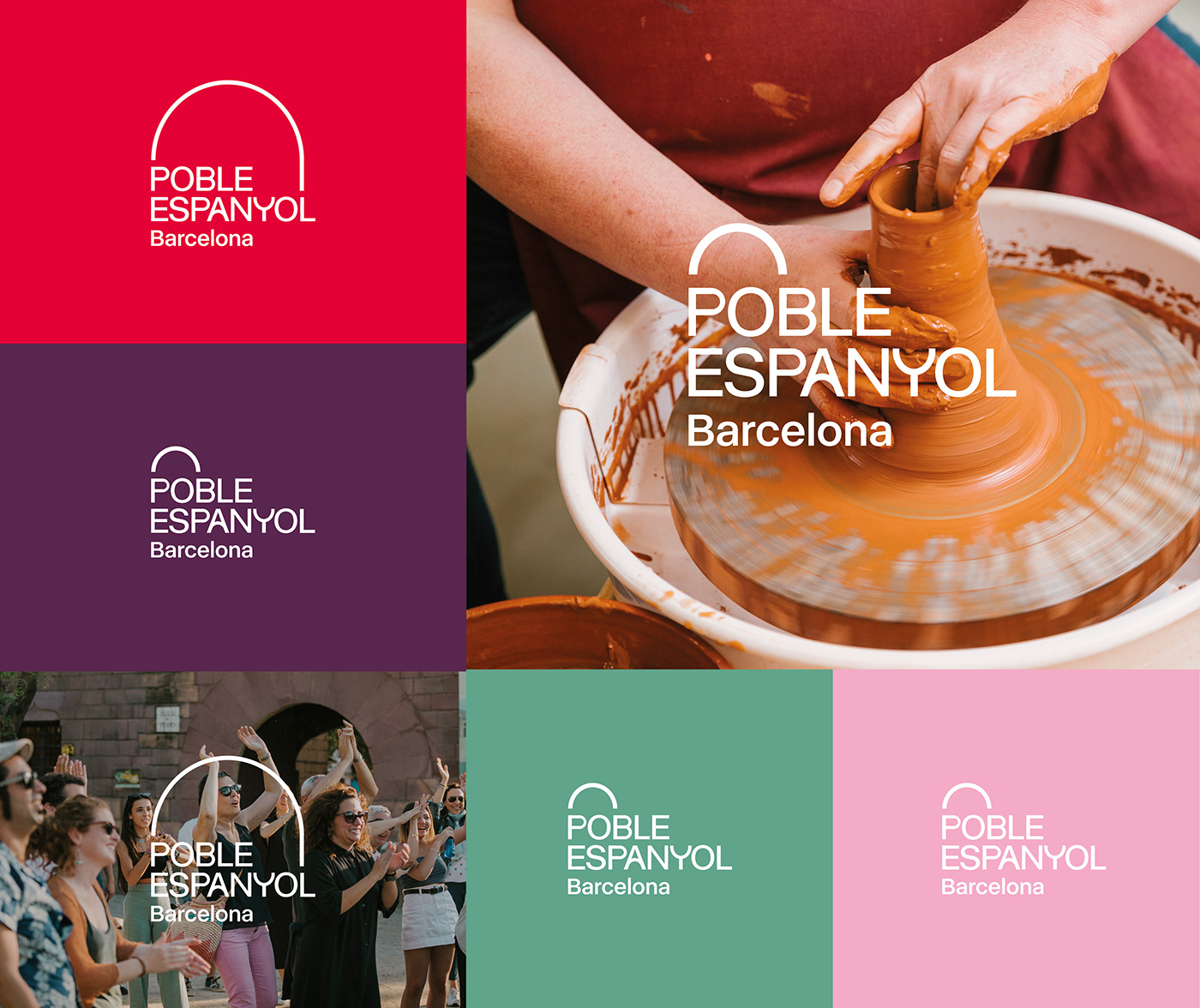


VISUAL SYSTEM
The system is formed from a base grid and geometric shapes that fit exactly into it. The main element is the arch, and this is accompanied by squares and rectangles. This system is useful for separating information and images into ordered blocks.


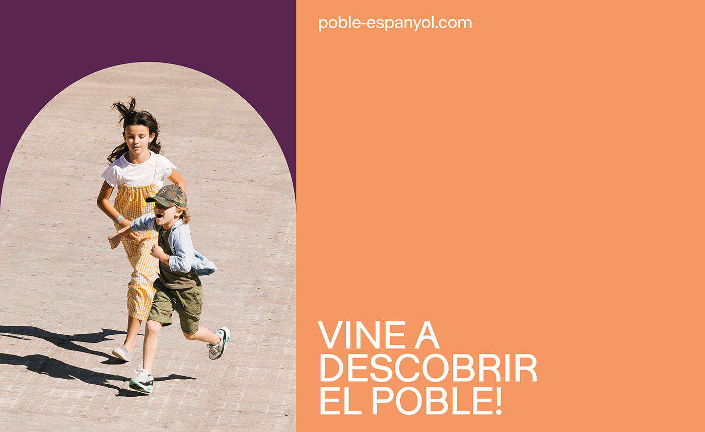
WEB DESIGN
The website is based on the visual grid system to organize elements in an intuitive and very visual way. Rounded shapes and main colors predominate to separate content.