Olaqin — Visual identity
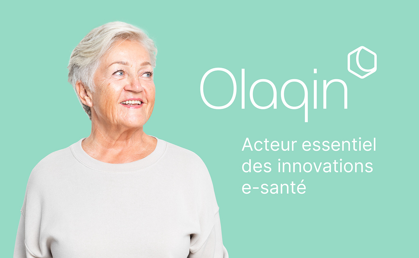
From key player to leader in e-health innovations
From key player to leader in e-health innovations
Olaqin is a company that contributes to the modernization of the French healthcare system. By facilitating the administrative procedures that consume medical time, Olaqin serves private practitioners, pharmacists and health institutions with solutions and services that simplify their daily lives.
In 2021, Graphéine worked with Olaqin on the evolution of its visual identity and the creation of a modern and playful graphic territory that humanizes and organizes the brand's solutions.
In 2021, Graphéine worked with Olaqin on the evolution of its visual identity and the creation of a modern and playful graphic territory that humanizes and organizes the brand's solutions.


A brandmark that evolves to better express itself
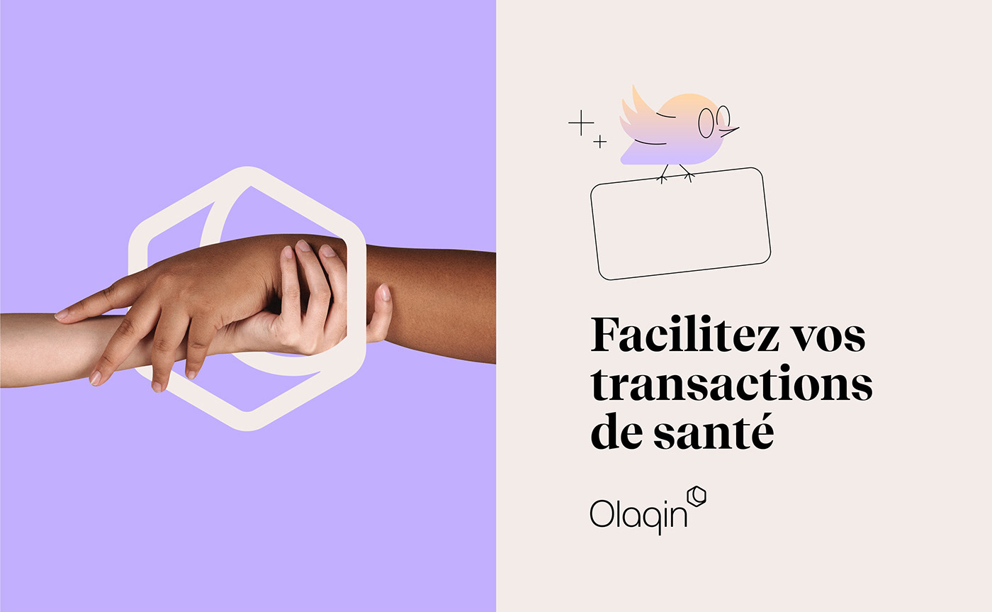
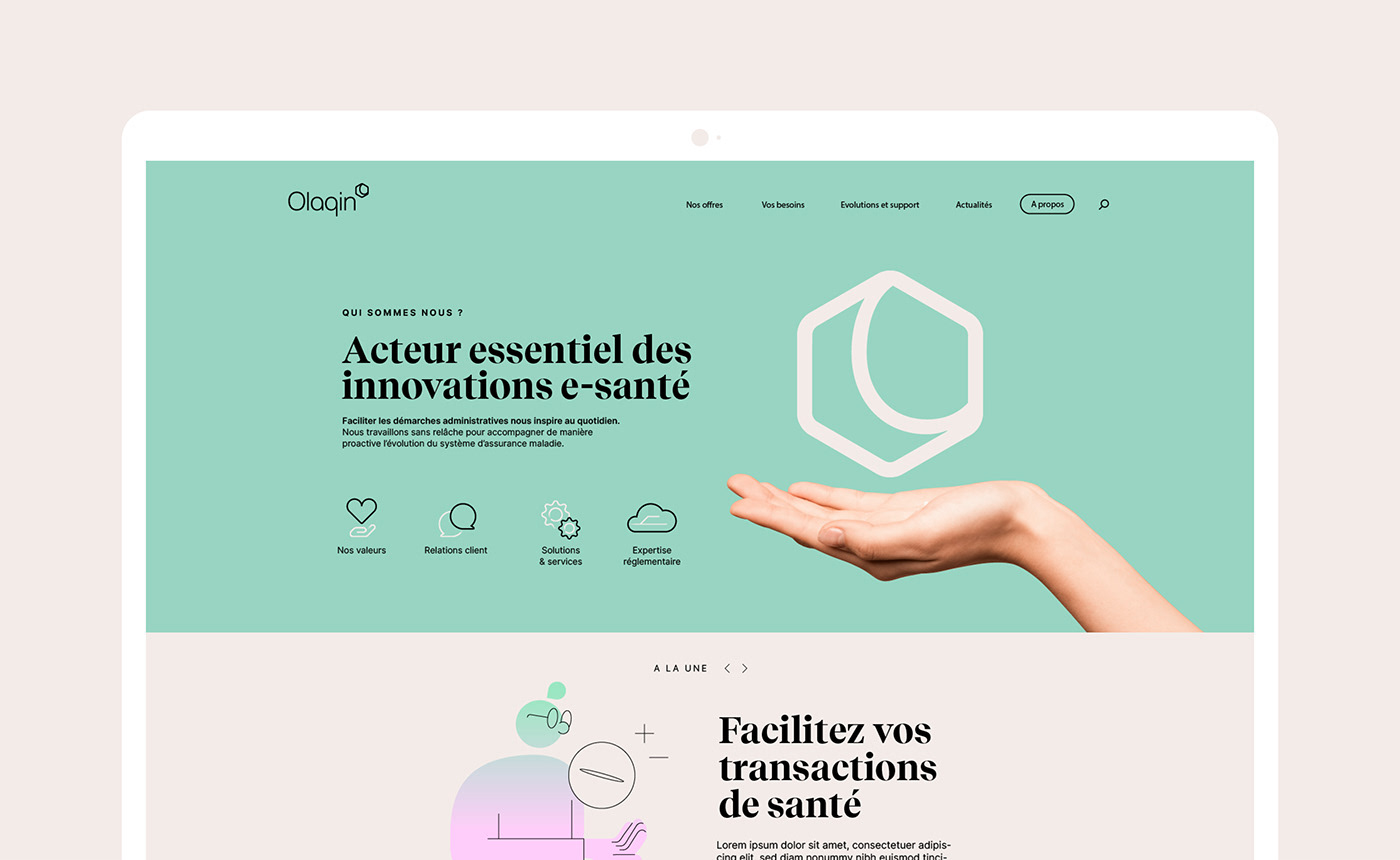
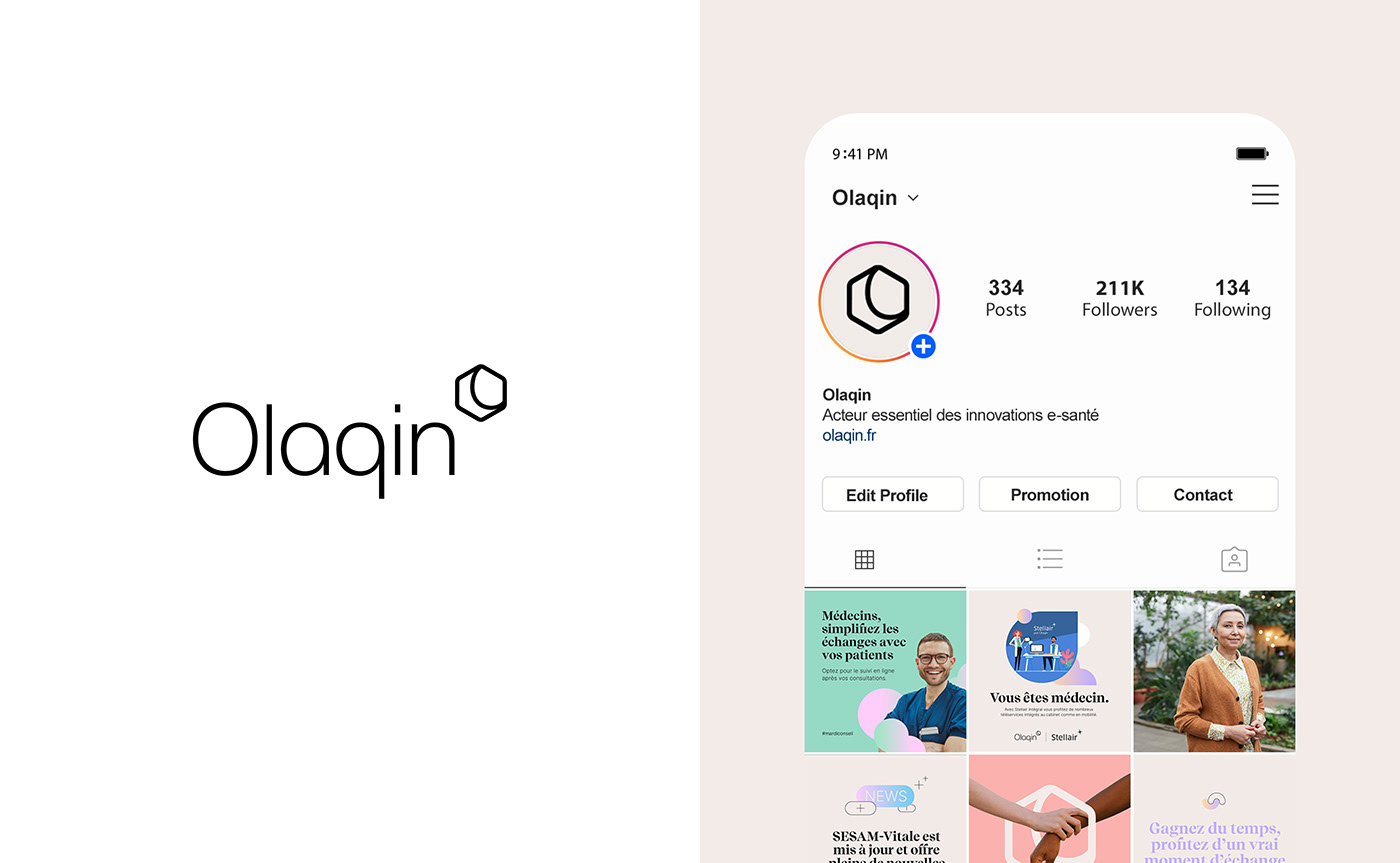
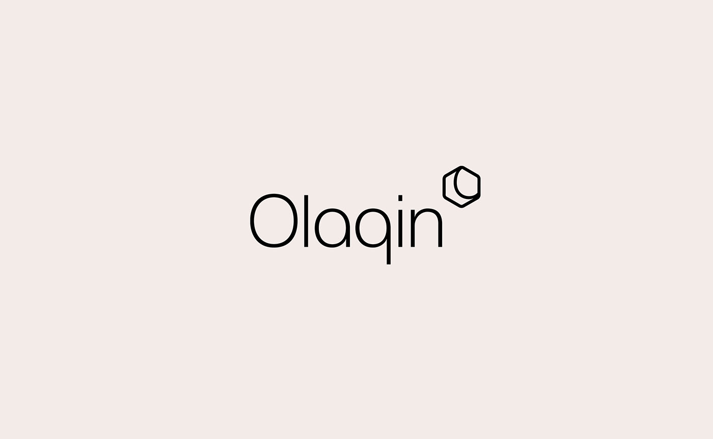
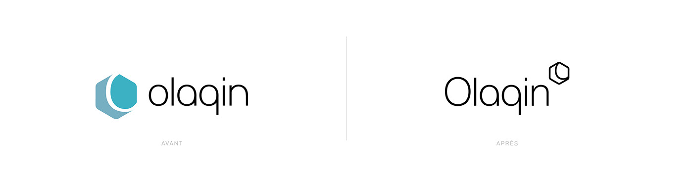
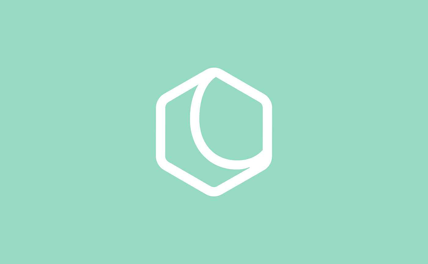
The logotype had a visibility deficit. Its emblem associated with colored backgrounds or photographs was barely visible. We gave the existing logo a facelift to allow maximum exposure on all communication media. This evolution gives the brand more elegance and asserts a prestigious image.
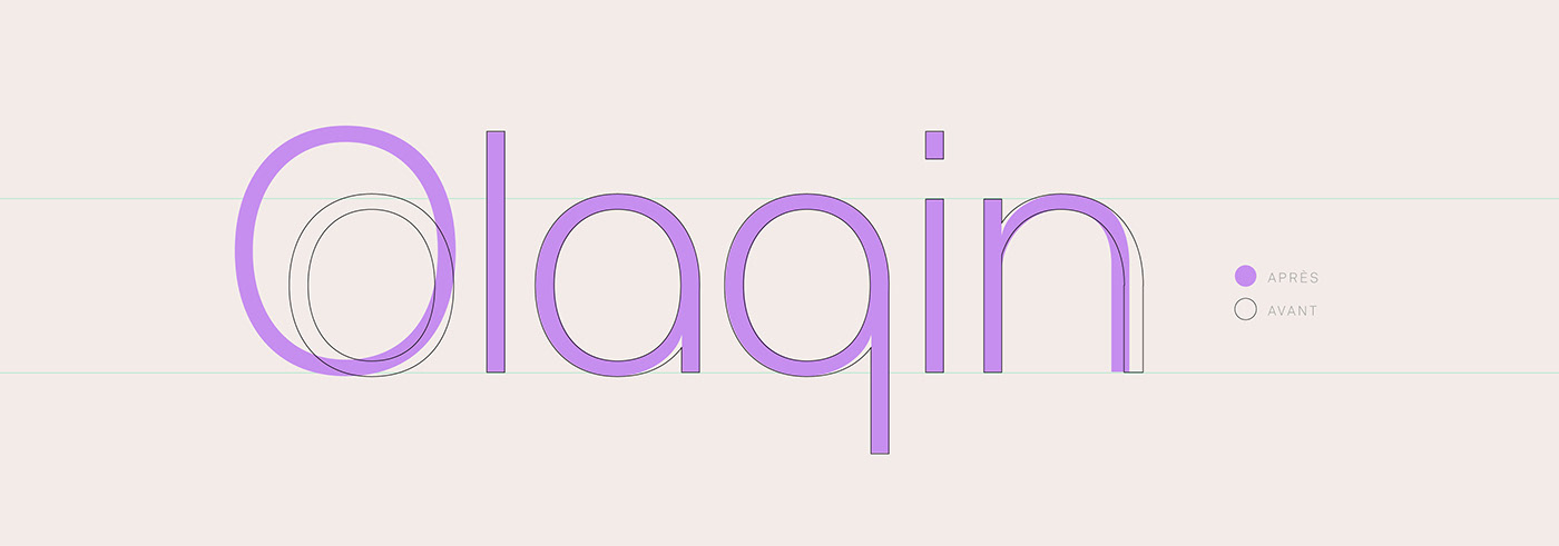
Olaqin’s typographic bloc is also enhanced with a capital O for a strong statement. In order to avoid redundancy of the "Oxagone" emblem and the first letter of Olaqin, the emblem is now positioned as a superscript of the wordmark. The emblem, in outline, works perfectly with the iconography and interacts directly in association with it.


A « human first » brand territory
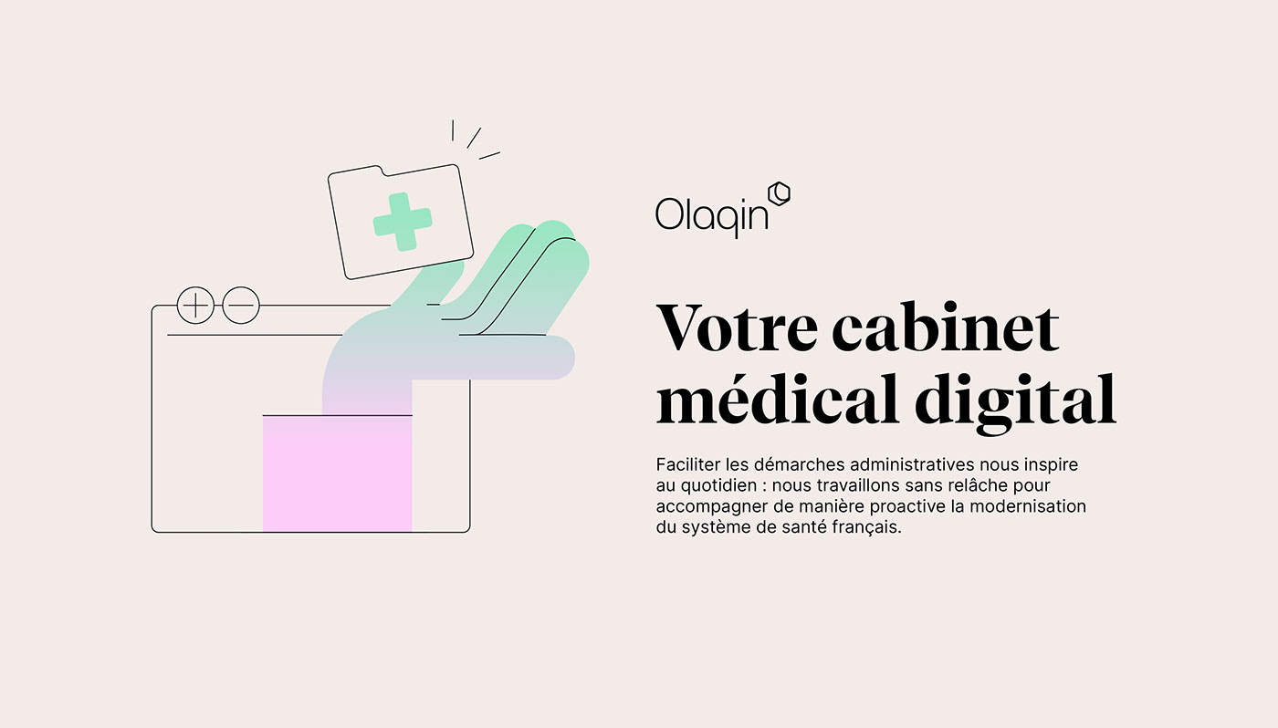
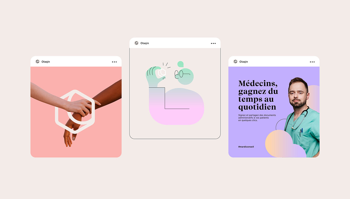
Until now, the corporate guidelines used impersonal iconography taken from image banks. The iconography of the new design combines photographs that embody care and medical attention with a world of colorful and poetic illustrations. The main objective was to propose a distinctive iconography that communicates the idea of an interface service for patients and health professionals.
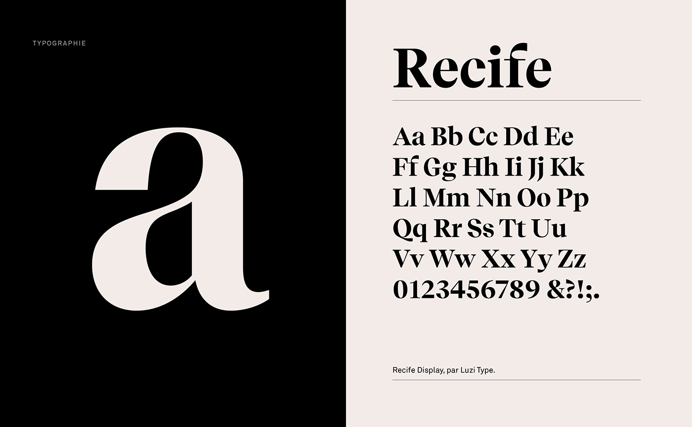
The organic quality of the solid and smooth lines of the Recif typeface, combined with the asperities of its serifs, gives flexibility to the layout. This typographic choice contrasts with the « sans-serif » typographic style usually used for digital. It’s a typographic choice that humanizes the brand.
The pastel chromatic environment corresponds to the care function of the medical universe in which Olaqin operates. The gradients directly evoke the digital context of the brand's services.


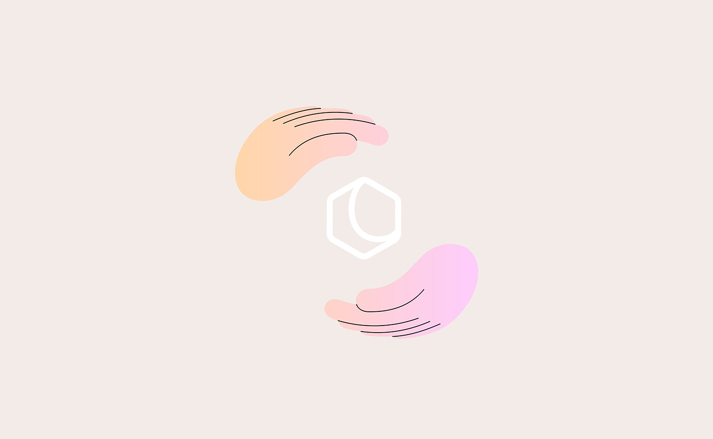
Cartoonish llustrations at the crossroads of health and digital
An illustrated set of images has been created to complement the photographic environment and to affirm the identity of the Olaqin brand.
This vocabulary of shapes mixes medical symbols and pictograms extracted from the digital environment in order to best represent Olaqin's business sector.
The illustrations are directly inspired by the shapes of the Olaqin logotype. Levitating forms that evoke the simplicity of Olaqin digital solutions.
A strong and understandable Olaqin brand
These strategic and graphic changes allow Olaqin to be anchored as a leader in e-health innovations while distinguishing it from its competitors. This new brand image, soft, dynamic, readable and refined, gives a second impulse to the company and allows it to continue to innovate for our health, for all of us.