

_
Game Spot - Rebrand
GameSpot is an American video gaming website that provides news, reviews, previews, downloads, and other information on video games. The site was launched in May 1996.
As gaming is one of my hobbies, I decided to undertake a rebranding project for the GameSpot site's logo as a personal side project. The goal was to create a simpler and more versatile logo that retains its unique character while resonating with the site's audience.


After collecting some relevant images and conducting research about the site's competitors, I created a moodboard that would act as a guide throughout my sketching process.
After sketching different concepts, I settled on the idea below.

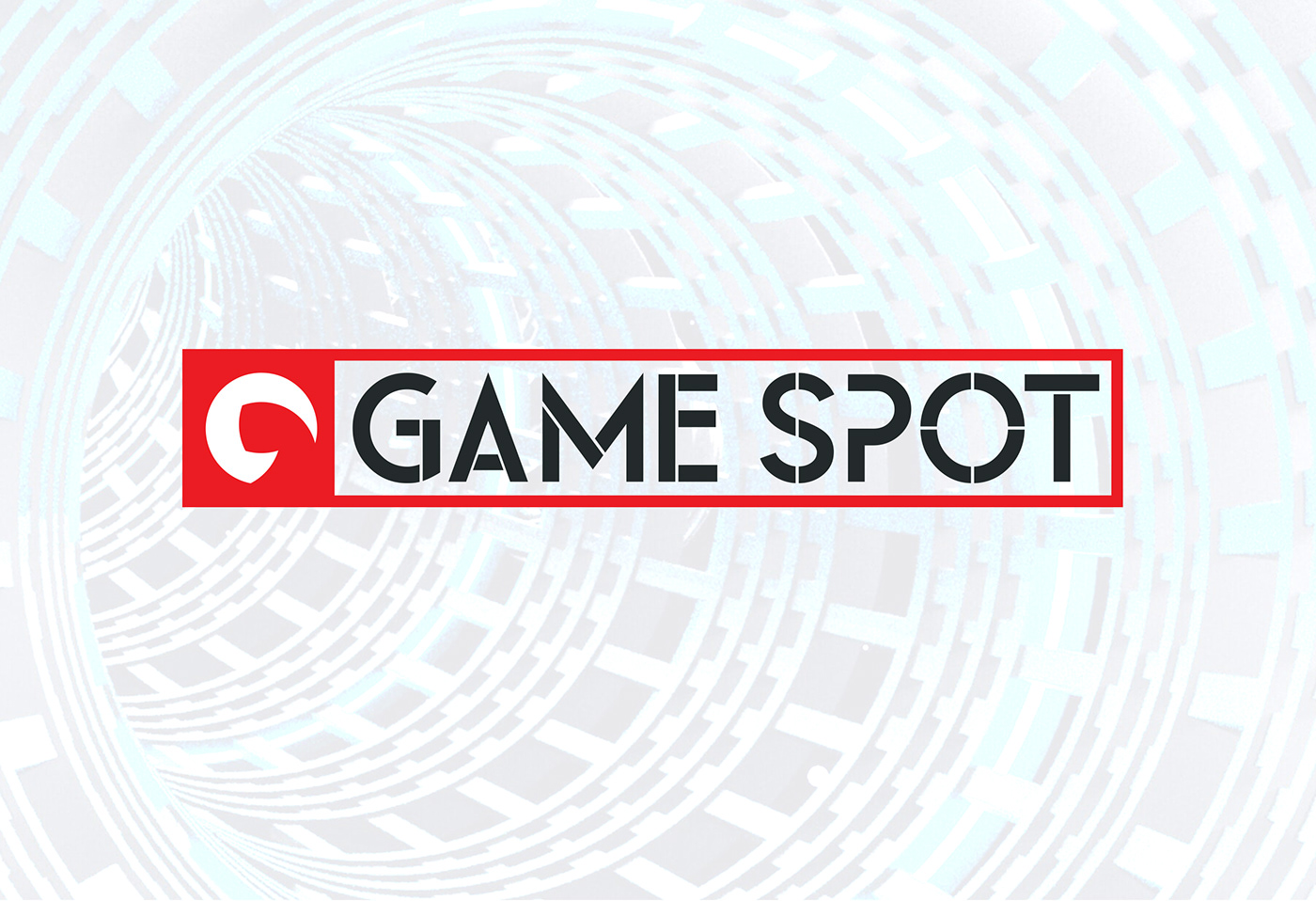
The logo is designed by using the golden ratio (circles) to create the curves, which represent the flow and action associated with gamers when they play video games. These curves are based on the first letter of the company's name, 'G' for GameSpot. They symbolize the dynamic nature of gaming, where players take actions that lead to mode changes.


For the brand color, I simply darkened the original flame red hue to increase contrast and enhance sharpness. This choice aligns with the brand's core values of being powerful, energetic, enthusiastic, and exciting. Additionally, I incorporated a custom typeface based on the Leaner font to further enhance the brand's identity.


Thanks For Watching!!
Do you need help with designing your logo or Brand Identity for your business? I'd love to collaborate with you and create something exceptional that resonates with your audience and establishes a strong emotional connection.
For work inquiries, please contact me at youkanaelhassen@gmail.com
Let's bring your vision to life!!

