LET'STOCK 📦
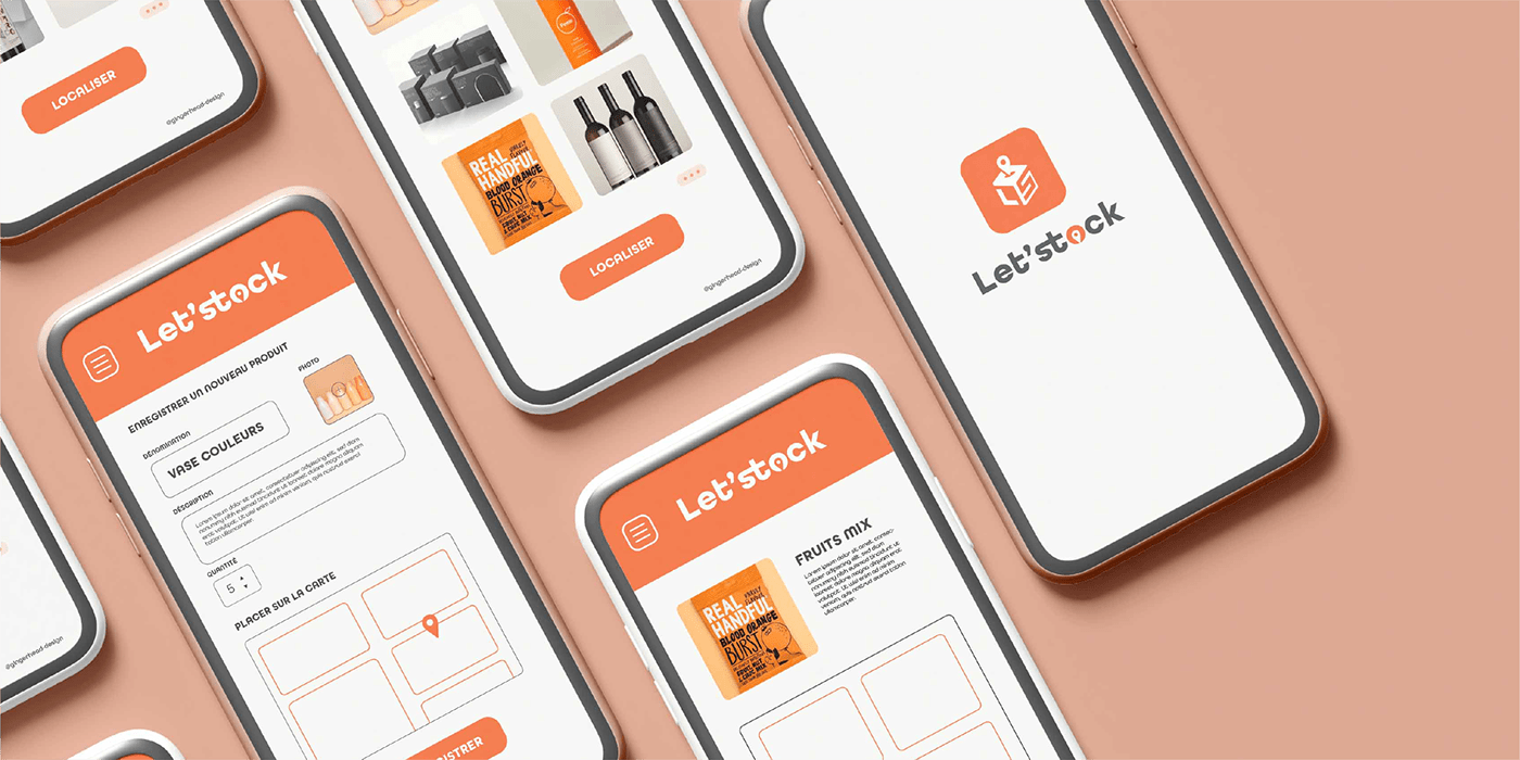
Let'stock is a storage management application. It allows companies with a warehouse to easily and quickly locate stored products.
Modern, geometric and minimalist, the logo has been designed to reflect the brand's values and activities. The L and S of Let'Stock are found in the logo, forming a cardboard box in reference to the logistics sector. The location pin illustrates the very concept of the application.
The colours, orange and charcoal grey, have been defined for the visual identity as they reflect the field of activity and are easily identifiable and recognisable by all.