DAMIR DOMA at Pitti W
Magazine Feature / Editorial Design
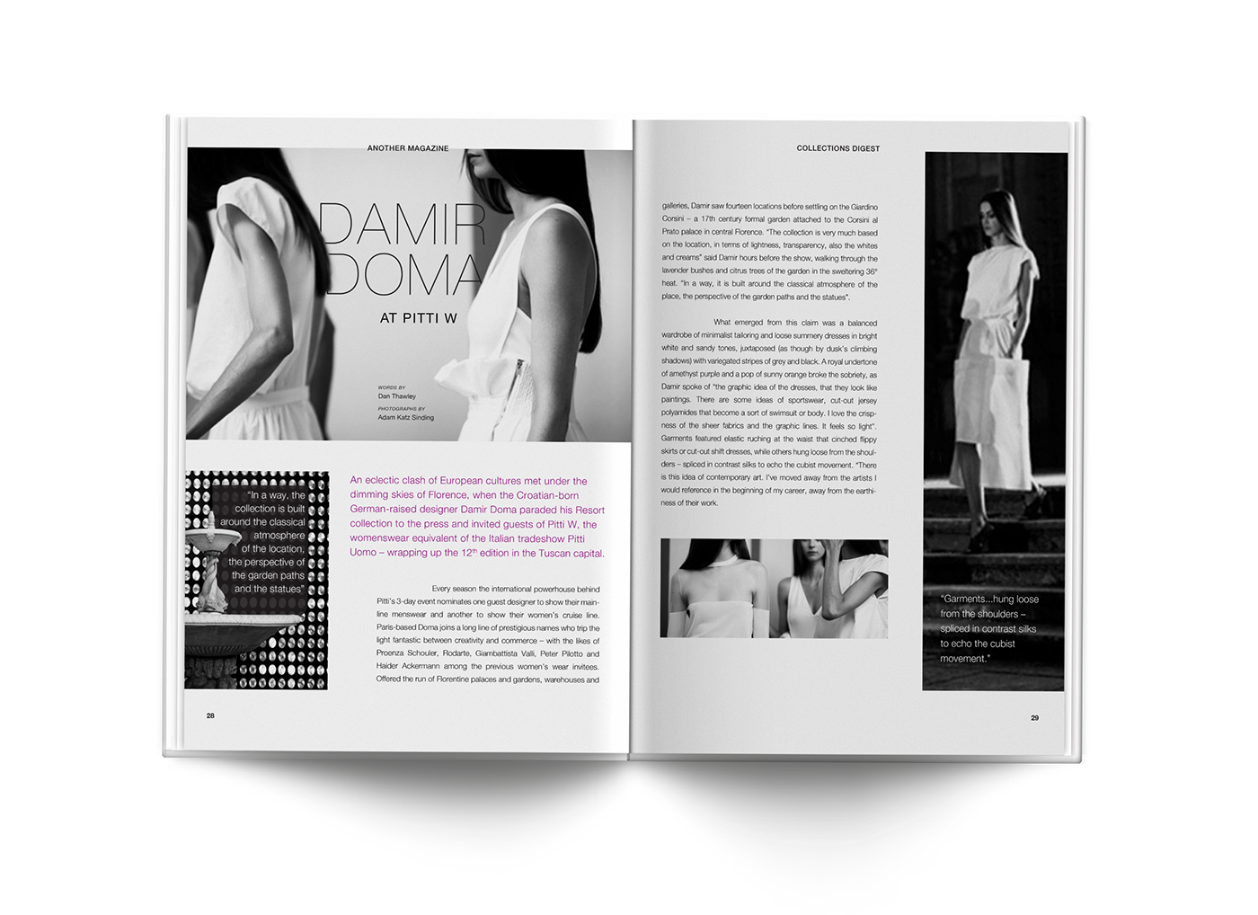
The layout is inspired by the article itself and the way it describes Doma’s collection. The text is held in a sleek and structured manner that at times stands out with subtle hints of purple, contrasting lines and adaptive forms.
The header signifies a sleek and polished collection, that is minimal and monochromatic. The typography merges, blends and complements, emulating the runway pieces as they adapt to their architectural surroundings.
Article Spread
The feature is characterized by a monochromatic scheme all throughout. The decision is based on the idea of a fashion editorial that echoes the runway pieces. To that end, a hint of purple is added for interest and to signify lavenders being one of Doma's sources of inspiration for this collection.

Photoshoot Spread
The use of negative space is optimized for simplicity, while the inverse color treatment of the typography gives a nod to the contrasting patterns prevalent in Doma's collection.


Editorial Design
2014
