

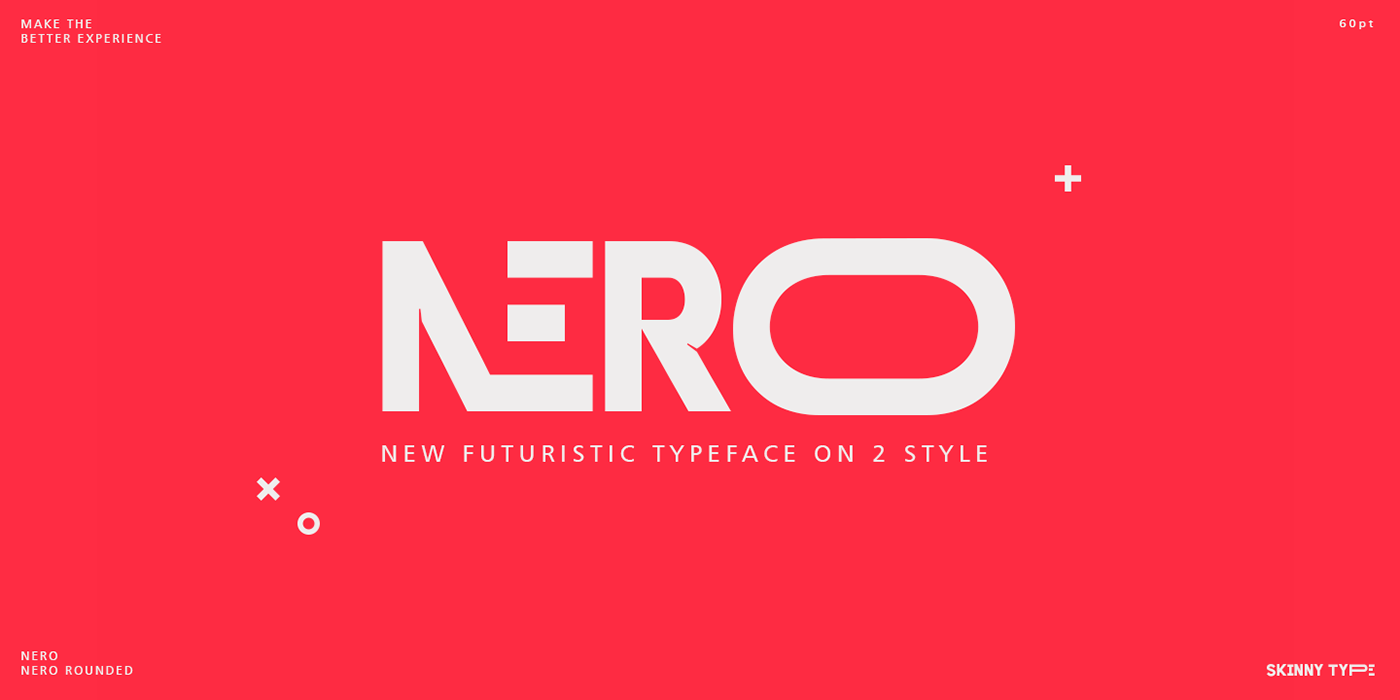
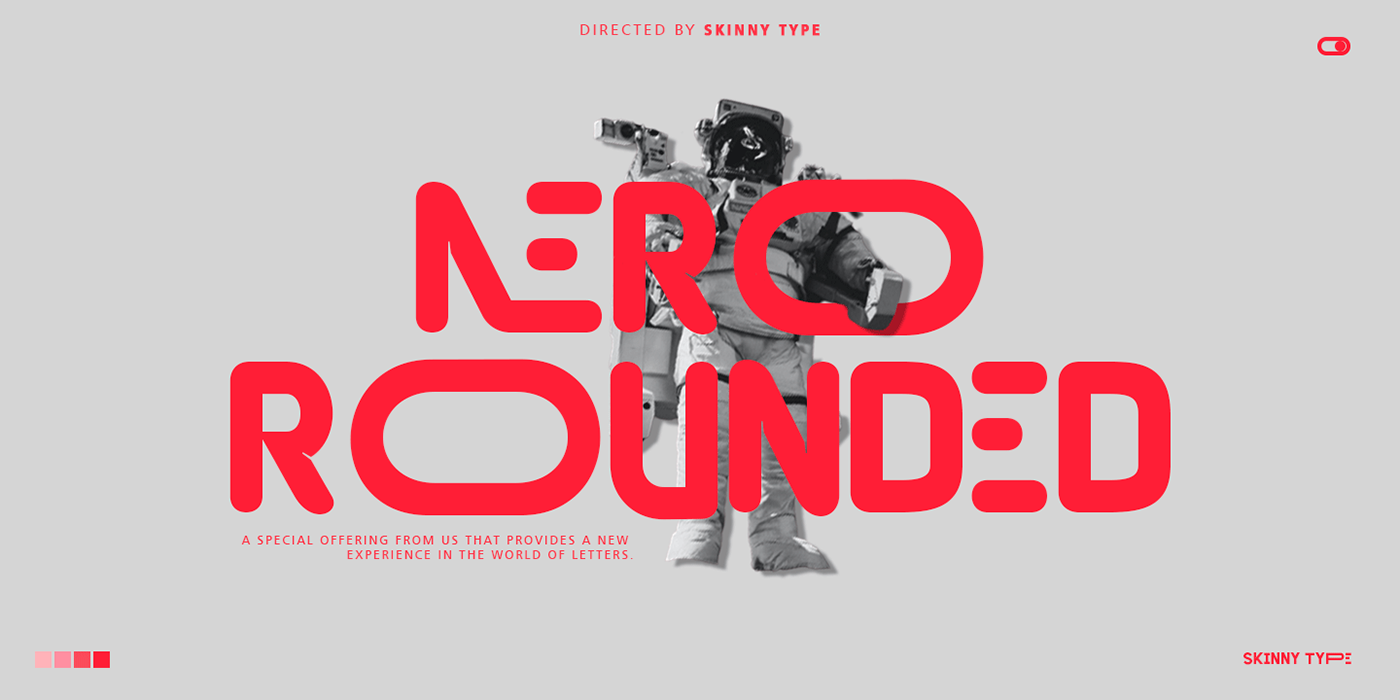
Nero is built on the Nero framework, our popular family of geometric types. Like the sans-serif Nero letterform, it has two contemporary look and feel styles. Echoing late 20th-century modernism, the Rounded's overall look is clean and sleek, more ephemeral and dynamic than pared-down bourgeois asceticism.
Nero's place in font history is a complex one. Praised for their readability and also at the same time their fashionable qualities, they look very modern and nostalgic, easy to read and very stylish, authoritative and fun. Nero and Nero Rounded when combined, offer 2 styles to suit all text types and sizes. Both are excellent for short texts that require a sense of urgency or playfulness.


I can't wait to see what you do with Nero! Feel free to use the #Skinny_Type and #Nero font tags to show what you've done
visit my Instagram : https://www.instagram.com/skinny.type/
Thank you!
Shocka Family is available for commercial download here
Now Available On Creative Market


