


In El Passatge, the new culinary offering of the Hotel Murmuri, there is a clear focus on Mediterranean flair, the cosmopolitan energy of Barcelona and bistro characteristics. The goal was to reinterpret traditional cuisine, adding freshness and a close and easy approach to the restaurant business that would appeal to a young, dynamic crowd. The corporate identity had to reflect these values and present El Passatge as a fresh, young, cosmopolitan, Mediterranean and proudly Barcelonese restaurant.
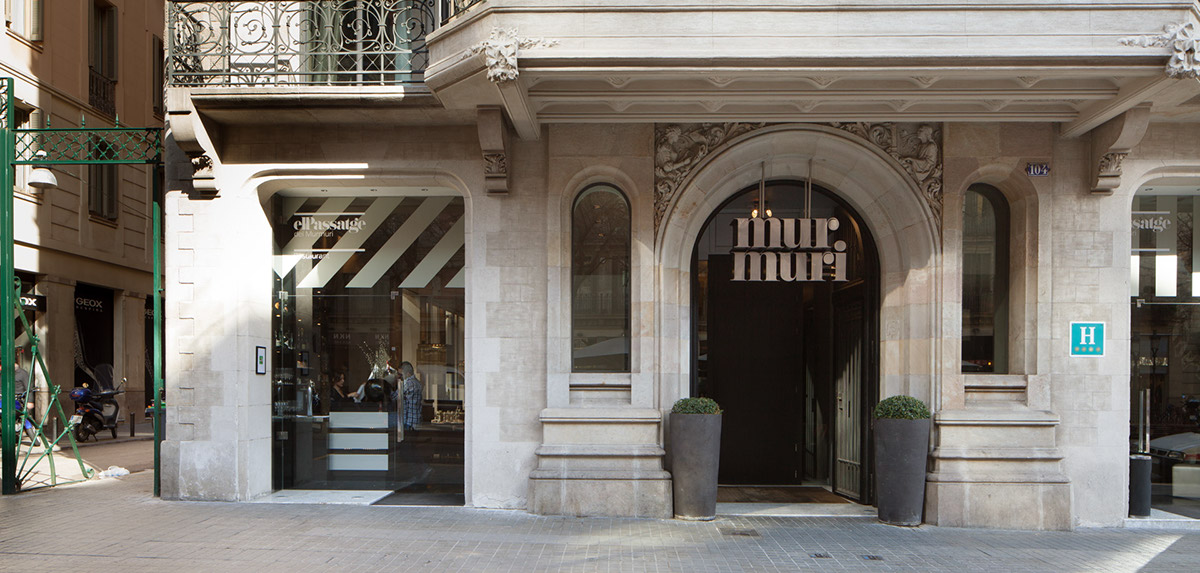
The logo employs a simple play on the hotel’s corporate font, eliminating the serifs between the “l” of “el” and the “p” of Passatge” to accentuate the passage way between the letters as an allegory for the passage where the restaurant is located. We brought in stripes as a graphic element as something very present in marine settings, especially the Mediterranean. Picasso shirts, stalls on the beach, lighthouses, umbrellas, hammocks… There are dozens of objects that recall this graphic motif. In addition, to complement the interior design, we asked nine artists to create nine posters that reflect the character of El Passatge, using stripes as a graphic resource, thus achieving additional variation that complements the graphic language and also brings richness and depth.
The logo employs a simple play on the hotel’s corporate font, eliminating the serifs between the “l” of “el” and the “p” of Passatge” to accentuate the passage way between the letters as an allegory for the passage where the restaurant is located. We brought in stripes as a graphic element as something very present in marine settings, especially the Mediterranean. Picasso shirts, stalls on the beach, lighthouses, umbrellas, hammocks… There are dozens of objects that recall this graphic motif. In addition, to complement the interior design, we asked nine artists to create nine posters that reflect the character of El Passatge, using stripes as a graphic resource, thus achieving additional variation that complements the graphic language and also brings richness and depth.


