project Overview:
4-week sprint with Advantages of Age. The collaboration started in GA as our final client project, but they came back to us and hired all 4 designers to finish the whole redesign.
Advantages of Age:
Is a social enterprise which shaping different mindset around the ageing. They helping people over 50 go back to the job market, start their businesses and maintain a different mindset in their community.
Is a social enterprise which shaping different mindset around the ageing. They helping people over 50 go back to the job market, start their businesses and maintain a different mindset in their community.
The process:
As we could expect we were challenged on user research with time constraints and different target audience. We still managed to gather a lot of findings just by doing interviews in public places around the GA campus. We framed the first persona around the problem of trust and took it to our design studio, which I have facilitated.
Another persona we considered to frame around accessibility and I decided to do extra research on it as I have participated in a hackathon for accessibility at the same time.
We have redesigned 1 user flow and provided huge changes for the brand, but our client trusted our decisions as we proved everything with our usability testing data.
As mentioned in the beginning the collaboration started in GA, but as our work helped them to get the new investment, therefore they came back to us and hired all team of 4 UX designers to finish the redesign. We managed to finish all screens and build responsive web design for all different devices including mobile and tablet.
I am proud of our results, but mostly I am happy for the opportunity to work with the different target audience and embrace empathy in my design work. This project helped me to build new knowledge in accessibility, as well as understand the need to design with accessibility in mind.
The more detailed case study below:
Team:
Eu-Hyung Han, Georgia Mantzana, Ivan Rubio Santa and me.
My role:
There were no pre-defined roles in this project, however, some of my responsibilities included:
• Facilitate design studio with the client and developer.
• Conduct extra research based on the accessibility.
• Improve design guidelines based on accessibility research.
• Redesign AoA lifestyle website within new style guides.
• Build responsive web design guidelines for mobile.

Responsive Business academy website design
discover:
the client — Advantages of Age:
Advantages of Age is a social enterprise originally created to challenge the media narrative around ageing. Owners Suzanne and Yvonne are aiming to build a community of members who are 50+ years and share a common belief. They host events, workshops and courses that inspire confidence, resilience and social connectivity.
Project scope:
“Fundamentally, it’s about users having clarity about our purpose and navigating through the site in an easier and clearer way.” — Suzanne
We were asked to redesign their business academy website.
Existing and new design websites in comparison:


Research:

Competitive analysis
USer research:

Georgia is conducting usability testing on existing AoA website
With all the findings we were ready to get to know the users better. We used a few methods of user research like surveys, phone interviews, face-to-face interviews and conducted some usability tests in the City of London Business Library and Barbican. We conducted usability testing based on existing AoA business academy site and the competitor’s website to understand the main usability pain points.
Define:
Affinity Mapping:
To synthesise all the findings, we used Affinity Map exercise. After mapping all the findings we could easily notice the user’s behaviour patterns and main pain points.
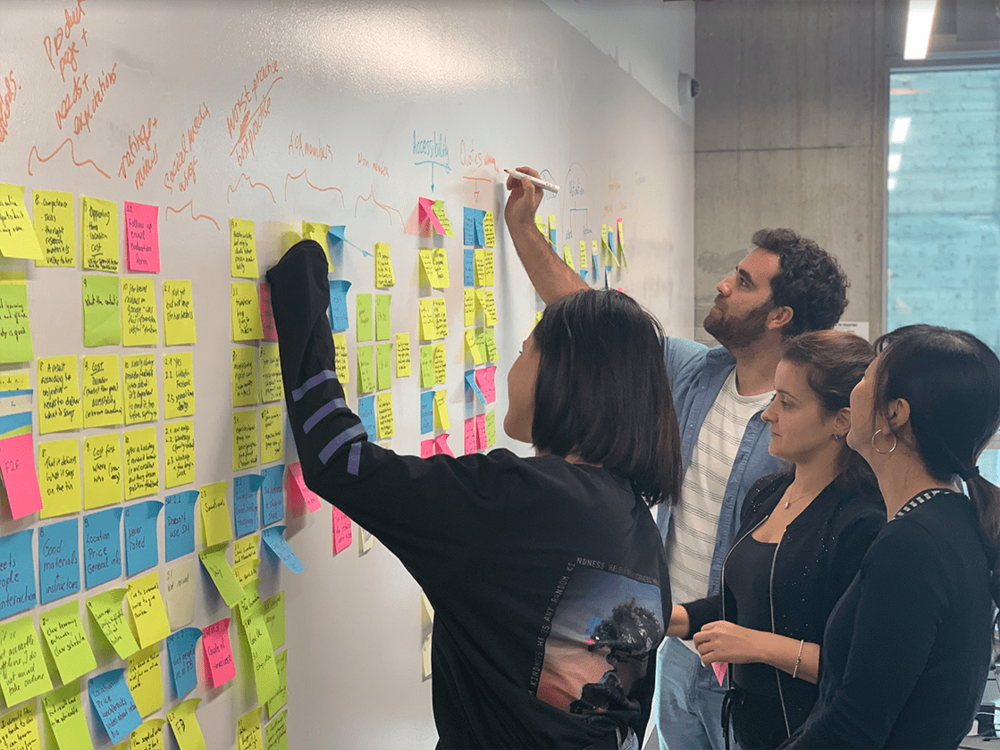
Team is synthesising findings through affinity mapping
Key findings from users’ interviews:
• Older users mistrust in online services.
• The preferred learning method is Face-to-Face.
• They are influenced by reviews.
From the usability testing:
• It is hard to understand the purpose of the business from the first sight.
• Imagery doesn’t reflect the customers.
• Membership benefits are not utilised.
Personas:
John — around 60 years old office manager who needs a help to start a new business, but doesn’t know where to look for help.
He doesn’t trust online offers.
Liz - around 50 years old local cafe owner who needs to advertise her business and improve her marketing.
She has visual impairment and frustrations about accessibility.


Develop:
Design Studio:
We worked actively with the client team and conducted a design studio with them. Once again, I would like to thank my team who trusted me in being facilitator, it was a great experience.
We focused on the first persona’s problem:
Problem Statement:
• John needs to sign up for a course because he wants to start a business, but he is slightly distrustful about online offers.
• John needs to sign up for a course because he wants to start a business, but he is slightly distrustful about online offers.
How might we …
• Create a website that inspires trust and confidence for the clients to use AoA services?
• Create a website that inspires trust and confidence for the clients to use AoA services?
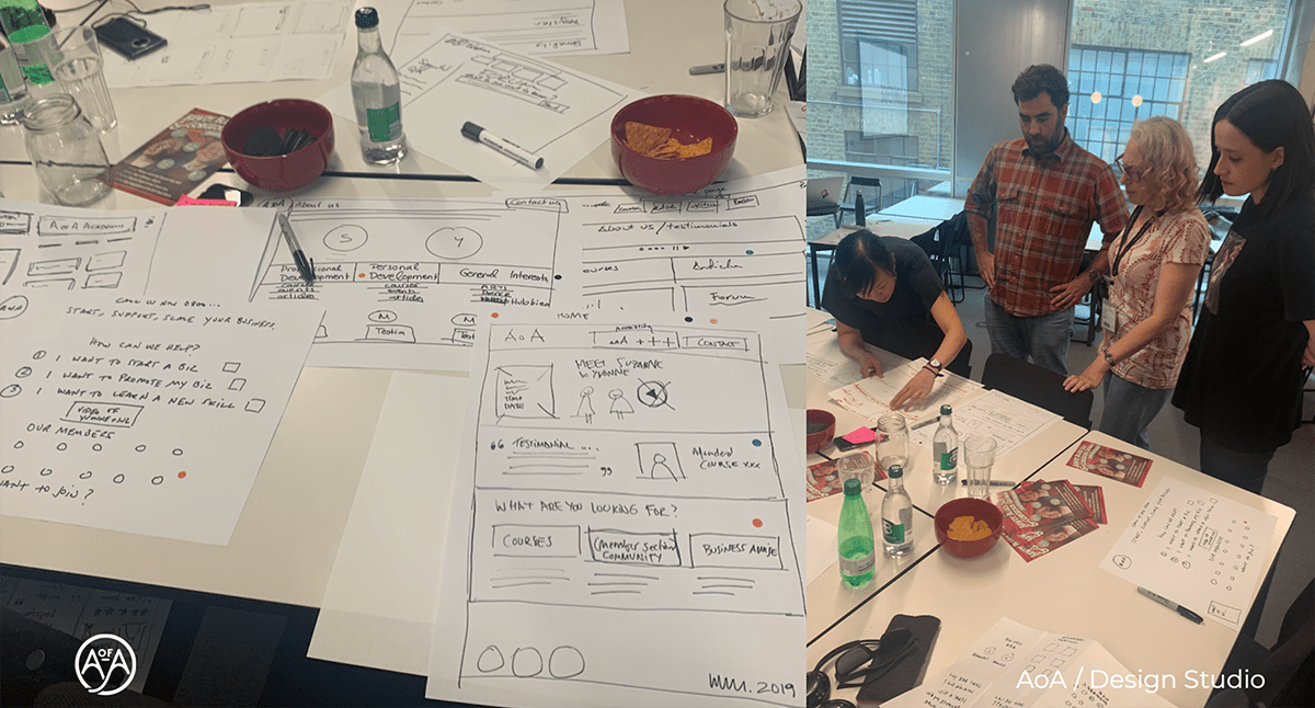
Moments from our design studio

Design studio final iteration
Accessibility:
Key factors that helped to achieve best results:
Colour contrast:
Tested existing AoA brand colours by using color.review. 4 colours from 5 do not meet a minimum ration of three.
C stands for Contrast, T for text as body copy and H for headlines.

Results of AoA existing colour palette accessibility
We increased contrast of primary green and set new primary colour.
After looking at some business-related websites and most accessible website in the UK — gov.co.uk, we decided to choose a secondary colour — blue. We noticed it is going to help us to build more trust and increase the authority in the new design.

Suggested colour palette with accessibility results
Consistency and Clarity:
• We built new and clear global navigation with additional guidancem( see in the example below).
• Built distinguished and consistent buttons.
• Reduced the distance between 2 interface elements in forms.
• Used labels with form fields and inputs.

Contact page
Typography:
• Kept Roboto typeface ( existing AoA typeface ) as the main one.
• Increased font sizes.
• Improved visual hierarchy and text readability.
Photography:
Our conducted usability testing showed that users do not feel represented by the photography used on the current website.
Research of design for elderly people supported the fact that users do not like to see imagery which is aimed for a particular age.
We decided to use photography which highlighted the business purpose rather than the age of users.

Our suggested photography
Iterations:
Prototyping from lowest fidelity to highest let us to build trust and implement accessibility. Here are some main changes:

Home page from paper to hi-fi prototype

Single course page from paper to hi-fi prototype
DEliver:
Prototype HD:
To watch a demonstration of the final prototype please click here.
As an alternative, you can test the clickable prototype:
Achievements:
In 2.5 weeks sprint, we redesigned most of the Business academy website that is easy to navigate and would enable an accessible experience to the users. Our created concept helped the client to raise some funding, furthermore, Advantages of Age approached us with an offer to finish the redesign completely. As a group of four, we redesigned every page of the Business academy as long as Lifestyle website and created the guidelines of a responsive website for desktop, mobile and tablet.
Knowing the time we had to work on this project — 4 weeks — I am very happy and proud of our achievements. The AoA team are satisfied with our work and are excited to make the new website live soon.

New websites home pages
My key learnings:
Working with AoA was challenging and I was pleased to have an opportunity to build a better understanding of older target audience as well as accessible design. Practising inclusive design helped me to extend my empathy and better understanding of more diverse audience.