Philab | Cosmetics

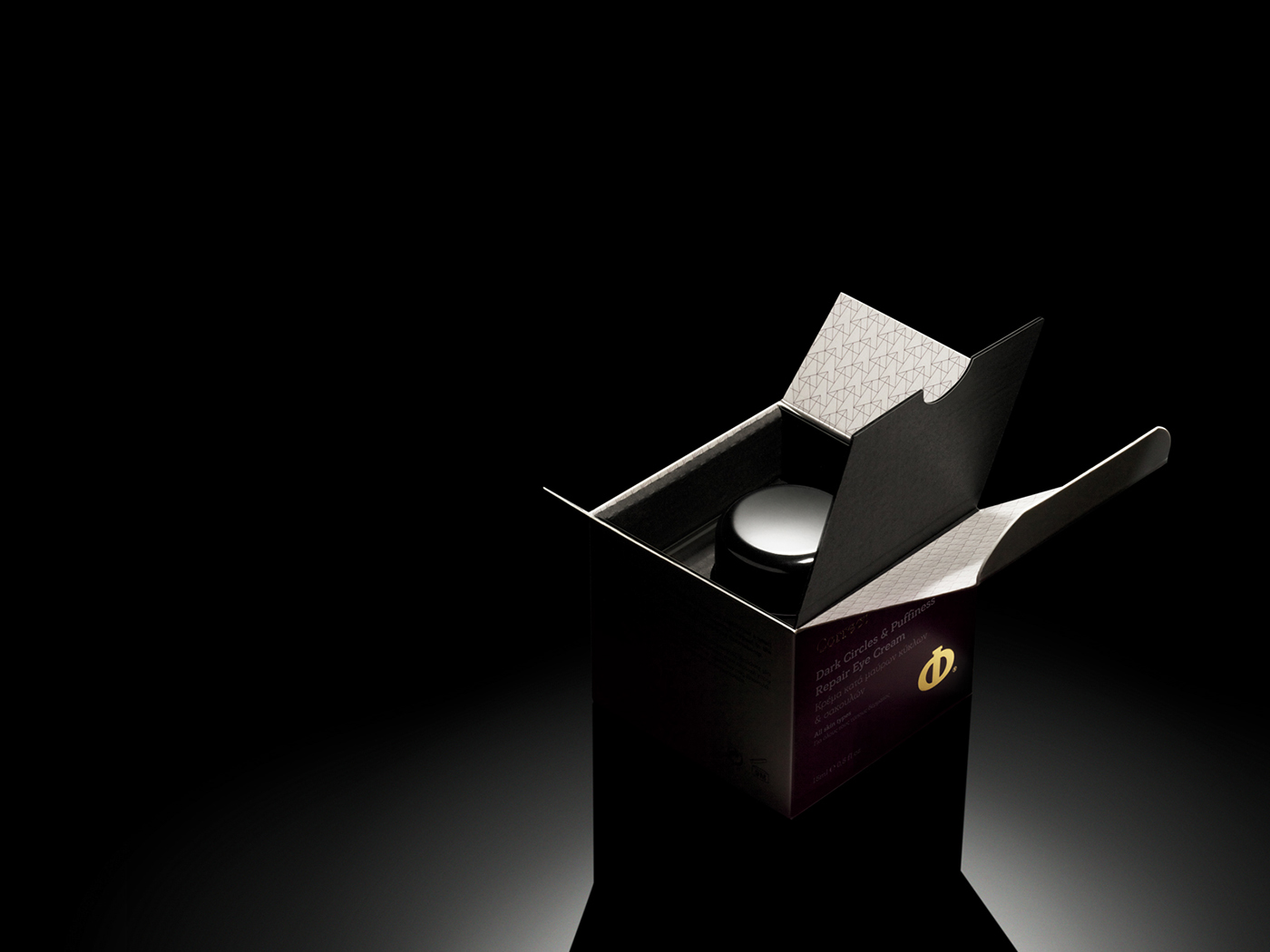
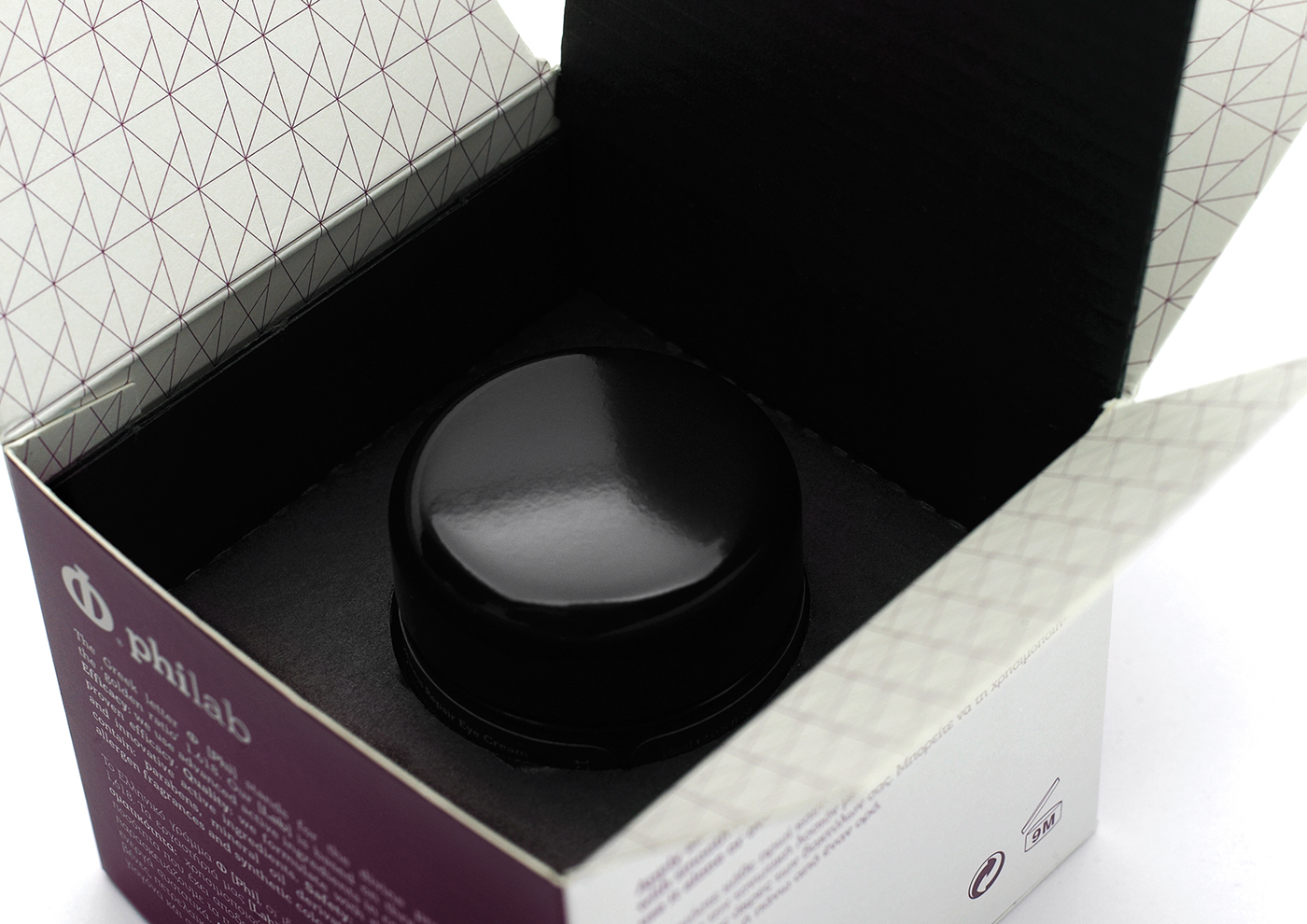
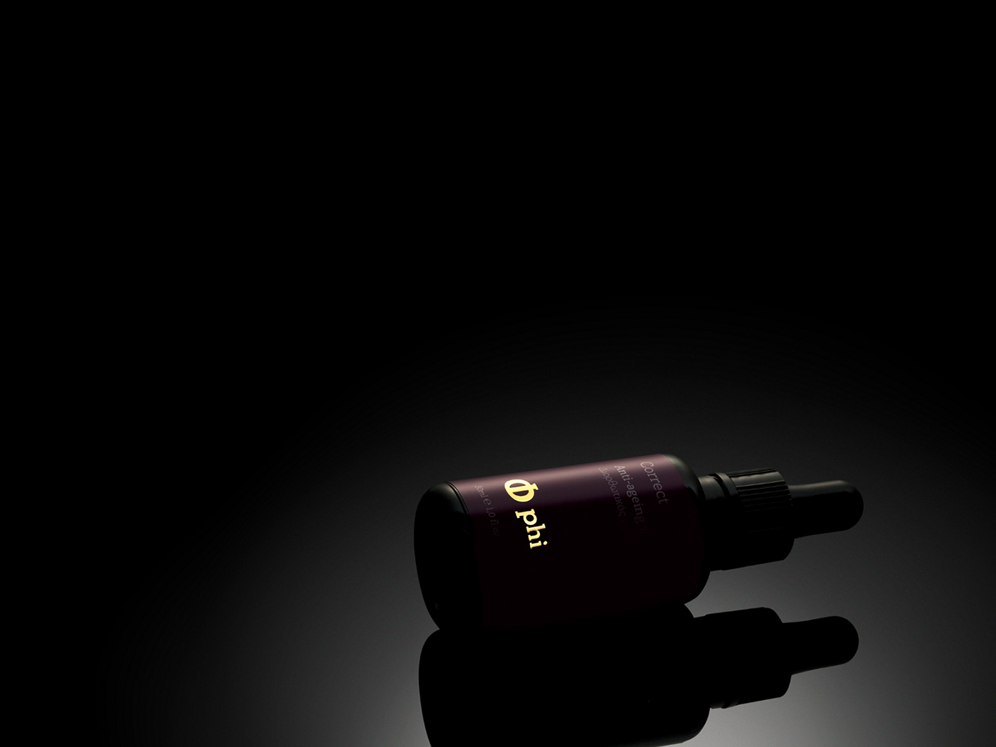
Συσκευασίες για σειρά καλλυντικών προϊόντων αντιγήρανσης, περιποίησης και προστασίας του δέρματος.
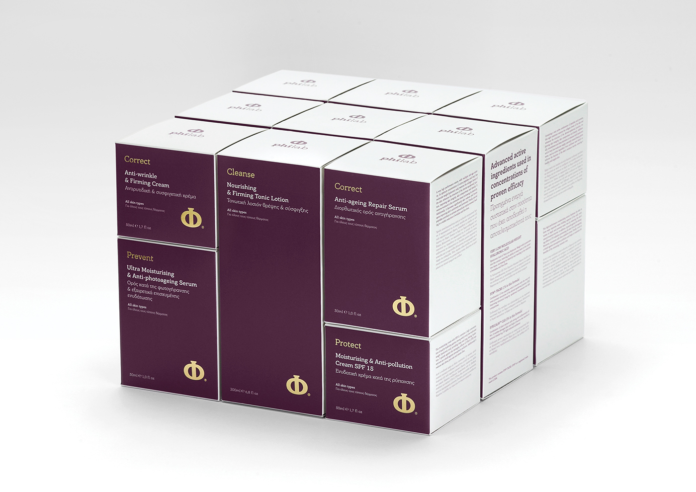
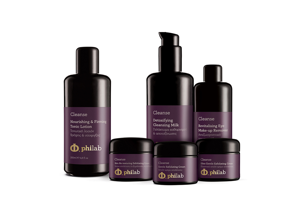
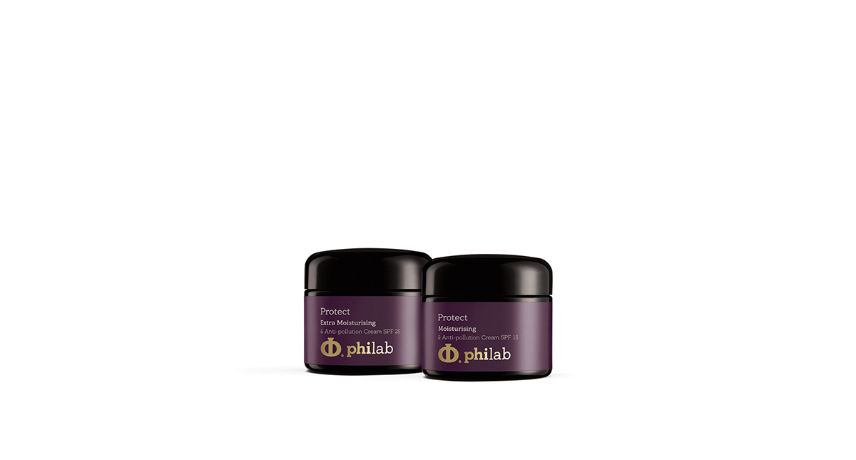
Σειρά συσκευασιών: 14 διαφορετικά προϊόντα, χωρισμένα σε 4 κατηγορίες.
Το αντικείμενο εργασιών της εταιρίας είναι η παρασκευή καλλυντικών. Η φιλοσοφία της εταιρίας στηρίζεται στις αρχές της αποτελεσματικότητας, της ποιότητας και της ασφάλειας.
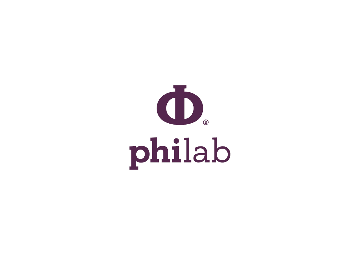
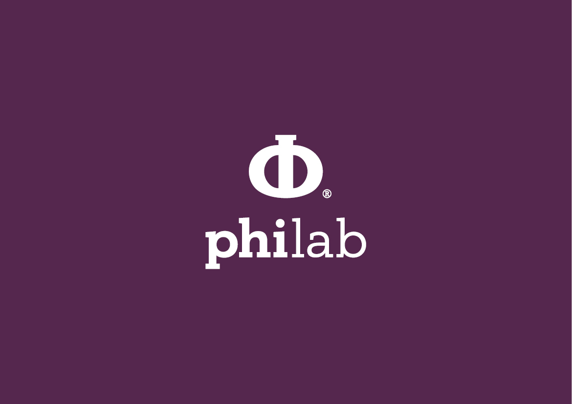
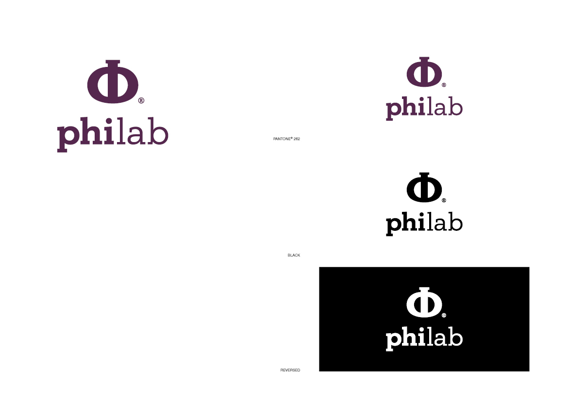
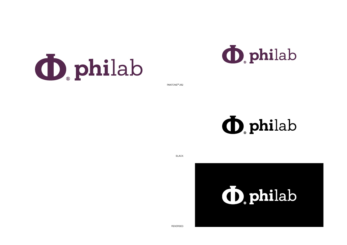
Με δεδομένο το εταιρικό όνομα, πηγή έμπνευσής του συμβόλου ήταν το κεφάλαιο γράμμα «Φ», ο χρυσός αριθμός 1,618, προς τιμήν του Φειδία. Η απόλυτα συμμετρική μορφολογία του κεφαλαίου «Φ» διαμορφώθηκε έτσι ώστε να παραπέμπει στο σχήμα της γυάλινης φιάλης χημικού εργαστηρίου. Το βαθύ ιώδες εναρμονίζει τη δύναμη του κόκκινου με τη δύναμη του μπλε.
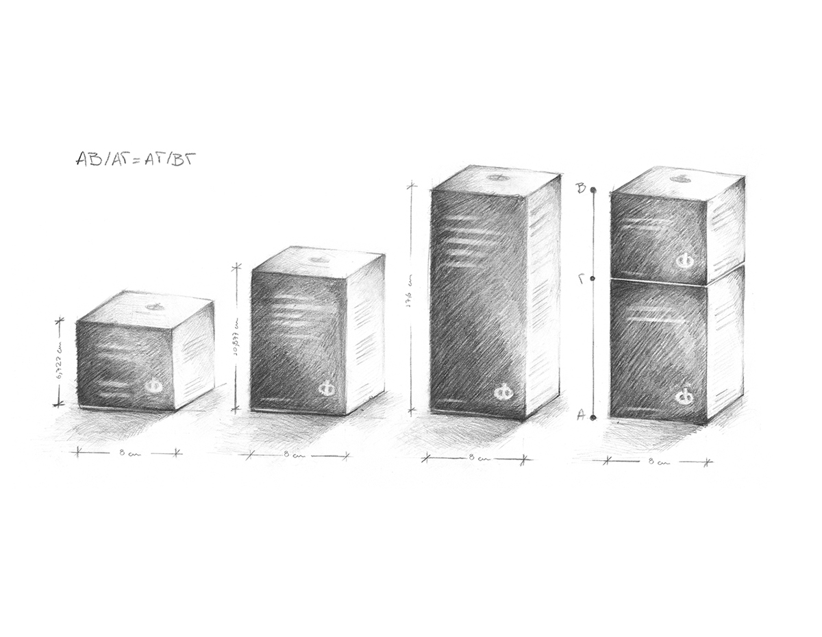
Ο αριθμός «Φ» εκφράζει την εσωτερική αρμονία ενός αντικειμένου. Οι πλευρές των συσκευασιών σχεδιάστηκαν έτσι ώστε να ακολουθούν με ακρίβεια τον χρυσό αριθμό «Φ». Εάν ΑΓ>ΒΓ τότε ΑΒ/ΑΓ=ΑΓ/ΒΓ. Το σημείο τομής Γ ισούται με τη χρυσή αναλογία «Φ» (=1,618), διότι ΑΒ/ΑΓ και ΑΓ/ΒΓ=1,618. Η συσκευασία των προϊόντων σχεδιάστηκε με βάση αυτή ακριβώς τη μαθηματική φόρμουλα. Έτσι, εάν τοποθετήσουμε τις δύο μικρότερες συσκευασίες τη μία επάνω στην άλλη, δημιουργούμε μια συσκευασία με τις ακριβείς διαστάσεις της τρίτης συσκευασίας. Στο ράφι, οι συσκευασίες αυτές δημιουργούν ένα τέλειο σχήμα, εκφράζοντας την φυσική αρμονία που αποτελεί τον πυρήνα του σχεδιασμού αυτών των προϊόντων.
Το ισοσκελές τρίγωνο, στο οποίο η αναλογία της μεγάλης προς τη μικρή πλευρά ισούται με «Φ», ονομάζεται «χρυσό τρίγωνο». Κάθε ισοσκελές τρίγωνο με γωνία κορυφής 36o είναι «χρυσό».
-----------------------------
Packaging for a range of anti-aging and skin improvement and protection cosmetics.
Series of packages: 14 different products, divided into 4 categories.
philab is a Greek cosmetic production company. Its philosophy is based on the principles of efficacy, quality and safety.
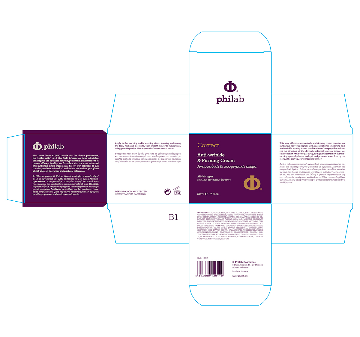
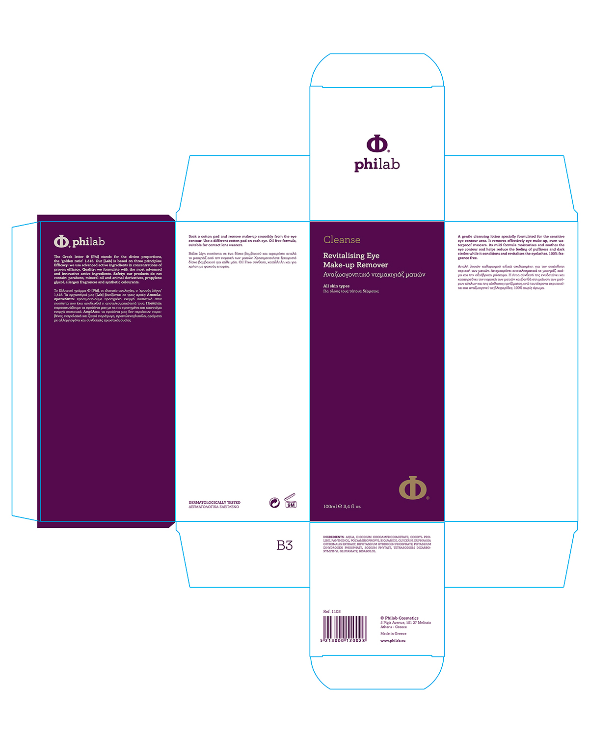
Given the company’s name, the source of inspiration for its logo was the Greek letter ‘Φ’ [Phi] which stands for the divine proportions, the ‘golden ratio’ 1.618, named after the sculptor Phidias. The absolutely symmetrical shape of the capital ‘Φ’ was moulded in such a manner so as to resemble the shape of a round bottom test tube of a chemical lab. The deep purple reconciles the power of red with the power of blue.
The number ‘Φ’ shows the harmony within an object. The sides of the products’ packages that were created follow the golden ratio ‘Φ’, exactly. If AC>BC then AB/AC=AC/BC. The bisection C equals the golden ratio ‘Φ’ (=1,618), because AB/AC and AC/BC=1,618. The packaging of the products was designed according to this mathematical formula. Thus, if we put the two smaller packages together, we create a package with the exact dimensions of the third package. On the shelf, the packages create a perfect shape, enchanting the natural harmony which is the core of the products’ design.
The isosceles triangle in which the ratio of the longer to the shorter side equals ‘Φ’ is called a ‘golden triangle’. Every isosceles triangle with a 36o acute angle is ‘golden’.
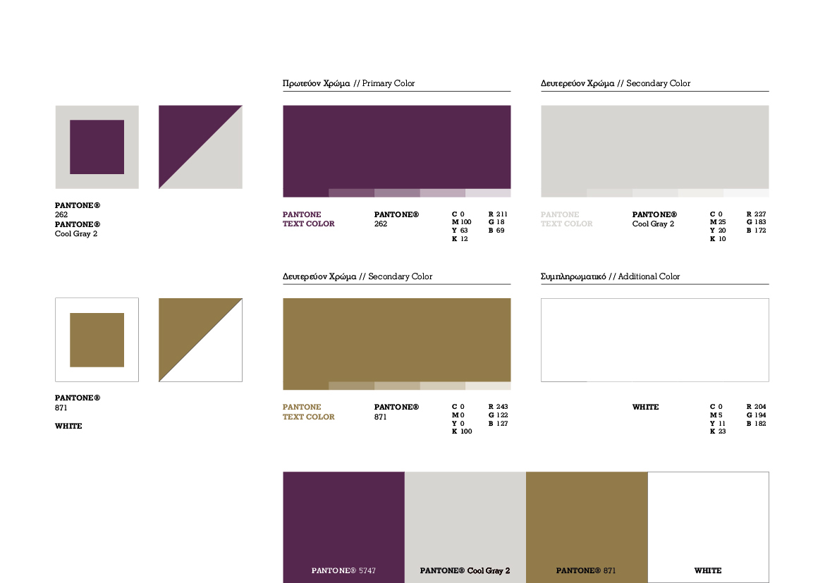
Color Palette
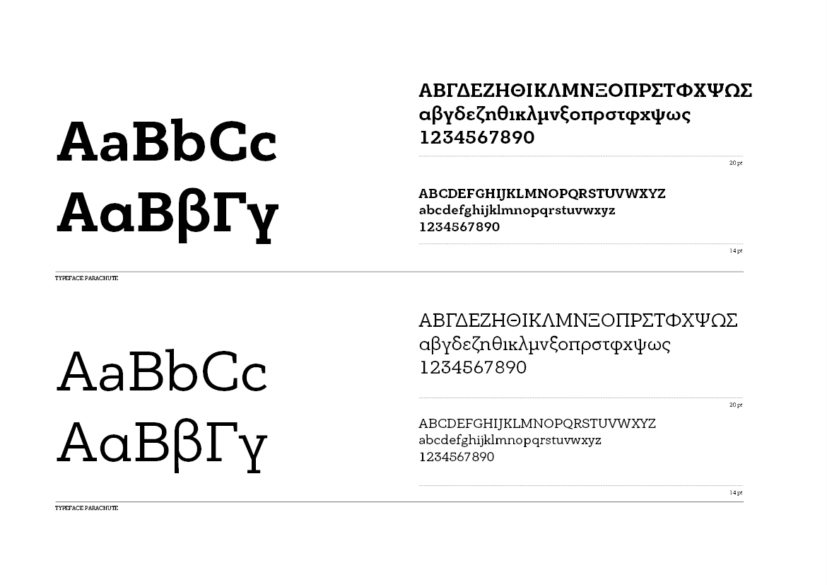
Typography
ΑΒ/ΑΓ=ΑΓ/ΒΓ 1.618

Patterns
The isosceles triangle in which the ratio of the longer to the shorter side equals 'Φ' is called a 'golden triangle'. Every isosceles triangle with a 36º acute angle is 'golden'. The products were divided into 4 categories. For each category we created a pattern, which reflects the function of the product line, as follows:
The isosceles triangle in which the ratio of the longer to the shorter side equals 'Φ' is called a 'golden triangle'. Every isosceles triangle with a 36º acute angle is 'golden'. The products were divided into 4 categories. For each category we created a pattern, which reflects the function of the product line, as follows:
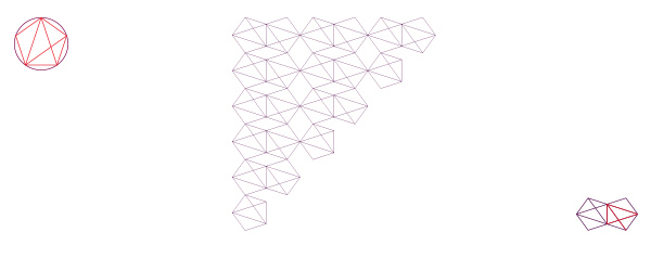
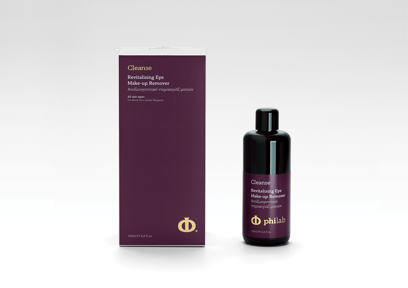
Cleanse
The pattern 'wave' was created by rotating the 'golden' triangle. It represents a wave, thus symbolising the element of water, the basis of cleansing.
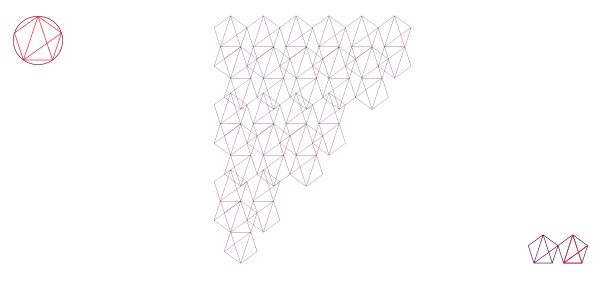
Protect
The pattern 'cube', designed by multiple 'golden' triangles, is a closed shape, one that can enclose, cover, protect. It is a geometrical 'hug', a basic symbolism of protection.
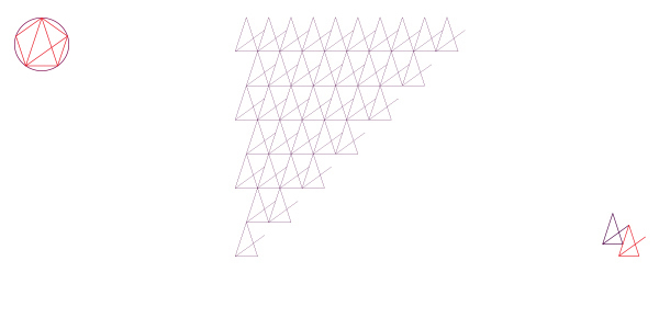
Prevent
The pattern 'simplicity' is a simple pattern, based on the 'golden' triangle. It represents the products’ characteristics, which are easy to use and work just like that, to put it simply.
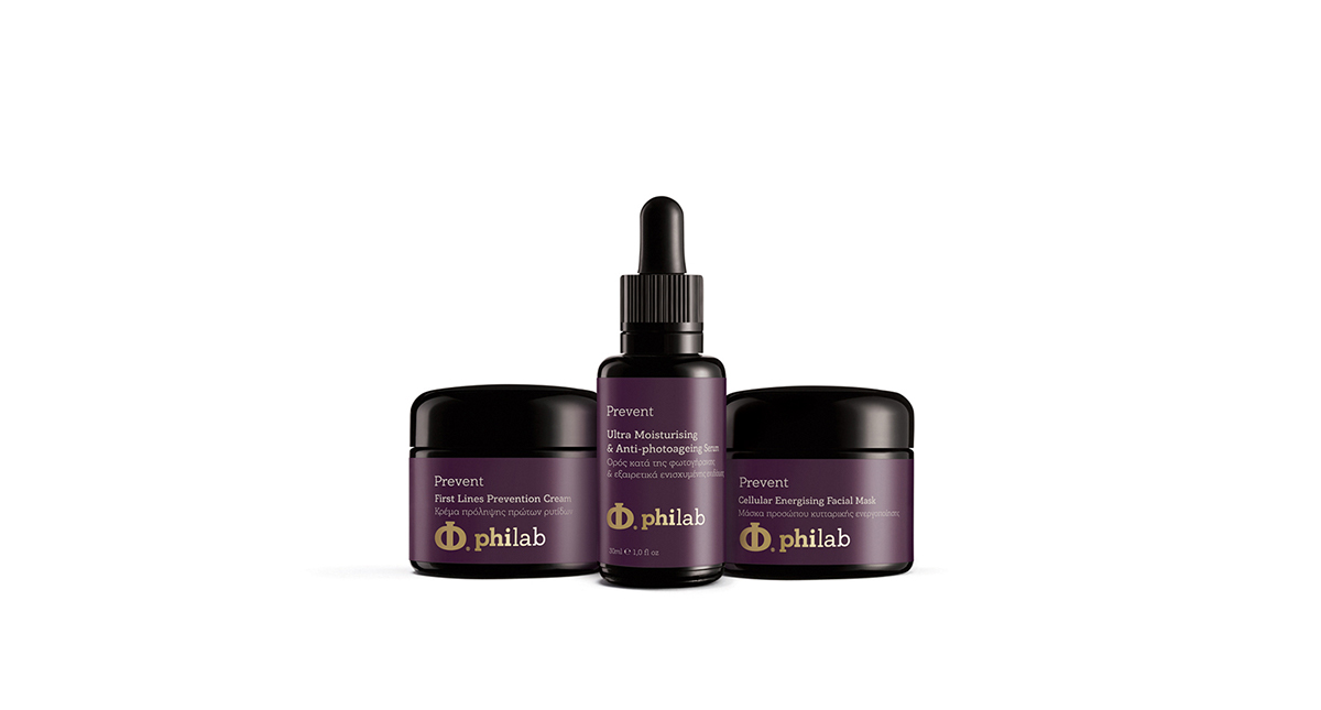
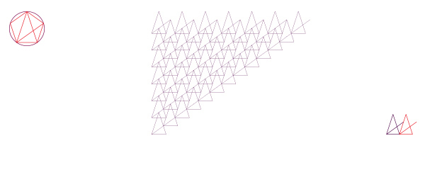
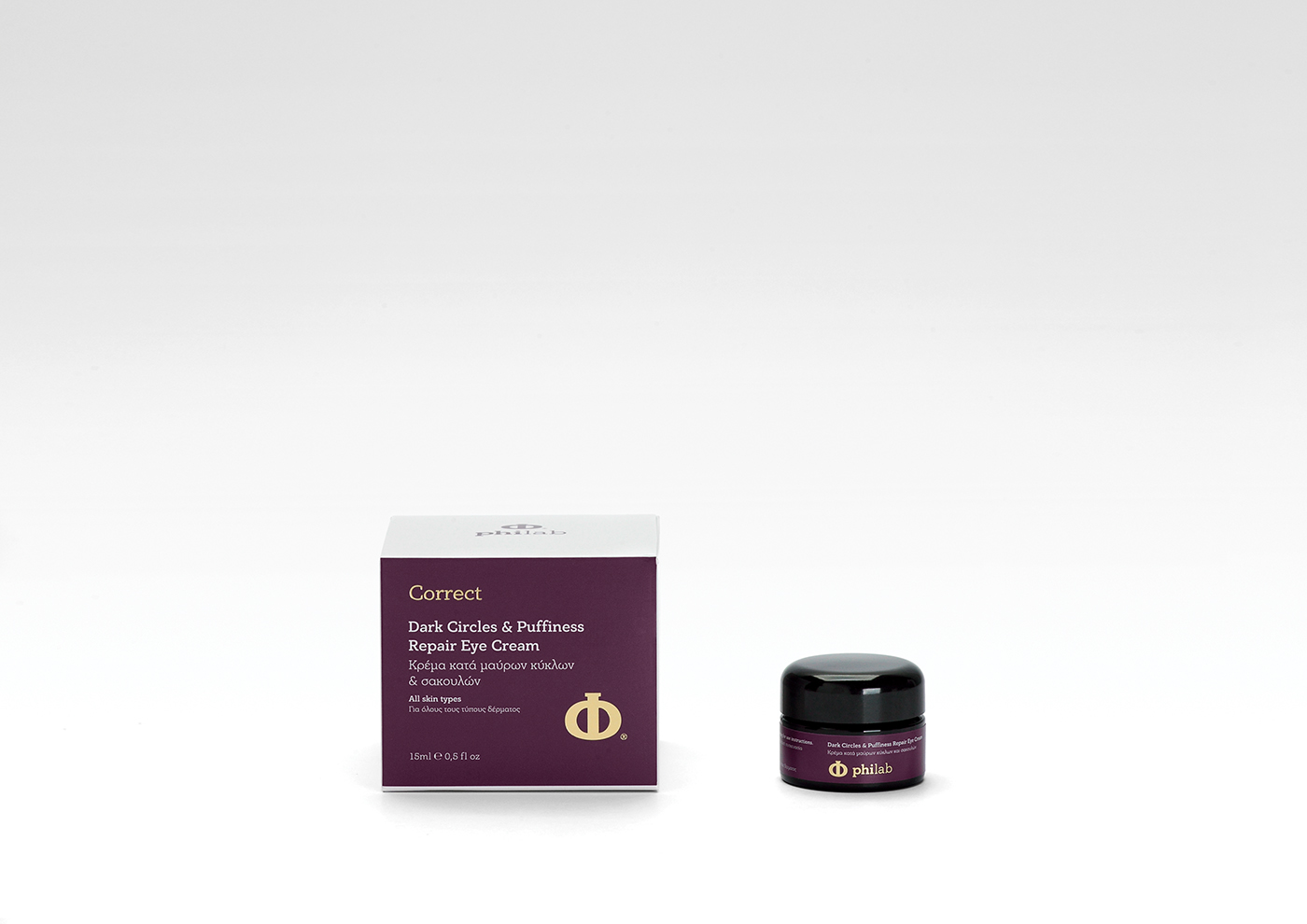
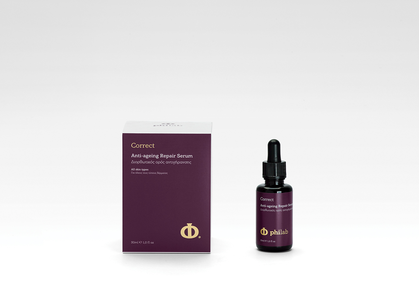
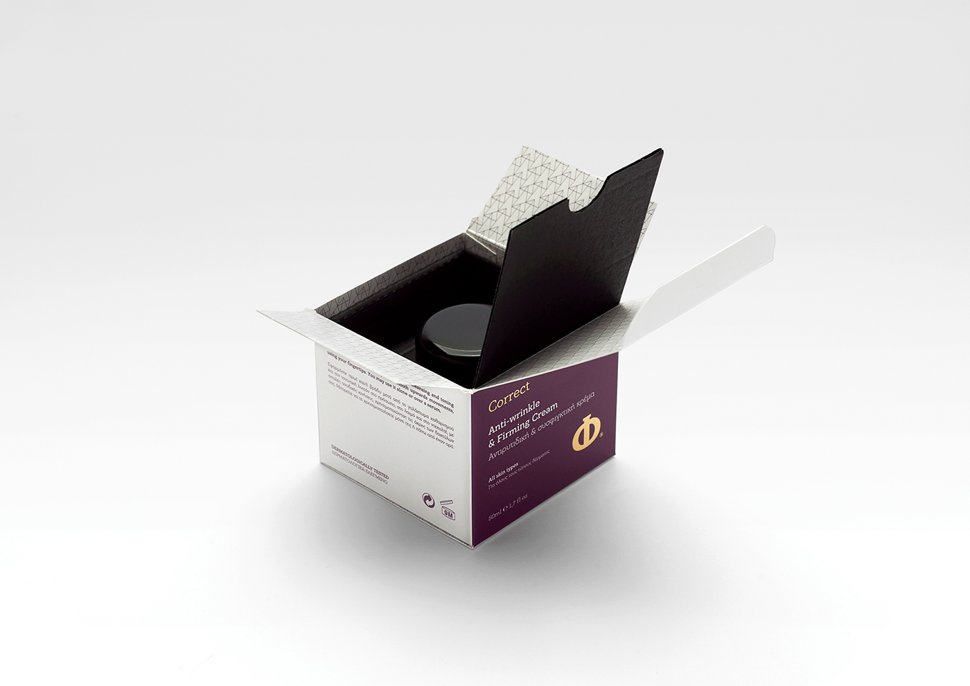
Correct
The pattern 'nature' is essentially a tree. By using the 'golden' triangle repeatedly, we created a 'forest' of triangles, in order to powerfully connect this product line with nature and the way nature heals and cures itself.


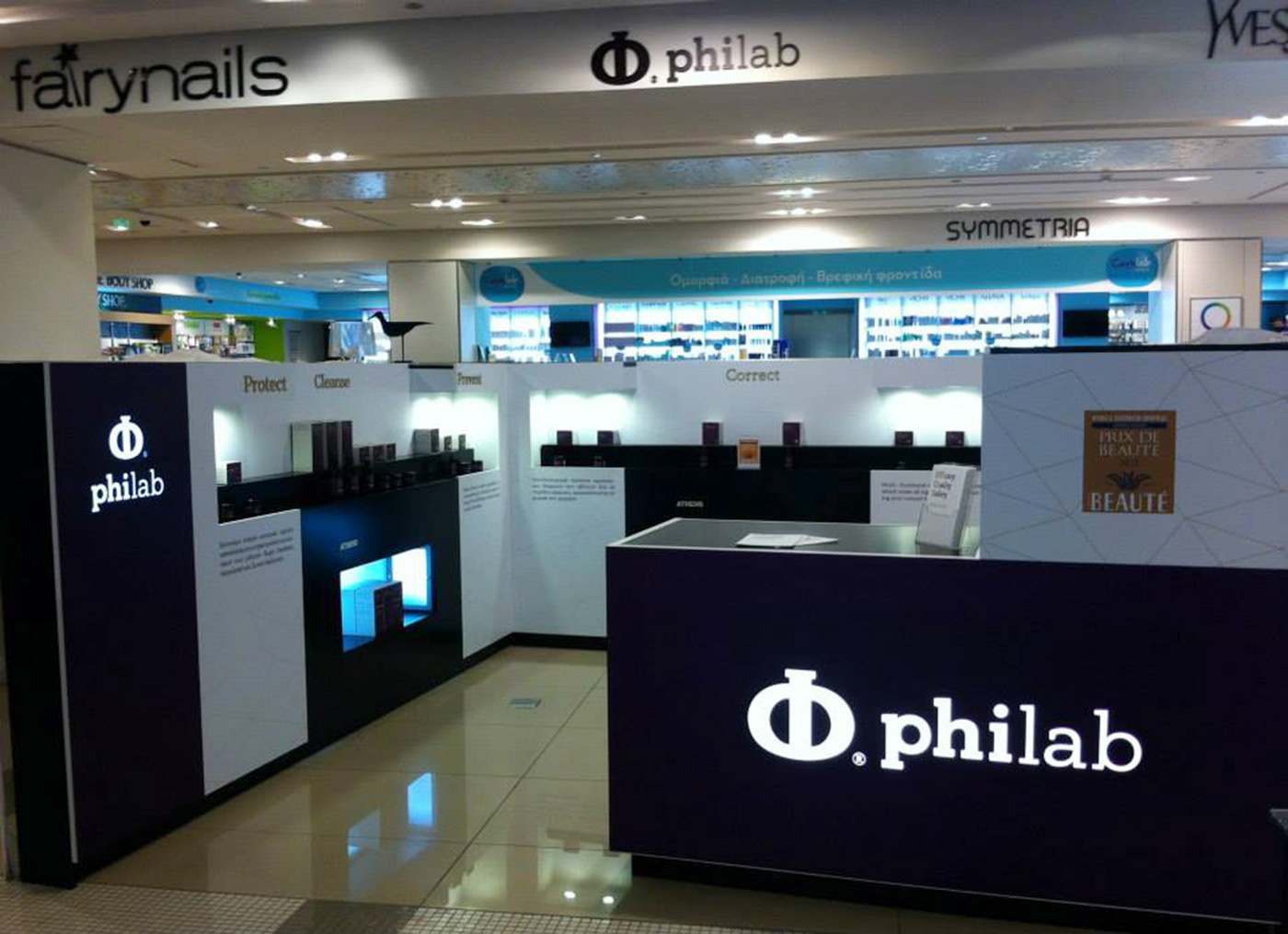
Shop-in-shop Attica Golden Hall


CLIENT
Philab Cosmetics
Philab Cosmetics
GRAPHIC DESIGN
George Strouzas
TEXT EDITOR
Sissy Caravia
ILLUSTRATOR
INSTALLATION & DEVELOPMENT
Lyhnia
PHOTOGRAPHY
Michalis Kloukinas

