Centre for Artificial Intelligence in Oncology
CAIO is an association of research groups that explore applications of artificial intelligence in the fight with cancer. Their focus is on biomedical image analysis using deep learning, but they also attend to data mining of patient records. CAIO interconnects computer science, biology, and medicine in the studies of cancer genesis, diagnostics, and treatment.

Brief
They were looking for a visual identity under which all research groups could be united. A logo that would symbolize use of artificial intelligence in the fight with cancer. Other option was a logo that would symbolize the cooperation of three fields, computer science, biology, and medicine.

My approach
I wanted to create a clean identity to showcase high professionalism and laboratory research. At the same time, I didn’t want it to come across as cold, since they would be interacting with a lot of patients. I started with a logo.

Concepts
In the first concept I explored the concept of three elements coming together to stop cancer, represented as tumor as negative circle. This concept was abandoned because it was too vague.
Second concept uses three cancer ribbons connecting into an infinite loop. Concept didn’t work because it sometimes came across as fan blades.
Third concept is the most conceptual one, but it still based on trinity. There are three repeating shapes each with three corners. Left out corner represents removal of the cancer. Each field is represented in its own way. Medicine as circle in negative space as it directly comes to contact with tumors. Biology as enlarging of the shapes because they use microscopes to analyze tumor cells. And computer science as shrinking of the shapes to represent recursion, which is often used in algorithms. This concept was also presented to the client but wasn’t chosen.

Chosen concept
In this icon my goal was to showcase the use of artificial intelligence in fight against the cancer. I tried to connect anorganic with organic. It symbolizes cells of a tumor transforming into squares, or in other words a data which can be analyzed by the AI.

Construction
The icon is constructed out of squares and circles of two sizes x and y. The size y is three quarters of the size x. The protection zone of the logo is determined by the double of the size of the space between icon and type.

Font
To accompany the icon, I chose a font called Sora. It is clean and modern looking sans serif font, therefore represents the use of modern AI. It also has very circular ‘C’ and ‘O’ which works nicely with the icon.

Colors
The brand uses mostly white to represent laboratory research. Cyan is often used as the color of the AI, but in this case, it would be too loud. Instead, I settled for blue which seems calmer and more trustworthy. Brand uses standard black for text and grey for image captions. It also uses orange in little amounts as contrasting color to the blue and a symbol for joy which hopefully CAIO bring to many people.


Work outputs
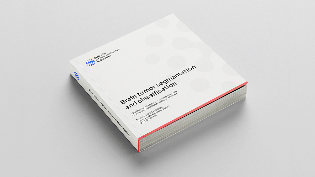
All logo variants exported to common formats used for print and digital use, a brand guide, Word and PowerPoint templates and images for project’s landing page.


Thank you for viewing my project!
If you liked it, please hit the appreciate button below.
Have a nice day ;)


