

Valise Luggage Service
Valise is a luggage service company with the mission of making tourists' and business traveller's life easier by taking care of their luggage. By collecting the luggage from the airport to the hotel (final destination) or vice versa, Valise is offering the customers the possibility of maximizing their time when visiting a country, focusing on the things that matter.
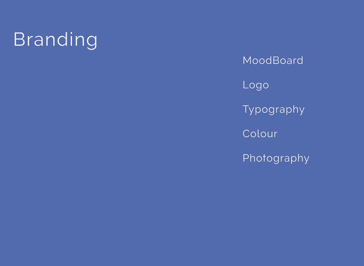

Branding
The brand visuals are based on these values, professional, trustworthy, modern and clean. They seemed appropriate for the field of operation, and also important for the customers.
I opted for a minimalistic approach reducing the visual content to what is important. Another element that guided my decisions was the logotype because it wasn't created by me and there was no briefing provided.
I opted for a minimalistic approach reducing the visual content to what is important. Another element that guided my decisions was the logotype because it wasn't created by me and there was no briefing provided.
Therefore, I created the branding to suit the logo.

Although the logo concept wasn't my idea I made some changes related to the typeface, from Helvetica to Raleway.
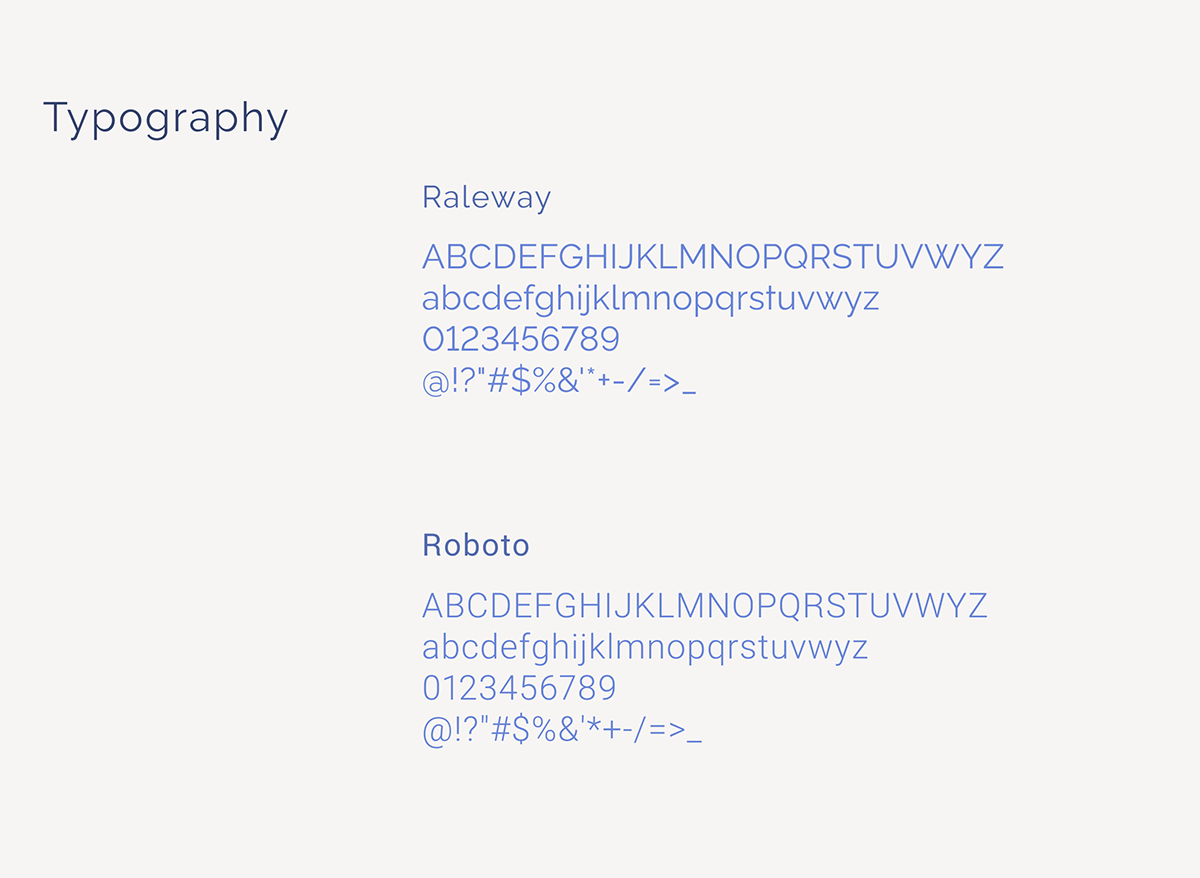
Raleway is a very elegant and modern typeface, with details in its shape that make it unique, it was the
obvious choice for titles and CTA's of this project. For the body text, I chose a more rational and easy
to read typeface Roboto.
Playing with the font sizes and the spaces between them, it was possible to recreate the idea of high-end service/product that the founders of Valise wanted.
Playing with the font sizes and the spaces between them, it was possible to recreate the idea of high-end service/product that the founders of Valise wanted.

The colour blue can symbolize security, confidence and royalty so it made perfect sense to be the main colour
of Valise. This specific blue has the name Glaucous, I selected several shades and tints of this colour to create a monochromatic palette. Additionally, white, black and shades of grey were added this allows us to create situations of greater or lesser contrast according to our needs.

Photos must represent Valise's target audience and their lifestyle. Images with good quality and an upbeat atmosphere. Diversity and inclusivity are important should be a factor to consider when selecting images.
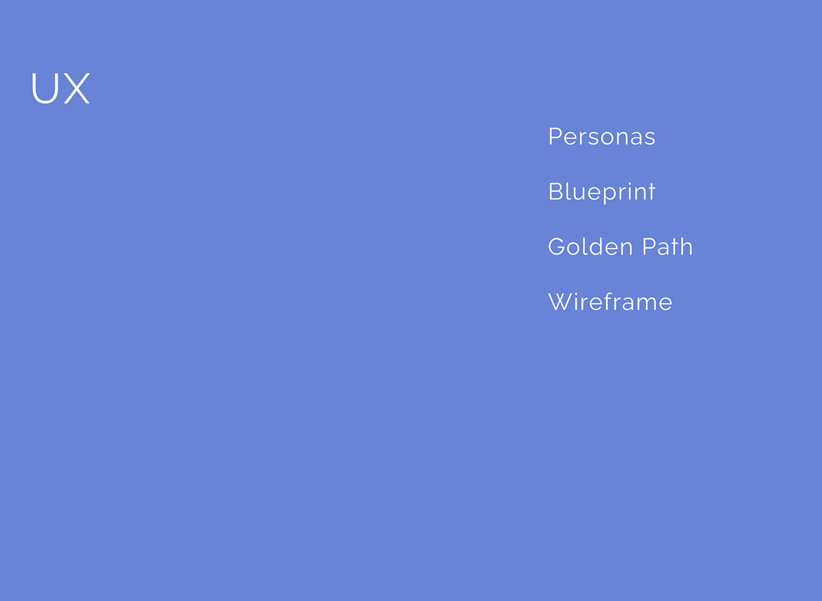
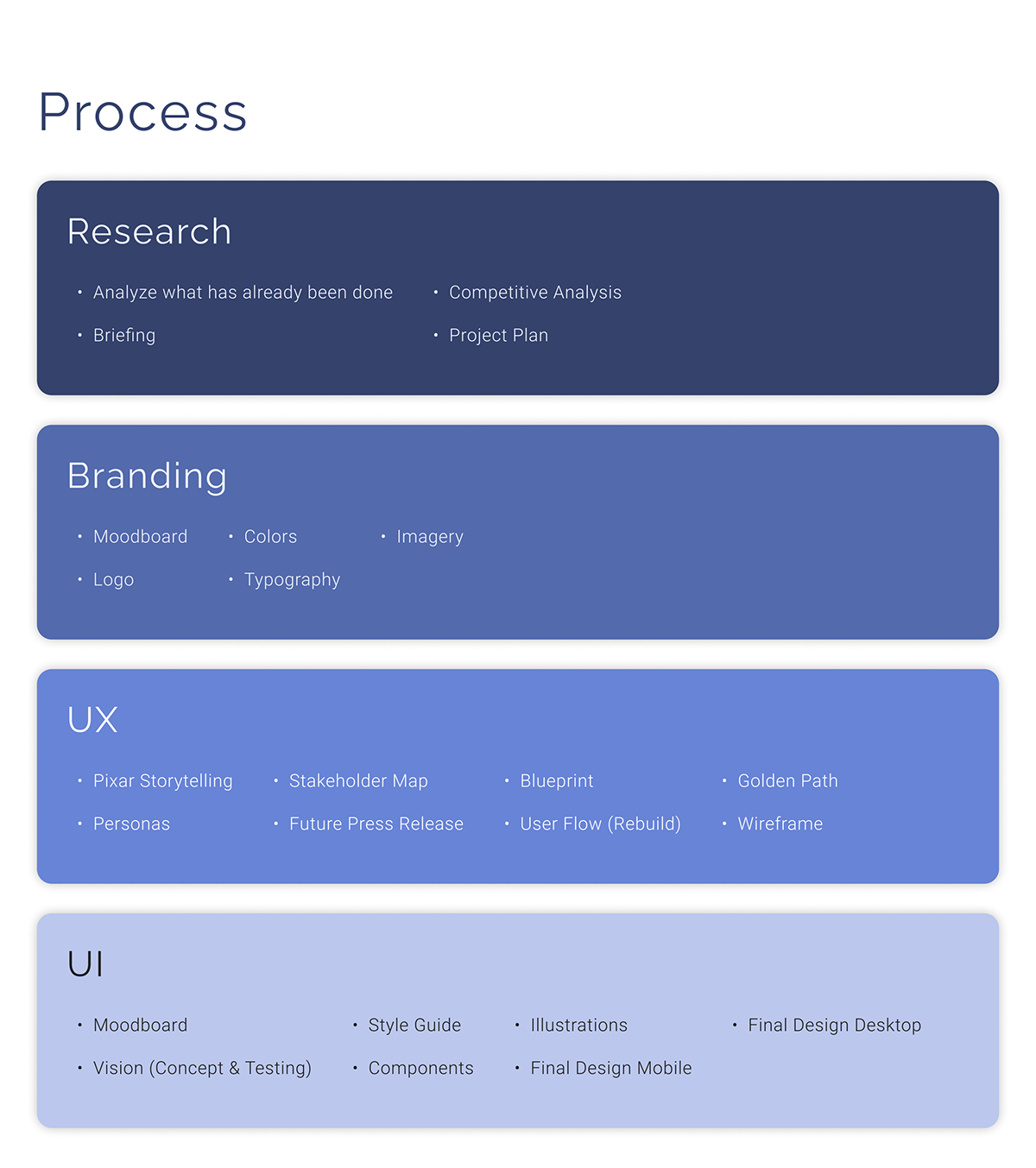
UX
Building the UX the idea was as it is most of the time when we deal with UX to be very intuitive and simple.
Tools like storytelling, personas, future press release, blueprints and user flow were applied. They help find new features and understand the needs of the user at each moment of the booking and post-booking process.
Tools like storytelling, personas, future press release, blueprints and user flow were applied. They help find new features and understand the needs of the user at each moment of the booking and post-booking process.
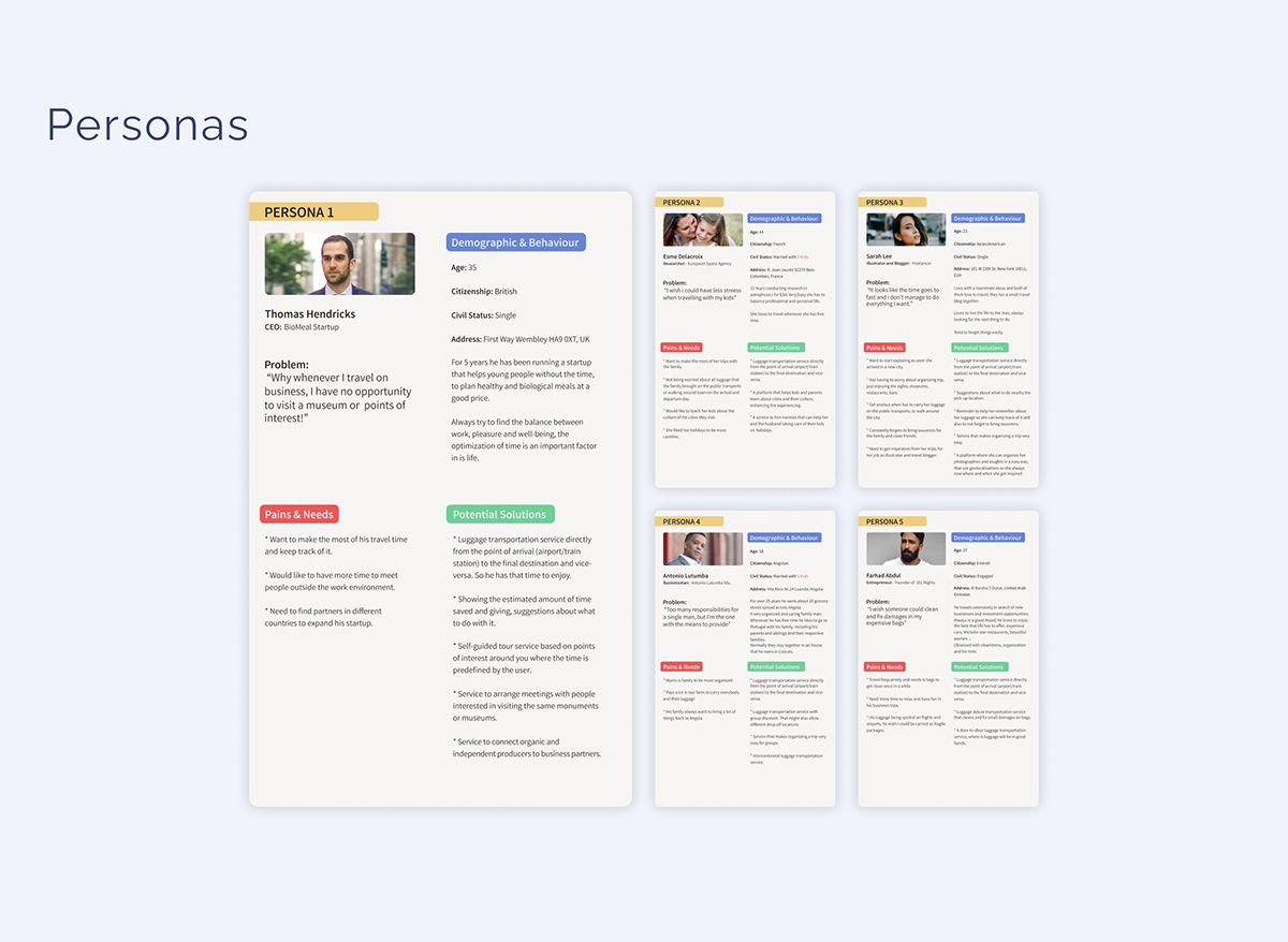
By using personas we can identify our ideal target audience and relate to them and the issues they face. Allow us to understand and anticipate their needs so we can come up with possible solutions for them. It also reminds the team of who we are working for.
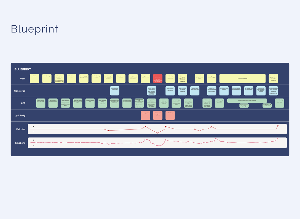
A Blueprint is a tool that allows us to map all the actions/processes involved when using a service/product and what each actor does. With this tool, we can identify critical moments and come up with solutions.
In this case, we identified that it wasn't possible to make pick-ups in less than 30min after the user placed
In this case, we identified that it wasn't possible to make pick-ups in less than 30min after the user placed
the order.
As a solution, allowing the user to make a reservation anytime before the flight would be ideal. As well as adding a feature to link flights to the reservation. This would allow the pick-up time to update automatically so Valise's concierge would be waiting for you on your arrival.
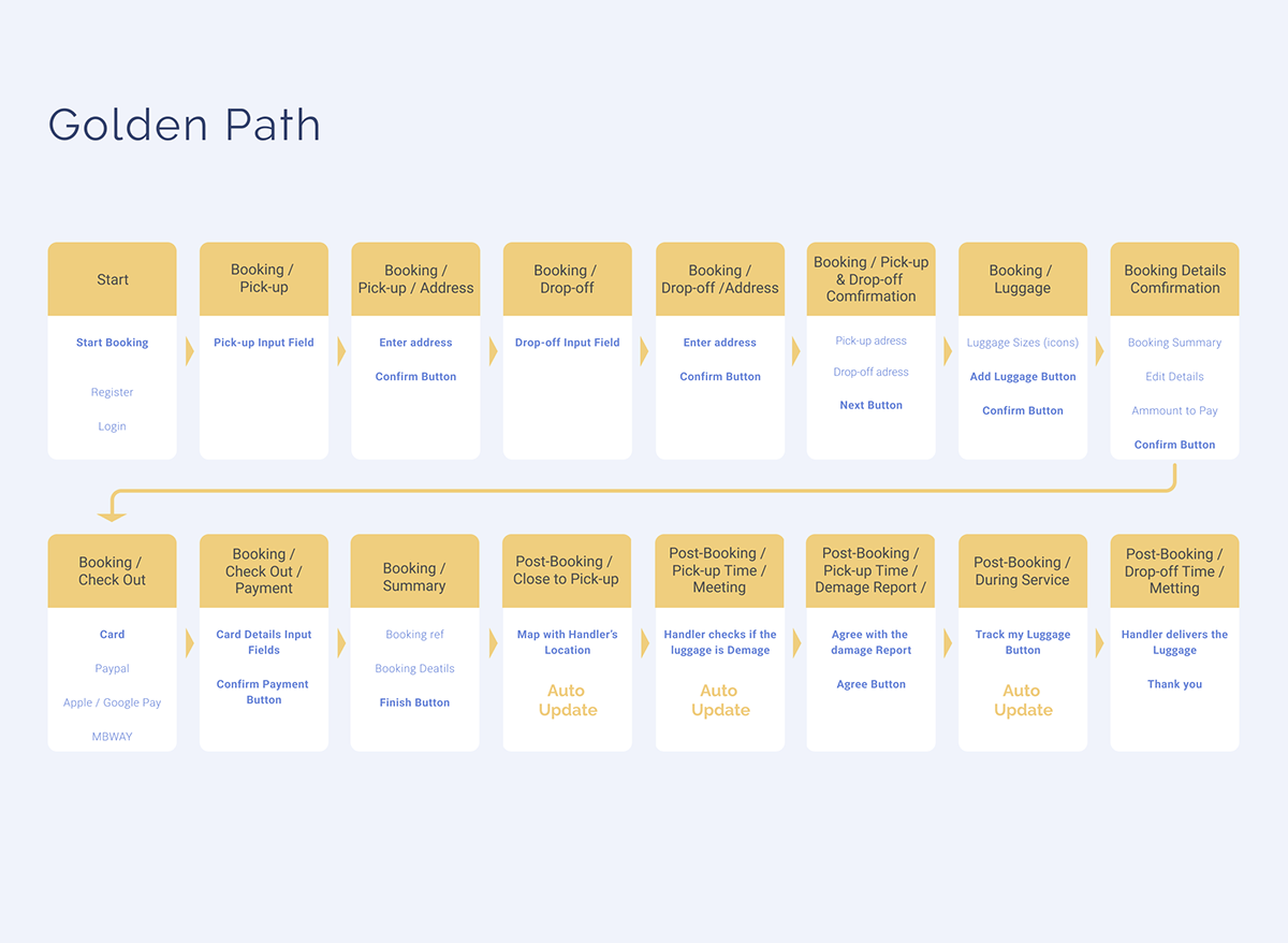
Golden Path is the fastest way for a user to do a determined action on an app, for Valise and its users the crucial action is to make a booking.
The booking process was divided into 5 steps, 1st define locations, 2nd define date and time, 3rd define items, 4th identify yourself, 5th Payment. If the customer has an account the last 2 steps are streamlined.
The post-booking is defined by 3 moments, 1st waiting for the concierge it's possible to make changes to the booking or place a new one, 2nd meeting the concierge human interaction where the luggage verification and collection will take place and 3rd tracking the luggage to the final destination.
Wireframes are sketches of your app screens, we can organize them into a flow to visualise how the
interaction will work. Use it to test on users or present to stakeholders and collect feedback before you advance in the project.
UI
The visual ideas for the user interface come directly from the branding and the UX, keeping things simple, clean and intuitive, paying attention to the small details and adding illustrations to help the customer relate to the web app and decoding information.

For the icons, it was important that they were outlined and had a filled version. Ionicons is an open-source library with a huge variety of well-designed icons. And they make the implementation easy.

The illustrations aim to make the user experience more pleasant. Similar to photos, they represent the target audience and show diversity.
They were made to fit the brand, the way the human figure is stylized, with straight lines, sharp edges and almost realistic proportions giving it a certain elegance. Flat colours without shading to maintain a clean look and outline only where needed.
They were made to fit the brand, the way the human figure is stylized, with straight lines, sharp edges and almost realistic proportions giving it a certain elegance. Flat colours without shading to maintain a clean look and outline only where needed.
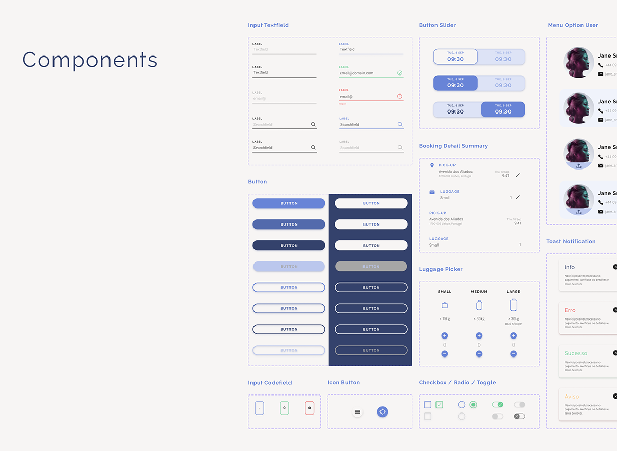
The components are a reflection of the design system taking shape, grids, typography, icons illustrations colours
everything getting together. They are the pieces that will compose the app screens.
everything getting together. They are the pieces that will compose the app screens.
What I learned
Design Sprints: I heard about this tool before but it was the first time that I worked under this technique, basically in one week your team have to conceptualize and test a product. We didn't use the exact same strategy as described in most articles and tutorials but an adaptation made by the project manager. It wasn't easy but is doable and rewarding.
Because you can Design does not mean it should be done: I'm a designer coming from the print media to the UX/UI world, and sometimes we get carried away by our ideas when designing for the web we have to think about things like how long is going to take for the webpage to load, how difficult is to code this and is this actually making the user experience easier!
Features and more features: Sometimes we also find features that look cool and we want to add everything, but we have to be aware of the time and budget limitations. In the end is better to be really good at one thing than ok at a lot of them.
UX/UI: I'm no stranger to the UX/UI design world but is actually my first professional experience, so I have been learning and relearning a lot of things related to it.


