


Branding Project, Spring 2012.
For this project I chose to brand an imaginary cafe that showcased its organic tea selection. My goal was to evoke a sense of calm and warmness not unlike a good cup of hot tea. Through research and iteration, I was able to devise a mantra - "Steep: strong tea, happy you" which communicated the essence of the brand in a concise manner. The hand-lettering and icon comprised the brand's signature mark, and a pastel color palette and corresponding typography contributed to the brand's mood.
Overview of brand design, various shots of individually crafted pieces, and birds eye view of completed brand components (11 pieces).

Branding Project, Spring 2012.

Hand-lettering for Monocle magazine, Fall 2013.
Working closely throughout the semester with Ken Barber of House Industries, this project showcased the hand-lettering process that was emphasized by the instructor. The lettering demonstrates my understanding of individual letter mass (or "color") but I also learned that it's important to make them all work together as a whole. The resulting mark evoked a sense of classiness and sophistication that is reminiscent of the historical city of Chicago.
Closeup of the original pencil drawing on tracing paper, the digital vector file, and the final printout on 9x11" matte paper.

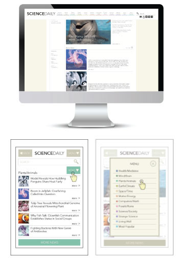
Website Redesign, Spring 2012.
For this project I chose to redesign an existing, published site (http://www.sciencedaily.com/). The original site was confusing and mostly text-based, making it difficult for its readers. The approach I took was more image-heavy; I redesigned it so that it was easier to navigate databases and find its numerous articles. These screenshots include UI interaction (mouse-over menu, article reading, and desktop/mobile components). I also used a color palette that was less sterile, thereby creating a more welcoming feeling even for the non-science audience.
Page interaction, article focus, desktop version, mobile interactions.
Website Redesign, Spring 2012.

Numerals Lettering, Fall 2013.
Working with Ken Barber, I took existing playing cards and decided to take a new, minimalist approach with them. After sketching the numerals with pencil on tracing paper, I then eliminated much of the card's surface area in order to maximize efficiency. A matching pattern comprised of simplified symbols can be found on the backs of each card. It was extremely important that functionality of the cards was maintained.
Closeup of original sketch, print out and assembly on matte paper, functionality and usability closeup.

Sequential Scroll, Fall 2013.
When asked to think of how motion and time can be utilized in Graphic Design, I devised a scroll in order to convey a series of events that can be revealed over time by the audience as they unroll it. This scroll measures approximately 30x76", was screenprinted on canvas and hand-stitched.
Closeup of original sketch with inking, screenprinted in 4 parts, hand-colored with acrylics, and hand-sewn with wooden dowels.
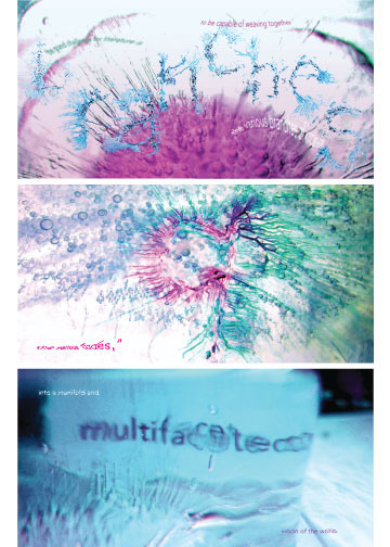
Calvino Booklet, Spring 2012.
Using Italo Calvino's "Six Memos for the Next Millennium" as inspiration, I pulled quotes from his essay and set them against imagery created from ink on ice. This was a process-driven project, as most of the time was spent photographing and experimenting with the effects of colored ink on ice. An 8-spread booklet (cover and back not shown) was compiled, with each spread showcasing my own interpretation of the pulled quote against a backdrop of ice.
Spreads of booklet.

Type Modulation, Fall 2013.
Using Bodoni Roman as the base typeface, I created modulations using a combination of analog and digital methods. I decided to return to my exploration of ink on ice, and then transferred them to Illustrator to create a unique typeface called Franki (building upon the Frankenstein theme). The resulting 24x36" poster served as a type specimen as well as my interpretation of Franki's mash-up personality.
Closeup of ink work on paper towel and ice, closeups of poster typesetting and ink spatter.

Calendar Poster, Spring 2012.
Bubble Tea is a refreshing sweet drink that originated from Taiwan. I decided to add some retro American flair into the mix and came up with this fun and friendly 18x24" calendar poster. Using inspiration from our family dog, I weaved a narrative into each month, starring Coco the Yorkie. Drink bands and coasters add an overall sense of whimsy to the brand design.
Calendar printout on textured paper, closeup of detail, closeup of original pencil sketch, cafe shots of drink with band and coasters.


