


As part of a project for university I was asked to design a series of film posters each exploring an individual style within the history of design.


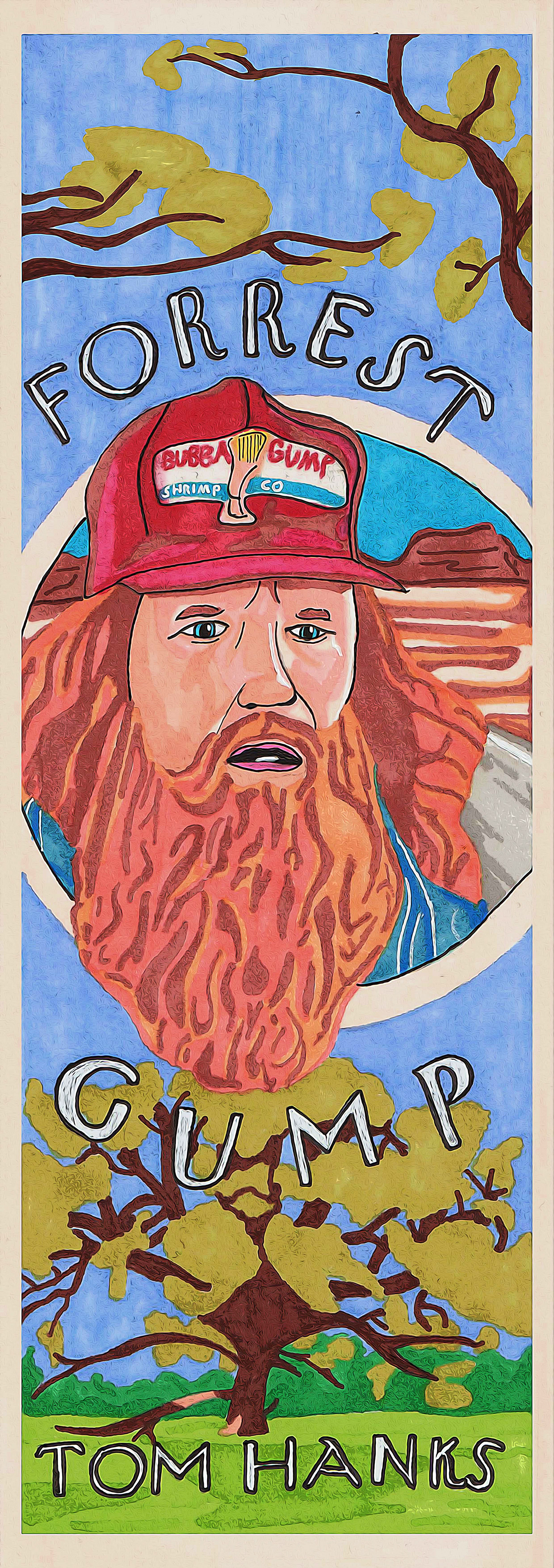
Art Nouveau
This poster focused on the style of Art Nouveau. Forrest Gump, a film which really inspired me and taught me many lessons which I can feel more positive about myself and life. This design was developed through hand-drawing and digitising the final artwork to increase the quality. Overall, I felt this outcome could have been more efficient, but I have taken away what I learned from it so I will be more skilled and prepared for similar projects in the future.
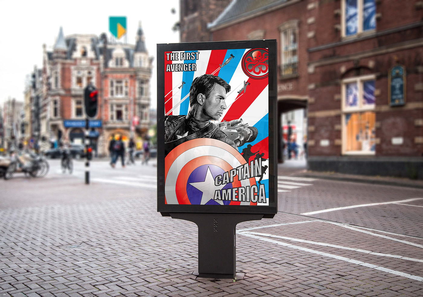
Constructivism
This poster focused on the style of Constructivism for Captain America The First Avenger My most successful design out of the three. The strength of the design I find is very impactful to the film since it covers all themes and elements throughout the visual, individually highlighting each one and increasing its expressionism to the audience. Decision of black and white on the main character proved the right pathway to go. The figure’s origins began in WW2 and in the future, his story continued in our present day. The design separates both timelines explaining this more as an origin story, making it easier for audiences to understand what they will expect to witness. In decision with typography I chosen (Impact) from the options I gathered as I feel it has the most relative similarity to other Constructivism Fonts. The 3D direction of it makes the design more expressive and stand out more explosively. I came to this decision as it is the same velocity and movement to how our hero throws his shield, similar to what a 3D experience would offer to you. Even in 2D it still has a big impact. My use of gradients made all the difference and being critical about tone and detail made it adapt more into the 3D world. A design for a superhero film should be heroic, having one that is attractive and embracive takes us into another world of our imagination and escape into a new reality we want to witness.
As also requested in the brief I was asked to animate one of my film posters in Aftereffects. I chose this poster since it was the most popular out of the three. The movements of the visual I find gives the character and the film the representation it deserves. The heroic atmosphere, historical theme in relation to WW2 and symbolises the main character with the use of having the shield become the first object to be caught in the visual. The way it reveals everything from the shield as a starting point to all elements of WW2 coming out like it’s a charge into battle and having the character’s name bounce out in a similar movement to when our hero throws the shield increasing the excitement by showcasing his signature combat moves. The brief duration of increasing the scale of Captain America allows the viewers to be drawn in more into not just the character, but also the actor. Chris Evans is most famously known for this role and for those who are unlikely unaware of this can be revealed through a more exciting visual. Resizing the shield back to its original scale makes the looping of the animation more professional and to loop more smoothly.
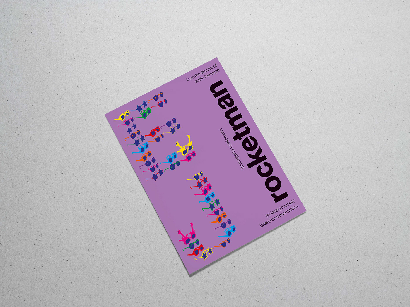
Modernism
A final outcome for this project focused on the style of Modernism. Rocketman. The vertical display of the title on the right side expresses how Elton John’s career started at ground level and took off into new heights like a rocket. Better to go straight into orbit than go diagonally off course. His variation of glasses forms the shape his initials to represent his style and recognisable features. The use of purple symbolises the sense of bravery, creativity, wisdom, royalty, wealth, pride, independence and magic which all describe Elton John’s talent and a musical atmosphere. I decided to keep the typography black since it expresses the strength and courage most in which Elton John has used throughout his journey to become the person he is known for today. Other designs included showcase my research and consideration into the use of style and layout during the development of the final outcome.
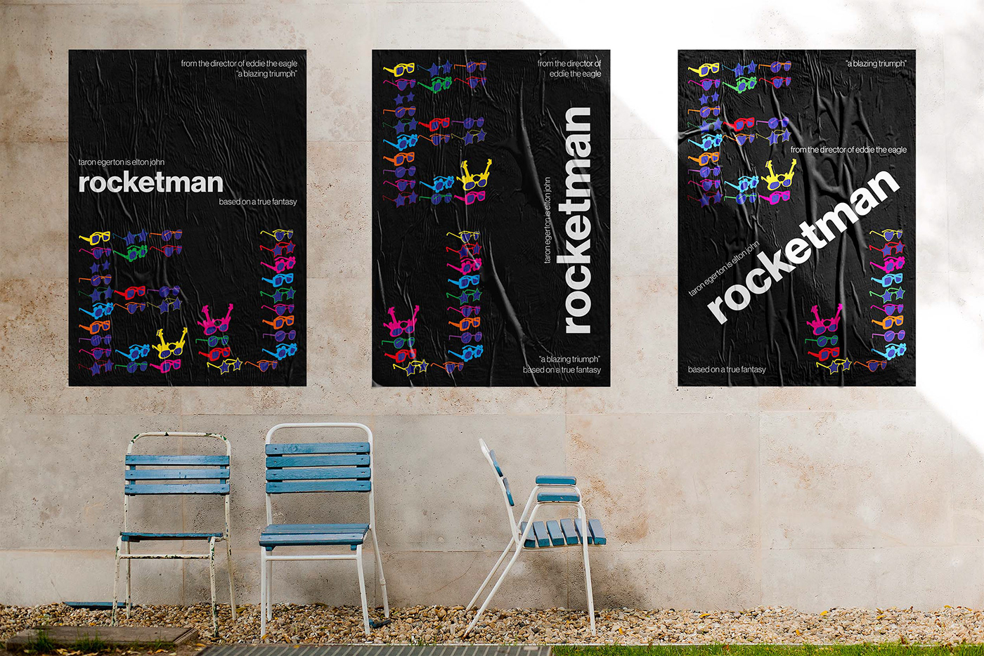

Other designs included showcase my research and consideration into the use of style and layout during the development of the final outcome.


