


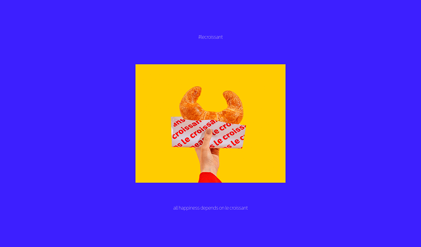
Born in Jeddah around four decades ago, Le Croissant has great equity based on serving authentic French breakfast & delicious coffee at affordable prices. The brand enjoys a good mental image among Jeddah’s dwellers & visitors.
The brand had an inconsistent identity, namely, the visual identity. Some branches had blue elements; others had green ones for no clear reason. The existing identity was there for long years. The client just wanted to give the brand a facelift, keeping the most important elements, making the brand look fresher, and giving the brand a boost.
The brand had an inconsistent identity, namely, the visual identity. Some branches had blue elements; others had green ones for no clear reason. The existing identity was there for long years. The client just wanted to give the brand a facelift, keeping the most important elements, making the brand look fresher, and giving the brand a boost.


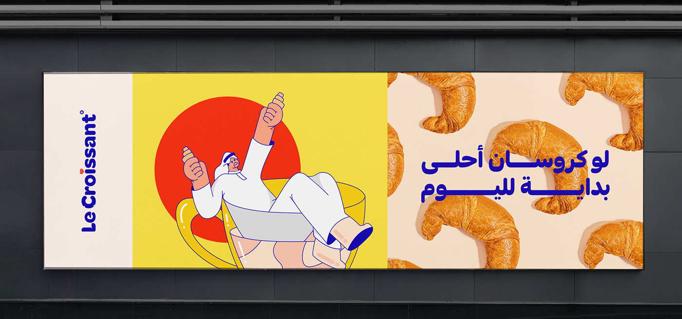
The new logo uses the custom typeface. It is now fluffier and more modern & mature. It looks more abstract. We have kept the dark blue background because it is the main brand color that distinguishes the brand from other brands. We have also kept the croissant shape in the beginning of the word “croissant”; it serves both as a symbol for the restaurant & replaces the letter “C”.
The heart symbol on top of the letter “I” embodies the brand archetype, innocent, and it stayed in the same place as the old one. The heart represents the brand’s tagline: “Baked with Love”.


Milk Network ®
E: hello@milkdesign.co
Client: Le Croissant
Project: Re-Branding
Year: 2021
Brand Strategy:
Fadel Shaath & Haya Al Jamal
Year: 2021
Brand Strategy:
Fadel Shaath & Haya Al Jamal
Design Director: Alaa Tameem
Art Direction + Logo Design: Karim Ahmad
Copywriting: Mootasem Al Felo
Graphic Designer: Fatima Emad
Illustration: Heba & Mario
Photography: Noreen
Animation: George Adel
Graphic Designer: Fatima Emad
Illustration: Heba & Mario
Photography: Noreen
Animation: George Adel


