


A brand identity update for a powerful team
Extreme Team have been developing the country's extreme sports and street culture industry since 2015. They are actively growing, organizing events with multi-million audience reach and media headlines.
The main goal of the rebranding was to build a flexible and adaptive design system that would allow them to work within completely different sports and cultural events, but still remain recognizable.

We changed the main symbol of the team – the cross.
It became sharper and more dynamic.

The voice of the brand has also changed.
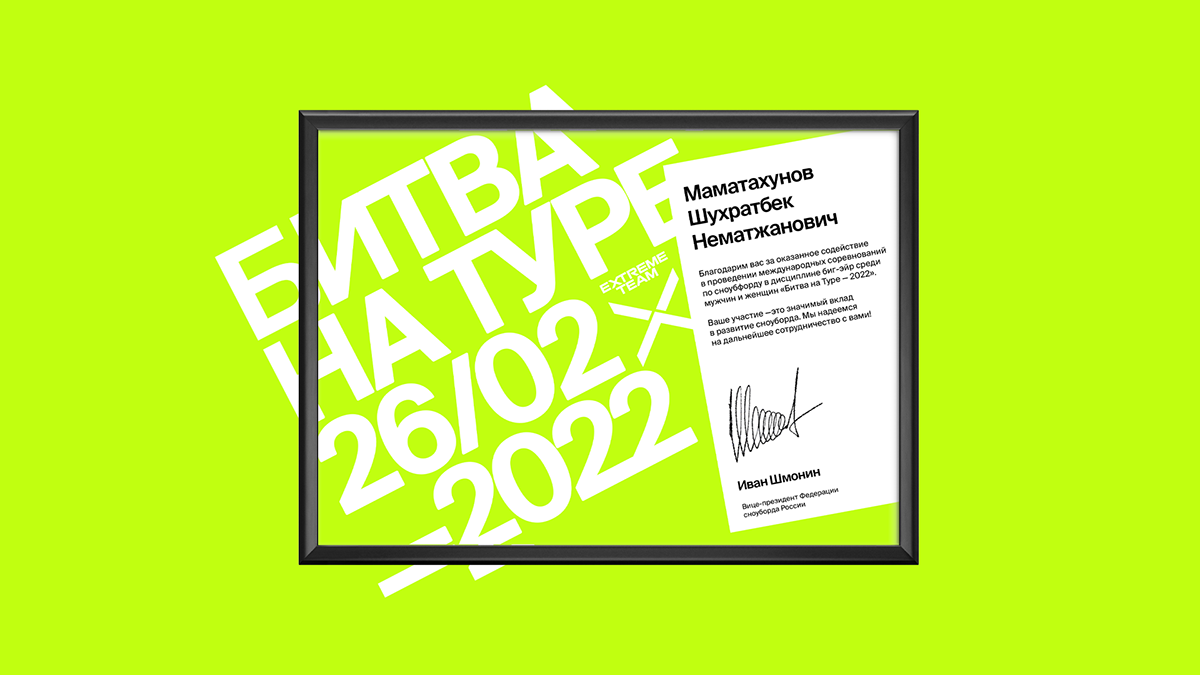
The project's typography now uses the confident, neutral grotesque Suisse Int'l from Swiss Typefaces to reflect the brand's matured character. In doing so, the brand communicates easily and wittily, thanks to an atypical layout.


Client: Extreme Team
Visual identity / Сommunication / Brand platform
Visual identity / Сommunication / Brand platform
Graphic design – Sasha Dooginov
Tyumen / 2022


