INSTORM
VISUAL IDENTITY / PRINT MATERIALS / MARKETING TEMPLATES
Instorm is a brand, developing online business board games and simulation, aiming to change the way companies train their employees. Their idea is to create a learning environment where people can learn from real life experiences, observe their own behavior and learn from their mistakes.
At the heart of the training is the experience - games in which participants experience strong emotions and are challenged to the limit. In other words, they are in a storm of emotion. This is how the name Instorm was born.
Our main task was to redesign the already existing Instorm logo, complemented by a strong visual identity, to successfully present the professionalism and experience of the team to some of the largest companies in the country and abroad.
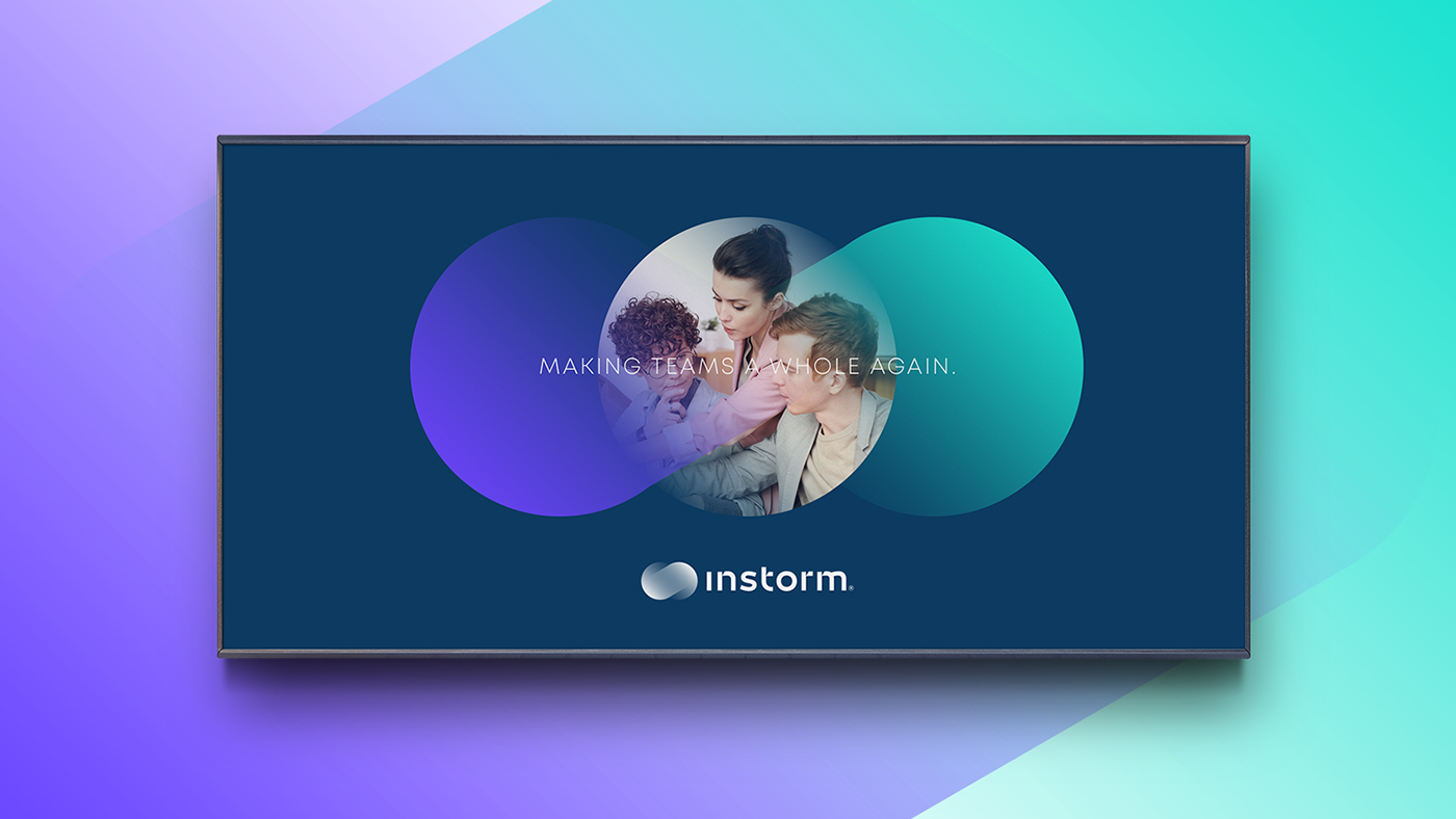
After developing many concepts, testing and revising, we came to a logo composed of a custom typography, combined with a simple mark with great symbolism. The color scheme we chose creates a sense of dynamism, and the bright colors complement the idea of a young company with bold ideas and effective solutions to business problems.
In itself, the brand mark combines the symbolism of an infinity sign, hinting at the idea that knowledge is for life and leads to endless possibilities, as well as the idea of merging - the traditional teaching methods with modern and the team as a whole.
At the heart of the training is the experience - games in which participants experience strong emotions and are challenged to the limit. In other words, they are in a storm of emotion. This is how the name Instorm was born.
Our main task was to redesign the already existing Instorm logo, complemented by a strong visual identity, to successfully present the professionalism and experience of the team to some of the largest companies in the country and abroad.
After developing many concepts, testing and revising, we came to a logo composed of a custom typography, combined with a simple mark with great symbolism. The color scheme we chose creates a sense of dynamism, and the bright colors complement the idea of a young company with bold ideas and effective solutions to business problems.
In itself, the brand mark combines the symbolism of an infinity sign, hinting at the idea that knowledge is for life and leads to endless possibilities, as well as the idea of merging - the traditional teaching methods with modern and the team as a whole.