


PT-BR
Moriarte é uma hamburgueria pequena
localizada na cidade de Venâncio aires, Rio Grande do Sul, Brasil.
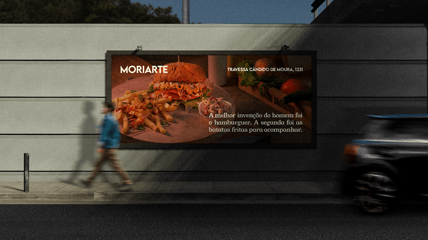
Todos os hamburgueres são criados de forma caseira e nisso que está focada a essência da hamburgueria.
O atendimento acontece nas Quartas e Sábados por encomenda.
Esse projeto tem como foco dar a identidade visual do estabelecimento (logo, tipografia,
paleta de cores e apresentação de produtos) e é somente um caso de estudo.
EN
Moriarte is a small burguer joint
located in the city of Venâncio Aires, Rio Grande do Sul, Brazil.
All the hamburguers are homemade and that is the essence of the establishment.
The service takes place on Wednesdays and Saturdays by order.
This project focused on giving the establishment's visuall identity (logo, typography,
color palette and product presentation) and it's just a case study.
PT-BR
O nome "Moriarte" vem da junção de
"amor" "e" "arte", que se faladas juntas (em Português), soam como "Moriarte".
Essa junção representa bem a paixão pela culinária,
unindo as duas coisas que mais movem essa hamburgueria, o amor e a arte.
EN
The name "Moriarte" comes from the junction of
"amor" "e" "arte", which if spoken together (in Portuguese), sound like "Moriarte".
This junction represents well the passion for cooking,
uniting the two things that most move this burger place, love and art.

PT-BR
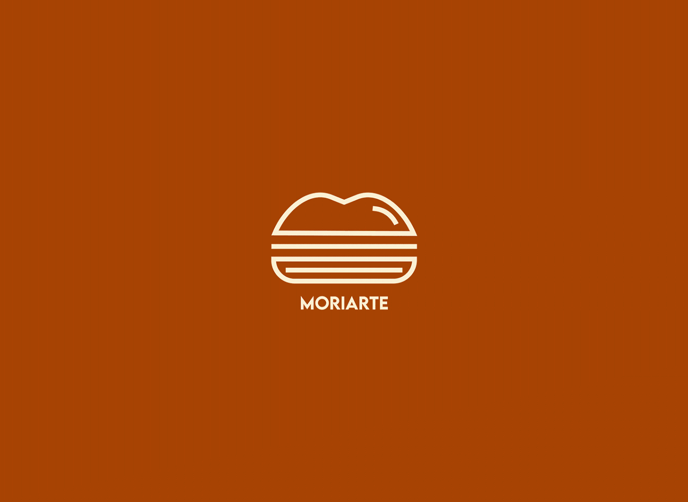
A logo tenta representar ao máximo o estabelecimento, o hamburguer como a peça central,
o pão superior em formato de "M" representando "Mori" ou "Amor e”, o pão inferior em formato de
"A" virado e estendido, representando "Arte".
EN
The logo tries to represent the establishment as much as possible, the hamburger as the centerpiece,
the upper bun in the shape of an "M" representing "Mori" or "Amor e” (em Português), the lower bun in the shape of an
"A" turned and extended, representing "Art".


