
Aeonik Mono and Aeonik Fono


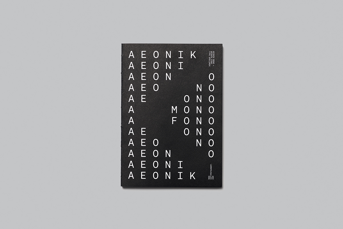


Aeonik Mono and Aeonik Fono Typefaces
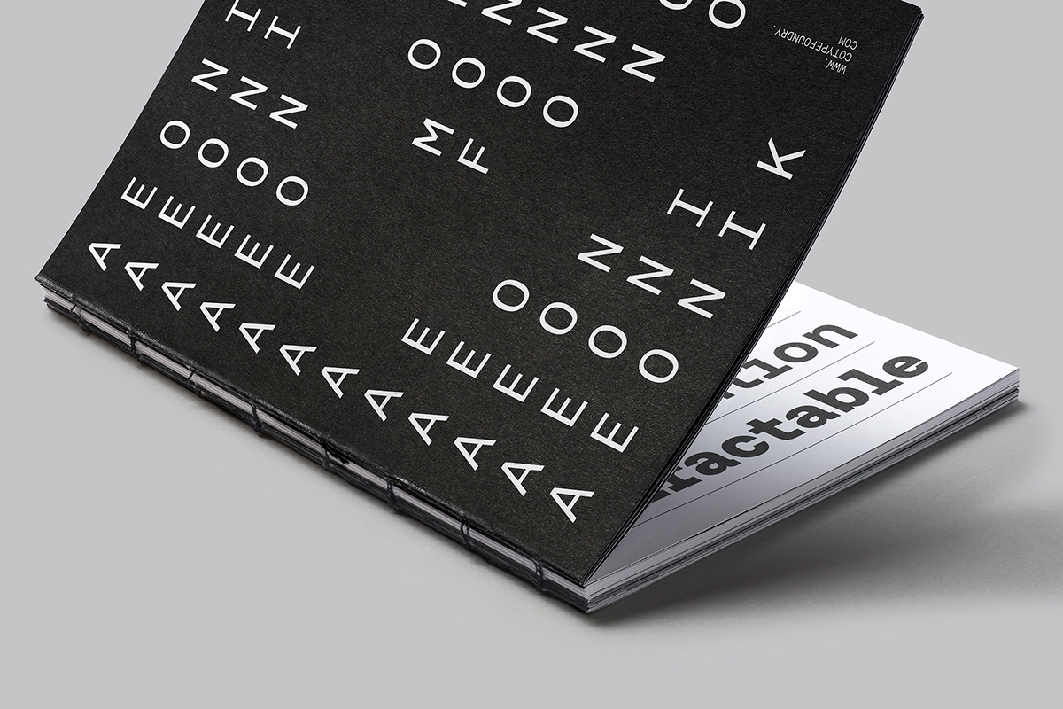
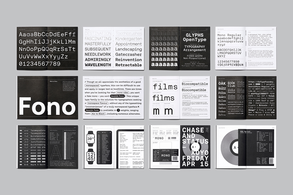
CoType Foundry introduces Aeonik Mono and Aeonik Fono. One is a typical fixed-pitch font where each character fits in a box of the same width. The other is a great illusionist posing as a mono but is actually proportionately spaced.
Our goal in creating Aeonik Mono was to pick up on the features that make the original Aeonik a beloved choice amongst designers and transform it into a true monospaced type family for use in any graphic design project and even for coding.
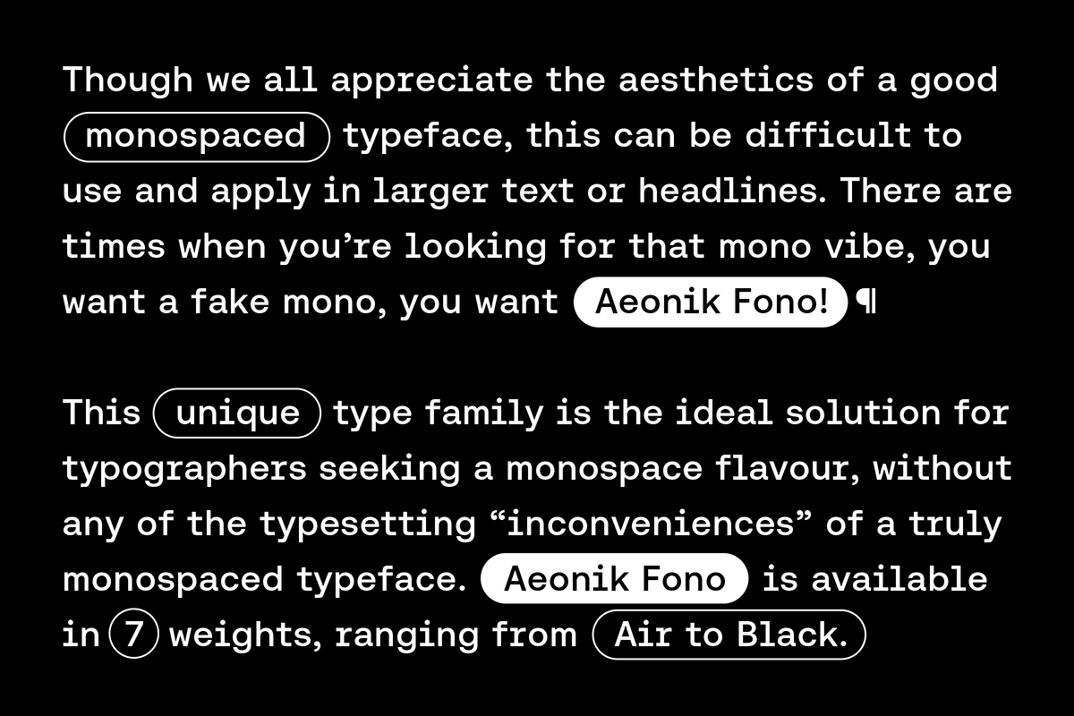
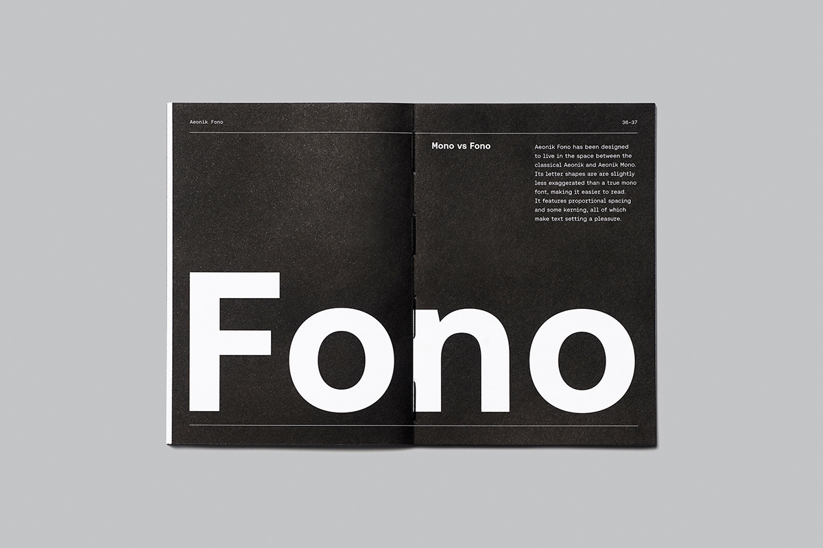
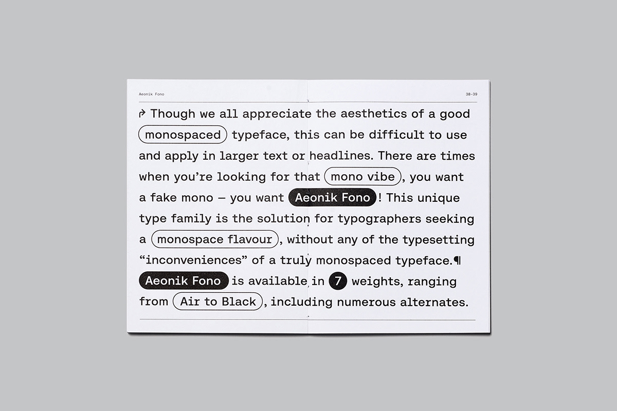
We all appreciate the aesthetics of a good mono yet such a typeface can be difficult to use in running text or in headlines due to its large word spaces lack of kerning and some very narrow characters. For typographers seeking that mono vibe without the typesetting “inconveniences” of a truly monospaced typeface we created a fake mono – a Fono if you will.
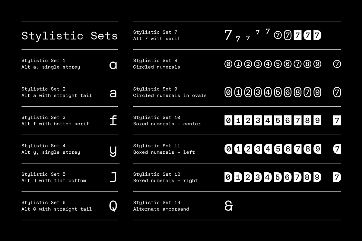
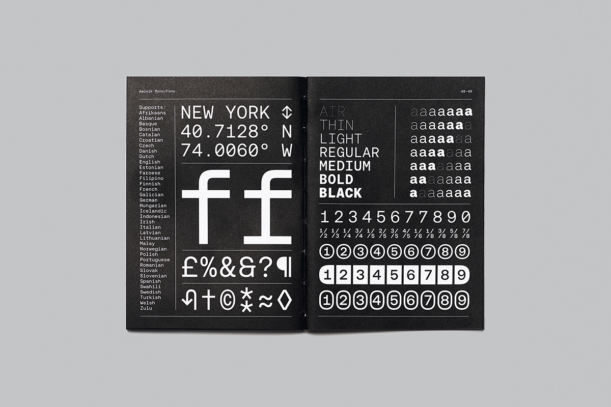
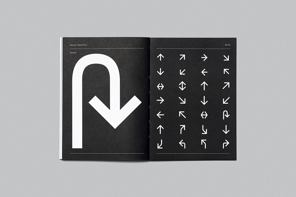
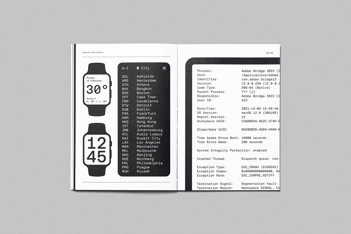
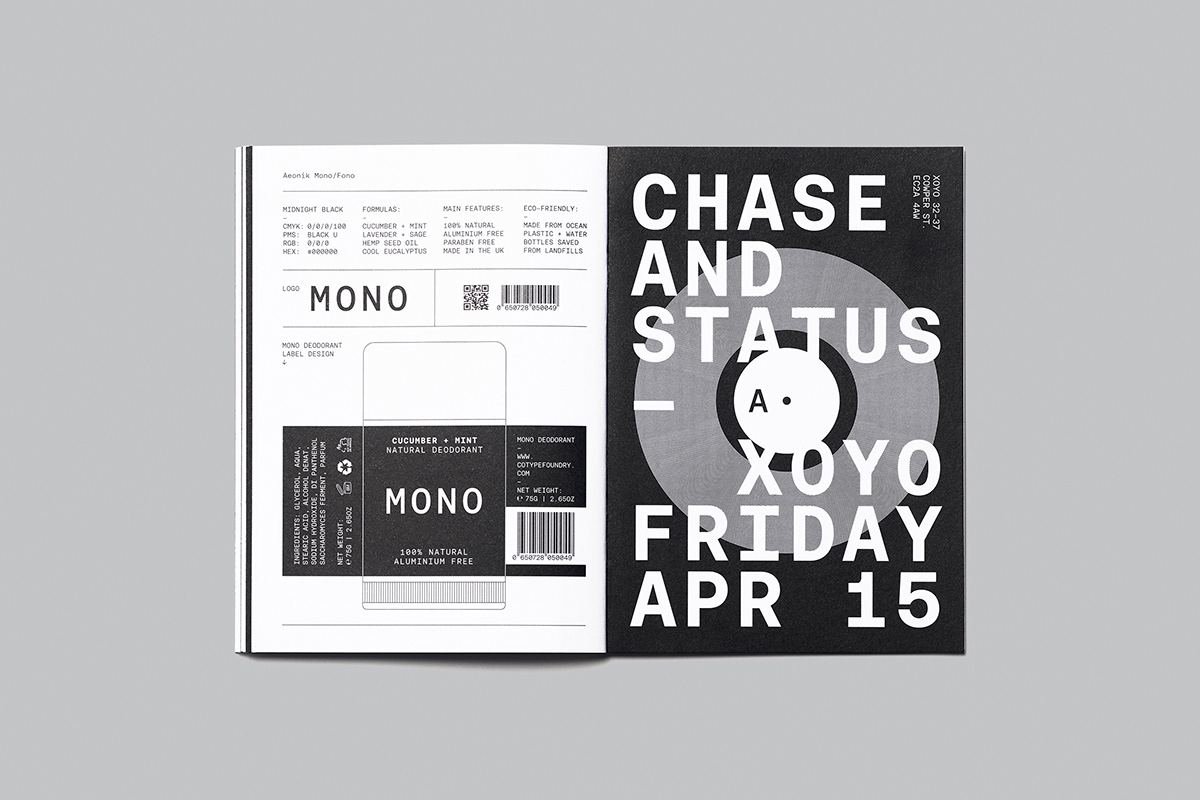
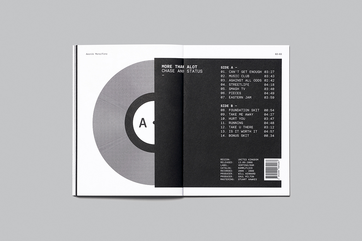
Aeonik Mono and Fono feature numerous stylistic sets, boxed and circled numerals as well as alternate characters and arrows.
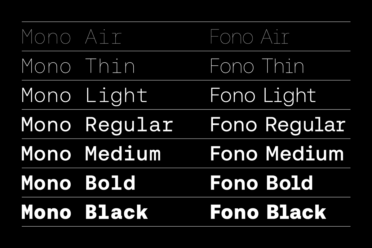
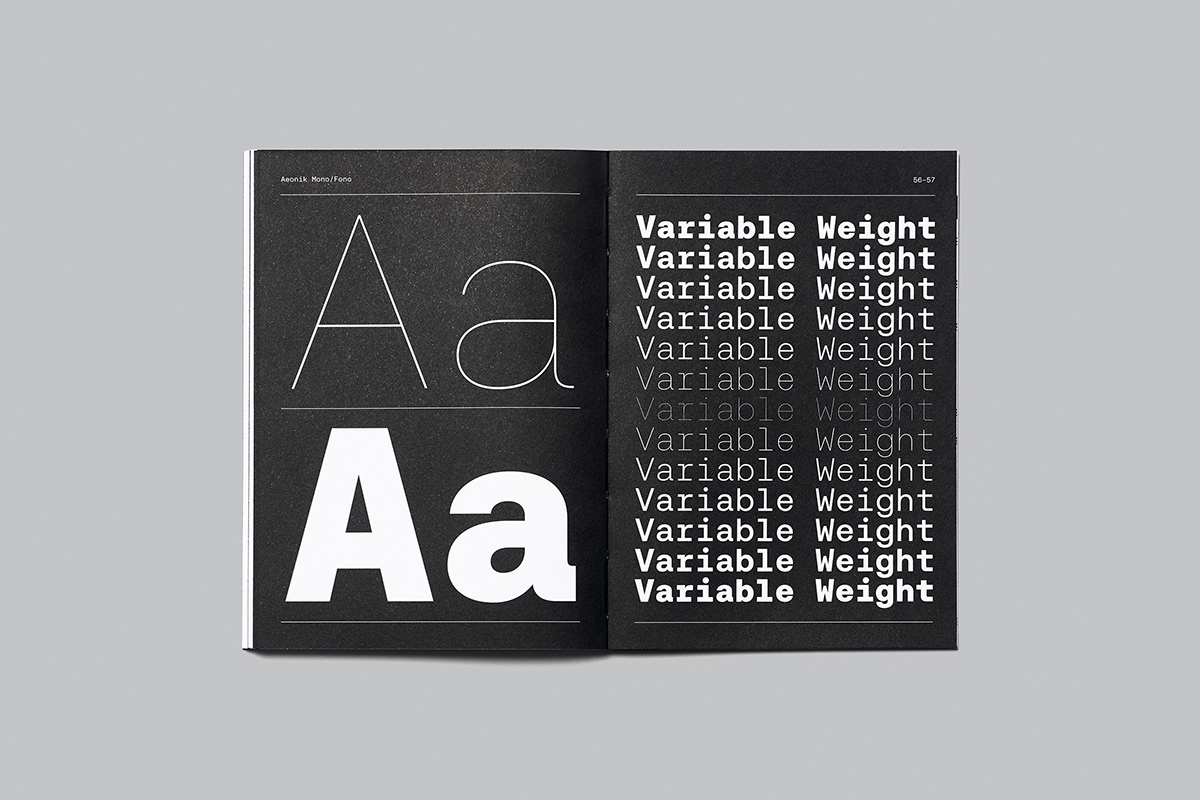
Aeonik Mono and Fono are available in 7 weights ranging from Thin to Black. The extensive language support (Latin Extended A) allows type setting in most European languages written with the Latin script.
FREE 68pp, type specimen book and variable fonts on all Full Family purchases.
Available to buy and trial exclusively at www.cotypefoundry.com
———
Credits:
Typeface Design by www.cotypefoundry.com
Type Support by www.blast-foundry.com
Printing by www.identityprint.co.ukType Support by www.blast-foundry.com
Photography by www.garysmithphoto.com


