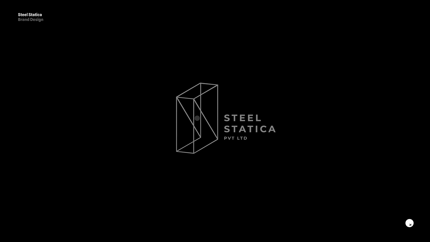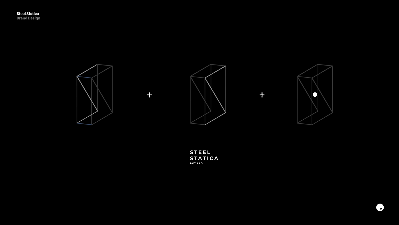

We were approached by Steel Statica to create their brand identity. We started by creating the logo that represents the structure of a steel bracket. It has a blue-gray color, much like steel. The red dot represents equilibrium or the center of the structure. Based on the logo and the blue-gray colors, we created the remaining collateral.
Artists _ Amitha Arun, Tharun Joseph Abraham
Client _ Steel Statica Pvt Ltd
Design Studio _ Pale Blue Dot Creative