

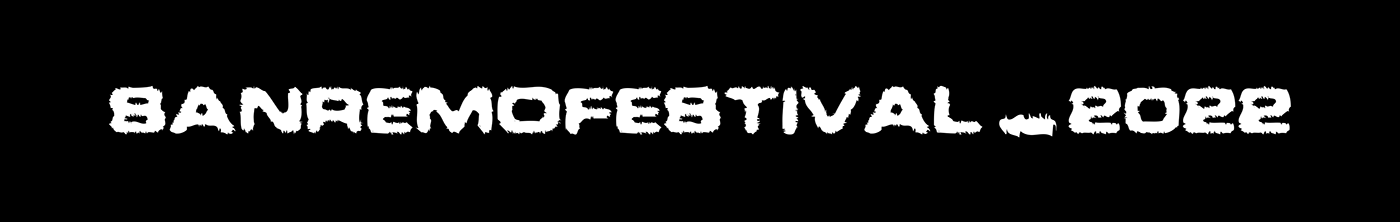
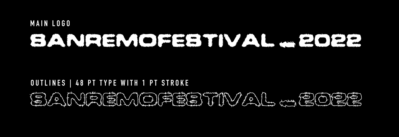
LOGO
- The logo uses BD Faxer typeface, which was ideal for my vision. The typeface has unique, sharp edges, which remind of electricity and energy. From distance, the logo looks like its blured, which is like the blinding spot lights on the festival
- The typeface can be also used for short headers and disclaimers
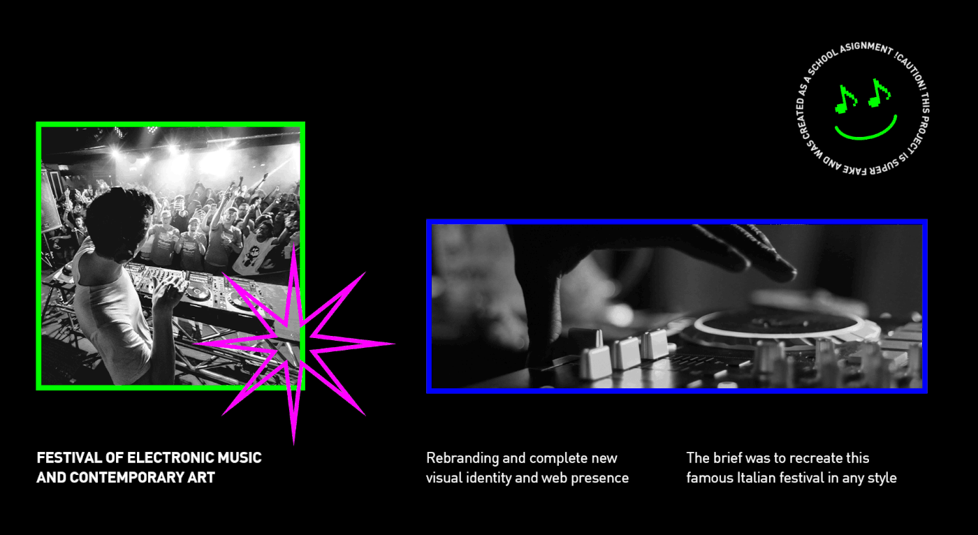
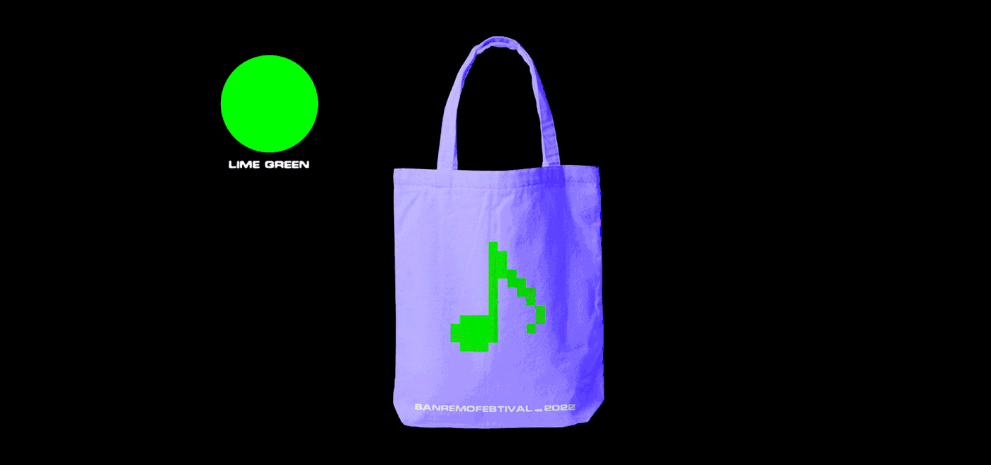
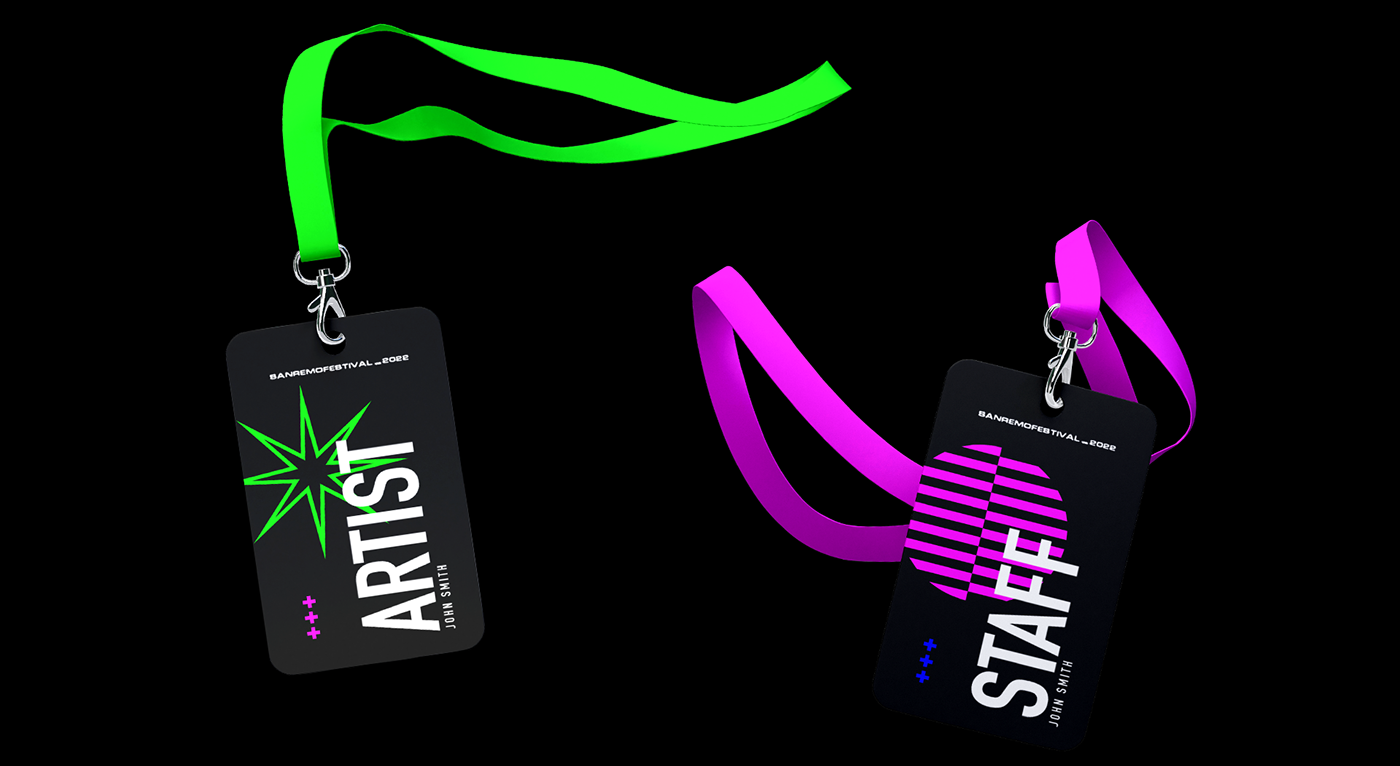
COLOURs
- Primary black and white, enhanced with three bright, secondary colours
- The goal here is to display something synthetic, digital which is mainly perceived in case of the green (the B767-300 airplane computer display colour, which inspired me)


Created as a school assignment
Designed with care and love under humane conditions
Follow me on instagram⭐️
Check out my portfolio🖥


