


PT
Fui convidada pelos meus clientes Gabriele e Heitor para desenvolver o projeto de identidade visual para o estúdio criativo.
O estúdio criativo Brive produz fotografia de moda com produção e styling. Faz fotografia de produtos, ensaios corporativos, press kits, ensaios femininos e produção de catálogos.
Para além das fotografias, Brive oferece uma experiência única e exclusiva. O diferencial do estúdio é proporcionar ao cliente mais praticidade e um serviço completo. O cliente faz a procura e o estúdio encarrega-se de todas as fases de produção.
A equipe tem um espírito jovem e uma mente aberta, aceitando novos desafios. Realiza trabalho profissional de forma criativa e com um toque de ousadia.
I was invited by my clients Gabriele and Heitor to develop the visual identity project for their creative studio.
The creative studio BRIVE produces fashion photography with production and styling. It does product photography, company essays, press kits, women's essays and catalog production.
Beyond photography, Brive offers a unique and exclusive experience. The studio's differential is to provide the client with more convenience and a complete service. The client does the search and the studio takes care of all the production phases.
The team has a young spirit and an open mind, accepting new challenges. It performs professional work creatively and with a touch of daring.


PT
O nome BRIVE foi escolhido pela Gabriele e o Heitor, que são os proprietários do estúdio. Trata-se da junção do nome da Ga(BRI)ele e o sobrenome do Heitor, (VE)rdi. O nome ficou com fonética agradável, fácil pronúncia e memorização.
Através do briefing realizado com os clientes, o objetivo central da identidade visual é comunicar-se com uma linguagem acessível, criativa e leve.
No briefing escolheram adjetivos que melhor representam a marca e também o trabalho que será desenvolvido para os clientes.
EN
The name BRIVE was chosen by Gabriele and Heitor, who own the studio. It is the junction of Ga(BRI)ele's name and Heitor's last name, (VE)rdi. The name has a pleasant phonetic, easy pronunciation and memorization.
Through the briefing conducted with the clients, the main goal of the visual identity is to communicate with an accessible, creative and light language.
In the briefing, adjectives were chosen that best represent the brand and also the work that will be developed for the clients.

PT
Conceito
Os atributos mais fortes da marca são livre, leve, sensível, criativa e ousada. Ao pensar nestes atributos, todos se relacionam ao ato de voar, que se tornou inspiração para o conceito da marca. Os animais que voam, como o pássaro, simbolizam a inteligência, a sabedoria, a leveza e a liberdade. Um pássaro tem o poder de voar por causa de suas asas. Um elemento em comum entre os animais que voam são as asas, cuja simbologia é a liberdade, a leveza, a inteligência e a inspiração. Elementos que foram descritos no briefing e traduzem muito bem o serviço prestado pela Brive. Foi assim que o símbolo da asa foi escolhido.
EN
Concept
The brand's strongest attributes are free, light, sensitive, creative, and daring. When thinking about these attributes, they are all related to the act of flying, which became the inspiration for the brand concept. Animals that fly, like the bird, symbolize intelligence, wisdom, lightness, and freedom. A bird has the power to fly because of its wings. A common element among flying animals are wings, whose symbolism is freedom, lightness, intelligence and inspiration. Elements that were described in the briefing and translate very well the service provided by Brive. That's how the chosen symbol.
The brand's strongest attributes are free, light, sensitive, creative, and daring. When thinking about these attributes, they are all related to the act of flying, which became the inspiration for the brand concept. Animals that fly, like the bird, symbolize intelligence, wisdom, lightness, and freedom. A bird has the power to fly because of its wings. A common element among flying animals are wings, whose symbolism is freedom, lightness, intelligence and inspiration. Elements that were described in the briefing and translate very well the service provided by Brive. That's how the chosen symbol.
Painel semântico
Moodboard


PT
Aspectos visuais
A Gabriele gosta de minimalismo, já o Heitor gosta de elementos mais vibrantes. Pensei em termos visuais para relacionar a personalidade e interesses dos dois, e também permitir que os clientes da Brive se conectassem com a marca. A vertente visual escolhida foi o minimalismo colorido.
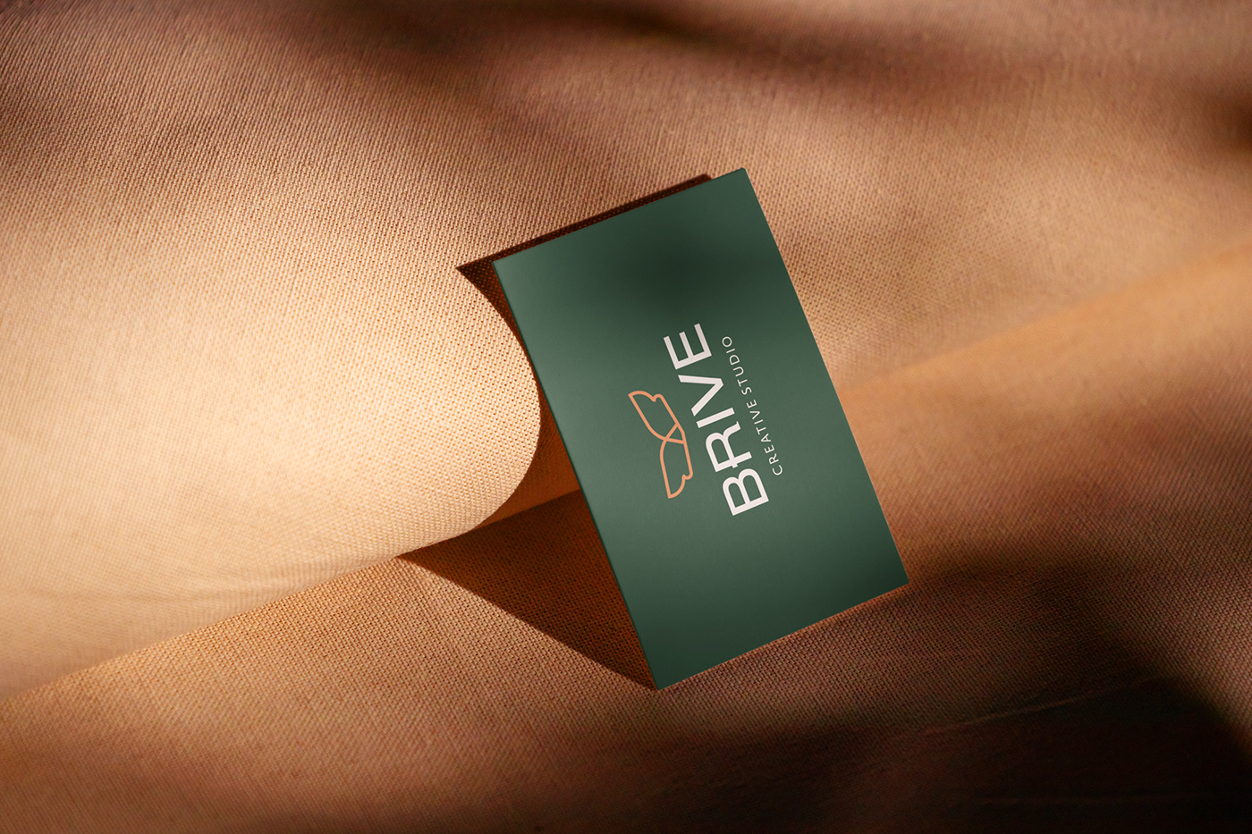
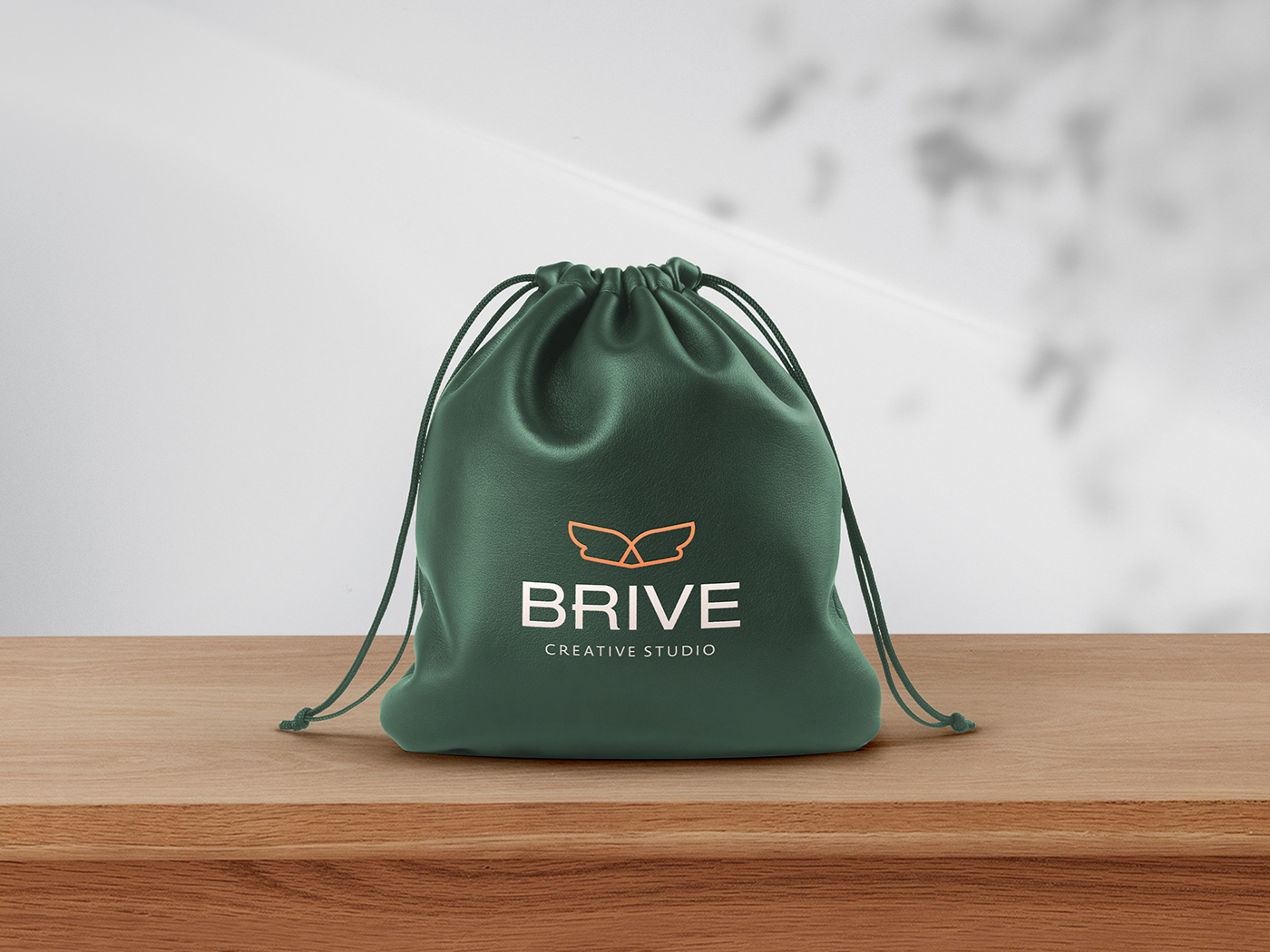
A tipografia escolhida possui traços mais imponentes, de modo que contraste com o símbolo da marca, que possui traços mais arredondados e amigáveis.
O texto maiúsculo transmite a imponência e empoderamento, que se relaciona com os modelos, marcas e empresas que contratam o serviço. A missão da empresa é tornar a experiência do cliente sempre criativa e exclusiva. O texto maiúsculo também foi escolhido para evitar que o público associe o aspecto jovem com "inocente".
As cores sugeridas no briefing pelos clientes foram estudadas pois meu maior desejo era trazer a identidade dois dois, já que o nome foi escolhido a partir dessa junção e associar ao conceito da marca.
O verde é a cor de tudo que cresce, assim como os resultados proporcionados pelos serviços da Brive aos clientes. Também é a cor da juventude, que é o espírito da equipe. O tom mais escuro foi escolhido para trazer imponência e grandiosidade.
O laranja desempenha o papel de transmitir boas vibrações, energia e remeter ao ambiente criativo. O tom do laranja foi escolhido com muito cuidado para contrastar com o verde sem que fosse agressivo.
EN
Visual aspects
Gabriele likes minimalism, while Heitor likes more vibrant elements. I thought in visual terms to relate the personality and interests of both, and also allow Brive's customers to connect with the brand. The visual aspect chosen was colorful minimalism.
The typography chosen has more imposing strokes, so that it contrasts with the brand's symbol, which has more rounded and friendly strokes.
The uppercase text conveys imponence and empowerment, which relates to the models, brands, and companies that hire the service. The company's mission is to make the client's experience always creative and exclusive. The uppercase text was also chosen to prevent the public from associating the young aspect with "innocent".
The colors suggested in the briefing by the clients were studied because my greatest desire was to bring the identity of the two, since the name was chosen from this junction and associate it with the brand concept.
Green is the color of everything that grows, as well as the results provided by Brive's services to customers. It is also the color of youth, which is the spirit of the team. The darker tone was chosen to bring grandeur and grandeur.
Orange plays the role of transmitting good vibes, energy, and the creative environment. The shade of orange was chosen very carefully to contrast with the green without being aggressive.


Projeto: Brive | Creative Studio
Designer: Nadine Fronza
Fevereiro 2022


