A corporate identity and full packaging designed for a samoosa business selling products called 'SAmoosas' (samoosas made in South Africa).

Concept Development & Design Strategy
The final theme and concept used for the “SAmoosa” branding and packaging is based on the idea of natural, organic, pure freshness. The idea was to promote a healthy form of samoosas in a creative eye-catching manner. The samoosas were initially designed as 'designer samoosas' with an element connected to them which makes them memorable and unique (this memorable element in the final design is the fork on which the samoosas are baked). The samoosas will be 100% organic, they won't contain preservatives, colourants or allergens. They are ultimately targeted at the health conscious individual who still wants to enjoy the traditional Indian snack while looking after their health amongst the modern day junk food and other fast foods that exist.
The recipe for the samoosas will be based on a healthier option. They will be baked as opposed to frying because baking reduces the oil content of the samoosa, therefore, making it a healthier option. The pastry will be made using wheat flour as opposed to normal flour because it is more beneficial. The vegetables used in the filling will be organically grown, therefore, reducing the chemicals and preservatives.
The samoosas designed for the company will be made and baked on wooden forks. The forks allow the samoosa to be eaten easily without making your fingers greasy and limiting the surrounding mess.
Logo

Stationery

Individual Packaging
The individual packaging for the samoosas involves a triangular box surrounding the samoosa with a gap in one side for the wooden fork to stick out. The inside of the triangular boxes will be lined with a plastic wax-like paper to keep the juices and possible grease from the samoosas from leaking through the packaging. The outside of the individual packages are specifically designed for each different flavour of samoosa available.
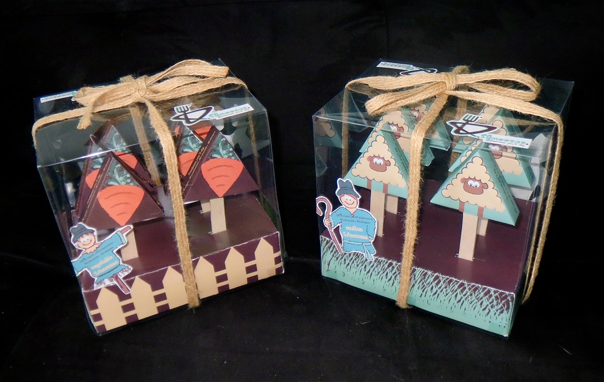
Final Packaging
The container packaging for the samoosas involves a rectangular box which is able to hold six samoosas in each box. The box for the mutton samoosas is designed to look like a field where the sheep are grazing. The box for the vegetable samoosas are designed to look like a vegetable garden. The top covering of the boxes are made from transparent acetate so you can see the individual samoosas through it.
Stickers have been designed for the outside of the container package. The stickers placed on top of the box show the company's logo and slogan. The stickers placed on the front and back of the box are a herdsman character for the mutton samoosas and a scarecrow character for the vegetable samoosas. The scarecrow and the herdsman have been used to represent the fact that the samoosas are looked after and made to perfection with the utmost care and pride.
Once the box is closed and all the stickers have been placed on it, a string made from organic materials has been wrapped around it with a bow on the top. This contributes to the organic and recyclable feel of the product as well as adding a finishing touch that is attractive to the customer.


" ...freshness you'll dig! "


