

Easy Base
Client
Oh! Broth
Services
Analytics
Naming
Brand platform
Package design
Task
Our task was to renew the existing brand “Oh! Broth” from scratch, to conduct analytics, develop positioning hypotheses, naming and packaging design for the entire line of products.
Initially, products were sold only via online channels. The main goal was to offer a solution that you can retail offline and talk about a product that is new to the market.
Solution
1. Market analysis
On a global scale, the instant soup market has enormous potential. It presents a large number of formats that satisfy the main need of the audience – the speed of preparation. The Russian market is characterised by high consolidation and the level of competition. Among the formats we analysed: cubes, mixes, soup dressings, spices and condiments, dry broths, frozen, jelly and canned broths.
Most of the players in traditional retail rely on the taste and speed of preparation. While on the online shelves, brands emphasise the purity of the composition and naturalness.
2. Competitor analysis
Communication in most cases is unified. In offline retail, customers are betting on taste, and in online retail, the bet is on good taste. Almost no one discloses the real benefits of the product.
The supermarket shelves remain traditional. The colours of the mass market are yellow and green, brands that offer healthy products are presented in a discreet range. The principle of coding in the tone of the product, to which the consumer is already accustomed, works everywhere.
3. Audience analysis
Today’s eating habits are part of someone’s lifestyle. Consumers unconsciously combine these concepts. They take pictures of dishes, subscribe to culinary bloggers' channels, look for products with the right composition and so on. What we cook and eat turns into an opportunity to express our own individuality. The audience expects from brands and manufacturers support in their choice and personalisation of the offer.
Our consumers are united by the desire to find a natural product that would not only speed up the cooking process, but also match the food style, reflect their lifestyle and become an object of admiration.
Positioning
A natural base for any meal you like, in your food and lifestyle
In positioning, we focused on an emotional message with a lifestyle emphasis. We can say that the brand helps consumers to simplify their lives by creating modern products that fit the food style.

Naming
The world we live in leads us to simplify different processes. When there is a foundation to create something, everything becomes much easier, because a lot has already been invented for us and you just need to use this base. Without the multiplication table, you cannot understand mathematics, and without a foundation you cannot build a house. This is what the Easy Base name tells about, our product is a base for different dishes. Regardless of the recipe and your eating style, dry broths will speed up and simplify the cooking process.
Design idea
The basis for any dish
Our product itself implies a certain basis. We worked within the framework of simple associations to evoke understandable images of a cozy home, beautiful dishes and large portions among the audience. It was important for us to show how easy and simple it is to prepare something amazingly beautiful with the help of Easy Base dry broth in order to please yourself and your loved ones.
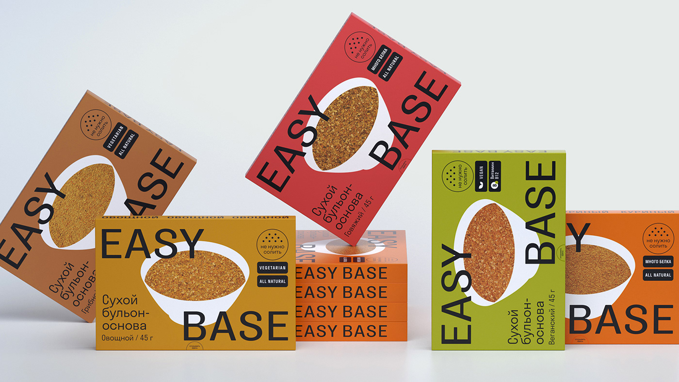
Design
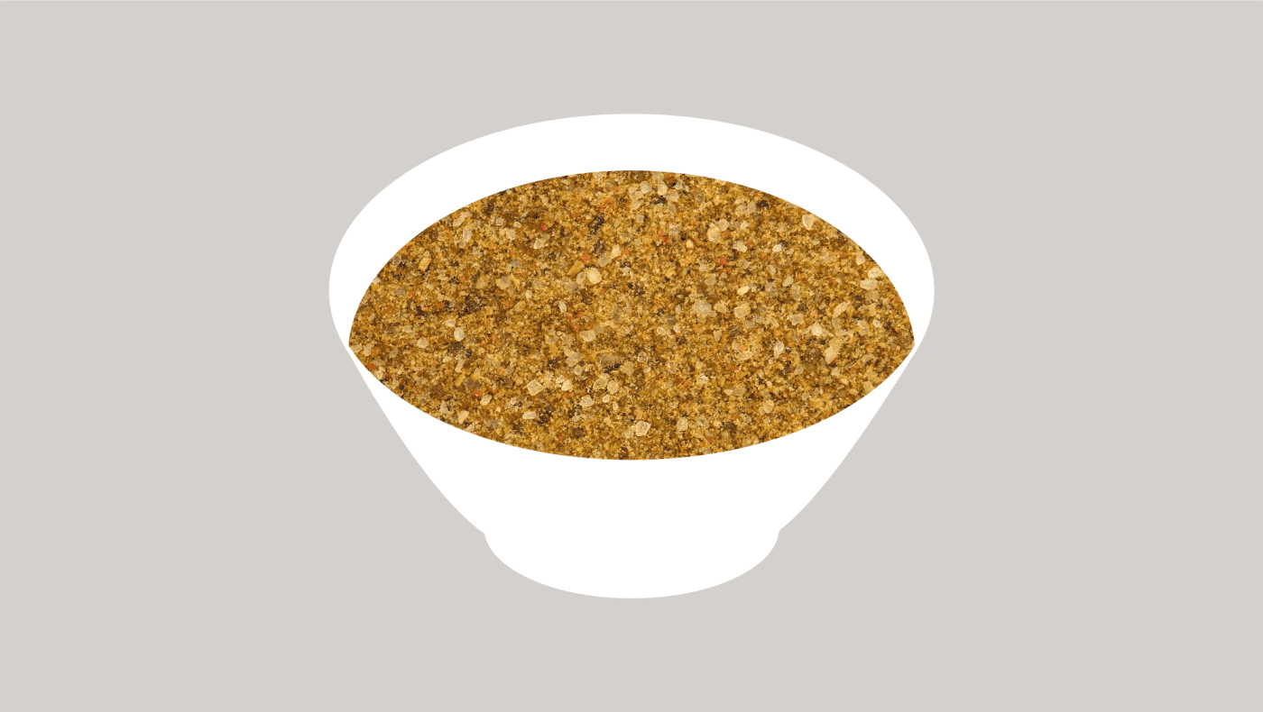
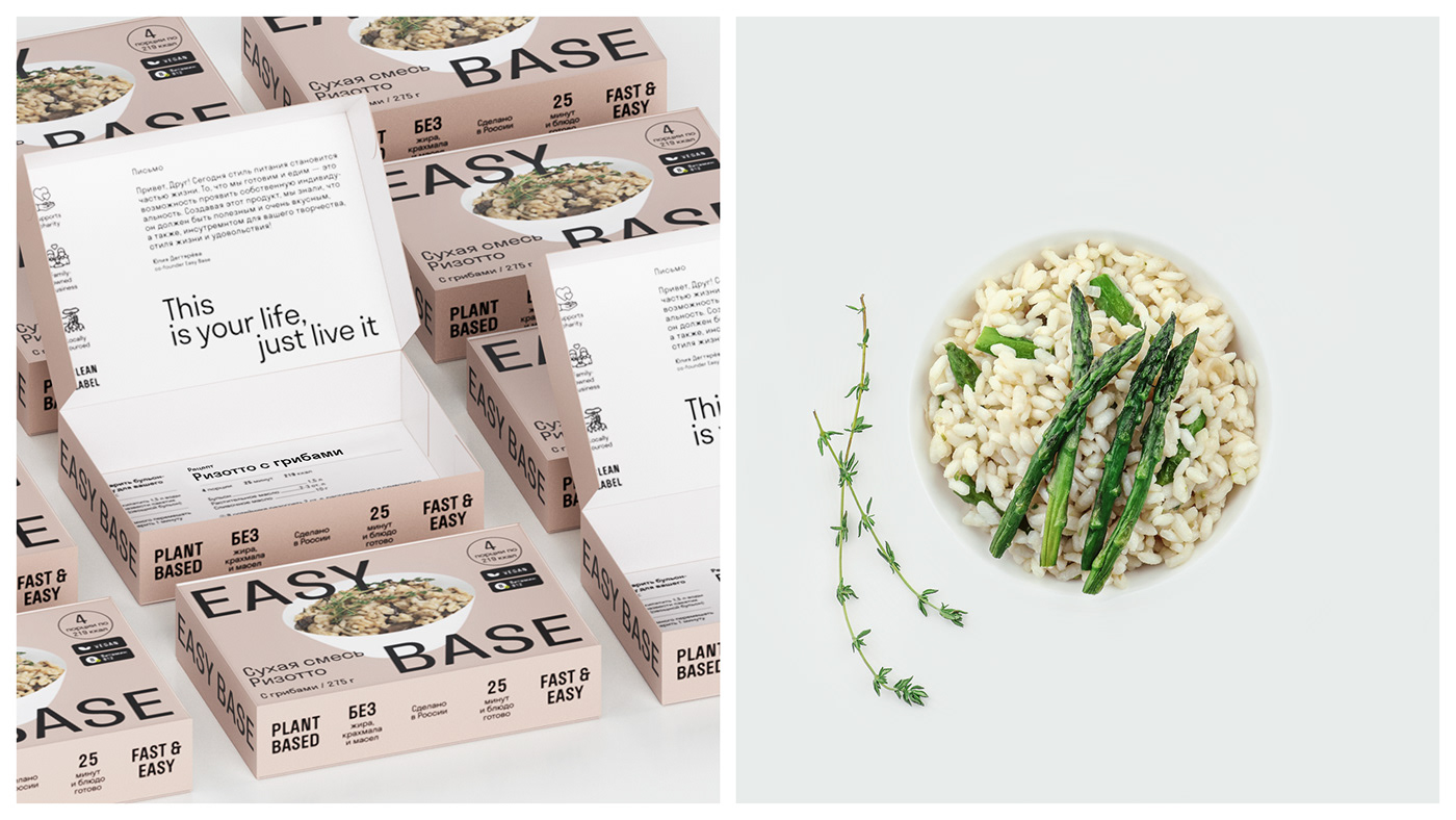
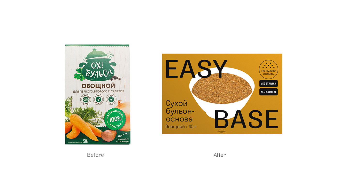
To create awareness on the shelf, it was important to focus on the name and logo. Therefore, we placed the brand box in the centre of the composition. It consists of two constants: graphics and font style. In the graphics, we used the image of a plate, which is filled with the image of a dry broth. We abandoned cutting down in order to maintain a uniform style on all packages, since it proved impossible on some of them.


To show the brand box with changing photos.
To demonstrate the situations of consumption and dishes when using broth, a food zone was created. The photographs were chosen so as not to disturb the visual design of the entire package. The composition, which is one of the strengths of the brand, was also extensively described.
To show changing covers.
To show changing covers.
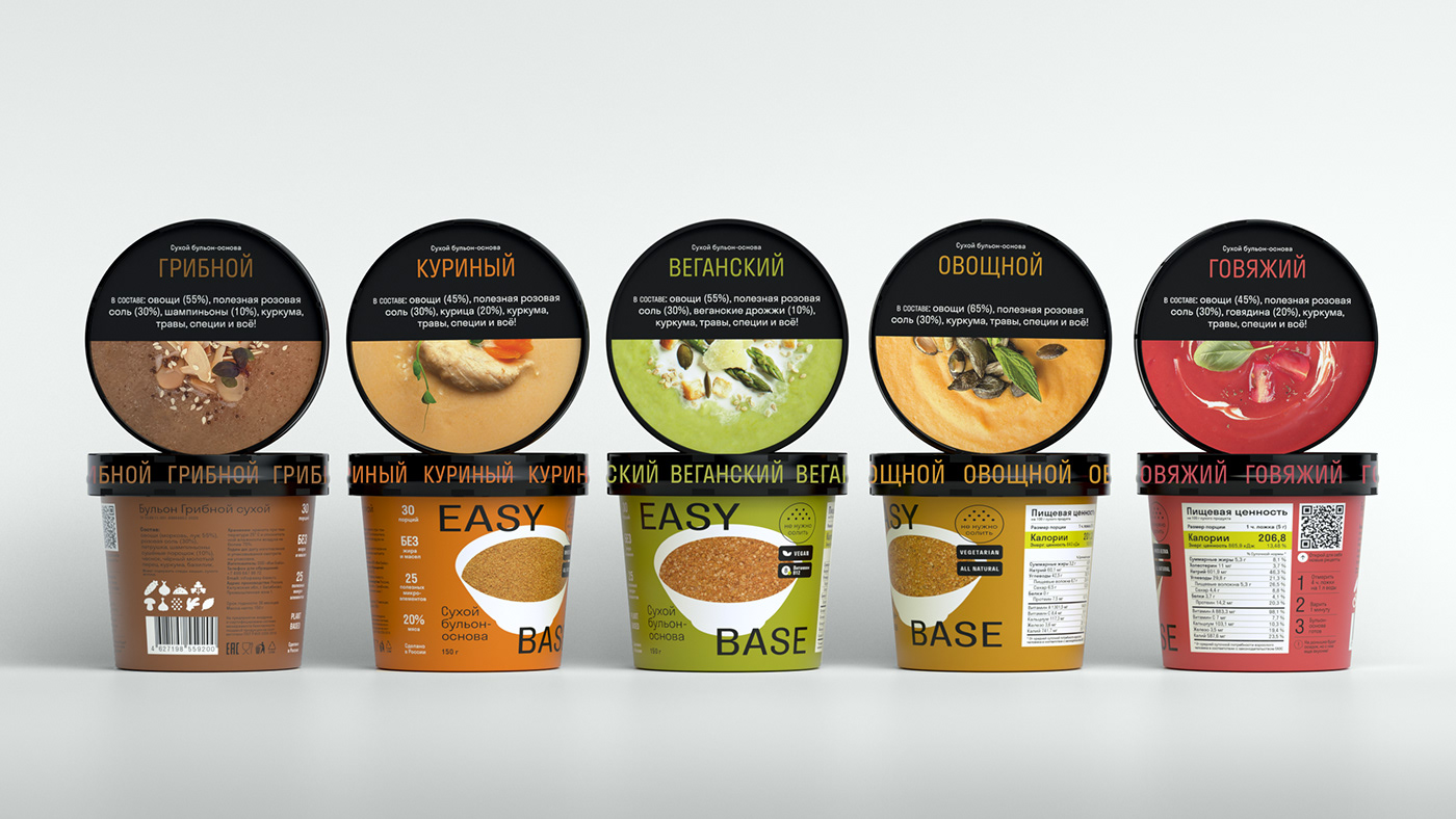
They brought out important information for the consumer: the method of preparation and recipes, adding a QR code and a short description of the sequence of actions.

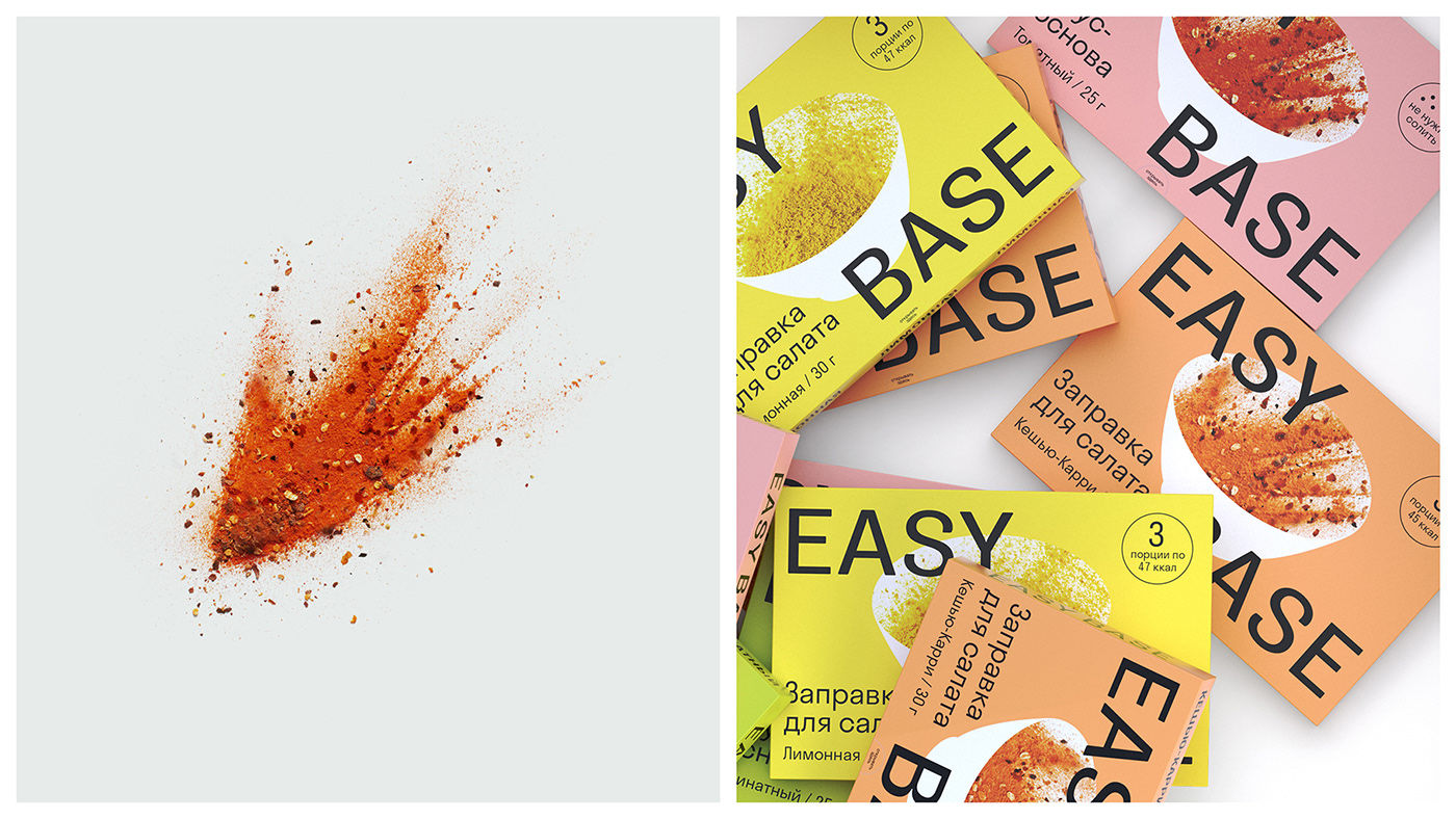
To show icons and recipes
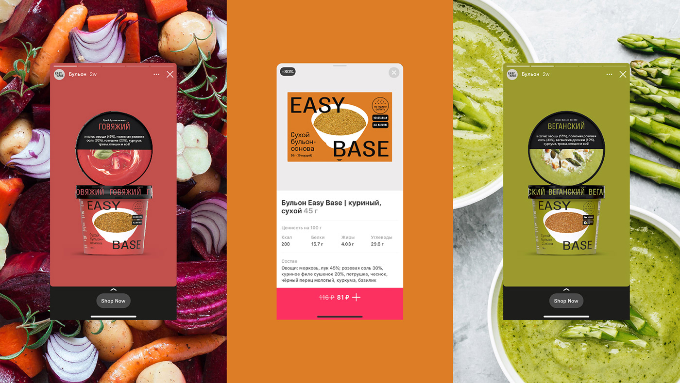
Towards the end of the design work, the number of SKUs increased from 5 to 19, and the line consisted of four categories: broths, sauces, dressings and ready meals. The image of the plate, which plays the role of cutting down on the packaging, allowed us to compare the food zone and the product category: dry broths – soups, dry ready meals – risottos, dry sauces – second courses, dry dressings – salads. Each line has its own colour, but due to a single brand box, they look holistic and form a recognisable image.

To show rulers
We also used color differentiation. For dry broths, rich, but dense in color shades were chosen, emphasizing the taste and nutritional value of the product. For dry mixes, the emphasis was placed on an appetizing ready-made dish in the food zone, so a neutral palette with low saturation was chosen as the base colors. Salad dressings are more associated with color. The shades are fresh, bright, but natural. They are harmoniously combined with dynamic photography of sprinkled dry mix. Due to a single brand block, all lines look harmonious and form a recognisable image.
To show rulers
In the course of the project, we got a new construct: a cardboard box. The line of dry ready meals required a design adaptation. Due to the smaller branding area, the recipe and food zone blocks were moved to the inside of the package. We also added a message from the creator of the brand there, which made this decision more personalised and emotional.

To show packaging inside
The project had a very tight deadline for implementation (2 months). It was important to have time to present the product at Prodexpo-2021. During this time, we successfully conducted analytics, developed naming and positioning, and adapted the design for 19 SKUs with the client. We completely relaunched the brand in both offline and online channels.

Results
1. After the rebranding, the company's revenue increased by 15% in several months compared to the same period in 2020 .
2. The brand entered offline retail (Azbuka Vkusa, PRISMA, VkusVill) and strengthened its online positions (Samokat, Ozon, Wildberries, Utkonos, 4Fresh).
3. All four product lines have been launched under the Easy Base brand, which includes 19 SKUs.


