
ISTD (International Society Of Type Designers)
STUDENT PROJECT 2014
A publication in response to the ISTD brief “Everything about one thing’, focusing on the sufferers expression of feelings and supported by grounded medical research. The concept of using traditional book conventions has been established to allow the consistency to be disrupted and an increase in emotion to be visually expressed.


The word 'Claustrophobia' was selected to enable a wide range of potential content as well as the opportunity to creatively explore inventive formats and typographic interpretation of content. The aim of the communication is to reveal information to adults wanting to find out more about claustrophobia – in a subtle and compelling manner.
MORE ABOUT THE PROJECT...
RESEARCH
Research revealed that the sufferer often over exaggerates what could happen. They feel they are in danger when in reality they are not. This led to the idea of the content focusing on individual case studies that focus on sufferers expression of feelings. These are supported and complemented by grounded medical research.
DESIGN
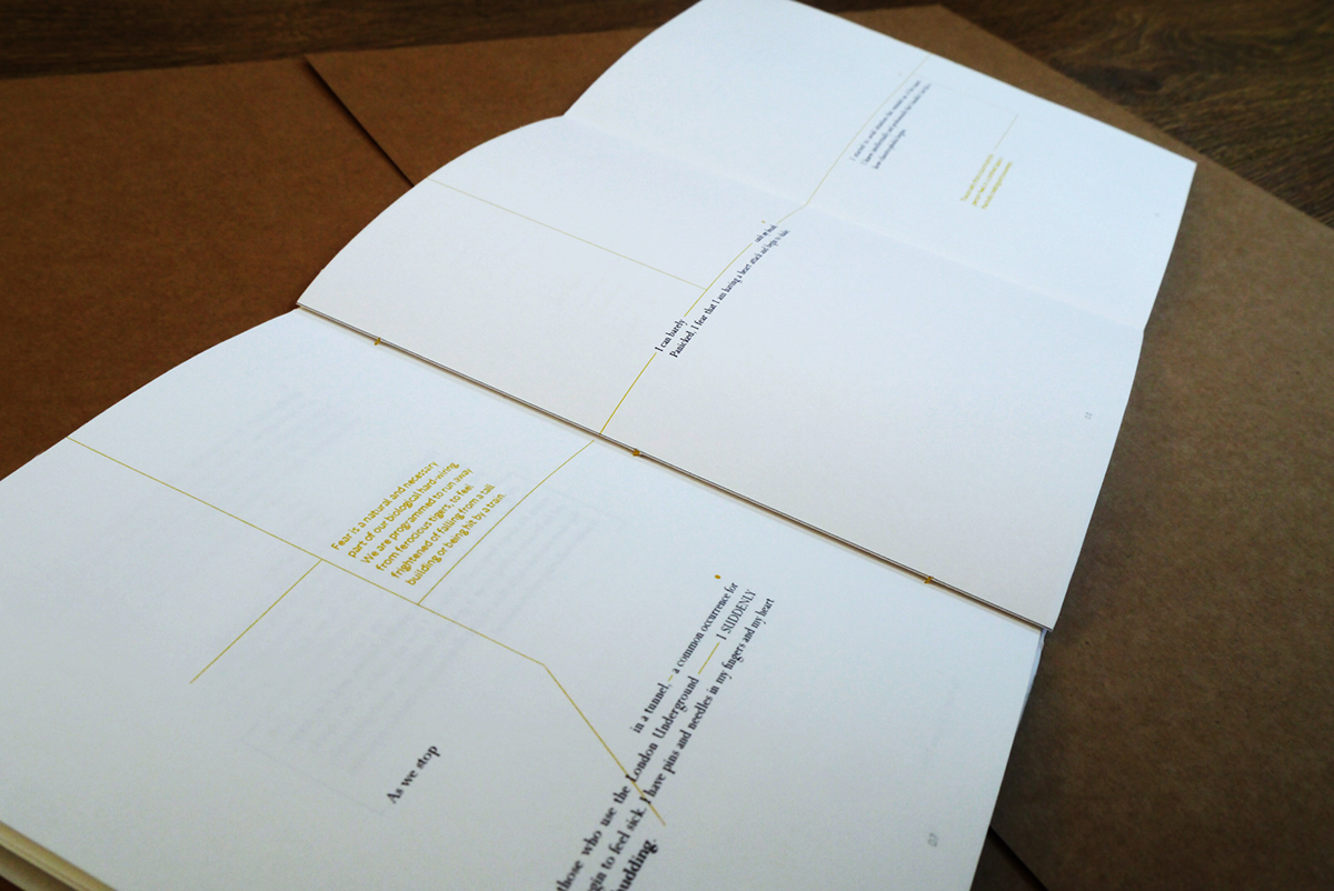
The concept of using traditional book design conventions has been established to enable this consistency to be disrupted and to allow for an increase in emotion to be visually expressed. Structure and unstructure can denote different stages of panic and the publication is intended to become more unstructured as the narrative progresses. Negative space is used to create a visual tension. There is also a French fold, pull-out page and a section that creates a pocket; all contributing to the feeling of being trapped.
The publication is intended to feel claustrophobic and create emotion by being trapped in a cover that needs to be torn open via a perforated edge. Instructions on the cover are prominent to build up tension and suspense before the client pulls the perforated tab. The cover material contrasts with the publication, which uses a clean, off-white matte paper to aid legibility and also add to a sense of fragility.
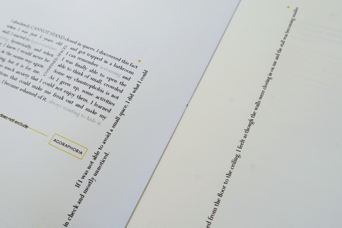
The font 'Perpetua' has been selected for the main copy, for its small x-height and counter space within the letterforms themselves. The word 'contrast' is used to reflect that fear is irrational even though the sufferer feels it is rational. In reality, the sufferer is not going to have a heart attack, suffocate or die! While initial exploration looked at the more obvious uses of tight tracking and leading to interpret the theme, this lead to restricted legibility and readability.
A broader understanding of ‘claustrophobia’ enabled the publication to be explored in more subtle ways.
Personal experiences throughout the book are represented in black and set in Perpetua, justified and over a 4 columns grid to emphasis claustrophobic tension. Medical information is set in Seravek to create a more modern, functional application and runs through the publication, using 2 columns in yellow to contrast from black, and together representing danger. It is set ranged left for a more fluid visual solution.
Subtle qualities continue through the book. Yellow rules are used to help the reader know when to pause and to break up the pages. This continues through the binding of the book using a 3-hole pamphlet stitch, with yellow thread to represent tension. This was also the most appropriate method for the amount of pages and light weight of the stock.
Footnotes in the form of symbols are used to represent individual sufferers. The shape of the footnote on the cover is also reflected in the shape of the perforated tab at the top, bottom and middle to give the client a space to pull out the publication.


